WordPress Tattoo Using The Wrong Logo?

Ed Morita, a Hawaiian resident can lay claim to taking WordPress Fandom to a new level as he now has a permanent WordPress logo as a tattoo on his forearm. Lorelle has been mentioning this event for quite awhile now on Twitter and it’s pretty cool to see Ed actually go through with it. However, I will play the controversy card as I received a message from Andrew on Twitter asking me if the tattoo was using the correct WordPress logo. So lets take a look and see.
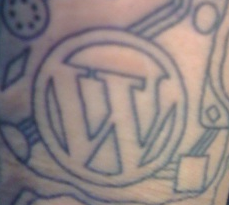
First, lets view the image of the tattoo in black and white form.

blackandwhitewptattoo

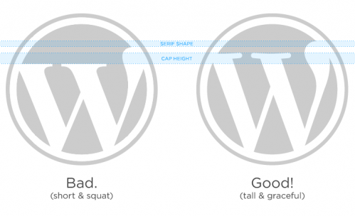
Now lets take a look at the correct and incorrect WordPress Logo. Click on the image to see the full size.
correct-wordpress-logos

After staring at the correct/incorrect logos while staring at the tattoo, I see one or two similarities to the bad logo such as the right space inside of the logo being straight while the correct logo has a curve. But, I also see similarities between the good logo and the tattoo such as the space on the left hand side of the W. Considering Ed had the expertise of Lorelle on hand, I’m pretty sure he used the correct logo regardless.

Some may think that I’m either bored to be analyzing such a thing but hey, I was asked a question and thought I’d put together my findings. I do think what Ed has done is cool and I look forward to seeing where tattoos of WordPress end up on other people.

On second thought, maybe not.

What do you think, did he use the good logo or the bad?

18

18 responses to “WordPress Tattoo Using The Wrong Logo?”

  1. Looking mostly at it with “tall and graceful” in mind I’d say Ed’s tattoo is closer to the bad than the good. Like Jeff, I note the right uppermost leg-end of the “good” logo curves back to the left leaving a little curvy crook in the “whitespace” to its right. That “whitespace” on the tat is has a completely straight edge against the right side of the W.

    But then, on the plus side: the tat W’s serifs are heavy and blocky. And, while the tat W doesn’t appear to be as tall and graceful as the “good” logo, it does extend a lot higher in the containing circle than the “bad” W.

    Do we know how big the tattoo is? I’d bet that the smaller a tat is the more the tattoo “artist” is forced to simplify design. Little itsy details would tend to bleed (excuse the expression …ouch!) into one another and just get splodgy.

    My final word – vote – would be that we give Ed some kudos for his WP enthusiasm.

    Sorry about the wordiness, but typography and logos get me all hot and bothered.

  2. He gave the artist the print out from the official WordPress logo page. Expect some minor distortion with the impact on skin, which he warned us about, but it was based upon the official.

    It’s the stuff around it that I find more interesting than the logo. Have you figured that out yet?

  3. It looks like a bastard child of the right and wrong logo. The caps on the W are supposed to have a curve in them. The blob on the far right is supposed to be larger. Also, the height of the W is wrong. It should be taller. Other than the spacing of the letter in the circle, it looks like the wrong W to me.

  4. I’m with @JLeuze – I think he probably showed the tattoo artist the correct version of the logo (mostly based on the amount of space above the W, which really is the biggest different). The rest of the discrepancies probably come just from innacuracies in the process of transferring it to skin. Not sure if a better artist would have done much better of a job but its clearly not important that it be EXACTLY like the official WP logo, the differences are arbitrary.

    Actually looking at the rest of the tattoo I can’t help thinking maybe he could have found a better artist. He could still do it really, find a serious pro and get the whole thing retouched (or wait till it fades a little and retouch it then to extend its life)

  5. I’d have to go with the artistic license of the tattoo artist being the reason for the look. Personally I think the idea of WordPress Ink is interesting, but the balance of the design being a circuit board(?) doesn’t work for me. Then again, it’s not my skin getting inked.

Newsletter

Subscribe Via Email

Enter your email address to subscribe to this blog and receive notifications of new posts by email.

Discover more from WP Tavern

Subscribe now to keep reading and get access to the full archive.

Continue reading