The default theme slated to ship with WordPress 4.1 dubbed “Twenty Fifteen” has officially been added to the development version of WordPress. In sharp contrast to Twenty Fourteen, Twenty Fifteen is a simple, two column, blog focused theme. The typography features Google’s Noto Serif and Sans, a font family designed to be visually harmonious across many of the worlds languages.
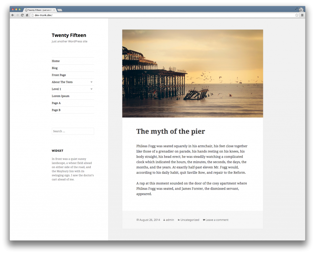
Here’s what the Tavern looks like with Twenty Fifteen activated. In the screenshot, you’ll notice a scrollbar between the sidebar and content. Being able to scroll the sidebar separate from the content reminds me of the Visual Editor in WordPress 3.9. I’d like to see both columns be a cohesive unit for a better experience and to eliminate the ugly scrollbar. This issue has already been reported.
In Twenty Fifteen, the comment reply link is aligned to the left. While not a deal breaker, I prefer the comment link to be aligned to the right.
On the Tavern, we routinely use the featured image as the first image in a post. This works well since the Tavern theme is configured to show only the excerpts and featured image on the homepage. The Twenty Fifteen homepage displays full posts which shows the same image twice, creating a post title sandwich. Keep this in mind if you use featured images and are thinking of switching to Twenty Fifteen in the future.
Each post on the homepage is separated by blank space. Featured images that are not at least 826 pixels wide are padded by an equal amount of blank space on each side. Similar to Twenty Fourteen, images that span the entire width change the visual look and feel of the theme. Posts on the homepage look great when the image is more than 826 pixels wide, while smaller images don’t have the same visual pop.
Since featured images touch the top of the content box, smaller images give me the impression that something is broken. For example, maybe there’s an alignment issue where the top of the image is being cut off. It’s not, but that’s what I’m thinking when I see it. This is all a moot point though if you use a full width featured image.

It’s Still Early
There is a long way to go before Twenty Fifteen is ready for prime time. Initial feedback I’ve seen so far labels Twenty Fifteen as a breath of fresh air. Twenty Fifteen goes back to the blogging roots of WordPress, but it does so in a modern, elegant way. Once the bugs have been squashed and the theme polished, I think a lot of people will either switch to or use Twenty Fifteen when WordPress 4.1 is released. If you’d like to see Twenty Fifteen in the wild, check out Brandon Kraft’s personal site.
How You Can Help Improve Twenty Fifteen
The Twenty Fifteen development team is holding meetings on IRC, every Tuesday at 15:30 UTC, in the #wordpress-dev channel. The meetings are opportunities to discuss all things Twenty Fifteen and to collaborate on tickets.
Yeah… Not gonna lie, so far, I really dislike it. Sidebar is on the left instead of the right, that scroll bar, the widths are annoying with so much useless whitespace on most laptops, that scroll bar, the customize options are lacking, that scroll bar, it’s very bright by default and thus hard to read, that scroll bar, and the sidebar is first in the html code which is not good for readers or seo. Also, that scroll bar.
Still, it’s new. I look forward to the improvements.