First Look at Designs for the Twenty Fifteen Default WordPress Theme

Konstantin Obenland released the first look at the Twenty Fifteen theme on the Make WordPress Core blog today. Takashi Irie, the Automattic theme designer who created Twenty Fourteen, was asked by Matt Mullenweg to design the upcoming Twenty Fifteen default theme.

It is now confirmed that Twenty Fifteen will in fact be a blog-focused theme, according to Irie’s description:

Twenty Fifteen is a clean, blog-focused theme designed through simplicity. With careful attention to typography, the theme treats text as a major part of the user interface. It features Google’s Noto Serif and Sans – a font family designed to be visually harmonious across many of the worlds languages, and a perfect fit for the internationalization strides being made in WordPress core.

The first preview of the theme shows that it includes a sidebar and makes liberal use of white space to emphasize content:

twenty-fifteen

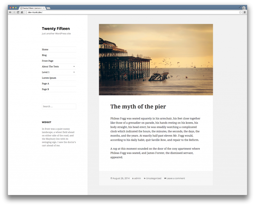
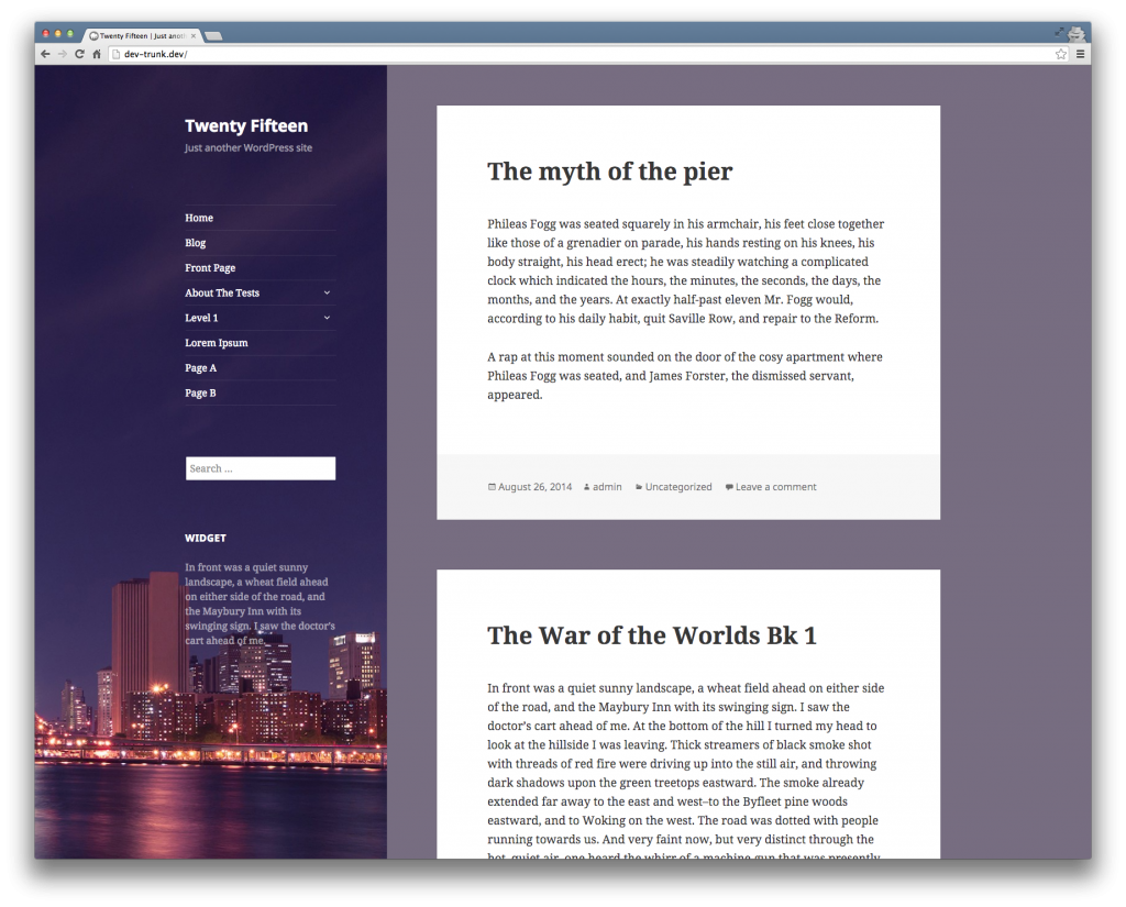
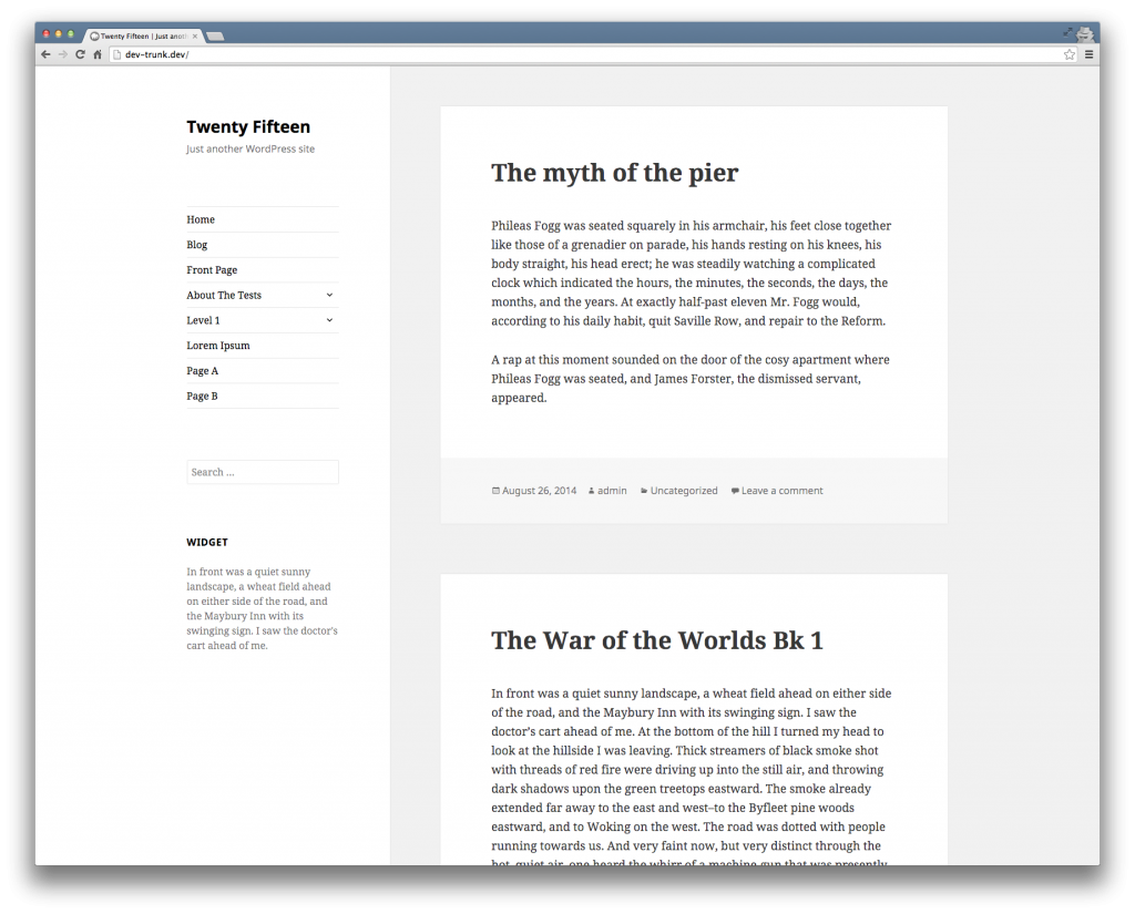
The theme will include the ability to add a custom header image and a custom background. Obenland shared additional images, which show the theme with text only (sans images), a further customized version, and examples of how it might look on mobile devices.

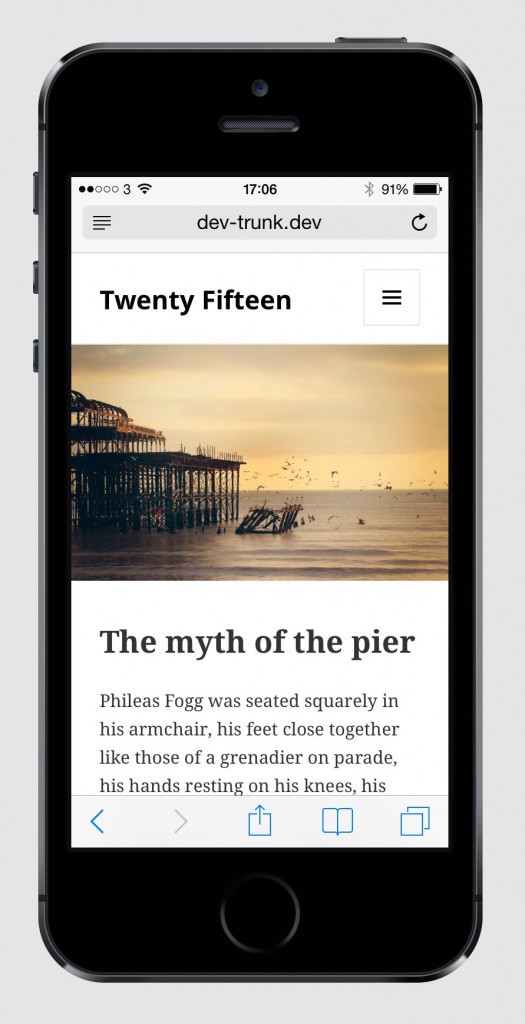
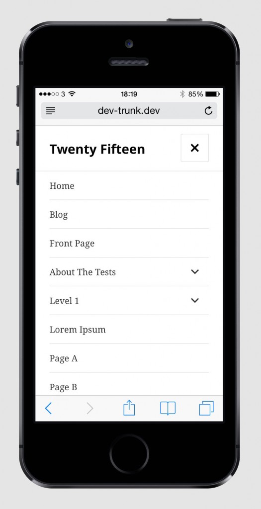
Twenty Fifteen is being designed from a mobile first approach. Obenland reports that the design itself is “far from finished.” After finalizing the design, contributors will create a working theme and commit that to core. At that point, those who have volunteered to test the theme will be able to put it through the paces to ensure that it meets WordPress’ standards for default themes. Twenty Fifteen is expected to be included in WordPress 4.1, which is scheduled to ship in December this year.

27

27 responses to “First Look at Designs for the Twenty Fifteen Default WordPress Theme”

  1. Thank you for the article, Sarah; that looks fantastic, though I’m bummed out about the continuing trend of losing the site’s tagline in the narrow mobile view. Some designers consider the tagline a dinosaur, but I’ve always felt it’s something that makes WordPress more personal and more special than similar blogging platforms. I’d love to see the tagline make it into the final design of the mobile view. But beyond that, that’s really a fabulous looking theme. Simple and handsome, as it should be.

    • Not exactly. The default theme for next year should arrive in time to be used the full year so shipping it in December makes perfect sense. It sure beats getting a new default theme in the middle of the year.

        • I know you didn’t say middle of the year. I was saying that with WordsPress 3.6 which contains a default theme called Twenty Thirteen, it was released on August 1, 2013 two thirds into the year of 2013. Releasing the default theme just before the year switches over gives people a chance to use it for the entire year it’s named after.

          The only way 2015 will come out IN 2015 is if WordPress 4.1 is delayed which it could be since 4.0 was delayed a week or two.

          • It’s like an early Christmas present! It’s exciting! A bit like how new cars come out before the calendar year starts. Except this car is free. And it’s easier to change the colour.

  2. Takashi Irie has skills and I like his design aesthetics. Nice to see a default theme going back to WordPress’ roots. Clean, simple, and elegant.

  3. I’d love to see a three column theme (with content in the middle) be the default one of these days. Either that, or one that had header and footer widget areas.

  4. I’m surprised to see another one with a sticky sidebar (is the sidebar SO important it deserves 1/3 or the screen and a set height?) – I was really hoping to go back to something like twenty twelve or twenty thirteen…. a three-column one would have been really nice…

  5. Great, it looks like it will be another perfect learning-experience theme! I don’t see myself actually using the theme as a whole on my own site or a site of my clients, but definitely bits and pieces of it will be(come) very handy indeed!
    I like the background image in the sidebar, very cool :)

  6. I love this design. For my own site, I was erring toward mashing up my Hellish Simplicity design with the Wintersong theme by StudioPress and the Rams theme posted recently here on the Tavern recently. But that mashup would look disturbingly similar to the 2015 theme design above. I want something original’ish, so I guess I need to go back to the drawing board now :(

    Damn you Takashi Irie for coming up with good designs!

    • I’m glad I’m not the only one who sees some similarities to the Rams theme. I liked Rams enough that I’m using it now. The differences between Rams and Twenty Fifteen are good. I’m excited to see this new theme and expect to use it.

  7. Just can not wait till the final design is released. First look of Twenty Fifteen Looks a simpler. Looks like the Twenty Fifteen is going to elegant and definitely focused towards blogging. I’m super excited to use it.

  8. ive always adored 2012 theme, never liked 2011, 2013 or 2014 (kinda ticked i bought it before it become the default theme), but 2015 is the next best thing to 2012

    • Agreed. I think the Twenty Fifteen design has turned out really well. The early builds were a bit ridiculous, but all the bugs and problems seem to have been ironed out and I really like it now.

  9. I may have found a bug. I have created a page with many thumbnail images on it. When you click on the thumbnail image, it goes to a sub level page giving a large image and about 200+ characters of text.

    Yesterday, I finished adding the images and text to about half of the sub-level pages. This morning, I checked it and all the images are there, but on about 1/2 of the 24 sub-level pages, the text has disappeared!!

    Any thoughts you might have about this would be helpful. Thanks

Newsletter

Subscribe Via Email

Enter your email address to subscribe to this blog and receive notifications of new posts by email.

%d bloggers like this: