When the floor was opened up to users for suggestions on what they want to see included in WordPress 4.7, Mark Root-Wiley advocated for Trac ticket #27159. The three-year old ticket was created by Hugo Baeta and suggests that certain buttons in the post editor be removed in order to improve the user experience.
In the initial proposal, Baeta recommends that the Underline, Alignment, and Text color picker buttons be removed. Throughout the last three years, members of the core team and those interested in the ticket have discussed the pros and cons of removing specific buttons. There’s also a suggestion moving the drop-down menu for choosing headings and making it the first item in the top row.
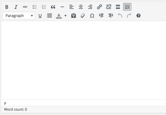
Here is what the kitchen sink version of the post editor looks like on a fresh install of WordPress 4.6.
The following is a summary of the proposed changes to the editor.
- Move the headings selector to the top row, at the front
- Remove heading 1 from the headings selector
- Remove align-left, center, right, and justify or maybe move them to the kitchen sink and only remove justify.
- Remove underline, other than the keyboard shortcut
- Consider removing text color that’s currently in the kitchen sink
- Consider adding a code button and/or a table button.
Nick Halsey questioned if stats could be obtained from WordPress.com that shows which buttons are used the most. Mel Choyce shared statistics from WordPress.com that indicate Bold, Italic, and Links are used the most while Lists and Blockquotes are the second most used buttons. The Center and Left alignment buttons are used often, but the data doesn’t determine if people are using them to align text or images. Information on which headings are used most was not available.
The self-hosted version of WordPress doesn’t collect this type of usage information so it’s difficult to know which buttons in the editor are used most often. Given WordPress’ market share however, it’s not hard to imagine that each button serves an important purpose for a subset of users.
Members of the core team are exercising caution on deciding which buttons to remove as Andrew Ozz notes, “This is one of the most used and perhaps most sensitive places in WordPress and even a small change can cause problems for many users.” Ozz said. “I hope we can use some of the info and experience from making the Calypso editor.”
The team wants to collect more usage data and perform user tests before making any final decisions. To help with testing, Ozz has created a small plugin that can be used to test different button configurations.
What the Competitors Are Doing With Their Editors
WordPress’ competitors which are mostly composed of services don’t have to worry about backwards compatibility or that potentially millions of people rely on a button. I took a tour of their post editors to see what options they make available to content creators.
Medium

Medium doesn’t have formatting tools at a glance and the buttons are only shown if you highlight text.
Tumblr

Similar to Medium, the post editor is bare and the formatting icons only display when text is highlighted.
Facebook Notes

Facebook Notes starts off with a bare editor with two buttons on the left. The first opens up links to embed something or add a photo. The hamburger menu icon displays headings and a blockquote button. Like the other two editors mentioned above, a select group of formatting options are displayed when text is highlighted.
Joomla 3.6.2

The post editor in Joomla 3.6.2 has a few more buttons than what the WordPress kitchen sink has.
Drupal 8.1.8

Drupal has three different editors users can choose from, Basic HTML, Restricted HTML, and Full HTML. Each editor has its own button configuration.
What Is the Ideal Configuration?
The buttons in the editor serve a multitude of purposes and contexts but not all of them. Whichever items the core team decides to remove from the editor will likely come back in the form of a plugin.
What buttons do you use most and which items would you like to see removed from the editor to make it simpler to use?
Perhaps they should not remove any at all.
If the option is to remove and then create a separate plugin that re-adds the exact functionality that was taken out, would that not constitute redundancy at its best??
Why not just give the user an option field much like the page options where a person can select a checkbox to show/hide any specific options. This could also include a potential for sort order as well.
This would likely not involve drastic changes to anything that is already there. Users who don’t care one way or the other could just ignore the option, while those users who “must remove” excessive buttons from view could do so.
Perhaps the best of both worlds??