Google Fonts is sporting a fresh new design that makes it much easier to browse. The catalog of free and open source fonts first launched in 2010 with 14 fonts and has grown to host more than 800 today. In addition to being viewed across the web over 15 billion times per day in 135 languages, Google Fonts is also used by hundreds of WordPress plugins and themes.
The new directory design uses Google’s Material Design framework to provide a cleaner look that scales across different screen sizes.
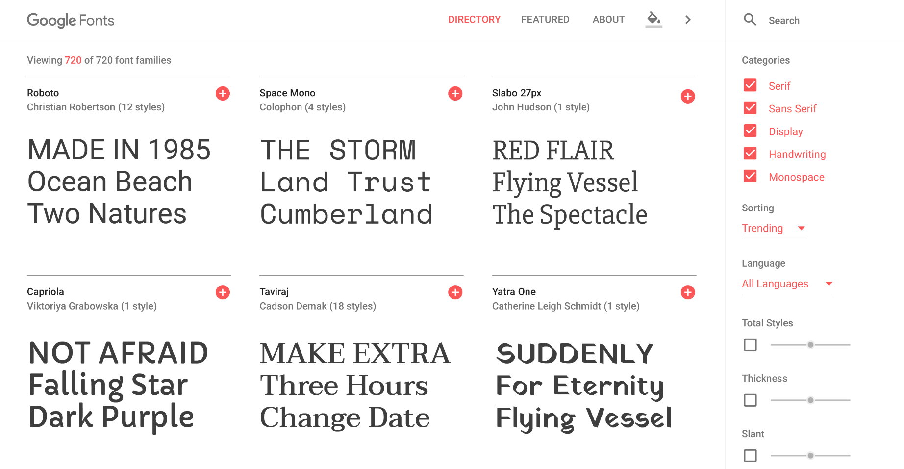
Fonts can be filtered by category, language, slant, thickness, and width. The specimen page allows you to scale the font up or down, experiment with popular pairings, and view information about the designer, countries where the font is popular, and usage analytics.

The new design includes many new interactive elements that give you the ability to get up close and personal with the fonts before putting them to use, which eliminates a lot of testing that previously had to be done in another environment. Selections can even be viewed in different colors:
My favorite feature of the new Google Fonts! pic.twitter.com/WRFJOOqSgL
— Eva Ferreira 💚 (@evaferreira92) June 15, 2016
The new featured collections section is fun to browse as a starting place or to discover new fonts. It includes curated groupings like Headline-Worthy Serifs, High-Impact Vernacular Display, and Perfect Pairings.
“One of our foremost goals with the redesign was to make Google Fonts a more visually engaging design resource,” Google designer Yuin Chien said in a post explaining the design process. “The type specimen was conceived with an eye toward creating a dynamic and playful way for people to explore various font families. By building in the ability to play with scale, color, and font pairings, we invite everyone to discover and seamlessly use typefaces in their projects.”
The new design makes it easy to create some inspiring font combinations without having to test them together on your website. Customizing the embed code is easier than before with real-time feedback on expected load times based on your selections. With all the improvements, Google Fonts has become an engaging playground that designers and typography enthusiasts will enjoy browsing.
The redesign looks fantastic! A true pleasure to use now.