 If you’ve been too busy to spend some time playing around with the new menu system in the latest bleeding edge version of WordPress, WPEngineer has a couple of screenshots of the latest user interface that will be part of the 3.0 release for managing menus. A couple of the comments mentioned that based on the screenshots alone, it was clear that it would be difficult to scale. I’ve played around with the menus for a little bit and I was able to create five of them before the sixth menu forced the menu widget to the bottom of the screen. One of the only complaints I have with the system as it stands now is a cosmetic one. Since the menu addition widgets are on the left hand side and the menus are on the right, it looks totally different than most of the other pages throughout the administration page, especially the widget management page. It’s not a huge issue but I think it detracts away from the consistency of the back-end. Here are two screenshots showcasing what I mean.


I suppose if the menu addition item sidebar were moved to the right, leaving the menus in the middle, it just might address the consistency factor. As for actually using the menus, I love the idea of not being limited to category or page links per menu. I can mix and match them as I please.
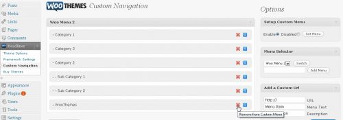
By the way, I’ve decided to add one more screenshot of what the WooNavigation system was like before it was hacked to death. There are some things that didn’t quite mesh with the surroundings such as the icons but just about everything else seemed native to me. I’ve not had the opportunity to use WooThemes version of the menu system but just from watching the video, it seems easy enough.
It will be interesting to see how the menu system will change either UI or functionality wise before the release of 3.0. I’m also looking forward to reading all the feedback around the menu system once it hits the public’s hands although many who upgrade right away may not even see the menu system until they upgrade their theme with the required functions.

I agree. The new UI doesn’t flow nearly as well as the original Woo UI. The new UI is not so fantastic. Swap the position of the menu content and the “tools” so the toolbar is on the right.
The tabs are also problematic because they aren’t going to scale. The best way to handle this would have been to handle Menus like Categories, Tags, Posts, etc. Where you go to Menus and you have a list of all your Menus. You either click “Add New” or you edit an existing menu and then get the menu editor interface. It would be more consist with the rest of WordPress if they went this route.
Here was a quick UI mockup that I had shown on the UI dev blog when this change was being discussed:
http://www.twitpic.com/18zl8j
The tabs are also large and chunky. I know these are the same tabs that were introduced elsewhere in the UI, but they just don’t fit in here or anywhere else they are used.
That being said, the functionality is FANTASTIC! Kudos to Ptah Dunbar and Filosofo for all the hard work!