WordPress for Android Version 4.1 Says Goodbye to the Hamburger Button

4.1-reader
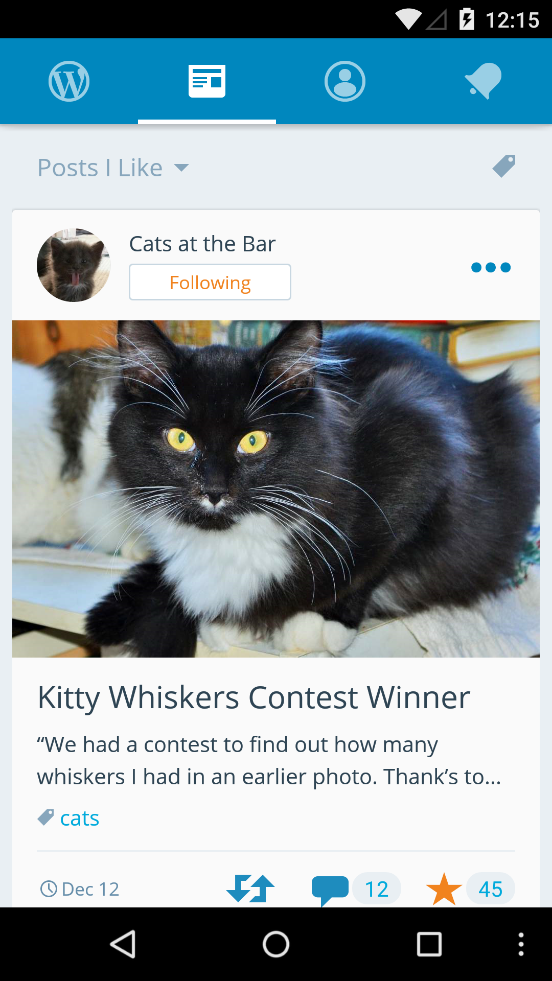
WordPress for Android version 4.1 is sporting some major design changes. Navigation in the app has been redesigned to remove the the hamburger button in favor of four simplified tabs spanning the top of the screen.

The ubiquitous hamburger icon, used on apps and websites for years, is slowly falling out of fashion on the web. While the side navigation drawer does a good job of keeping nav items out of sight, it comes at the cost of user engagement. Hamburger menus are also inconvenient for one-handed device operation.

Version 4.1 of WordPress for Android has been redesigned to display a tabbed action bar with quick access to your sites, the reader, user account settings, and notifications. The sites menu will allow you to manage any of your connected sites and includes a short menu for publishing, stats, theme customization, and access to the full dashboard.

tag-autocompletion
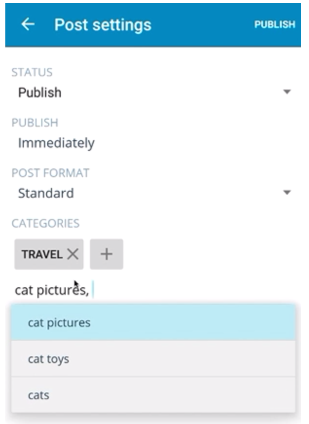
Another new feature in 4.1 is tag auto-completion. When adding a tag on the post settings screen, users will now receive suggestions (based on existing tags) while typing.

Stats have also been improved to provide a noticeably faster viewing experience. The app now takes just a fraction of the time it previously required to load stats data. Interacting with this feature no longer feels like visiting a foreign land.

Overall the 4.1 release is a big leap forward for WordPress’ usability on Android. The navigation redesign is more intuitive and smaller features are continuing to be refined with each release. The 4.1 update should have already hit devices, so Android users can open up the app to check out everything that’s new.

16

16 responses to “WordPress for Android Version 4.1 Says Goodbye to the Hamburger Button”

    • It’s interesting to see the difference between Google and Apple’s recommended best practices for design guidelines.

      Apple has always advocated for the primary navigation bar to be on the bottom of the app, so it’s easier to navigate with a single handle… with your thumb. Google has went the other way and in Material UI places the primary toolbar on the top. Given so many mobile phones are so large these days, I wonder how things shook out the way they did.

      From a personal UX standpoint I definitely prefer the primary navigation bar on the bottom the way Apple’s own apps do it, as well as Facebook, Twitter, and the WordPress app on iOS precisely because it’s easier to navigate without having to adjust how i’m holding the device naturally, or having to hold it in one hand and navigate it with the other.

      It’s in line with Google’s Material UI design guidelines, but I definitely prefer Apple’s design guidelines when it comes to this specific element placement.

  1. “The ubiquitous hamburger icon, used on apps and websites for years, is slowly falling out of fashion on the web.”

    Strange, Sarah, that you should link to an article to support such an assertion, where the comments make it clear that many users prefer the hamburger.

    I am one such user. If I download an app to my Android phone that insists on using a cluttered list of buttons, that’s uninstalled pronto and replaced by one using a hamburger. It creates a much cleaner, aesthetic.

  2. The tabs are ok, but ONLY icons are a real bad decision!

    What is needed instead of only icons this this: text alone OR text + icons —> both would be much more intuitive and user friendly.

    I hope the permanent design changes in this app will end soon – otherwise it should be clearly stated as “beta”…

  3. Still a fan of the Hamburger, even though it does require two clicks. On most websites and apps, the bigger issue for me is screen space. I don’t like a cluttered screen (mobile ads, I’m looking at you!) and want to be able to get to different pages even from the bottom or middle of another page. Sure, there’s the footer, but I don’t want to scroll through all those irreverent, irrelevant, and unappealing ‘sponsored articles’ to get to it when I can get where I need to go in two taps with a hamburger menu.

  4. Doh!
    Just when I’m totally comfortable with the hamburger! I’m going to campaign for hot dogs, or preferably sausage menus. Come to think of it, my clients are already asking for sausage in the form of absurd dropdown menus, so I guess sausage is already covered.

    Maybe bubblewrap or an airhorn. :)

Newsletter

Subscribe Via Email

Enter your email address to subscribe to this blog and receive notifications of new posts by email.