WordPress 3.4 introduced the WordPress Customizer API and over time it has evolved from being a theme customizer to a framework for live-previewing changes to WordPress.
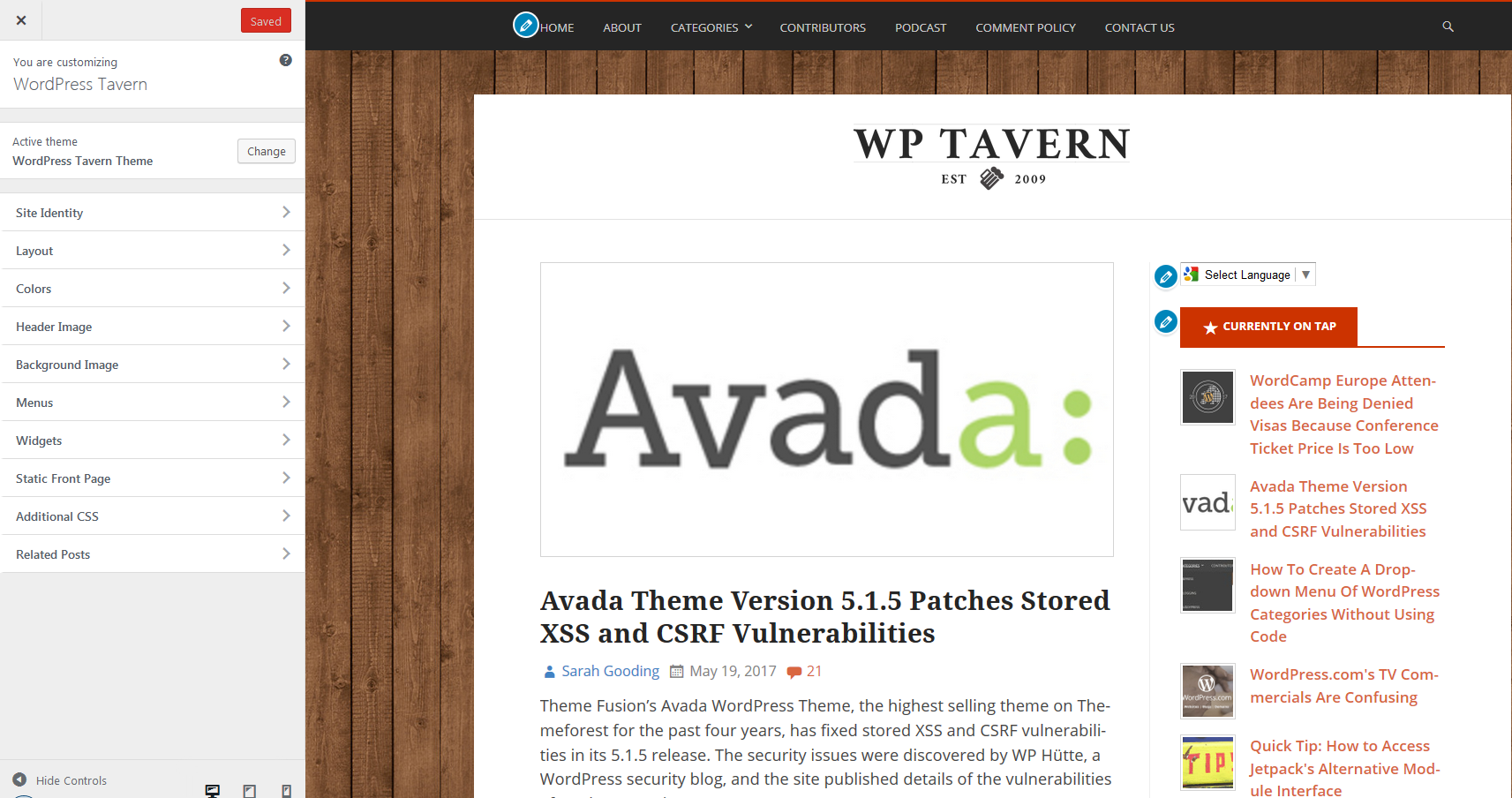
Since its inclusion, one of the most common complaints about the Customizer is its narrow sidebar. Even on widescreen monitors, the Customizer sidebar is only 300px wide.
This limitation was one of the motivating factors behind the Customize Pane Resizer feature plugin created in 2015. Although Customize component maintainers tried to get the feature plugin ready in time for WordPress 4.5, it didn’t make it.
In WordPress 4.8, the Customizer Sidebar Has a Variable Width
Weston Ruter, Customize component maintainer, announced that the Customizer sidebar in WordPress 4.8 has a variable width.
“Ticket #32296 was created to allow the sidebar pane to be user-resizable with a grabber just like the Dev Tools pane in Chrome can be resized,” Ruter said.
“After a lot of back and forth, the scope was reduced to remove the user-resizable aspect and to instead address a more fundamental issue that the sidebar is exceedingly and unnecessarily narrow on high-resolution displays.”
The sidebar has a minimum width of 300px and a maximum width of 600px. What users see depends on the width of their screen. I use a 21 inch widescreen monitor and the width of the sidebar on my screen is 345px.
While not a huge change, the extra width is noticeable. WordPress theme and plugin developers who have built custom controls into the Customizer are highly encouraged to test WordPress 4.8 to ensure that they display properly on large screens.
“Custom controls in plugins and themes should utilize alternative approaches to doing layout than using pixel widths,” Ruter said.
“Use of percentage-based widths or flexbox will help ensure that controls will appear properly in larger displays, while also making controls future-compatible when the sidebar width could be user-resizable.”
If you’d like to be able to adjust the width of the sidebar, check out the Customize Pane Resizer plugin. I tested it on WordPress 4.8 beta 2 and it works as expected. There’s also the Fluid Customizer plugin which also allows you to manually resize the sidebar.
Why should plugin developer bother? who is still working from a desktop? (and how am I supposed to test it? should I buy a 21 inch just for that?)
(Just bought a 15” laptop for my mother. I don’t expect her to use it more then she used the desktop, but less wires and easier to move to clean below it)
just another example of “(stupid) decisions, not options”. Even with your screenshot it is obvious the customizer can be easily wider… this should just be an option, or at least expose and API for it.
In addition being wider is not enough unless the customizer can take advantage of the additional width and show more information, for example show two columns of sections instead of one. Right now all this change does is probably adding white space.