Ridizain is a free WordPress magazine theme, heavily inspired by the new Twenty Fourteen default theme. Zulfikar Nore released it just before Christmas, adding to his library of 17 themes in the official WordPress.org directory.
It’s important to note that Ridizain is not a child theme of Twenty Fourteen. Rather, it’s an adaptation or re-design of it, as the name suggests, with two important design distinctions: Ridizain is full width and centered. These major differences answer a couple of the most common complaints about Twenty Fourteen.
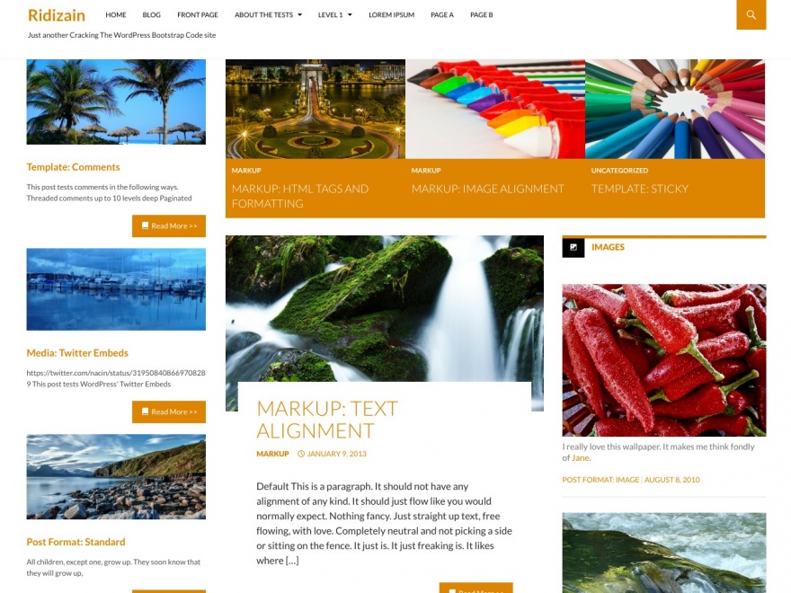
Check out the Ridizain demo and compare to the Twenty Fourteen demo to spot the differences between the two themes.
Ridizain is built with the same template structure as Twenty Fourteen and maintains all of its other features, including featured homepage content, three widget areas, custom recent posts and full color control for many of the theme’s elements.
Hopefully, the developer will incorporate any major changes added to Twenty Fourteen in the future. If this is a concern for you, it might be better to simply create a child theme of Twenty Fourteen with the CSS changes included. This is a theme worth looking at if you’re a fan of Twenty Fourteen and want a quick way to get it centered and full width. You can download Ridizain for free from WordPress.org.
I like how the content is centered. For me though the site is just too darn busy and big. Why are the images so dog gone big! I’d like to see that left sidebar in Ridizain disappear and then shrink the featured content area a bit while adding another featured post spot so there is 4 of them. Then, stretch the actual content portion out to 600 or so pixels leaving the right side bar as is.
Overall, nice to see a different take on the 2014 idea.