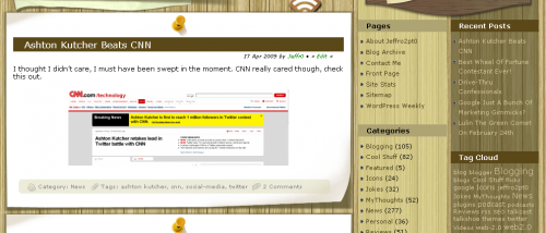
At A Glance:
Wooden Fence is a three column theme compatible with WordPress 2.7 released by TemplateLite.com on May 6th, 2009. This theme is also free. Also mentioned by the author: Compatible with IE6, IE7, Firefox, Chrome, Safari, Opera and W3C XHTML and CSS compliant.
License:
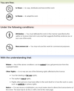
As for the license, Wooden Fence is licensed under a Creative Commons Attribution-Noncommercial 3.0 Unported license. So what the heck does that mean? Perhaps the following picture will help you out.
However, the theme author stresses that the main thing to keep in mind is that you must keep the footer link and a footer script intact to enjoy free usage. Footer script? Let’s take a look.
Designed by WordPress Templates Courtesy of Cheap Dedicated Server
Yes, that is a link in the footer to a cheap dedicated server hosting company therefor making this a sponsored theme. All I’ll say about that is if you plan on using this theme, plan on advertising for a cheap dedicated server company as well. If I know anything about the WordPress community, I highly doubt many people will.
Installation:
Installation was as easy as can be. All I had to do was extract the theme folder to my desktop and upload it to the WP-Content/Themes folder.
Configuration:
While most themes now a days have an entire panel of options, this theme doesn’t have one. The reason being, this theme does not have any fancy doo dads built in which need configuring.
However, there are a few things you can edit with this design. TemplateLite.com offers a PSD file that you can edit if you own a copy of Photoshop to change the text in the header. Unfortunately, you’ll need some design skills to change out the images in the photo frames since the photos are not on separate layers.
This theme is heavily dependent upon the initial design for it to look and feel the way it does. If you change one of the design elements, chances are good that it will make the entire theme look bad.
Design:
The initial design looks great out of the box but there are quite a few small things which bother me. The first is that the font color for the sidebars does not work well with the background image. You can tell the theme author put in some effort here as each sidebar has a dark or light color part of the background image but in my opinion, it doesn’t work. I think solid colors would work better here. The color of the font in the search box is a little too gray. I think it would look better with the font color used in the right sidebar. Other than that, this theme scores high points from me for creativity.

Widgets:
Only two places you can put widgets in this theme, the right and left sidebars.
Support:
As far as I can tell, support for this theme is limited to the comments section on the release post. Not a great way to do support but if you’re just starting out, it’s a great way to measure demand for the theme. If the comments for support reach a certain point, that’s a good time to move things to a forum.
Final Thoughts:
Overall, this is a solid theme. it doesn’t leave much room for customizations due to the dependency on graphics within the design but then this theme wasn’t created to be customized. My favorite aspect about this design is the way posts are displayed. Each one has a paper fold with a thumbtack at the top. I just think that is pretty cool. The sidebars could be improved with solid colors and the footer looks great.
With the lack of an options panel, end users will be up and running in no time when they install this theme. A bit refreshing when you consider the amount of time it takes to configure a theme sometimes.
You can view all of the other themes TemplateLite has created by checking out their WordPress theme Showcase. While you’re there, check out the review they wrote up for WPTavern.com.


Or, just use the theme, and remove the footer links.
I’m not a big fan of image-heavy themes, but this one does look nice.
What’s the thing above the posts, that looks like a piece of long, thin cardboard tacked to the fence?
I think one thing he could have done that might have been a nice touch would have been to change the color (or style or whatever) of the thumbtack for “sticky” posts. (All posts have a gold thumbtack “holding” them to the fence background. The “sticky” posts could maybe have a red thumbtack, for example.)
Also, I like the paper-curl effect, but I would have put it at the top of the post, instead of at the bottom – in order to emulate the behavior of paper that is tacked with only one thumbtack (the top of the paper curls, rather than the bottom).
I like the post-it note-style pull quotes, too.