How to Get Your WordPress Site Ready for Google’s New Mobile-Friendly Ranking Algorithm

mobile

The WordPress Theme Review team is encouraging all theme authors to take notice of Google’s upcoming change to its ranking algorithm, which will be put in place at the end of April:

Starting April 21, we will be expanding our use of mobile-friendliness as a ranking signal. This change will affect mobile searches in all languages worldwide and will have a significant impact in our search results. Consequently, users will find it easier to get relevant, high quality search results that are optimized for their devices.

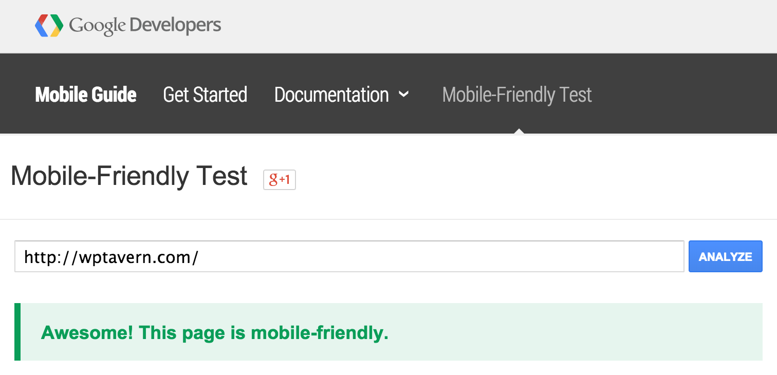
You can find out if your site is ready by testing it with the mobile-friendly testing tool created by Google. It will give you a rough idea of how the Googlebot views your pages.

mobile-friendly-test

Google Webmaster Tools has a new Mobile Usability Report that will also give you a more detailed breakdown of any mobile usability issues with your site.

Although Google hasn’t published an exact guide to how the new ranking algorithm will work, it provides a guide for mobile SEO. The documentation for the Principles of Site Design on Web Fundamentals is also a great resource with practical suggestions for making your site better for mobile users.

Google also created a mobile-friendliness guide specifically for WordPress users. It encourages site admins to update to the latest version of WordPress and to use a theme that that is mobile-friendly.

If you want to test your site on various mobile devices, the Google Chrome browser has a “mobile device emulation” feature that can be found under the “Developer Tools” menu.

Find a Responsive WordPress Theme

Out of the 3,000+ themes listed on in the official directory, filtering by “Responsive Layout” under “Features” currently returns only 947 themes. This doesn’t necessarily mean that 2/3 of themes hosted on WordPress.org are not responsive. These are simply the ones that have been tagged with “Responsive Layout.”

The Theme Review Team posted a notice about the update to encourage developers to examine their themes for mobile-readiness ahead of time. If your theme is not responsive, Emil Uzelac suggests adding responsive media queries:

Mobile-Friendly can be a Responsive design, but also an App that turns your theme into a “mobile version”.

Since we don’t accept themes with mobile Apps because that would fall into a plugin territory, our choice is Responsive and media queries instead of browser sniffing tools.

Now, for the mobile-friendliness, responsive media queries will be enough and that is the very basic to be qualified as “mobile-friendly”.

Not all WordPress.org theme developers will be willing to update their themes with a responsive layout, as some of them are abandoned and no longer maintained. If your theme is failing Google’s mobile friendly test, the most important change you can make is to update to a theme with a responsive layout. Even if site ranking and SEO are not important to your objectives, improving the experience for mobile users should be enough motivation to make the change.

26

26 responses to “How to Get Your WordPress Site Ready for Google’s New Mobile-Friendly Ranking Algorithm”

  1. I love the notification of this and suggest that both WordPress.com AND WordPress.org plaster this all over their Home Pages or Theme Directories as constant reminders to both Theme Developer and prospective users searching for themes.

    Make WordPress the most Mobile-First Blog/CMS Platform on the planet !!!!!!!!!!

  2. Helpful guide, I am now using WPtouch plugin to make one of my site mobile friendly. I found it better than using responsive design, since it also reduces the page load time, by serving a separate theme for mobile devices, which is specially designed for mobile browsers.

    • It’s a bad user experience if the mobile theme is very different from the desktop one. But if the design of both match then it’s an option.

  3. Overall, I think this is a good move by Google and hopefully a lot more of the older WordPress themes will start to adapt as a result. It’s great that Google are offering good resources and information to back up their latest move. There is also a good Google blog post here: http://googlewebmastercentral.blogspot.co.uk/2014/11/helping-users-find-mobile-friendly-pages.html revealing a bit of information about what they actually test for (I expect the list is not comprehensive and will grow over time).

    RWD (responsive web design) is pretty much part of a standard website build nowadays, whether that is a custom build for a business or a theme. So, this should start to show up those themes that are no longer supported or are very out of date.

  4. For those that can’t switch themes, I’d suggest Brave New Code’s wptouch plugin. They have a lot of nice stuff in there.

    Also Jetpack has a mobile option, though I’ve never tried it.

    • Tried Jetpack for some time on my themes. Fairly plain with limited settings. Also opened all my site pages to the public , not only the menu ones. It was readable and passed the google tests.

  5. There is a good chance your robots.txt file is actively blocking the wp-content/themes folder. This is done by many SEO plugins by default. The result would be that Google can’t see your CSS and JS files and will perceive your content as if it was unstyled. To fix this you have to edit the robots.txt file. You can check your robots.txt file through Google Webmaster Tools and even check if your current theme stylesheet is being blocked. If it is being blocked, simply remove the reference in robots.txt, rerun the new mobile check, and Google will flag your site as mobile friendly.

  6. This should be headline news. There will be a lot of people that get dinged that wont even see it coming. It will take some time to fix and climb back up the ranks. Thanks for the great write up

  7. Just a heads up for others – initially I got some errors, but apparently they where caused by some robots.txt rules I was using to restrict spider access to certain WP folders. Google uses spiders to check the mobility of the site and if they cannot access theme and other files, they consider site as not mobile-ready.

    • I had to comment out these robots.txt lines:

      # Disallow: /wp-content/
      # Disallow: /wp-includes/
      # Disallow: /wp-*
      # Disallow: /*?*

  8. You should not required to change the theme, which is responsive. Update the latest wordpress version & you are done. But the mobile friendly version is in beta right now!

  9. Awesome! My pages are mobile friendly. Great post, i check my blog immediately after read this article. Thanks for information.

  10. Any suggesting about how to convert a custom built site (e.g. http://www.webtoolhub.com) where there are many sections and users just not read articles but interact with many features like using tools to analyze their site?

  11. Hello Sarah,

    I am using responsive theme but still got the notification from Google. It says some of the pages are not mobile friendly. I think mobile crawler pays attention to page size too, when it exceeds certain size limit than it will flag as non-mobile friendly.

    Google recommended to use “WPtouch” plugin for self hosted WordPress websites.

    • I use WP touch and it works really well, the free version is o.k and you can upgrade for access to more themes.

  12. I’ve been told Google is going to charge a fee for websites that are not App friendly – is this true? And will I be able to make it App friendly without the help of the person hosting our website? Thanks!

    • @Christena – The only thing Google can do is penalize your rankings in their search results. No fees charged.

      • Thank you for the prompt reply – I wonder why they told me I’d be charged? Oh well – next question……I know a little about updating a website, is there an ‘easy’ how to that I can follow to make it App friendly? We are a non-profit, any help in that area? Thanks !

        • Are you using Google AdWords? Perhaps Google will charge extra for that. But really, a penalty in search result rankings is likely worse! BraveNewCode’s WPTouch plugin is the easiest solution I know of to make a WordPress site mobile-friendly. The free version is very capable and can be found on the WordPress plugin repository. If you need additional functionality or some nice mobile-friendly themes, a pro version of the plugin is also available. All this being said, the best long term solution is to use a mobile-friendly theme. I would suggest planning ahead for your next website refresh to ensure that you make your WordPress theme mobile-friendly.

          • Thanks for the info – we have a place that hosts our website and they developed it on WordPress but I’m thinking I can do what it takes to make it mobile-friendly myself. I do not believe we use AdWords.

  13. Funny thing is that if I open my site with a mobile device, it looks okay, I can browse normally and all is good. When I check my site with google checking tool, it says my site is not mobile friendly…

Newsletter

Subscribe Via Email

Enter your email address to subscribe to this blog and receive notifications of new posts by email.

%d bloggers like this: