Gutenberg 8.6 Adds Cover Block Video Positioning and Updates Block Patterns

Gutenberg 8.6 landed quietly last week. Much of the focus right now is ironing out the remaining bugs for WordPress 5.5 during its beta cycle. However, that does not mean the Gutenberg project has come to a complete halt in terms of new features. The team is marching forward with extra goodies for those who use the plugin.

The latest update of the plugin did not cover as much ground as normal, but it does include an enhancement for the Cover block when using a video background and several updates to block patterns.

The primary focus for version 8.6 was squashing bugs. The development team addressed over three dozen of them while correcting a handful of performance issues. While new features and enhancements from 8.6 onward are not expected in the upcoming WordPress 5.5, most bug fixes should be included.

Focal Point Selector for Video Covers

Using the focal point picker with a video background for the Cover block.
Selecting a focal point for a video background.

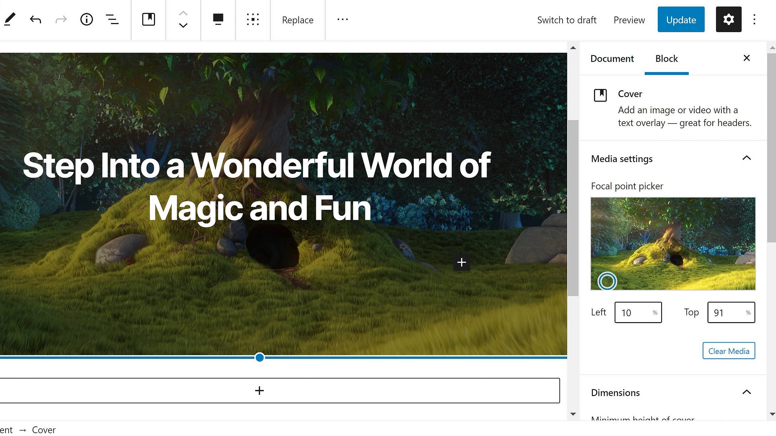
The Cover block has long allowed users to pick a focal point for background images. However, this feature was missing when users added a background video to the block. As of version 8.6, that is no longer the case. Both image and video backgrounds should work in much the same way.

Gutenberg now has a new “Focal point picker” option located under the “Media settings” tab when adding a video background. Users can select the focal point by dragging the circle icon in the video box or hardcode left and top percentage values in the input fields below it.

This is not a particularly exciting development for most Gutenberg users. Self-hosting video is not cheap and remains unused for most. However, for those who do use video backgrounds, it is one of those nice-to-have features that is there when needed.

Updated Block Patterns

Inserting the Quote block pattern into the editor.
Inserting the updated quote block pattern.

The Gutenberg team updated several of the existing block patterns. For the most part, the pattern updates were minor cosmetic changes, tweaks that improve the overall design. The button-related patterns received simple changes, such as new text labels and colors. The developers also changed the colors and text of the large header patterns.

The team moved the header above the columns in the two columns text pattern and changed the text to make the columns appear equal height by default. It is a poor use of textual columns, which would ideally be handled with CSS instead so that it works appropriately across screen sizes. Perhaps it would be better to have a “Text Columns” block in the long run.

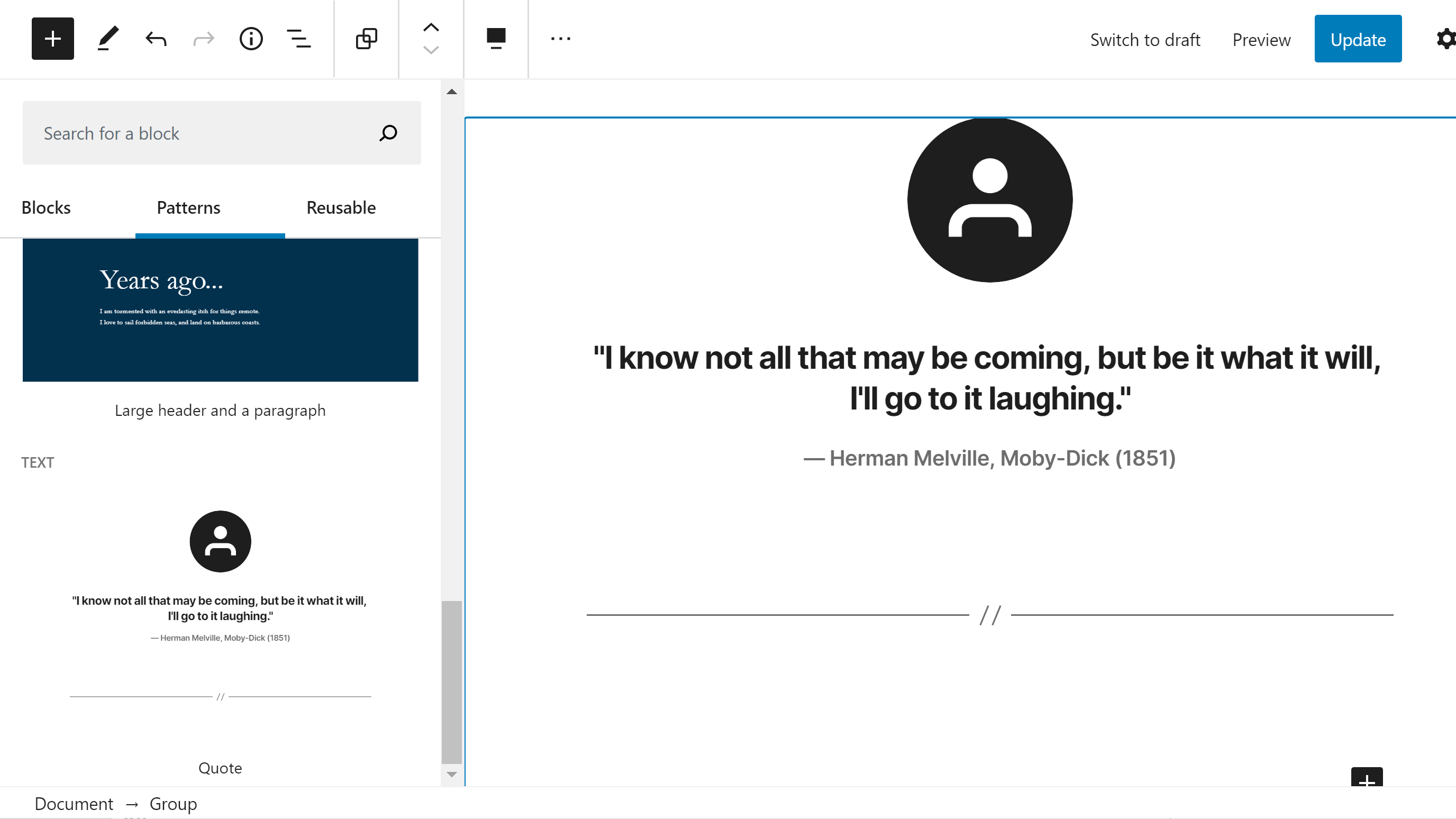
The nicest block pattern update was for the quote pattern. It now has an image at the top and a separator at the bottom. It is akin to a single testimonial, which is more of a pattern than a basic quote.

Theme authors can also remove support for the core block patterns with a single line of code: remove_theme_support( 'core-block-patterns' ). This does not drop support for patterns altogether. For example, patterns added by plugins or the theme will still appear in the inserter.

Site Icon Used in Fullscreen Mode

Testing the site icon button with fullscreen editing mode.
Site icon appears in top left in fullscreen mode.

When writing in fullscreen mode, the “back to posts” link has utilized the WordPress logo in the past. In version 8.6, the user’s custom site icon will take its place. However, this will only happen if the user has uploaded an icon via the customizer.

I am unsure how I feel about this change. In practice, it almost feels like clicking the icon should take me to the front end of the site instead of the post management screen. At least with the WordPress icon, it felt like it was pointing toward an admin-side screen instead. For my workflow, I would rather see this link/icon replaced with a button that toggles between fullscreen and normal mode, popping the admin menu back into place rather than departing the editing screen altogether.

5

5 responses to “Gutenberg 8.6 Adds Cover Block Video Positioning and Updates Block Patterns”

  1. “I am unsure how I feel about this change. In practice, it almost feels like clicking the icon should take me to the front end of the site instead of the post management screen. At least with the WordPress icon, it felt like it was pointing toward an admin-side screen instead. For my workflow, I would rather see this link/icon replaced with a button that toggles between fullscreen and normal mode, popping the admin menu back into place rather than departing the editing screen altogether.”

    I completely agree. This change made no sense to me. Either put it back to the WP logo or change to a toggle fullscreen button.

    • +1 for ” popping the admin menu back into place rather than departing the editing screen altogether”.

      Anything else is as crazy as removing the ability to click and drag blocks when the toolbar is set on top !

      P.S. (warning: off topic) Are they really going to release a major version in a few days without having the accordions in the block inserter? Mind you that we are year and a half+ after Matt declared Gutenberg is ready for the masses – yeah, it’s getting better, much better actually, but it still can’t compete with even the most average page builders without a lot of help from plugins (Editorskit, Block CSS, etc…) and custom blocks.

      Also, something must be done with the Pattern previews, as if you have too many of them, especially if the patterns are full pages (many vertical blocks), it takes several seconds to load. How are themes and plugins supposed to serve dozens of these patterns in this condition?

  2. WordPress developers should put themselves in the shoes of the average Joe which is the major user of WP.

    Developing a workflow that is tailored towards geeks, devs, coders and technical people is the wrong approach.

    The average Joe doesn’t use software where dragging is happening with page velocity move.

    The average Joe doesn’t have a clue if a paragraph symbol is actually the place from which he can drag something.

    The average Joe doesn’t know what CSS is.

    The average Joe would expect to see a navigational menu and to use a a left corner button to make it appear.

    The whole Gutenberg project looks like build from devs and tailored towards technical people working on laptop.

    It doesn’t embrace simplicity and ease of use with common UI and UX practices tailored for the average consumer.

    The result is all these negative stars on the WP Gutenberg page. I work with many clients and from all of them just one and now two prefer the new editor.

    I am fan of the block idea, but the implementation is still not baked.

    Please hire someone to run consumer servers on large scale and get their feedback rather than providing geeky solutions that the general public hates.

    • I completely agree!

      If the simplicity of the classic editor is not integrated into Gutenberg, at least up to version 10. I will forever abandon the idea of ​​using Gutenberg and mark Gutenberg as a failed project.

      Nowadays it’s almost impossible to use it for large articles with lots of media, shortcodes and other elements. it takes 5 times more time than in the classic editor. Allocated a day to compare. The result is vary sad.

      • You are totally right, and on large pages, the so called “long form content” there is an extreme lag if you embed lots of images due to some issue that produces the lag and is multiplying. I have a maxed out iMac with 32GB RAM and i7 6700K and it still lags. I can’t even type normally, it’s like the whole browser is into an extreme stress. This is an addition to everything wrong with the editor. Again, I like changes, I love changes, I embrace changes, I love blocks idea, the implementation is horrible.

        I can imagine people with 10-20-30 pages sites which remain static to use the Gutenberg editor, but I can’t imagine professional magazines, blogs and news agencies using Gutenberg to write long form, pillar content type of articles.

        I was thinking it’s just me, but it looks like my clients are on the same page [I didn’t influence their opinion, I actually tried to convince them to continue use the editor as it will “improve” in order to save myself some time.]

        @Matt, please do something about it, Gutenberg needs change now!

Newsletter

Subscribe Via Email

Enter your email address to subscribe to this blog and receive notifications of new posts by email.