WPTavern Gets Responsive With New Design

It’s been a long time since the Tavern has received a new coat of paint. I’d like to introduce you to the new WordPress Tavern. This design is a child theme that we created, based on Stargazer, a new parent theme from Theme Hybrid. WPTavern is now responsive and looks good on any mobile device without the need to use a special mobile theme. If the font used for the content looks familiar to you, it’s because it’s the same one used within the newly redesigned backend of WordPress.
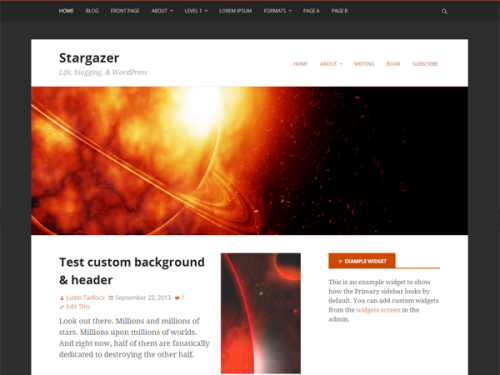
Stargazer Theme By Justin Tadlock

We’ve tried to maintain some of the personality unique to WordPress Tavern such as the wooden floor. This time however, the wood is a lighter shade which brightens the website. I’d like to take this opportunity to thank Angie Meeker for the inspiration behind the new Tavern header logo and Scott Reilly for playing the role of guinea pig. The beer mug in the header will be used as our brand image across the various social networking sites.

This is the first of many big changes on the way. With the redesign in place, keep an eye out for the WordPress Tavern forum to make a return. If you come across a bug while browsing the site, please get in touch with us. When providing a bug report, tell us what browser and version you’re using. Be as descriptive as possible.

66

66 responses to “WPTavern Gets Responsive With New Design”

    • Was worried you were going to call us out for ripping off the design of Post Status :) In some ways, the sites are similar but I think we’ve done enough so that people don’t think of PostStatus right off the bat when they view the site. Although you wouldn’t mind that, I’m sure.

      We originally used Hybrid Core with a child theme that Justin helped created for me and we’ve been using it for more than 3 years. It’s nice to be able to stick with it.

    • Yeah, nice big everything although sometimes I feel like it’s a little too big. But Control+Mousewheel solves the problem for me. I switch between making things just a tad smaller and normal size.

      The site really does look good on a mobile device, logo and all.

    • The typography definitely received a face lift. Bigger and easier to read. Between the logo and the wooden floor, we still have that Tavern vibe.

    • The logo is pretty much what I had in mind when I was thinking of the redesign. Angie showed me a concept and I loved the use of the Beer mug. Between that and locating a font that matched the icon (Crimson) it was a matter of spacing and trying out different layouts. This one looks great centered on this white background. Sort of like a newspaper!

  1. I noticed a few hours ago and I was surprised you didn´t write a post about it. Now here it is.

    The funny thing is that this very same morning, right before I saw the new design, I was thinking that the old Tavern needed some renovation (boy, did that wooden floor smell like stale beer!).

    So it looks like I anticipated it this morning! :)

    Good job, Jeffro (and Sarah). Please keep surprising us.

    • Thanks for being one of the first to notice the redesign. We called in a flooring company and they sanded down the floors and put a lighter coat of stain on them. We like their work :)

  2. Everything looks great! My only constructive criticism would be that maybe the beer mug could have looked a bit more like a W. Right now it has 4 “fingers” but how cool would it be to have 3 “fingers” for a subtle WordPress reference. :-)

    • That’s an interesting idea and observation. I’ll have to play around in Photoshop to see what I can come up with.

  3. Well, you already know I like it. :) I’m just happy to see you dropping that old, old, old version of one of my original Theme Hybrid themes and seeing you use a new one. Sarah did an awesome job. Don’t hesitate to contact me if in need of any help with the theme and working out any kinks.

  4. Ha looks good. Cool thing, I discovered you guys three days ago (and thought that it could need a redesign) or so and now I can say that I’ve seen the old design. Looks good, will come back to the site now instead of waiting for the newsletter. :)

  5. I had no complains with old design, but WPTavern looks really cool now. I really like Stargazer theme. Yes please bring back the forums. I think that even though comments are good for discussions too, but with forums users would be able to start their own discussions and it would be fun.

    • The next big thing on our todo list is to migrate the forums from Vbulletin into bbPress. We may not start working on this until bbPress 2.6 is released since it will contain a feature that will replace WordPress comments with bbPress topics, a feature critical to the Tavern.

      Once the forum comes back, this place will be a bustling Tavern, just like it was a few years ago.

      • Four levels? :-) Congrats on the new look! I really enjoy the big fonts! Btw, one small item: It seems the right border of the author box is missing. Sorry, I just notice these kinds of things. ;-) Since I like my cold beer like the next person, I would have probably made the logo a bit bigger, the mug in particular. :-)

      • Thanks. I’ve noticed it as well. Has to do with the box taking up 100% of the width. I hate noticing details like that because it drives me crazy. It will be fixed in due time.

    • That means a lot coming from you Ian. It’s not TwentyFourteen but we have our reasons as to why that is :P Taverncon

    • Thanks Andrea, we installed some new LED track lighting to make the floor look nicer and overall, brighten the space up.

  6. Great new theme, especially love the top title and logo. Looks great on mobile too.

    Am I the only one that prefers .avatar { border-radius: 1px; } over the circle format?

    • I’m more of a blocky kind of guy but since the images were circles to begin with, we’re going to let them be for awhile to see what happens.

    • If we would have axed the wooden floor background, it just wouldn’t be the same. Thankfully the new floor is lighter than the old which makes the Tavern a little cozier place.

  7. Nice! Easy to read with the big font. And nice for the Europeans who follow your blog and receive your newsletter at night –> now we can read your blogposts on mobile phones while travveling to work ;)!

  8. Nice design/layout. Love the new look and feel, it was the first thing I noticed when coming to wptavern. Very nice job.

  9. Awesome,crisp and bold design. We’re working on a new design for our site as well, hope to get it done by new year.

  10. Yeah, looks cleaner, but there was something more “Tavern-y” about the old standard. Sometimes newer isn’t better, even if it’s cleaner.

  11. Bravo! Cleaned up everything including the wooden floors :)

    Kudos to all involved with the redesign, very nice!

  12. Awesome, I love it!

    May I suggest a

    -webkit-appearance: none;

    on the email subscribe button to maintain the nice flat look on mobile, too.

  13. Sorry, Jeff, I’m a bit late with the comment, but I was wondering, what is the purpose of having breadcrumbs on WP Tavern? ;)

Newsletter

Subscribe Via Email

Enter your email address to subscribe to this blog and receive notifications of new posts by email.

%d bloggers like this: