Michael Arestad Sparks Renewed Effort to Improve the Content Creation Experience in WordPress

In 2013, Mel Choyce, Design Engineer at Automattic, published a proposal to improve the content creation and editing experience in WordPress. Her proposal and associated mockups like the one below, generated a lot of discussion. However, the project lost steam and major changes to the Add New Post screen were not implemented.

ContentEditingProposal
Post Writing/Editing Interface Concept From 2013

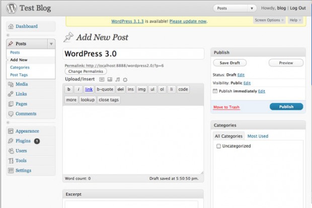
The post editor has undergone numerous improvements over the years from metaboxes in WordPress 2.0 to oEmbed support in 2.9. Here’s what the post editor looked like in WordPress 3.0.

WordPress 3.0 Post Editor Interface

Michael Arestad, Designer at Automattic, is sparking renewed interest to revamp the content editing and creation experience in WordPress. The project is composed of several smaller projects such as, the publishing user experience, automatic saving, the toolbar, metaboxes, and more.

“A few of us have been talking about getting these projects going for a while so I wanted to see how much interest there is and how many contributors we have to work with. I am by no means leading this as much as doing what I can to get the people interested in some of these projects going on them. I’ll personally be working on some of the longer projects,” Arestad told the Tavern.

A few people have already committed to parts of the project. Tammie Lister is leading a team focused on improving the Revisions UI while Hugo Baeta is leading the Toolbar Remix team.

The Revisions UI project is focused on experimenting with alternative interfaces to improve user friendliness with a secondary goal of providing a way for users to quickly switch between revisions. The Toolbar Remix team will audit the toolbar in the editor and determine whether buttons should be rearranged, added, or removed.

“Most of these projects will span multiple releases depending on the complexity of implementations and the number of usability tests required. There might be a few small ones that make 4.5,” Arestad said.

A majority of the projects are in the beginning stages. If you’re interested in contributing to an initiative, contact Arestad on SlackHQ or the person leading the project that interests you. You can also leave feedback by commenting on the proposal.

Looking Forward to Change

I work in the post editor everyday and while it’s a good experience, I want to experiment with alternative interfaces like the conceptual editor in the screenshot above. Consolidating metaboxes into the visual editor is a refreshing idea that I want to use in the real world to see if it speeds up my workflow.

If I were a betting man, I’d say the Add New Post screen is the most viewed and used part of the WordPress backend. Any changes to the editor and experience will affect a large number of users as evidenced by the removal of the View Post and Get Shortlink buttons in WordPress 4.4. However, any change that is implemented will likely be meticulously calculated by the core team.

What changes to the Add New Post screen do you want to see that would improve the way you create content in WordPress?

22

22 responses to “Michael Arestad Sparks Renewed Effort to Improve the Content Creation Experience in WordPress”

  1. I love that concept and I support this idea very much. TinyMCE simply cannot fulfill today’s user expectations anymore. People need columns, icons, tabs and other predesigned content elements. We need a built-in alternative instead of shortcodes, so average users can create nice content visually without any code.

    • Dini,

      I am in full agreement with you. I think if WP would develop its own type of Visual Composer or something along the lines as that, I think they actually could see an exponential growth in the amount of people who would be willing to jump on board and start using WP as their choice of CMS.

  2. My $0.02:

    I wish distraction free mode *stayed* distraction free until I turn it off. I write a lot of tutorials, and work on 2 screens, so I’m constantly moving my mouse from one screen to another to copy and paste code. It’s annoying that the admin menu and sidebar meta boxes appear every time your mouse moves out of the Editor textarea.

        • @kalico I don’t suggest any alternatives. He should turn it off. Distraction-free Mode is meant for typing, “distraction-free,” and not copy-pasting between screens and moving your cursor around.

          I’m not quite sure of that feature history, but I’ll assume the mouse-out event was intentional to allow full functionality back in. Possible theory: if you enable Distraction-free Mode, do stuff, do more stuff, un-click Distraction-free, do more stuff… you’re really, REALLY distracted ;)

          However, I do agree that this functionality can be improved. But for now, it behaves as it should.

      • From a UX standpoint, if you *have* to click it to enable it, you should *have* to click it disable it. Yes, you have to click to fully disable the mode, but it’s quite jarring to have the sidebar and all meta boxes come fade/sliding in when you accidentally move your mouse out of the editor.

        If anything, it’s not consistent.

        • @darrinb I agree on the UX click point. Perhaps there can be a “Distraction-free” checkbox setting in Settings => Writing? The distraction-free button is not a TinyMCE requirement. It’s more of a UX feature.

  3. While not directly part of creating a new post initially, I’d love to see the experience around nonces expiring improved. When you are writing a long post and leave the add post page open too long and try to save things, seeing a bunch of -1s and “are you sure you want to do this?” messages is frustrating. There is a ticket for auto-refreshing nonces for the customizer:

    https://core.trac.wordpress.org/ticket/31897

    but anyone know of any other work in that part of the post editor?

    • @Brian, why not to extend the length of the validity of the nonce? If your workflow is for a page not to be submitted for 5 days then setting the nonce to have a six days window should be good enough and only very slightly less secure then the current 2 days window.

  4. I really like the new concept and the UI improvements. It makes the terms of publishing clearer and reduces lots of distracted elements. I’m not sure about the concept of inserting elements into the editor and that is the only one thing I don’t 100% like.

  5. I’d love to see a major release dedicated solely to improving the UI and UX of the WordPress dashboard.

    Menu items such as “Reading” and “Writing” probably don’t make sense to the average user.

    I also think a huge issue with the UX has to do with plugins. It would be awesome to see guidelines set for plugin developers that set some kind of standard for how a plugin should integrate with WordPress.

    I spent 10 minutes the other day trying to figure out where the “Theme Checker” plugin installed – only to find it tucked away under the “Appearance” tab. While this makes sense after finding it, the initial hunt was not fun and I imagine it would be even more frustrating to a user unfamiliar with WordPress.

  6. it might sounds stupid, but in my opinion before we concentrate on fancy functionalities like nice UI to adding grid, boxes, etc.. (which can already be achieved using plugins). We should address one very important flaw of the current editor, which is the fact that a user cannot easily add a line break, because as soon as you press Enter, the editor goes on a new paragraph adding a margin between the lines.

    of course you can quite easily go in “text mode” and add a br tag manually, but most of the users don’t know it, and it’s quite an hassle if you have many of them within a page.

    it is a feature that everyone needs, so I normally add a custom shortcode for BR, and explain the clients how to use it, but I’d love if there was a built in solution in the wp_editor, quick and easy to understand.

  7. Jeff,

    This was an amazing article. After reviewing the previous concept, my only question is “why didn’t they put it into place?”

    I think this would gain a phenomenal amount of traction in the present WP community.

    Anything that provides a user with more options to utilize more resources without having to rely upon shortcodes, could be nothing short of amazing.

    I would love to see this concept come back onto the plate for the next release of WP.

Newsletter

Subscribe Via Email

Enter your email address to subscribe to this blog and receive notifications of new posts by email.