You Might Not Need That Block

As I was perusing the WordPress plugin directory this morning, I noticed a new block plugin, which is always one of the highlights of my week. It was a simple pricing block. Of course, I installed it and began playing around with its features. It was a version-1.0 product, so I was not going to fault it for not exceeding any expectations I might have had.

I have little doubt the plugin will meet many users’ needs. However, it did not bring much to the table that users could not already do with stock WordPress. And, as the block system continues to mature with more block options, end-users will gain more design control over every aspect of the existing core blocks.

This is not a knock at this particular plugin. I see less and less need for many third-party blocks the more I browse and test them. With WordPress’s base blocks and a decent theme, many custom solutions are possible via patterns.

To test the plugin’s block, I added it to a Columns block and duplicated it a couple of times to create pricing columns.
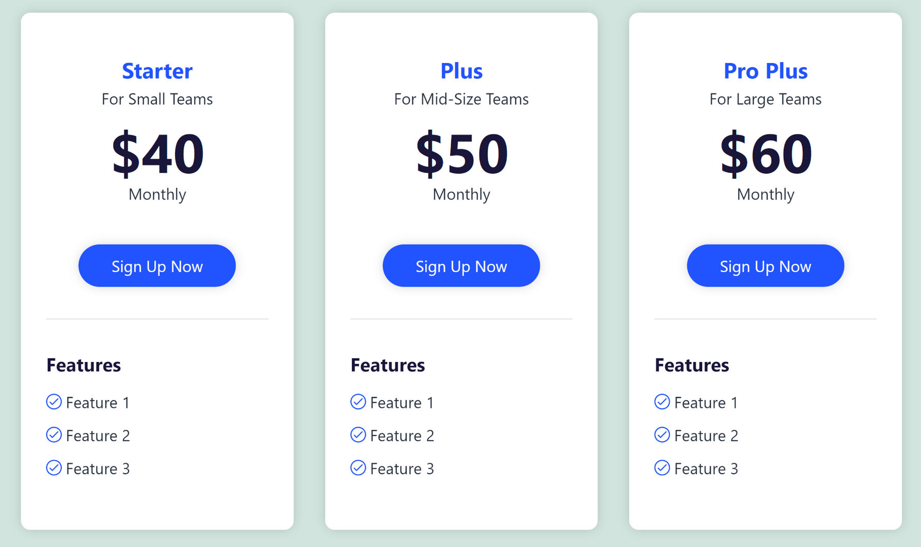
Pricing Block from a plugin inserted into columns.

The structure of an individual pricing block is straightforward. It contains the equivalent of the following core blocks:

  • Group
  • Heading
  • Heading/Paragraph
  • Heading/Paragraph
  • Paragraph
  • Button(s)
  • Separator
  • List

Since I had the structure, I tried recreating it while using the Twenty Twenty-One theme. I kept everything nearly the same other than a couple of font sizes and colors.
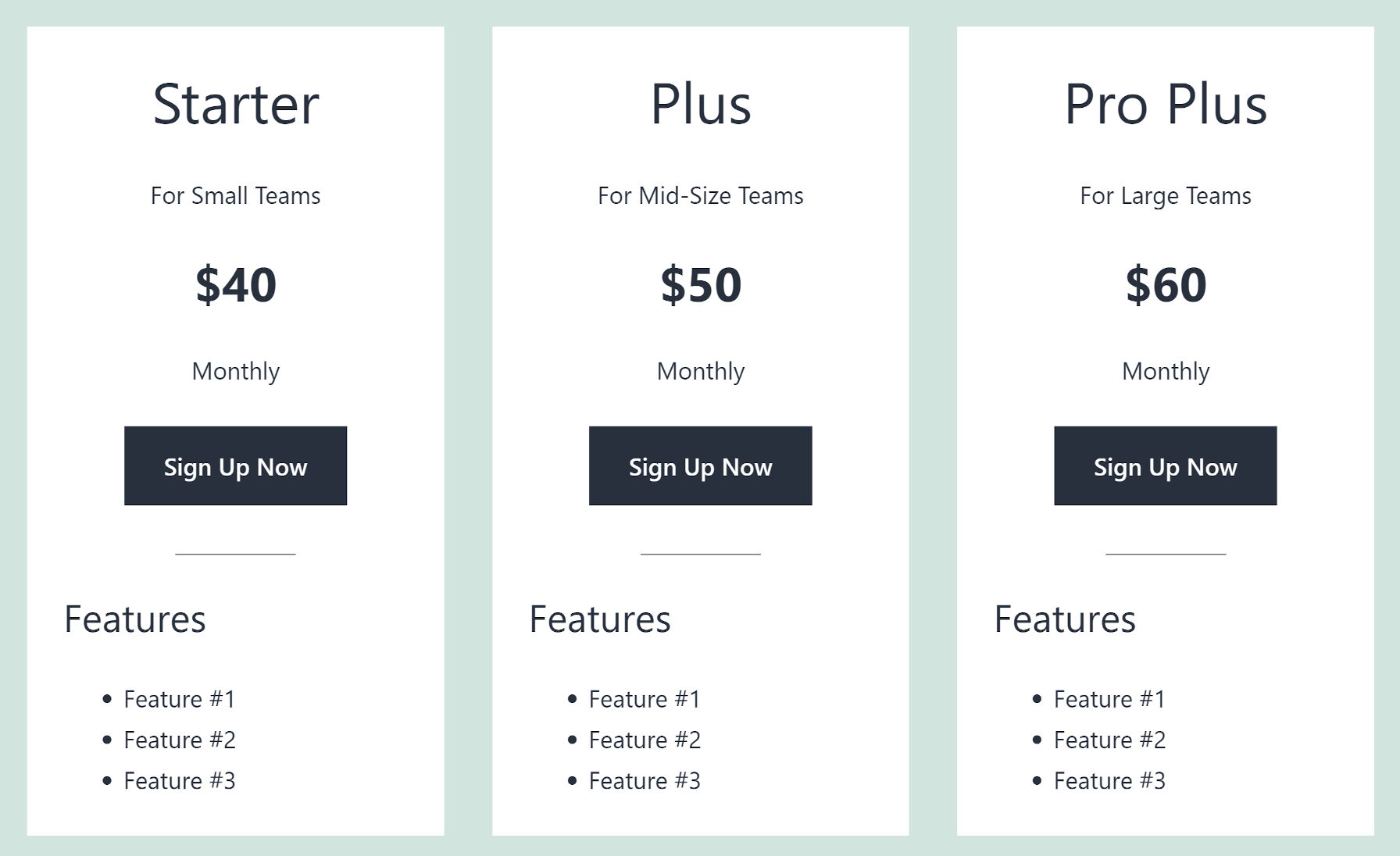
Pricing columns pattern as shown from the Twenty Twenty-One theme.

The result was not particularly impressive, but it was mostly on par with what the plugin was doing. The biggest letdown with Twenty Twenty-One is that there are no vertical spacing controls to tighten up some of the text. This is more of a limitation of WordPress than the theme. Plus, margin and padding controls are coming.

Aside from one-click insertion into the content canvas, the benefits the Pricing Block plugin brings are rounded borders, box shadows, and list icons. However, these items would fit more into a site’s design if they were controlled by the theme.

Knowing that the Eksell theme solved the vertical alignment issue with a custom block style, I decided to try it. Again, I mostly stuck with the same structure.
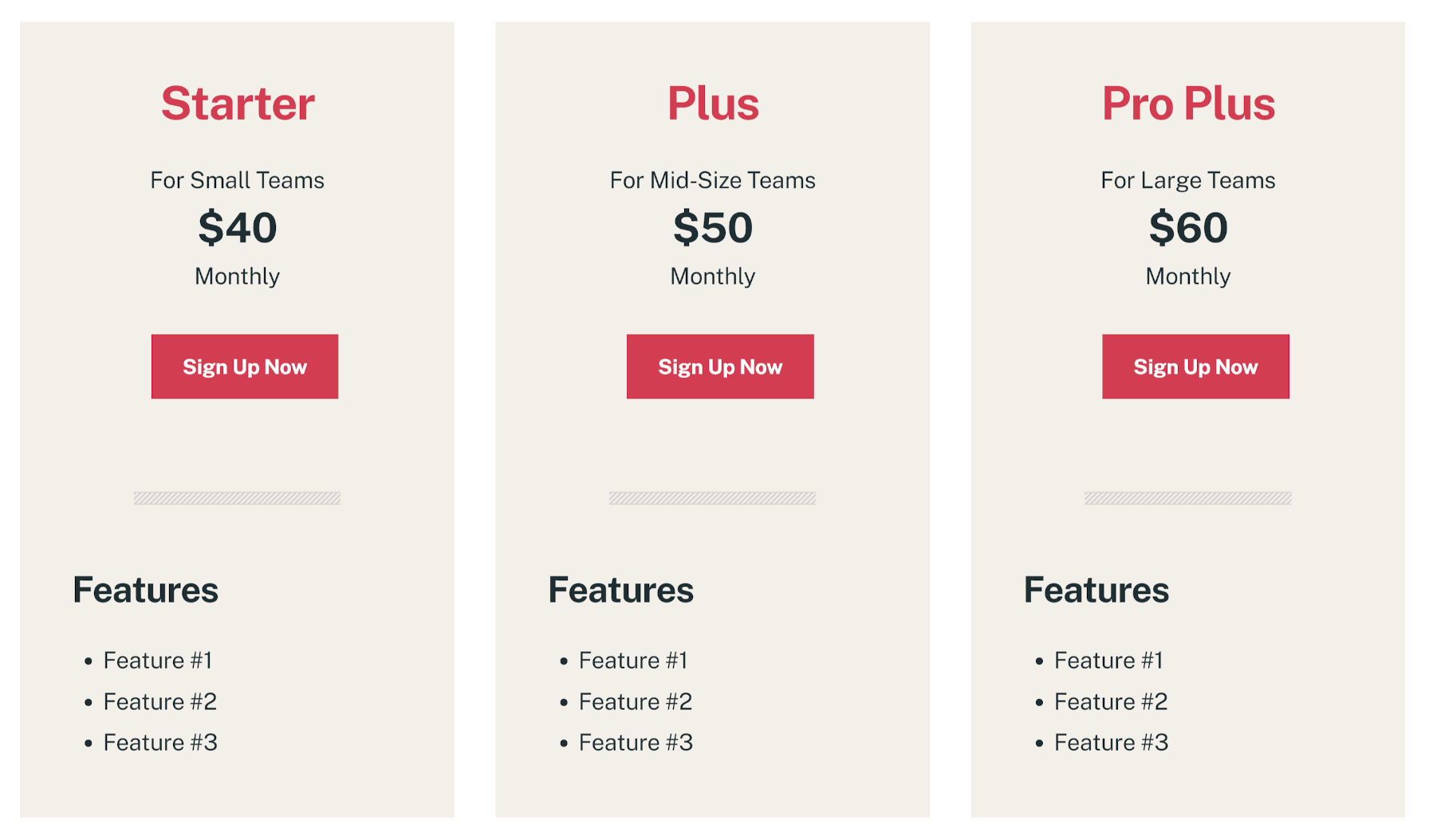
Pricing columns using the Eksell WordPress theme in the block editor.

Much better. However, Eksell is such a beautifully designed theme that it will upgrade the appearance of nearly anything. It almost isn’t fair.

Kicking things up a notch, I gave the pattern an overhaul. I moved some things around, changed a few colors, and tried to have a little fun with it.
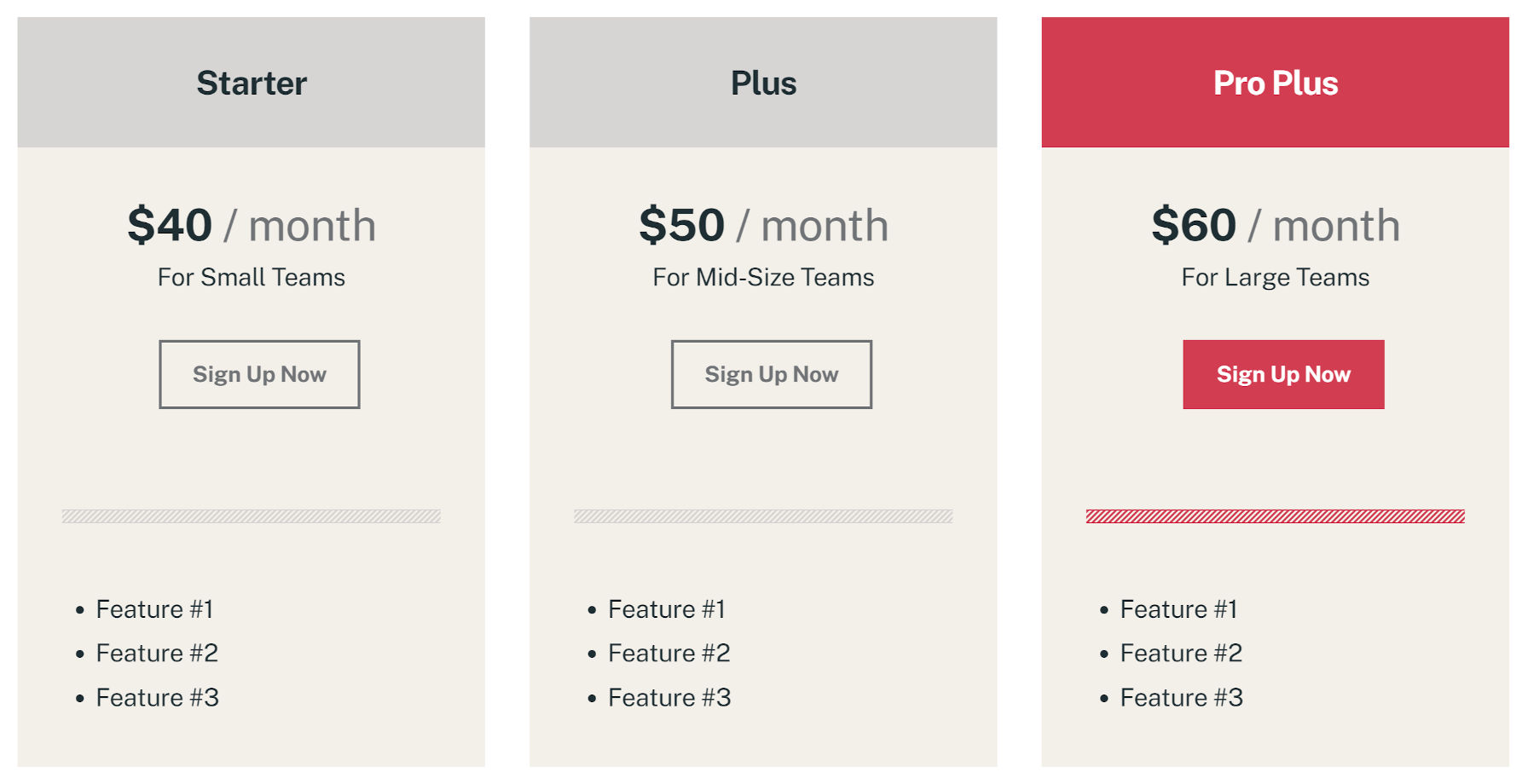
Alternate design of pricing columns with the Eksell theme. Added heading background.

The noteworthy thing here is that I had far more control over the placement and design — within the current WordPress limitations. This was not possible with the plugin’s block.

There are more robust pricing blocks. This is not a comparison of all the available options out there. However, many blocks share these problems. Often, what they need to do is take advantage of WordPress’s “inner blocks” system and nest core blocks, which provides access to existing design options.

Wanting to take this experiment just a bit further, I activated a development version of the Gutenberg plugin and a block-based theme I have been tinkering with. With the right tools in hand, I had control over spacing, borders, typography, and far more — features that users will have in the coming months.
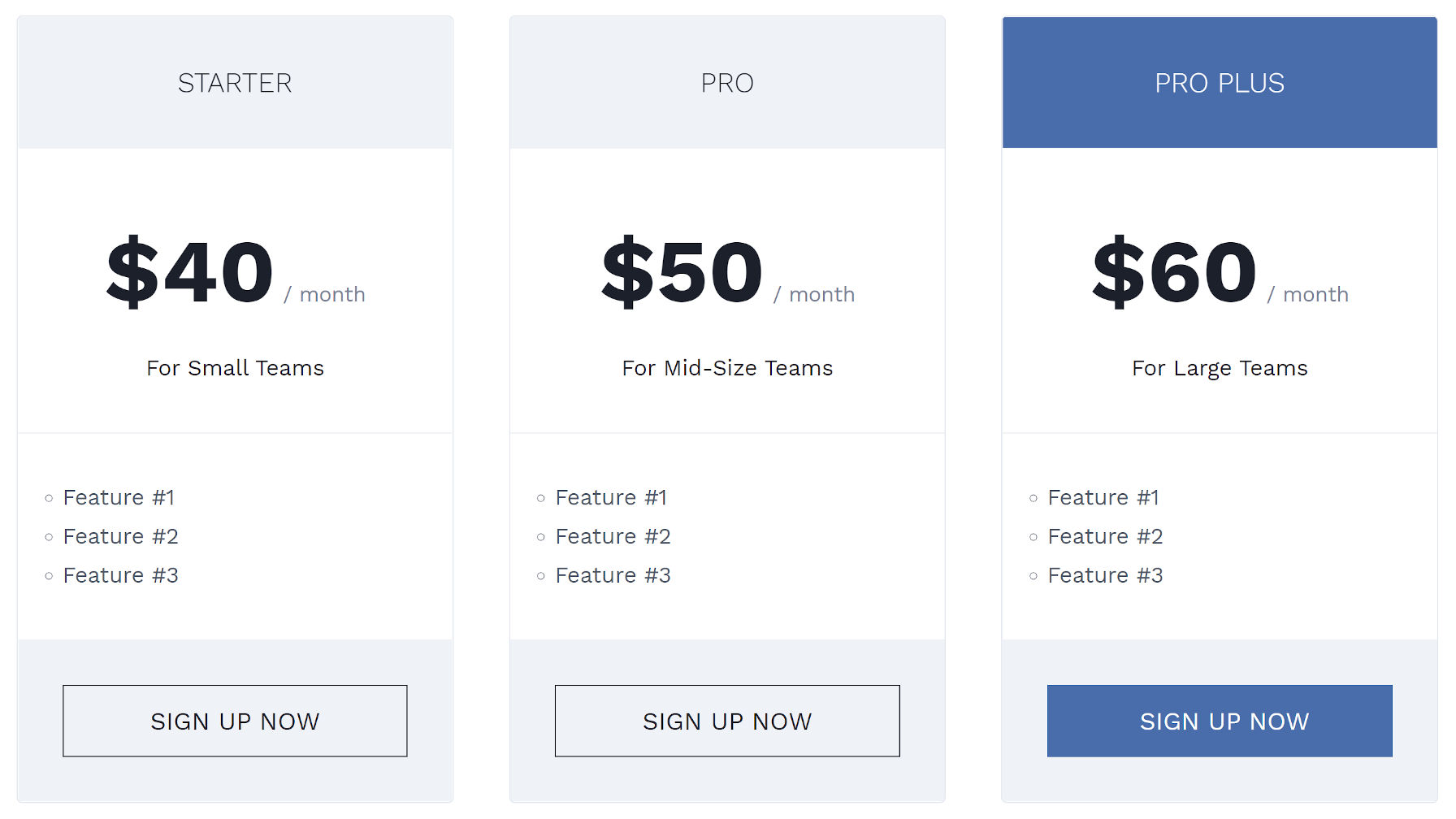
Custom pricing columns with a custom-built WordPress theme and full-site editing.

I like it, but I would also like to see professional designers take over from here. I want to see various pricing columns/tables available as patterns in themes and in the upcoming block directory.

The next level of pricing columns would be integrating with plugins like WooCommerce, Easy Digital Downloads, and other eCommerce solutions. For example, users could insert a product’s price or buy-now button into a pre-built pattern inserted into the editor canvas. That way, the data stays updated.

However, this is not specifically about pricing columns. It is about the blocks ecosystem altogether. Nearly every time I see a testimonial block, for example, I just see it as another pattern that could be registered.

For end-users, the quick solution will often be to activate an extra plugin. This requires more resources in the editor and, usually, the front end. It also ties them to another third-party tool, one which they may not necessarily need.

Ultimately, most webpage sections can be broken down to the individual blocks that exist in WordPress. They simply need to be arranged in a specific order and grouped together. Our community of theme authors can start providing these solutions by doing the legwork of this grouping and register them as patterns.

The most useful blocks do something that WordPress is incapable of doing alone or adding elements that do not exist.

21

21 responses to “You Might Not Need That Block”

  1. Justin, I’m really glad to see you writing as much as you are about blocks, patterns, et all. It has taken me quite a while (several years TBH) to fully see where Gutenberg/WordPress/block editor is going. At first, I wasn’t so sure, and that played a part in our decision to sell StudioPress. But, the clouds—so to speak—are lifting for me, and I see so much potential with the project. Thanks for covering these things in such detail. It helps me, and I presume it helps the community at large as well.

  2. Thank you Justin for pointing that out. I thought I was doing something wrong when building my custom theme and using WordPress core blocks to design so many different layouts.. I don’t think I’m using a single third party block.

    I ran into a issue where I needed multiple classes for a block layout, I thought I could maybe create a block variation but then I remembered block patterns exist now :)

    The only extra block tool I’m using is a plugin that removes top or bottom margin, but I mostly try to handle the design in the theme.

    You can also create pretty nice pricing tables just using the table block.

    • Even I don’t want to write out the HTML and CSS for fancy pricing columns any time I need them (even though I have the knowledge and skills do it), especially if I can just drop it into the editor with one click. I doubt the average WordPress user could do it, nor do I think they’d want to. That probably includes simple versions too.

  3. I understand a lot is possible with the Block Editor, but am constantly frustrated with Core Blocks. It would be great to see live demos instead of screenshots of the examples you build. The sites I design and/or code have highly complex layouts that require special attention to alignment and spacing, especially with responsive sizing. I don’t have that level of control with Core Blocks, and honestly, I am not seeing a path forward to accomplish this critical need that doesn’t rely on a third-party.

    • If I do something like this again in the future, I’ll remind myself to copy the block code over to a Gist. That way, folks can at least test it out.

      Obviously, with the last example, it’s using some future stuff from the Gutenberg plugin on a custom theme, but the Twenty Twenty-One and Eksell theme examples would be easily testable.

  4. I have wasted lots of time & money on these themes & plugins. Before I fully understood themes(I don’t) I was able to launch a decent store. After attempting to use a plugin to improve, I had to scrap the store and have been down since then. Hours upon hours of reading documentation & watching tutorials that are mostly done for techs have made me tired of plugins, blocks and all the stuff packed with themes just to get the dough, or make you pay a grand or more to get started with themes & plugins.

  5. Sorry, but I have to disagree for now. Core blocks are basic to say the least.

    Let’s start with the column block. It has not semantic element settings. So pretty much from the first block on the page, your site is not Accessible and you need a more complete section block from a plugin.

    Mobile responsive settings for core blocks: NOPE! ehh are you serious WP.

    Then what about dynamic content. There is a latest posts block. What about for other content types. Really a product like toolset should be redundant, not essential.

    • The argument isn’t that the core blocks are the end-all-be-all of laying out a web page. This is a post for helping users make decisions on whether they might need a block plugin and theme authors for creating some of these solutions as patterns.

      The a11y issue with the columns block was fixed in Gutenberg 10.5 and will ship with WordPress 5.8. As for dynamic posts/content, the first version of the Query block is also shipping in WordPress 5.8. You can install the plugin right now if you need those features.

      If you need specific block options based on screen size, yeah, you’ll want to grab a plugin for that. For this, at least, we agree:

      The most useful blocks do something that WordPress is incapable of doing alone or adding elements that do not exist.

  6. Generally I do agree, but in reality I’ve seen that we needed to add specific blocks in cases where they could easily be constructed out of other blocks.

    Why? Otherwise, the Block Editor was not performant anymore until a point where you couldn’t use it at all in some instances. For example having 200 blocks because you use group + heading + image + button instead of having just 50 blocks (that simply combine these inputs) can have a huge impact on the backend editor right now.

    This is the main reason I’m unsure how well block patterns will work out in the end. The idea is great: don’t create blocks for elements that can be constructed out of other blocks. But the editor’s performance needs to keep up with this, otherwise it will be unusable, as it sadly is right now for larger pages.

  7. If don’t know if just popping in vertical spacing controls is the best way to go about some of this. The text “for small teams” etc is basically the heading equivalent of a subtitle. It’s actually pretty common for people to need these, and it seems like there should be some kind of built in block variation for that.

    The problem with relying on custom spacing options is that the average user won’t use them in a consistent and therefore professional way. They should be a fallback option and not the first answer to all design issues.

    I also can’t help but notice that you didn’t get this text sitting right below the heading in any of your core block layouts. Were you unable to do this or did you decide to do it differently?

    • I talked about the vertical issue with Twenty Twenty-One. Then, I solved it with Eksell’s custom No Vertical Margin style. I just removed the margins between different sections. I could’ve used it between the first and second headings there. However, I could not with Twenty Twenty-One.

      Agreed on margin controls for end-users not being the ideal solution for this. The primary solution is for themes to offer pre-built block patterns. The margin controls should be there for advanced usage, but smart design choices should be the default, and that comes down to the theme.

      A block variation/style for a “subtitle” would be a good addition too.

Newsletter

Subscribe Via Email

Enter your email address to subscribe to this blog and receive notifications of new posts by email.