WP Tavern’s New Design: No More Wood Grain

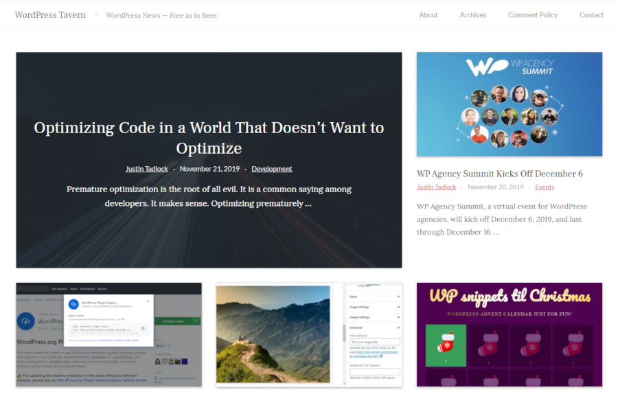
Screenshot of the WP Tavern homepage.
Screenshot of the new homepage design.

If you are viewing WP Tavern from your browser today, you might be a bit shocked. Things are different — much different. If you are reading this post via email or a feed reader, hop on over to the live site to take a look.

Welcome to the new design!

When I accepted the job to write for WP Tavern, some of you asked if I would be handling anything with the design and development aspects of the site. Today, you have your answer. I was tasked with overhauling our dated design and getting something fresh up.

From the moment I logged in and started peeking behind the curtain, the task seemed almost insurmountable. WP Tavern has had nearly 5,000 posts over 12 years. It has content mixed and matched with plugins that have not been used in years. Being perfectly honest, I was unsure what some plugins did for a long while. However, I have gotten to know the site and its inner-workings over the past couple of months, and the new design has taken shape around some of that.

Rather than taking the time to do a complete overhaul of everything, which is sorely needed, our team decided the best course of action was to get a new theme up and iterate.

The first step of the design process was to remove the wood-grain background. There is likely some nostalgia attached to that for some of our readers (some of you may have grown accustomed to it over the last 12 years), but it is the one thing we universally agreed to drop.

The second step was to move to a sidebar-less design. Our team at the Tavern decided that nearly everything in the previous design’s sidebar offered few benefits to our readers. It was a distraction that took away from the content.

The next step of the design process was to add complete compatibility with the block editor (Gutenberg). With no sidebar, this will open the door for us to do more interesting things with media and other elements over the long term.

Overall, the goal was to make the reading process nicer for all of you who visit the site. I hope that we have accomplished that.

The Future Design of the Site

This is version 1.0 of the new design. A large part of the process was laying the groundwork in a way that it would be easy to make changes going forward.

There are still some missing elements that will be re-added soon. Primarily, the site needs a search form in the header/navigation area. Redesigning the email subscription form and moving it to a different location is high on the list.

The site should load faster than before. However, there is still a lot of cleanup to do with plugins over the long haul. Page loads should be even snappier as we continue to iterate.

I also hope we can add a custom logo and other Tavern-esque elements that bring more personality to the site as we move along in this ongoing process.

However, this is the point where you, the WP Tavern audience, get to join the conversation. Before pushing too far with additional changes, it is important to get your feedback about what you want to see in the coming days, weeks, and months. Ultimately, the goal is to serve you WordPress news and information in the best way possible.

Feedback is certainly welcome. If there is a missing element you want to see return, post it in the comments. If there is something you would like to see added, don’t be shy about letting us know.

The contact form is also always open for private feedback or for letting us know about a problem with the site.

What Is Under the Hood?

To get the theme up and running, I reused a ton of code from my previous theme-related work before joining WP Tavern. It made sense to use a build system I already knew from top to bottom and not reinvent the wheel.

The CSS system is a customized and stripped-down version of Tailwind CSS. Tailwind is a utility-first CSS framework. For most of my professional career, I have shied away from utility-based frameworks. However, Tailwind is a well-designed framework with a smart naming scheme that strikes a balance between readability and practicality. It is one of the few that has clicked with me. WordPress also uses several utility classes, especially with the block editor. The two systems made sense together.

WordPress front-end output and some plugins (I’m looking at you, Jetpack) do not make it easy to take a full utility-class approach. Everything else was addressed on a case-by-case basis.

If any WordPress developers want to know more about the technical aspects, I am happy to answer questions.

91

91 responses to “WP Tavern’s New Design: No More Wood Grain”

  1. I have to say a HUGE improvement. The old theme for WPTavern was aged and desperately needing a fresh new look.

    I do have one suggestion…on the blog grid layout of summaries, I’d go for a bolder post title, a bit more bottom margin, and perhaps a line-height of 1.4? OF course, design can be subjective, but when I tried it from Chrome’s webmaster tools, it looked even better.

    But to reiterate, the new site design is seriously a major improvement.

    • I have fiddled with bolder titles there. It is tough to do when taking into account the length of some of our longer post titles. We have some that are 3 or 4 full lines long, and bumping the weight pushes them to another line. It’s something I’m still tinkering with though.

    • I miss seeing the comments number in the post byline at the top. I had it originally, but replaced it with the category based on earlier feedback about wanting to know if articles were news or opinion. I think there’s something we can do to fit both in without cluttering the space too much.

      • I miss a direct link to the comments as well. The # of comments served that purpose well. The category is nice to have but the comments’ number and link would be more useful.

        Also, there was one important aspect of the sidebar and it was the fact that it surfaced recent comments which enables more discussion on certain articles. Right now, we would have to go back and check each article one by one and look up all their comments in search of new ones.

      • Just noticed the “Recent Comments” section in the footer. :)

        As a sidenote, the comment form should remember our details instead of having to re-type the name and email for each comment.

        One last thing, there is too much white with the new theme, there should be a dark mode…

  2. Howdy,

    the old site was aged but at least looked unique. When I was reading an article I knew at a glance that it was the WPtavern I was scrolling through. That new site could be one of a million without any recognition value.

    Feedback is certainly welcome.

    Where to begin? Good design is difficult but at the moment I just see a white page;) IMHO this is a little bit too much of a minimalistic design.

    Please begin with the established logo. It’s the most important and well-known element that’s missing at the moment.

    Cheers

  3. I feel like with the redesign that the website has lost a little bit of its charm and distinctiveness. I get the need for an update, it was due. But when I look at the the homepage and blog posts, I wonder what sets it apart from all the other WordPress based blogs. The Tavern is built around the idea that it’s a central place for WordPress news, but right now it seem indistinct not does it carry any sense of community feel. I don’t doubt it will evolve, so I just wanted to add my thoughts to that process.

  4. “To get the theme up and running, I reused a ton of code from my previous theme-related work before joining WP Tavern.”

    From the first second it loaded, I could feel the server ‘exhaling’ a new theme ;)

  5. I’d like to also see the fonts addressed a touch more too. Currently there’s 3 fonts loading… none feel like the “Tavern” to me. I’m not suggesting we go to Google’s Smokum or Rye, but perhaps a refreshed western style slab serif like Hepta or Zilla?

  6. Like:

    I agree the wood-grain background had to go. Been reading WP Tavern for many years and I loved its wood-grain background in 2011.
    Overall, a net positive gain because of the faster loading.

    Don’t like:

    The new fonts are too hard for me to read because of low-contrast color, serif-type, and small size. Just a bit more contrast between the text and background color would help. I much, much prefer the previous sans-serif fonts for paragraph text. The previous font-size was just a bit larger than the current size. I do have bad eyesight.
    I prefer the site name (and logo) centered as it was rather than left-aligned. Centered, it felt more like a newspaper and had more character, instead of looking like a million other sites.
    I prefer the old heading for the “Trending” list, which was “Currently On Tap.” It added to the “tavern” theme.
    The beer mug icon, the “EST 2009” and the “Currently On Tap” heading, at least for me, somehow subliminally encouraged me to visit the site more often at the end of the work day, as one would a real tavern. I don’t drink beer because it has gluten, but “tavern” is in the domain name, and that means beer should be part of the theme. I can see that the word “beer” is still up in the site description, but these other “beer things” are removed, and I miss them. There are nice things to appreciate about tavern/beer culture: the TV show “Cheers” comes to mind.

  7. I like the new fonts better, but that is the only positive change IMHO.

    Please consider doing some more work on the menu and logo as they are simply not ready for release ;-) (active menu item is not marked, no search field despite the 5000 articles, etc…)

    The desktop view is really strange. I mean the there is a narrow text column with glowing white empty space on both sides. But for that we need to scroll all the way down to the footer to follow any conversation. This feels rather like a kiosk than a tavern. Please bring the latest comments back to the sidebar on desktop if there is only empty space otherwise.

  8. I like minimalism but this is a bit too minimalistic if you ask me. It’s just white. Take a look at the new twentytwenty theme. It is minimalistic too but has some design effects such as background color and not just cold white.

  9. Our team at the Tavern decided that nearly everything in the previous design’s sidebar offered few benefits to our readers.

    I used that sidebar pretty much every time reading a new article to find the latest comments on other articles and to check if I’ve missed any of the previous articles. Now they’re in the footer below the comments which requires a lot of scrolling.

    Also, the basic formatting tools for the comment input area were handy for not typing out HTML tags, especially on mobile.

  10. I actually liked that WP Tavern had a sidebar. I generally glanced at it whilst scanning down articles. I found it particularly useful for plucking out interesting comments to go read. I also liked that the original design was very distinctive. It could have been improved for sure, but at least you immediately know which site you were on. This new design could be anything.

    Content is always the most important thing though, and you can’t keep everyone happy :)

  11. I actually enjoyed the woodgrain look and I thought it was what made the site stand out from other blogs. You should definitely hold on to that aesthetic! There are ways to implement it without being dated, maybe use some warm browns/warm greys or reference lights from a tavern or use iconography or display headlines. eg. http://scotch.io

    I don’t think the flat look suits the Tavern brand and the cool greys make the overall site look generic and completely disjointed and jarring from the previous version. Unless I missed the bit where the branding changed to a cooler grey palette, I think using warmer colours and making the overall site more welcoming with more white space and better type hierarchy would be even more of an improvement.

  12. This is very similar to your theme, Justin.

    Some things I would like to improve for WPTavern:

    Sans-serif font: this is a tech blog, and sans-serif font is a better choice.
    Darker font color: for better contrast and readability.
    A sidebar: I still love sidebar, just to see other top articles + recent comments. Putting these things in the footer is not nice to me.

  13. “our team decided the best course of action was to get a new theme up and iterate.”

    This is a really confident, brave move which should be commended. Give people something that works now and add to it down the line. Considering how many thousands of posts the site has and the scale of the thing, this approach makes so much sense to me.

    Can’t wait to see how the design is developed over time. Great job!

  14. Change always feels weird, but is obviously desirable.
    But there’s a couple of things I’m really finding hard:
    The serif font is a lot harder to read – sans-serif is a lot less busy. And that combined with the reduced colour contrast – especially the lighter grey (which is a WCAG2.1 fail too).
    Also, the sidebar was a good way to catch up with articles that I may have missed, without having to go right to the bottom.

  15. Sorry, not a fan. It just looks incredibly generic, like an off-the-shelf theme that hasn’t had any unique branding added yet. The bright white is a strain to read, the soft grey fonts are an accessibility hazard, and on any good sized desktop screen the empty left and white space fills too much of the screen.

  16. and on any good sized desktop screen the empty left and white space fills too much of the screen.

    Unfortunately, that seems to be all the rage in screen layouts – leave half the screen blank and scroll baby scroll.

  17. I always read the posts in my email, so it’s hard for me to compare. But the site now looks very clean and easy on the eyes!

    You talked about getting rid of some of the plugins. Maybe make a list of the ones you plan to keep/remove? There are tons of lists of recommended plugins on the web, but I like how your site looks and would love to know the essentials and the dismissibles in a sleek-looking site like this.

  18. Well, I like that there is something new for sure, but definitely expected something more. There is no brand feel at all. I know it’s not a product or a service, but so is smashing magazine, but their design is very easy to spot and connect with. Same goes for CSS-Tricks which is similar.

    Here however it’s generic and looks like free theme installed which also has some problems. Example – images on the grid are different in height, you didn’t set proper number for archive so the last one is missing, there the text color is low contrast.

    Honestly dev.to is doing good job for reading and all even with serif fonts like in here. A lot more contrast. It also defines a feel for the site, which is definitely missing in here

  19. Sad, another case of changing what works (at least in terms of look, under the hood stuff and features that some want added may be a different issue) just for the sake of change.
    Old design seemed just fine to me. If you are to have a background, wood-like is the 2nd one I’d pick, after old paper.
    And always will be… not just fond of sidebars, but consider them necessary really, as a major aspect of using the screen width that desktops have. If you want mobile design that’s meant to be scrolled on narrow screens, can have a separate mobile design, don’t affect the desktop style!
    And also keep being very put off by this style of articles presented as blocks containing a large (pointless) image and, if there’s text at all, a tiny snippet that doesn’t really tell you anything under it. Want to just have the articles, in full, at a few per page, plus a title-only archive listing. So at least a good thing that you have this last thing now. But that’s all the good.
    And, of course, considering any mention of Gutenberg as counting heavily against.
    Oh, and see what happens if you try to view in IE.

    • I’ll be happy for folks to contribute via the GitHub repo. It’s not quite set up for community involvement yet since it’s just been me working on the code, and I have hot-fixes scattered a bit at the moment. But, I’ll take some time to clean up some things in the next few days and make it more inviting (e.g., explanation of the tools, build process, etc.).

    • Objectively, the site’s metrics are much better now. There’s still a lot of cleanup to do with plugins. We have disabled several of them, but many others will take more work to either replace or address issues with. The team wanted to get something up more quickly and iterate rather than attempting a full relaunch another six months down the road. In the meantime, the site is faster but is not where we want it to be in the future. We’ll get there; it’s just going to take some time.

      On the topic of the logo, it is definitely on the to-do list.

  20. Looks great, but I immediately saw that the comments number is removed. (but I notice I’m not the only one)
    I sometimes open posts that have comments, before reading the other posts.
    And I’m missing the “tavernish” layout.. just a little bit.

  21. Not a fan of the “new” design – it looks like every other “modern” site out there.

    I think the reason for the white redesign is to get out a GB showcase as soon as possible, since no large sites are using GB. “Look! WPTavern is using Gutenberg and the future is blocks! And white…”

  22. Sorry, but the design looks very sterile. For a site named “WP Tavern”, very little here feels like a tavern, and the site seems to have lost its character. It almost feels like someone is trying to set up a bar in a hospital.

    Also, it feels counter-intuitive to have recent comments at the bottom in a bid to go “sidebar-less”. Not all articles here are of interest to many readers, and the comments in the sidebar helped people jump to the more interesting (or sensational, or contrarian) comments without having to go through the entire listing of posts. And obviously, the number of comments in the byline would help, as others have noted.

    The other thing is about printing the category in the byline. E.g. on this post the category is “Tavern”. Where do I see the other categories? In fact, there is no way to navigate to the other categories without going through the Archives pages. To stay congruous with the design, either the category in the byline should go away, or the categories should be available for access on each page.

  23. Funny how it seems half of the people love the sidebar-less design and the other half lament the loss of the sidebar.

    Maybe this would be a great opportunity to provide the ability for readers to customize the site to their liking? You’d have to make it obvious to people, of course, but it would be great if you could offer a few customizations like Comments on top vs. Comments in Sidebar.

    #jmtcw

    P.S. My vote is for sidebar.

  24. Why is Google Analytics currently added and triggered with exact same params on frontpage? Wouldn’t that mess up the stats?

    Also there is no privacy policy available, so currently the site voids GDPR big time, better fix soon, thanks.

  25. A full 10 days after the initial post and still no logo in sight.

    If you say that you are taking comments and feedback on board, then usually that means that you actually do something about it.

    Perhaps you just want to make a “popular post” with loads of comments?

    This re-design has nothing to do with the good ol’ WP Tavern!

    • Our first priority is bringing new content on a regular basis. The design is secondary to that because we do not have a dedicated design staff, but it is something we will continue working on. Also, last week was a pretty big holiday in the U.S., so there wasn’t a whole lot of movement on getting anything done.

      We have already made real changes to the design based on feedback thus far (e.g., better contrast for secondary text). And, we will continue looking at actionable items and working through them as time permits. It won’t happen overnight. It is a process that will take months and will continue on beyond that.

  26. Hello! I am new to WordPress so don’t even know what the old design was like.

    That being said, I really like the design/layout of WPTavern as it is right now.

    It has a very clean, uncluttered feel.

    My question is, can I replicate such a layout with standard Gutenberg and TwentyTwenty theme?

    I am learning WordPress and want to stay with the standard, free themes.

    Thanks for any help in terms of pointing me in the direction where I can learn to do a site that “looks” like WPTavern.

  27. I appreciate the work you’ve put into WP Tavern but for me, the gray text is still too gray – it’s not readable on a dim display.

    Also consider please widen the layout for desktop users so we don’t have to keep scrolling down so much. Just look at how much vertical space the comments take up on this page while the sides are full of empty white space.

    Agree with others it’s unfortunate there’s no #comments on the posts and the recent comments are down below. That’s what makes WP Tavern the “tavern” – the comments! Make it a conversation right?


You may also like

Newsletter

Subscribe Via Email

Enter your email address to subscribe to this blog and receive notifications of new posts by email.