WP Tavern Is Sporting a New Website Design

We are back with a brand-new edition of WP Tavern. Technically, we have a spiffy new coat of paint that I hope you all can see if viewing from your browsers. If you are reading this post via a feed reader, email, or something else, hop over to the site and check it out.

The Tavern received a few updates under the hood too. I will not go into those details, but some of you may have noticed that we are now hosted on Pressable, a hosting service owned by Automattic. Thus far, things seem to be going off without a hitch.

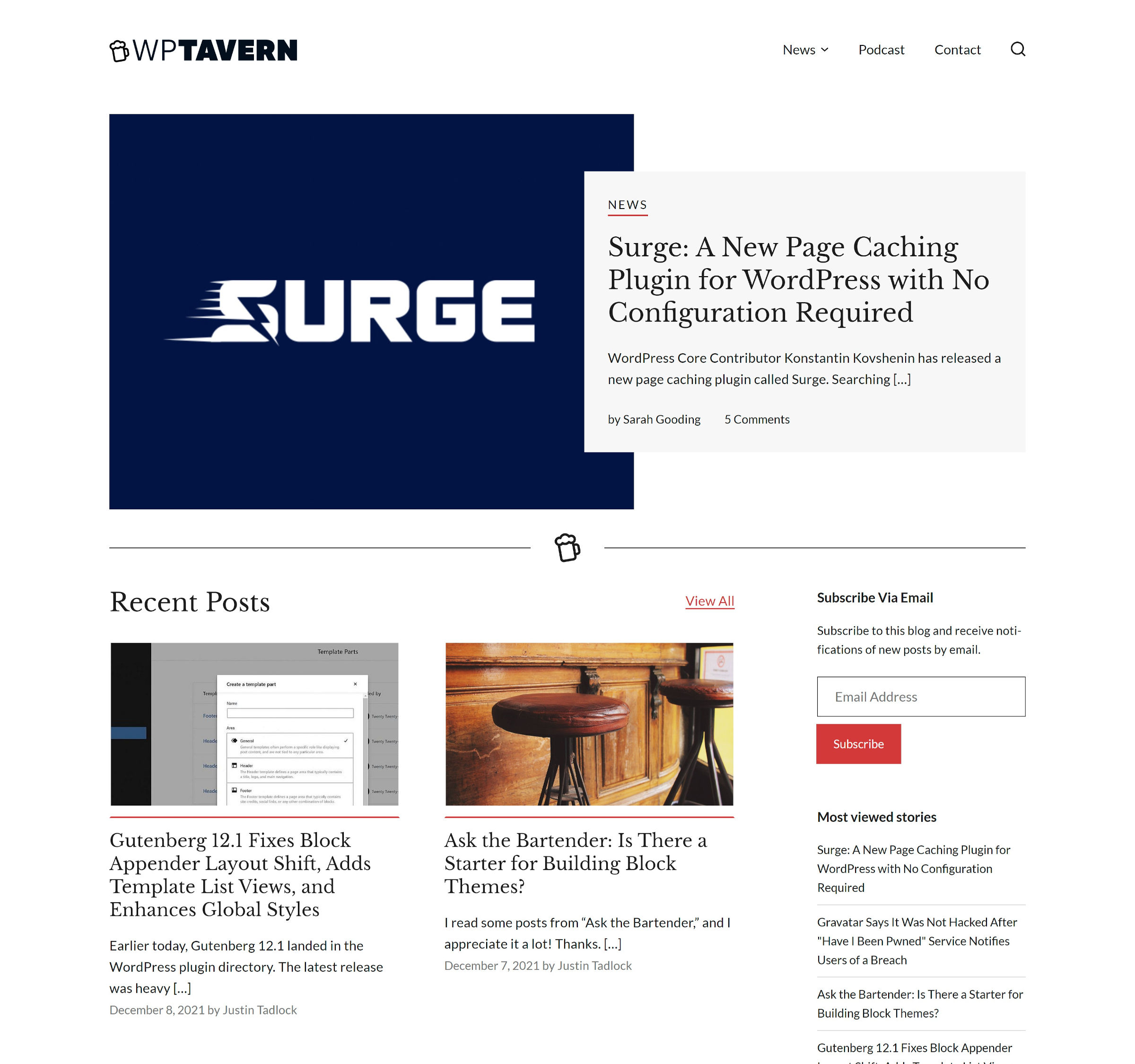
For posterity, the following is a screenshot of the old homepage design along with the new one:

This is as much your home as it is ours. We just write the articles, but you are the ones who spend time browsing the front end — actually using the website. Constructive feedback is always valued and taken into account.

A Yearlong Design Project

It is hard to imagine the last time WP Tavern was not running a WordPress theme that I built. Before joining the staff here in 2019, the website had almost always had a little piece of me tucked in.

I would have to dig back into the archives, but I know for sure it used to run a modified version of the Hybrid News theme I released in 2009 and eventually a custom child theme on top of Stargazer years later.

I created our last theme in the middle of the early block editor days, and the changes over the past two years have been like running a stress test against my skills as a developer and designer. For the most part, it held up well as we ran the latest version of the Gutenberg plugin in production. I had to fix a ton of few things here and there, but I am happy to say that the site kept chugging along.

Our last theme was aging, though, and we needed to freshen up the place. We had ideas dating back to late 2019 that we had not implemented, and it is always tough to squeeze in the time for a full-blown redesign when there is so much going on in the WordPress world. Our first priority is always sharing the news.

We were fortunate that the WordPress.com Special Projects team contacted us in November 2020 with a proposal. Their mission:

We help interesting people, organizations, and projects to have an excellent experience with WordPress.

It did not begin as a new site design project. The team had actually reached out about building a feature that I would like to bring back to the Tavern. That part of the project is not quite ready yet, so we will hold it as a surprise for the new year. Folks are gearing up for the holiday season, and there is no reason to rush it.

Our team had planned on redesigning the site ourselves. We were just waiting for Full Site Editing to launch alongside WordPress 5.7 — so, that did not happen at all.

After some back-and-forth, a group call, and a leap forward to January 2021, we were looking at design tiles. Our plans had changed. And that is part of the magical process of keeping communication open. When you surround yourself with smart people who excel at their jobs, you can end walking a path far better than the one you first set foot on.

Let us fast forward beyond logo decisions, design mockups, and the constant FSE changes throughout 2021. It was a long journey, but we finally arrived at our destination of a new and improved version of WP Tavern.

From the Tavern to the WordPress.com Special Projects team: thank you for your work and professionalism throughout this entire process.

From the Outside Looking In

Admittedly, I had reservations about the project from the beginning. I look at other developers’ code almost every day, and I usually prefer to do my own thing. It is one of the reasons I never took any of the dozens upon dozens of agency job offers over the years. I would be that one employee who would want to uproot everything on Day #1. By the end of the first couple of weeks, I would be “let go,” my employee file labeled with “does not work well with others.”

The team provided me with committer access to our development repo and used my preferred commands for the build process. It was a welcome gesture, and I was happy to know that I could change anything I needed.

But, I have not once used any of the power at my disposal.

I was comfortable feeling like we were in a partnership. Plus, every ticket I opened in the repository was handled — and I absolutely opened plenty of issues.

Relinquishing development control was a weight off of my shoulders. I quickly learned that this was a team of professionals who knew what they were doing.

Sure, there were some things I would have done differently with the code, such as modernizing some of the PHP (something that was unnecessary in the context of the project). I would have probably reorganized a few folders too. At the same time, this was an opportunity for me to learn, and I absorbed as much as I could.

Aside from wearing my student hat, I also kept my client cap on. This was the first time I had ever gotten to play that role. There were moments where I worried whether everything would work out as I scanned an unfinished project. However, most of the time, I was able to sit back and watch in awe as the team put this whole thing together.

50

50 responses to “WP Tavern Is Sporting a New Website Design”

  1. Looks amazing and load super fast. Like the minimalist design and the simple menu to access everything. Well think! Reading this on an iPad Pro and it displays properly. Congratulations! It must be a lot of work with all the articles you have in archives… Bravo.

    • I’m going to talk to the team about open-sourcing this so that other theme authors can learn from their work. It’s probably best that some of the kinks are worked out and wait until after the holidays. It’d be nice to at least have a read-only copy of just the theme available. I’ve had a couple of others ask as well.

  2. Congrats on the new design. Really neat, clean & minimal as it should. Just a couple of thoughts:

    No pagination on the home page to go through more posts? Even the categories menu is hidden under the top menu -> news item. There’s also no categories links in the footer, which could be handy.
    Maybe the categories filter on the home page to filter the recent posts would be nice, like this: https://cln.sh/yhlkgc
    Home grid images better have some border like the single post has, to make sure images with the white background doesn’t blend with the page background. https://cln.sh/RWqgQQ
    Maybe remove the sidebar from home.

    ⚠️ I am no designer/expert just passing my feedback as a user.

    • On this point, once you scroll to the bottom of the posts on the homepage, you end up at a dead end of sorts. There are no pagination links. So you scroll to the menu, but there it’s broken down by category, so there’s no “all posts” view… unless you happen to stumble across the “View All” link below the hero post. However, once you click that, you’re back at the top of the post index, and you have to find your spot. But now it’s different because it switches from 2 columns to 3 columns.

      It would help to have pagination links on the homepage, or a “Blog” link in the menu, or something that makes it easier to discover/see the whole blog index at once.

  3. Welcome to Full Site Editing. Welcome to the future!

    It’s awesome to see the Tavern taking a lead in this. The design is clean, fresh, easy to read and shows that FSE is now getting to the stage where it is more than suitable for a very popular live site.

    Just one issue I found on mobile when scrolling through comments, I keep accidently hitting the reply link for every comment, and then have to close my keyboard and close the reply form before I can continue reading. I think this may be because the reply link is full width, making it all too easy to catch when using touch scrolling.

    • We have a fix for the comment reply link issue on the way. Thanks for letting us know.

      I definitely agree that FSE is getting to that stage where it’s ready for prime-time. It is by no means perfect yet, but I feel like it’s important for a site like WP Tavern to be a pioneer. Actual real-world usage is where you really find the problems in the system, and that translates into feedback that makes it better for everyone.

  4. Looking good!

    Two minor things I’ve noticed:
    1) The comment reply script seems very aggressive. On mobile, I literally can’t scroll through comments without repeatedly opening a comment reply form. The click detection seems to be picking up scroll touches.
    2) It would be nice to have the mobile menu close button in the same position as the mobile menu burger button. Slightly better UX :-)

  5. New site looks really nice but currently voids GDPR on many levels, please adjust accordingly.

    It includes by default various external resources like Google Tag Manager, Facebook Social Graph, Gravatar, wp.com, wordpress.com, gaug.es, Google Analytics, pressablecdn.com, Google Webfonts, …

    There is no consent from user, no way to disable includes and also no linked privacy policy page.

  6. Nice redesign. Congrats.
    One minor inconvenience I have with the new site is that the reply arrow links in the comment section cover the whole width, So, when scrolling down with my finger on my phone to check the comments I inadvertently click on those links.
    Can you change this, please?

  7. Well done for getting a site up, and I’m sure the rough edges will get sanded off over coming weeks.

    A suggestion:

    I’d say the teaser text should be a bit longer on the listing pages, also as it’s an automated extract it’s too short to deliver added meaning to the headline.

    EG on this story it reads: “We are back with a brand-new edition of WP Tavern. Technically, we have a spiffy […] ”

    I’m not sure that text delivers much added meaning. This text works more as a design space filler in the block than as an information supplier. If it was Lorem Ipsem in a pattern library someone might say “that looks nice”, but it’s not a useful summary, or any kind of teaser, and as it’s an truncation of the body copy it’s not supplying much added value to the headline in terms of meaning.

    So it either needs a longer truncation word count, or preferably to use a manually typed subhead/summary which delivers better contextual info. Also, the googles love contextual summaries.

    For example an alternative (on this story):
    “Find out how we used Full Site Editing to redevelop the site. Our year long project, what we learned, and what’s next …”

    Might be a bit more useful teaser strategy for you and readers.

  8. Congratulations 🎉 The new design is sleek and clean with ease to access your articles. But my fear with redesigning websites is the loss of traffic afterwards.

    How did you fo your own please? I’ll like to know what you did to retain your overall ranking positions.

  9. Comment dates are not formatting nicely on my Android phone with increased font size which forces date onto two lines. I have screenshot if you want to see it.

    Also, when following the ‘See all comments’ link in the emails, I end up at top of article and not in the comments.

    Otherwise it looks good on a phone.


You may also like

Newsletter

Subscribe Via Email

Enter your email address to subscribe to this blog and receive notifications of new posts by email.