If you happened to be browsing WordPress.org on Sunday, you might have been in for a shock. The website got a bit of an upgrade. A partial one, at least, as developers implemented a new global header and footer across the site. This is the first stage of a longer-term overhaul of the site’s front end.

Not everyone was ecstatic about the change, and there were at least some mobile-related issues. Some visitors could not close an open nav menu when browsing with mobile Safari, but that issue has since been addressed.
Others, such as Support Team rep Steve Stern were concerned about the rollout. “It bothers me that changes like this are made with no notification,” he said over WordPress Slack in the #meta channel. “Yes, it’s on GH, but really, if you’re going to change the look/feel of support pages, it might be nice to drop a note in a place where the support team lives (or at least notify the team rep via DM or some Slack message). I can’t patrol forum messages, Slack, and things hidden in a repo about mu-plugins.”
His criticism of keeping track of things is fair. Aside from the Slack app, I have 15 browser tabs open that are somewhat related to this story. WordPress has always seemed to have this problem, and you have to be in it neck-deep to keep up with the channels where everything is happening, lest you be surprised with an update like this one.
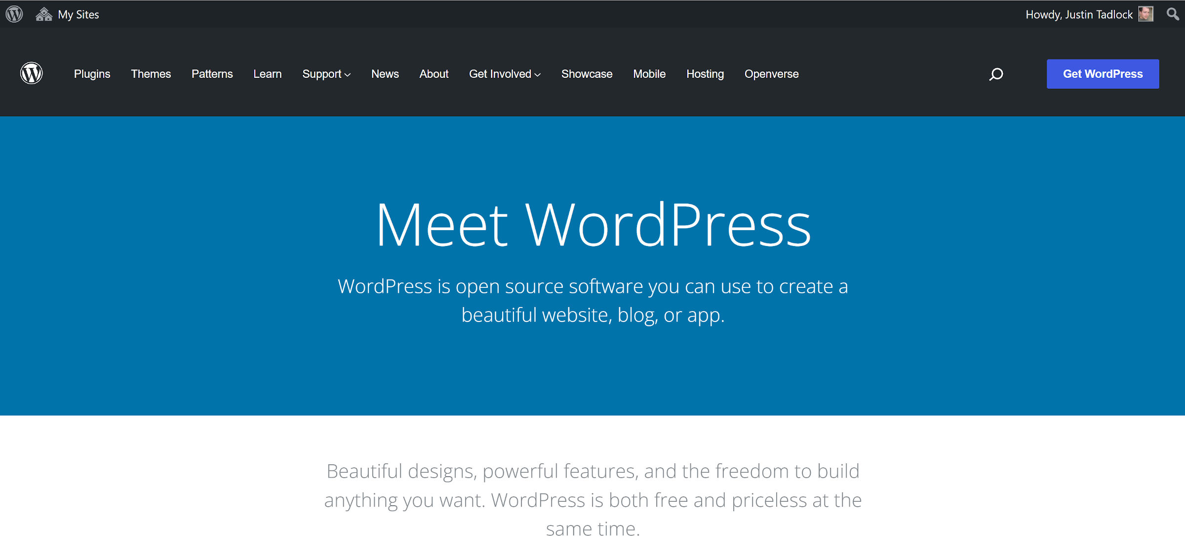
Some people noticed the growing list of links in the navigation menu. It now displays 12 top-level items. Previously, it had 10, but links for Patterns and Openverse were added.
“We need a structure,” said Dennis Žoljom in the Slack #meta channel. “Not everything can be a top-level menu, that just doesn’t make any sense. If everything is an important piece of information, then nothing is important. Somebody should get the analytics on what page is most visited and those should be left, and the other parts should be categorized in dropdown menus or placed in the footer.”
Dion Hulse noted that this is merely Phase 1 of an ongoing design project. There is more to come.
“So understandable for it to feel odd,” he said. “But it’s one part of a lot of design work that the design teams have been up to.”
I am a fan of the sharper and cleaner look of the new header and footer. I just have one complaint. The header is sticky, staying attached to the top of the site as readers scroll down the page.
I know it is a personal hangup, but large sticky headers feel like walls are closing in on me as I scroll the page. It can get bad enough that I have trouble breathing. I have written about this in the past while reviewing a theme. Do not worry about me, though. There is still a developer underneath this writer-like exterior and plenty of browser extensions for storing custom, per-site CSS. So, I am enjoying a sticky-free browsing experience.
WordPress.org actually has two sticky sections at the top of the page. The first is the standard WordPress toolbar, and the second is the new header. Together, they combine for about 135 pixels of valuable screen real estate.
With the design update, at least one inconsistency across the site is blaring. Not every page displays the toolbar.

The sticky header is more acceptable on the News page, but it does not display the toolbar. Snipping a few extra pixels off its top and bottom still would not hurt.
Speaking of the News page, it should be receiving a new coat of paint within the next week or so. Beatriz Fialho first introduced the proposed redesign in June 2021.
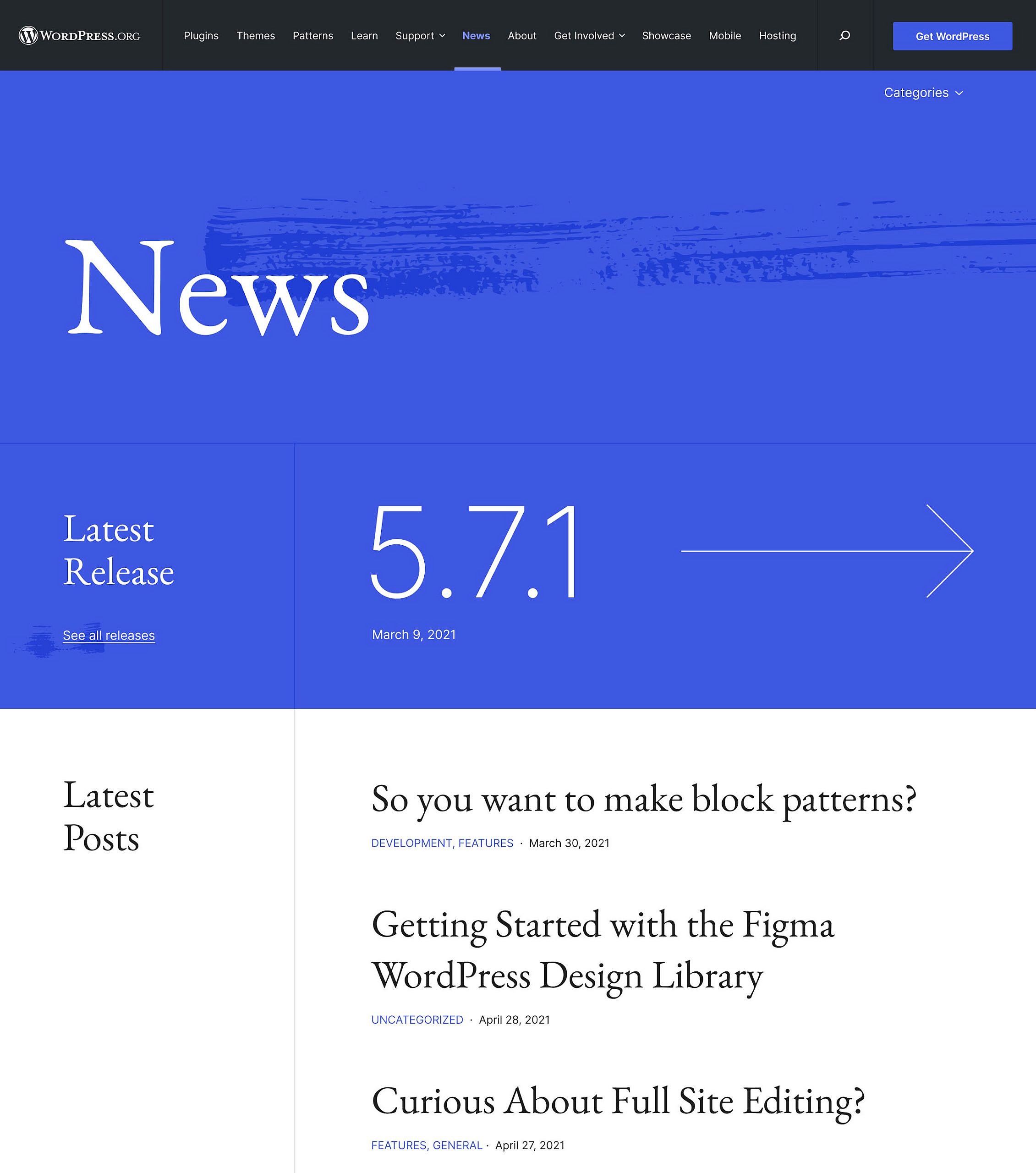
The News page redesign has its own GitHub repository. There is also a test site and Figma project for people who want to visually browse it.
Hulse said that its update “will form the base for further rollout of the style and design to other sites.” In this instance, “sites” are the subsites across WordPress.org, such as the individual Make blogs.
I have been looking forward to the fresh style. The News section has always felt like an afterthought, especially when compared to the rest of the site.
I am eager to see more parts of WordPress.org updated. The design was getting a bit stale. What do you think of the progress so far?
Thanks for the detailed article Justin! We’ve certainly attracted more attention and discussion than expected. Fixes for a few issues are rolling out already, and more PRs are in the works. It looks like the biggest issues are on the Translate site where the sticky header interferes with other important headers in the UI.
Just to make sure your readers are clear: the header and footer redesign work was done as part of the News site redesign. That’s been in the works since Beatriz’s post last July. Turns out that the way the header and footer code is handled across WordPress.org is quite complex and fragile. Rolling it out across (almost) everything at once was the best way to solve that without breaking servers. In sparing the servers we’ve unintentionally stepped on some human toes; we’ll certainly take all the feedback on board and try to handle that better next time.
As you note both the News redesign and the header/footer change have GH repos. I’d like to encourage your readers to contribute there, including opening issues:
https://github.com/WordPress/wporg-news-2021/issues
https://github.com/WordPress/wporg-mu-plugins/issues