WordPress Launches New Homepage and Download Page Designs

WordPress.org is now sporting a new look with a refreshed, jazzy design that complements the recently updated News pages.

“The new homepage brings more attention to the benefits and experience of using WordPress, while also highlighting the community and resources to get started,”  Automattic-sponsored WordPress marketing team contributor Nicholas Garofalo said.

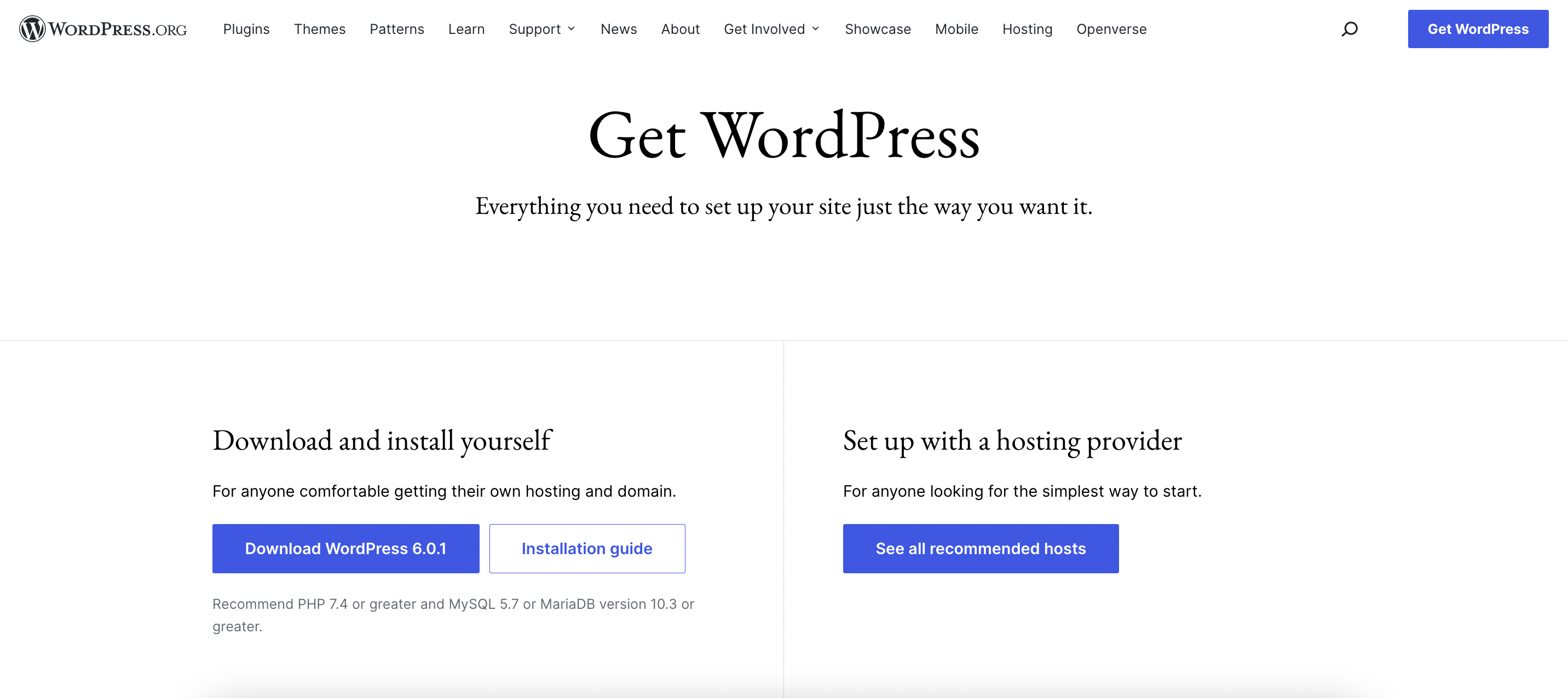
“The new download page greets visitors with a new layout that makes getting started with WordPress even easier by presenting both the download and hosting options right at the top.”

The Download page now clearly offers two paths at the top – buttons for downloading and installing WordPress, and hosting recommendations for setting it up through a hosting provider. It also includes help getting started with resources linked further down the page WordPress courses, developer resources, support, and user forums.

Although the designs have received overwhelmingly positive feedback, their journey to development was not without a few bumps in the road. When the Meta team published an update about taking the designs into development, less than three weeks from the design kickoff, Matt Mullenweg’s criticism of the pace of the project drew the ire of some community members who were offended by the interaction.

“This is not a good use of time, nor does it further the actual goals of a new homepage or download page, and we have better places to spend our development time,” Mullenweg said in response to the plans to create a block theme for the new designs.

Responding to the criticism on Twitter, Mullenweg said, “Regardless of whether someone is a volunteer or sponsored, open source developers need to be able to debate and discuss our work in public, as we have since the dawn of wp-hackers, so that we arrive at the best outcome for users.”

Automattic-sponsored contributor Alex Shiels defended the amount of time spent on the project and elaborated on some of the behind-the-scenes work. Mullenweg contended that turning Figma designs into a theme should have taken far less time to launch.

“On the ‘hours not weeks’ to implement — it’s such a basic layout, it’s hard to imagine it taking a single person more than a day on Squarespace, Wix, Webflow, or one of the WP page builders,” Mullenweg said.

“So, if we’re just doing a prettier version of the same thing, make those changes in place with the existing code approach quickly and move on to something higher value. If you are trying to further WP itself, you need a fundamentally different approach.”

Some interpreted these comments as a referendum on the block editor’s usability. The development plan Shiels outlined included the creation of custom blocks in order to launch an MVP of the new theme. This called into question whether the block editor is delivering on its “dream it, build it” promises.

“The core team has to edit the core blocks for such a simple layout – after 2+ years, what should ordinary users/developers expect?” WordPress developer Aleksandar Perisic commented.

“Dog-fooding is needed just as much as code-focused contributions right now,” WP Engine software engineer Mike McAlister said. “One informs the other. I’ve been knee deep in FSE for months and honestly it doesn’t feel like anyone has tried to make a REAL site with this.”

In addition to giving WordPress.org a fresh coat of paint, the project has sparked a larger conversation about how challenging it still is to build out simple designs with the block editor, even for the people who make WordPress.

16

16 responses to “WordPress Launches New Homepage and Download Page Designs”

  1. I have to say, in comparison to the passionate and eclectic designs i saw executed in Figma, these are really tame. Why the constraint. I feel like those designs said something. They had an opionion. They have intention. These designs are playing it really safe, and i think are trying to please everyone. WordPress itself is meant to be basic and bland because its a starting point. Its website needs to he anything but boring.

  2. The sticky navigation absolutely kills any kind of design flow for the homepage.

    The color choices for navigation and sections seem off, and parts of the design feel claustrophobic because of it.

    The “WordPress is also available in” is pretty hard to see ‘as is’ due to the small text size, but it also has an incorrect contrast ratio on the AAA spectrum.

    The “Get WordPress” button on the hero section and navigation has two different colors.

    But yes… these are personal nitpicks, of course.

    I do love the type choice.

  3. I liked the new design of the Homepage and the Download section, but I didn’t like that the link [https://wordpress.org/download/releases/] to the old WordPress releases disappeared somewhere in the new version of the section. I’ve had a bookmarked link to old releases for a long time, so I can access and download previous versions of WP. Being able to download older versions is very important to me. But if I didn’t have that link saved, I wouldn’t be able to quickly find and download WordPress releases and download them. I would love it if the creators of the new design would add a link to previous releases in the Download section.

  4. Nice new design, but it’s mind boggling that such a simple clean page design couldn’t efficiently be built using blocks after 5 years of Gutenberg development.

    It remains today fundamentally difficult to impossible to take a traditionally mocked up page design and execute that design using blocks. This is a problem.

    Sure, blocks are fine to “design a page in the browser” and accept what you get out of blocks, but blocks continue to lack the flexibility and controls needed to produce a responsive, accessible, pixel perfect layout based on a mock-up.

    What used to take a day and a dozen lines of php and a dozen lines of css, now takes weeks of building custom blocks because the core blocks can’t easily be tweaked via hooks and lack the basic controls necessary.

    Blocks needed a standardized format like widgets had, with a standardized set of controls native to all blocks (responsive settings, color settings, font settings, borders, spacing, etc). Instead we’re still in yolo mode where everyone does blocks their own way and the UX between blocks is absolute chaos. Very little looks intentionally planned out from the ground up to be effective.

    How did we get here? And how do we fix it?

  5. I’ve been building a full FSE theme from scratch and was surprised at how much of my design I was able to successfully replicate with the editor, theme.json and minimal-to-no custom CSS. Sure, it took a lot of tinkering, but I was impressed nonetheless.

    However, as Jon mentions, the second you need to adjust something for a smaller screen (or bigger screen if you dare to try mobile-first design in the editor), you hit a wall. It’s particularly apparent with margin, padding, and block gap, which have no responsive controls yet. You can see this adjusted via CSS in the new theme on .org.

    However, there are hints of improvements coming for responsiveness. Fluid typography and clamp() certainly have helped get typography in check, but there will always be circumstances where you need even finer control. Every other site builder has solved this, there’s no reason to think WordPress can’t or won’t. (I certainly hope so, as ~50-60% of traffic is coming from mobile devices these days!)

    As quoted above, one of the best ways to push past these growing pains is to have as much dog-fooding as possible — using the editor and FSE to build for as many real-life scenarios as possible to uncover these blindspots.

    Surface what you find, dig into some tickets, and be kind to the volunteers who spend their time making this free software better each day.

  6. You know those rectangles/squares/whatever around DREAM IT, BUILD IT….I thought they were cell phone at first, didn’t like it.
    That was yesterday.

    Now at 11:11 the next day……..meh, I like it.

    Think of it like Yahoo vs Google……….Yahoo’s homepage is over stuffed with content. Google’s homepage is simple

    KISS – Keep It Simple Stupid. (not my expression but I like it).

    I am on my computer, not a mobile phone.

  7. I never looked at WordPress.org as a marketing site, I just go there for the resources. I’m not a fan of the new design, looks too busy, colour scheme looks random.

    I can see Matt’s frustration but I wouldn’t of addressed a person like that.

    But every experience is worthwhile in one or another way.. now they discovered not so simple to always build what appear to be simple layouts/designs with blocks.

    I just wish full site editing was not beta and fully featured and the main way to create a theme in wp. Right now there is multiple ways which causes frustration.. classic, hybrid, block theme, full site theme, etc.

  8. To be honest, I am not too impressed by the new design. Sites like Statamic are much more individualistic, and feature world class style. That would be a design really worth replicating via the block editor.
    And just on the side, does someone has a link to the initial Figma designs? Can’t really find them.

Newsletter

Subscribe Via Email

Enter your email address to subscribe to this blog and receive notifications of new posts by email.