WordPress Designers Explore Proposal to Simplify WP Admin Navigation

The admin can be intimidating to navigate if you’re just getting started with WordPress. After installing a few plugins, top-level menu items begin to pile on. This adds even more complexity to grapple with in a narrow space with long lists of items hidden behind flyout menus that make managing WordPress on mobile a frustrating experience.

The admin dashboard design hasn’t changed significantly since the MP6 plugin was merged into WordPress 3.8 in 2013. This project brought updated typography and improved contrast to the admin but didn’t tackle the increasing complexity of admin navigation.

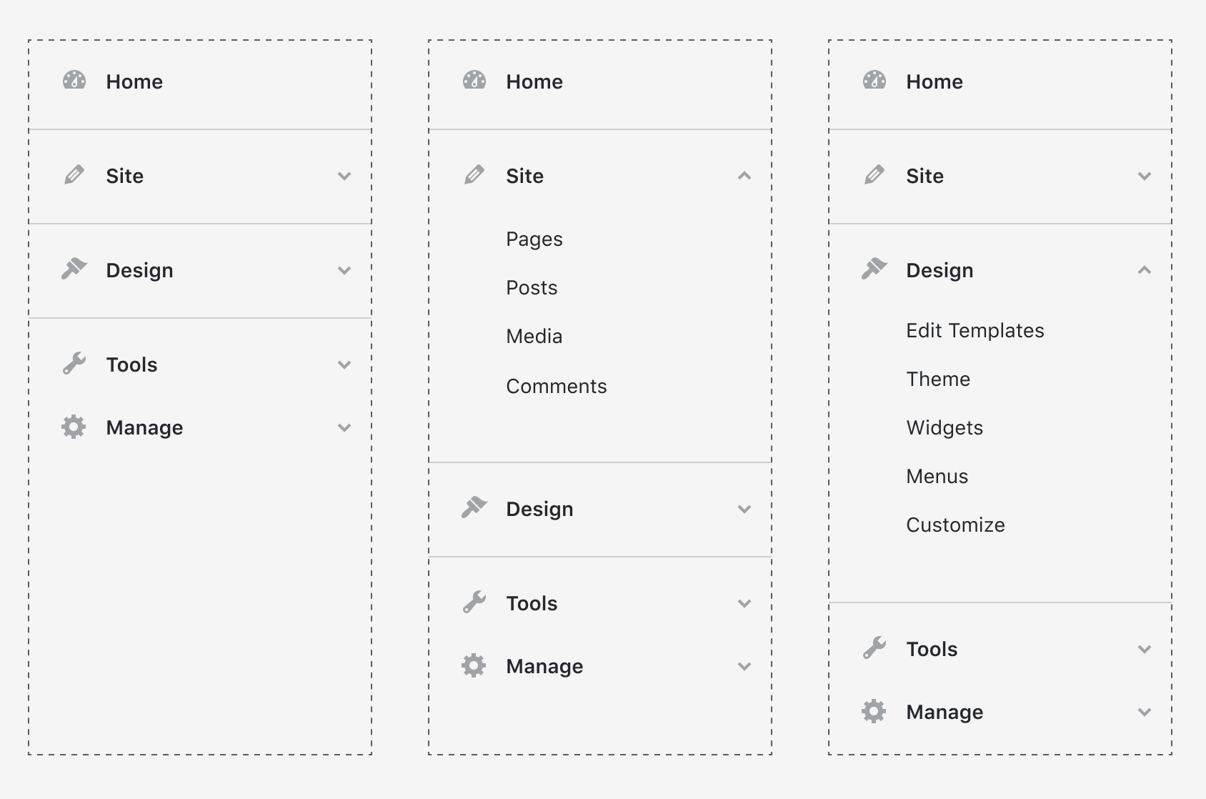
A new proposal on trac aims to simplify the left sidebar navigation to improve accessibility, usability, and scalability by replacing the flyouts with accordion menus. Designer Dave Martin shared some mockups originally created by Joen Asmussen, and describes them as “a very early, exploratory concept.”

Martin listed several reasons for exploring a new design, including the inaccessibility of the hover/flyout menus and how poorly they scale on mobile interfaces. He also cited the abundance of top-level menu items that are rarely used, which he said contributes to the cognitive weight of admin navigation by still being permanently visible.

The major changes included in this proposal include the following:

  • Flyout menus are replaced with accordion behavior. This scales all the way from mobile to desktop, and affords better accessibility.
  • Menu is made 80px wider (240px vs. 160), affording a 14px minimum font size for all items, perhaps bigger icons in the future, more relaxed spacing, enhancing usability and accessibility.
  • Sidebar is grouped in major sections, “Site”, “Design”, “Tools” and “Manage”.
  • “Updates” are moved to a subsection of “Manage”, making Home a single item.
  • Items related to content on your site (such as “Posts” and “Pages”) are moved under “Site”.
  • Clicking major menu items just opens or closes the accordion, as opposed to go directly to the first subsection. This unifies the mobile and desktop behavior. You can keep the accordion open if you use it all the time (each click will save state, so you’ll see the same open/closed sections upon page refresh).
  • All “Settings” subsections are moved under “Manage”, along with “Plugins & Blocks” and “Users”.
  • Separators group major categories, like “Site” and “Design” together
  • Dashboard is renamed “Home”, because all of WordPress is a Dashboard, and “Home” is where you can get an overview at a glance.

WordPress core committer John Blackbourn commented on the proposal, recommending further exploration of what the menu could look like for different user roles and whether that might affect the appearance, grouping, and behavior of the menu items. For example, roles with more limited publishing capabilities, such as a subscriber, would see very few menu items.

There’s also a bit of discussion regarding the use of the word ‘Site’ where some might better understand that section as ‘Content.’ As this is just an initial mockup, nothing is set in stone and many iterations will likely follow.

Even with many changes expected as the concept evolves, the proposed design significantly reduces cognitive load, especially for new users who may not be as familiar with the admin menu. An updated admin navigation design might lend itself well to being tested as a feature plugin. As with any major change in WordPress, there are many considerations for how it will affect plugin developers. Major visual overhauls like this are exciting, but it takes time to get it right. This proposal already shows a lot of promise but needs more feedback and participation from diverse user groups across the WordPress community.

22

22 responses to “WordPress Designers Explore Proposal to Simplify WP Admin Navigation”

  1. How about putting all of the plugin settings pages into ONE menu instead of letting the plugin dev choosing where they would like their menu to live. How many times have a installed a plugin and then had to search all over the place for the admin settings of the plugin or a simple links plugin pushed right to the top of the main menu structure.

    That’s gotta be fixed!

    • Some plugins add extra options/settings hat enhance WordPress settings, like those on the Writing, Reading and Permalinks options pages. In many cases the user will not first think of what plugin, but what kind of thing to change or adjust.

      So plugins must be able to hook into any screen.

      Some plugins provide a link to it’s own settings page on the plugin screen. This may be made kind of mandatory, in case there is one.

    • Depends on the plugin. Some have multiple admin pages and sub-pages. They really need their own top-level menu item. But, for most of those plugins that have only a single admin page, they already have a standard menu called “Settings” they should be under.

      If plugin developers are putting them in weird places, the best thing to do as a user is let them know via the review system.

    • What about adding an extra button to show/hide additional menus..? I mean if I’m looking for core items I agree that plugin/theme menu items can be distracting… but vice versa.

      So some way to switch between three “menu states” would be even better: core items, plugin/theme items, and combined (default.)

      Would be simple enough to do by adding a few menu classes automatically (if needed) and some button interface and simple javascript function to change the display states.

  2. I think these changes are not an emergency.
    From my point of view, an important change would be if WordPress would force developers not to create chaotic pages in the admin dashboard, so we will have a very clean dasboard.
    It would be ideal for themes to create pages only in “Appearance” and for modules only in “Tools” and “Settings”

  3. Unusually for me, rather like the idea, never liked stuff that expands on hover (and then you need to keep the mouse on what expands to prevent it from closing before reaching the element you want!).
    BUT what will this do to the collapsed menu? I mean, not keen on larger stuff (even just the icons) either way, things are too darn large in most places, and assuming too much screen width mainly, as it is for me still on a 1280×1024 monitor, but first things first, and that’s to still be able to have the collapsed menu as I do now, not take up that space with the text too, and I’m not quite sure how that will work in the new concept.

  4. Make the admin menu like widgets, adding and subtracting as required. All theme functions in an expanding menu, all config/setup options and functions in an expanding menu and then can be tucked away. More admin Menu choices and a way to avoid more than one click to get to the All Posts screen.

  5. Good effort, but i dont feel like it addresses the larger issue. The biggest problem i see in the admin sidebar is the inability for plugin developers to place their menu items in the correct location.

    Most developers place them as main menu items without rhyme or reason. There is no point in having the Facebook Pixel plugin visible at all times since it is a “fire-and-forget” thing that usually only needs a one time setup.

    Move tools to the tool section, move settings to the settings section etc. anything else just clutters up the interface needlessly.

    That combined withe the fact that more and more plugins use ugly colored icons that makes the admin area look like someone dropped a bag og skittles.

  6. WordPress admin area is simplified already for users & customers if you as the developer provide proper roles for them, that’s what WordPress roles and capabilites are for.

    Basically it’s the developers fault, if he/she/it provide an unmodified admin role to customer and customer can’t handle it or breaks things.

    The above screenshots unfortunately do not reflect real world usage at all with lots of custom post types & custom taxonomies also added to native post types, removed native post types and all that visible based on custom user capabilites etc.

    Better brovide a proper role / capabilities editor in core, problem solved.

Newsletter

Subscribe Via Email

Enter your email address to subscribe to this blog and receive notifications of new posts by email.