WordPress.com Unveils the Action Bar

WordPress.com has unveiled a new user interface called the Action Bar. It’s a bar that shows up in the bottom right corner of the screen for logged in users and is accessible from any device. The bar performs multiple tasks depending on the page you’re on.

WordPress Action Bar

When on a WordPress.com powered site that you’re not following, the bar turns into a Follow button. Clicking the follow button will notify you of new posts published on the site.

Action Bar Follow Button

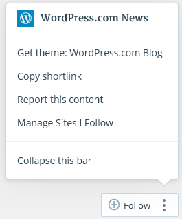
If you click the three dots to the right, you’ll see a variety of options depending upon the page you’re viewing. If it’s the homepage, you’ll see links to download the theme the site uses, report the content, or manage the sites you follow.

If you’re browsing a specific post on a WordPress.com site, you’ll see an additional link to copy a shortlink for quick and easy sharing.

Easily Share Posts
Easily Share Posts

If you have a site on WordPress.com and are logged in, the Follow button turns into a Customize button. This link provides a quick way to enter the Customizer. There’s also an Edit link if you’re browsing a published post.

Edit and Customize Links

If the action bar is too big and you want to minimize it, click the three dots and select the option to Collapse the bar. It will shrink the bar into squares and get out of your way.

My User Experience

One of the best features of the action bar is the ability to quickly see and download a theme used on a WordPress.com site. However, it doesn’t work for WordPress.com specific sites like The Daily Post.

What annoys me about the action bar is that it disappears when I scroll down. I caught myself scrolling down to read a post and when I looked for the edit button to fix a typo, the action bar was gone. I think it should stay on the screen at all times.

I’d also like to see the Edit link in the action bar open a front-end editor. It’s time WordPress.com step up its game and stop forcing users through a backend interface to edit published content.

I like the experimental action bar but at the same time, I question the reasoning for adding yet another user interface element to mimic actions already supported by other buttons and links.

For example, between the admin bar, dashboard, the edit link underneath a post, and the action bar, there are now four different ways to edit a post. How many roads are necessary to reach the same destination?

If you have a site on WordPress.com, let me know what you think of the action bar.

12

12 responses to “WordPress.com Unveils the Action Bar”

  1. I already left my 2¢ on the WPcom News Blog. It’s distracting, it interferes with our site layouts and as far as editing, that’s what the New Dash is all about. We’re being redirected more and more to the New Dash. For someone who still prefers working with the Classic Editor interface, it’s getting even harder to do so. Carry it further, even the WPcom Support docs are doubled up to include both interfaces. Well, that ended up being my 5¢ worth. :)

  2. there are now four different ways to edit a post. How many roads are necessary to reach the same destination?

    Exactly. I’m not sure why this isn’t in the “admin bar” which is visible on all WP.com connected sites (for logged-in users) and already has a link to the Reader.

  3. However, it doesn’t work for WordPress.com specific sites like The Daily Post.

    Thanks for catching this! The “get theme” link should only appear for themes available to everyone on WordPress.com—it has been fixed for sites like The Daily Post.

    On the edit link, more changes for the toolbar coming that will streamline the number of links to edit.

  4. neat idea – but the execution.. first thought as a user is when I see that “+ follow …” – I am going to think that is another “share this / add to any (privacy stealing, please promote us on third party begging buttons) – aside from my issues with that, my point is that I would have no idea there are cool powers in the “…” portion of the button.
    I’d be annoyed if it covered up important info from the layout / design..

    It would be better ux to have the button perhaps slip with a vertical separator to show that it’s really three different buttons?

    as a wordpress publisher however I think the best ux would be to put it in the admin bar and get it off the screen that way.. separate the functions..

    reminds me of the hamburger menu debate to some degree.. useful functions hidden behind something non-descript – likely rarely used..

    like the idea of more power / info available from the front end without having to right click view source… think the actual button itself is not as descriptive as it could be.. and more descriptive may make it too obtrusive for the bottom right of screen… so leads me back to admin bar might be better..

    perhaps have the admin bar animate to highlight newly available info when on a page that can provide extra available details like “get this theme” – shown with a hover would get used on my end.

  5. I’m not a fan of hiding features until they’re needed. Let’s see, if the WP team designed a car…

    The rearview mirror appears only when there is a car behind you. If the transmission is in “park,” the options for “drive” and “reverse” don’t appear until you start moving the gearshift. Only when you approach an intersection does the turn signal lever appear.

    And the power button for the radio is available only when (if?) something good is on the air.

    How would you explain all of this to a new driver?

Newsletter

Subscribe Via Email

Enter your email address to subscribe to this blog and receive notifications of new posts by email.