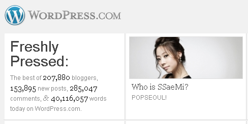
Matt Thomas last night announced on Twitter that WordPress.com would be live testing a new design.
We’re running a live redesign on http://wordpress.com this week, if you’re into that sort of thing. I think it’s gonna be pretty swanky.
Upon checking it out, I gotta say that it’s strikingly different than the design it replaces. It’s visual, has more images, and still manages to keep that clean look that is a staple for Automattic.
There are a few minor issues I have with the design. The first is that I think the right sidebar looks a bit clunky with images on the right and the top one on the left. Also, the spacing between the text and images varies and makes it look weird. The other concern I found was with the text color #888888. I think it’s too light and should be bumped up a shade or two darker. While the Sign Up Now button looks great with the orange gradient, the solid orange sign up now link does not mesh well with the background color. It seems too bright.
What do you think of this design?

I’m liking the new design …
You’re not losing screen real estate with the login now moved to the bar at the top of the screen; and I find the “blocks” of blogs more enticing to click on than the former text style of links.
I’m looking at it in a standard 4:3, 1024×768 monitor so that may be affecting the sidebar layout, which I find to be a little “off” but after logging into the site it “fits” better. It might be the layout, or the choice of fonts sizes … or it could just be me ;)
The random block in the footer area is a nice touch to promote their own sites/apps as in the case of WordPress.tv and the WordPress iPhone app, its not obtrusive and fits the design well.