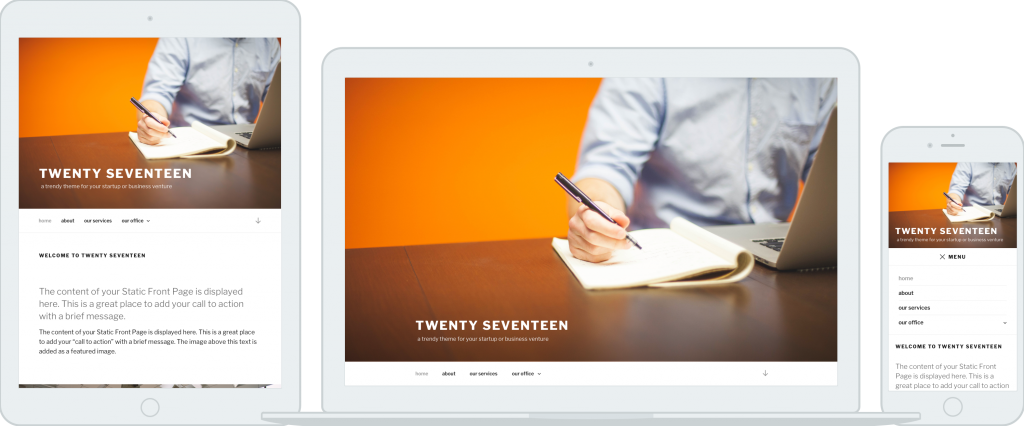
WordPress lead developer and 4.7 release lead Helen Hou-Sandí unveiled the design for the Twenty Seventeen default theme today and confirmed that it will be part of the upcoming release. Mel Choyce, a core contributor and design engineer at Automattic, is credited with the design of the new theme, which falls into the business or product showcase category.
The homepage features a fullscreen header image with navigation directly underneath, a call-to-action section, and various sections for services, blog posts, location, and featured content. Hou-Sandí posted several screenshots of the design in action on mobile devices and linked to a collection of higher resolution mockups.
“Twenty Seventeen will focus on providing a seamless initial theme setup so anyone can set up a website for themselves or their business with minimal hassle,” Hou-Sandí said. She identified several usability improvements planned for core which the theme will exemplify:
- A better flow for using a static page as your front page
- Visible edit icons in the Customizer, replacing the current hidden shift+click method
- Expanding custom header images to include video
- Dummy content for live previews
Hou-Sandí also said that the new default theme will use plain CSS, instead of using preprocessors, in order to “keep it simple, making the theme easier for everyone to understand, quicker for anyone to modify and better to maintain in the long run.” Twenty Seventeen development will initially happen on GitHub but will be merged into core when it’s stable so that issue reporting can be handled on Trac.
Contributors will have the opportunity to offer more specific design feedback in the #core-themes Slack channel on Friday. Choyce, known for her critical attention to typography and color, is a co-author on several popular WordPress.org themes. She will continue leading the design efforts along with Laurel Fulford and David Kennedy, who will spearhead development. Contributors will work closely with the Theme Review Team to ensure that it meets the core standards.
Initial reactions to the design on the Make/Core post are overwhelmingly positive, as many WordPress users have been waiting for a default theme that can be easily customized for businesses. Twenty Sixteen was more blog-oriented, as were Twenty Fifteen, Fourteen, and Thirteen. It hasn’t been since Twenty Twelve that WordPress had a default theme resembling anything close to a business style theme.
Twenty Seventeen is the shot in the arm that WordPress needs to make it easy to set up a business website with a trusted, well-supported theme. When combined with the improvements to the initial theme setup process that are planned for core, Twenty Seventeen will make it possible for a business to go from installation to a professional-looking online presence in a matter of minutes.


Looks fab. I’m so pleased it’s not another overly blog-centric theme: thereby better catering to a diverse range of small businesses and showing more of what WordPress can really do! Also, those images: wow. Gorgeous! :)