WordPress 3.8 marked a major milestone for the admin with the inclusion of “MP6,” a brand new responsive design and color scheme. By now many users have become accustomed to the color scheme, but 4.2 will introduce subtle changes to create a more harmonious color palette.
Over the past several months, Hugo Baeta has been working to help document and refine the WordPress.org brand. Baeta works as a designer on WordPress.com. Most recently he has been focusing on evolving the brand and preparing its design handbook.
“In the process, things like a unifying typographic modular scale and the Logotype metrics also got some attention – all in the efforts to unify the brand and make sure it is consistent,” Baeta said. “A couple months ago I asked to switch my gears to .org and help the .org universe get a similar treatment.”
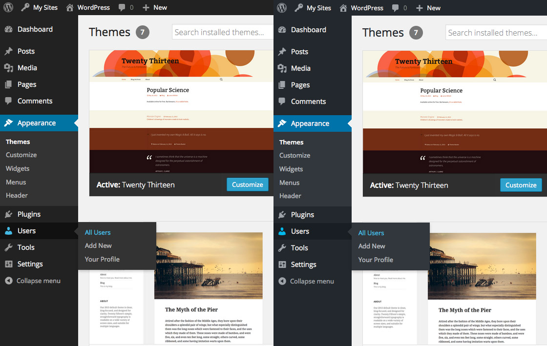
While documenting the colors used by WordPress core, Baeta’s critical eye for color palettes prompted him to explore some subtle changes that would bring greater harmony to the admin color scheme. If you look carefully, you can see that the new admin colors (on the right) have a more bluish hue than the original MP6 colors (left).
“The idea was to make the grays look intentional and refined, by bringing out a subtle blue hue to them,” Baeta said. “I tried to maintain the value (lightness/darkness) of the colors, so that it would be a ‘lateral’ evolution. So, technically there isn’t much change to contrast.”
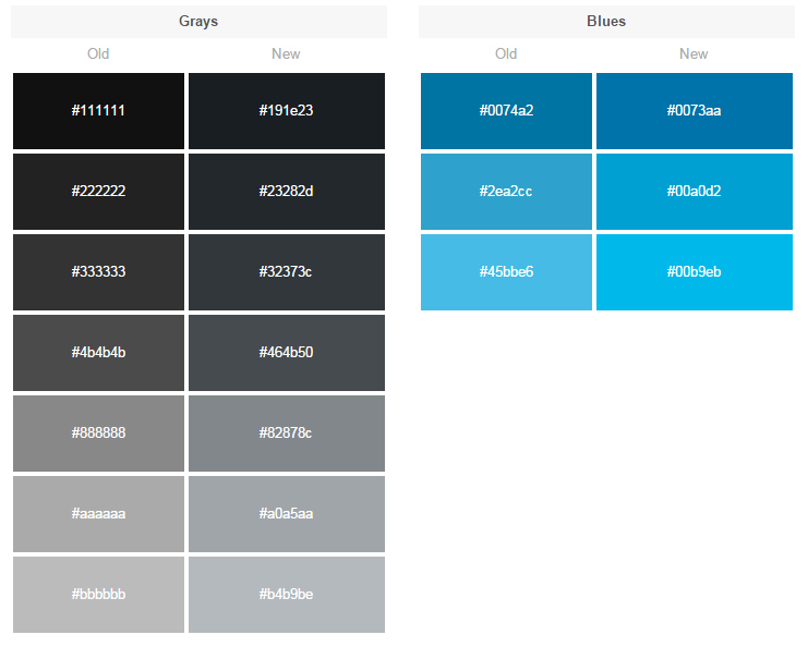
A closer look at the HEX changes side-by-side shows the subtle evolution from dusty greys/blues to a more true blue hue:
I asked Baeta what his response would be to those who, like one commenter on the announcement post, see the new color scheme as looking “too bluish.”
“It’s all a perception game,” he said. “The technical reality is the change is incredibly subtle, but depending on your monitor calibration and the way your eyes see color, you’ll see more/less blue.
“Let me give you an example of a specific hue breakdown – the main sidebar gray:
before: rgb(51,51,51)
after: rgb(50,55,60)
“Each channel goes 0-255 – so you can see how subtle the change is,” Baeta explained.
Feedback from contributors on the ticket where Baeta proposed the changes was overwhelmingly positive and the new color updates will land in 4.2. Core committer Matt Miklic aptly summarized the overall consensus:
My subjective feeling is that the shift in colors is so slight, it doesn’t really change the feeling we intended to convey with the original MP6 colors. If anything, it makes the grays look more intentional, a color palette designed to work harmoniously rather than pairing a signature shade of blue with a lot of neutral grays.
Why It’s Important for Companies and Projects to Iterate on Branding
Like it or not, users tend to judge software by how it looks. Even the most minute color choices can affect public perception of an application. Most users are not likely to consciously perceive the changes in this round of WordPress admin iterations, but the improved harmony of the colors will make it easier on the eyes.
Baeta believes that companies and open source projects need to be open to iterating on their branding every now and then to keep pace with where the web is going.
“I believe a brand is something we should cherish very dearly,” he said. “It’s a project/company’s most recognizable asset, right? I think iteration should happen in order to achieve refinement and keep a brand relevant.
“Specially when a brand doesn’t begin with a strong set of assets and rules, it allows for the people involved to treat it as they think is best. Eventually atrocities like the fauxgo make everyone regret the absence of rules.”
This is one of the reasons that Baeta is involved in the initiative to document and refine the project’s brand through contributions to WordPress.org’s Design Handbook. Without clear branding guidelines, anyone can take the logo and colors and alter them in ways that muddle the project’s brand as a whole.
“I think the web has evolved greatly since WordPress first started,” Baeta said. “WordPress is now a mature project that deserves to have its very recognizable brand refined and documented to make sure it is protected for years to come.”
When you say ‘subtle’, perhaps you should say very ‘subtle’? I almost couldn’t tell the difference looking at the before and after colour swatches. But then, when looking at the before and after screenshots, the new version makes everything come together better and the page elements look so much more sharp.
Great job!