When Matt Mullenweg, co-creator of the WordPress open source project, announced that design would lead the way for WordPress development in 2017, utilizing user research and mockups, the first thing that came to my mind was WordPress 2.7. That release was the culmination of effective leadership and effort from Jen Mylo and Liz Danzico. In order to learn why this release is in a class of its own, we must look at how it was created.
Introducing Crazyhorse
On March 29th, 2008, WordPress 2.5 “Brecker” was released to the world. The biggest feature in 2.5 was the redesigned backend that was built in collaboration with Happy Cog.
When Mullenweg gave the public a sneak peek at the redesigned backend, he had this to say:
For the past few months, we’ve been working with our friends at Happy Cog — Jeffrey Zeldman, Jason Santa Maria, and Liz Danzico — to redesign WordPress from the ground-up. The result is a new way of interacting with WordPress that will remain familiar to seasoned users while improving the experience for everyone. This isn’t just a fresh coat of paint — we’ve re-thought the look of WordPress, as well as how it’s organized so that you can forget about the software and focus on your own creative pursuits.

While some people praised the redesign, others were not happy, particularly with the menu hierarchy. Since sentiment in the community was mixed, Mylo contracted Ball State University’s Center for Media Design, Insight and Research to perform a usability report on the WordPress 2.5 admin design. The report was used to figure out which issues were based on interface problems versus people simply not liking the changes.
Usability testing results were shared with lead developers which inspired a prototype interface to address some of the issues discovered. This allowed developers to use WordPress 2.5 on their own sites and the prototype on a test site. However, once testing began with the prototype interface, it became clear that a more ambitious approach was required.
According to Mylo, the second prototype known as “Crazyhorse” blew test subjects away:
The second round of testing blew everyone away. The research team had never seen such consistent results. Tasks were completed faster, participant opinions rated it higher, understanding of how interface elements worked was greater, and it wasn’t even a fully functional application. Of the test participants, every single one said they would choose the prototype over their current administrative interface, and it wasn’t even pretty.
Throughout the 2.7 development process, Mylo used a number of communication channels to gather user feedback. On September 15th, 2008, Mylo published a Navigation Options Survey. The survey was part of a broader effort to get more people involved in the design and decision process:
As part of the mission to increase user involvement in design decisions, we’ve created a survey intended to give WordPress users the ability to play a part in deciding how the navigation options should be grouped and labeled.
Later that month, a second survey was created that allowed users to vote on mockups of the search box, favorites menu, the Future/Publish and Edit Timestamp buttons. It only took two days for the survey to reach its maximum response count of 5,000.

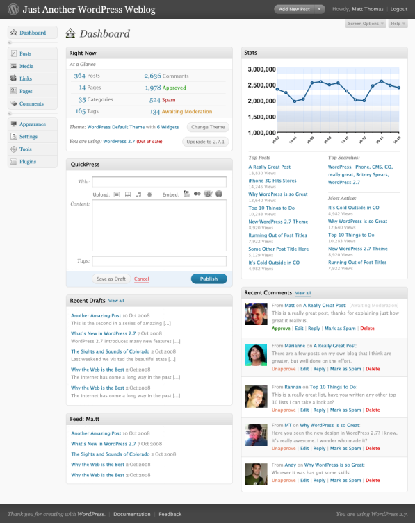
Once the survey concluded, Mylo published a follow-up post as well as a document containing wireframes that gave users an idea of what the end product might look like. Near the middle of October, 2008, Mylo published semi-polished screenshots of the 2.7 interface and explained how it worked. Matt Thomas and Andy Peatling are largely responsible for the design of WordPress 2.7.
The response to the screenshots was overwhelmingly positive. A week after showcasing the 2.7 dashboard, Mylo asked the WordPress community to create a set of icons to go with each of the navigation sections. More than a dozen people submitted icon sets and instead of choosing one, Mylo let the community vote on which set best matched WordPress 2.7’s style. With 35% of the vote, the winning set was created by Ben Dunkle.

I asked Dunkle what inspired him to create the icons and if Mylo didn’t offer the opportunity to the community the way that she did, if he would have contributed to WordPress 2.7 otherwise.
“When I saw Jen’s post calling for icon designers to submit a set for 2.7, it was right at the deadline,” Dunkle told the Tavern. “I can’t remember how I found the post, since I didn’t visit the WordPress development blog very often. I’d been building sites with WordPress for few years by that time, and really enjoyed it, but I didn’t think much about the online community.”
“Jen expressed the direction eloquently: ‘Icons should be subtle, with a classic/designed look, nothing cartoonish. Thin lines. Maybe a little old-fashioned looking.’ I was designing icons for other open source projects around that time, and the language of the post struck a chord with me. I rushed out an email.
“I ended up as a finalist, pushed the pixels, and sent off the design. Mine got the most votes. The contest caused some controversy, since anything resembling spec work has always been a lightning rod in the design community. I didn’t see it that way. It was an open source project and I was a volunteer, not a contractor.
“In the end, it launched an ongoing connection that I maintain to this day. They’re now called Dashicons, made with vectors instead of pixels, and soon to be SVGs instead of web fonts (once we get the bugs sorted out).”
After going through the beta and release candidate stages, WordPress 2.7 “Coltrane” was released to the public on December 11th, 2008. More than 150 people contributed code directly to the release and countless others contributed with valuable feedback during opportune times through surveys, mailing lists, and testing.
Referring to WordPress 2.7, longtime user Ozh had this to say, “The dev team asked users what they wanted and what they liked, and the result is light years beyond what the design studio produced for 2.5 six months earlier. One word to summarize it all: ‘Above the fold!’”
WordPress 2.7 Set a Great Standard
During Contributor day at WordCamp US 2016, I asked Mullenweg if the WordPress 2.7 development process inspired the experimental approach to developing WordPress in 2017.
Yeah, I mean that was one of the beginnings to Jen’s contributions and her huge impact on the WordPress world. She brought an entirely different way of thinking with a user first, usability, research led mindset. It was fantastic to have female leadership demonstrating very early on in the WordPress community that this is software made by everyone for everyone. What that was for its time is a great standard to hold ourselves up to as we move forward in 2017.
Out of all the WordPress releases I’ve covered since 2007, WordPress 2.7 is special. It’s the only release where I feel like a lot of the community rallied together and focused on making WordPress better. Through surveys, comments, blog posts, testing, and reaching out to talented people in the community for help, Mylo proved that the community can be part of the development and design process of WordPress and end up with a better product as a result.
Things have changed since 2008. The community, contributor pool, and the project itself has become larger. Communication is spread out among the Make Blogs as well as SlackHQ. The WordPress development process is more open now than ever before. Since WordPress 2.7’s release, I haven’t felt the same spark of rallying together for a common goal that Mylo was able to foster. Perhaps it’s because I’m not part of a project team like the REST API or I’m not searching for it in the right places. I hope those feelings are rekindled in 2017.
It will be interesting to see how the new development process works out. Until then, I leave you with a wonderful quote from Mylo as it succinctly captures the way I feel and remember the WordPress 2.7 development cycle.
“I hope you enjoy getting an inside look at how we’ve been organizing our thoughts around 2.7, and that when the community feedback starts flowing everyone remembers that we all want the same thing: the best WordPress possible.”
Yes, most will agree that the admin design of v2.5 was a fail and v2.7 “healed” that. And also in this heavy contrast lays the great feedback that v2.7 received.
However, you’re painting a picture here that this version 2.7 was made by the community “mostly”. I don’t see it that way; “we” the users were given some surveys, yes, and that was new and great, really! In the end, however, it was a small group of core developers or “influencers” who made this release. But a few surveys aren’t a big community effort, if a small group still makes most of the work…
I have voted in this one (or were it more than one?) survey about the admin icons, it was fun. I voted for the icon schema submitted by a German agency, which was second place in the overall voting and ended up being used for the blue color scheme in the admin.
In my opinion, the fall release of 2013 with the new admin styles and the former “MP6” plugin were as much community driven as the 2.7 release – if not way more! Because of the widespread MP6 usage of the feature plugin, the users, the community could “smell” this release a lot more before and a lot of feedback found its way back to the “developer circle”.
Every way of working out such releases has its advantages and its downsides of course. Given Matt’s new strategy and tactics for the next releases/ cycles I can’t wait what fruit is coming out of that. I hope for matured releases, that will have impact again for the long run (like 3.0 for example). It’s time that half-baked, slow solutions like the Customizer get a makeover/ rebuild, so that’s finally worth it. And if it’s not worth it, then cut it off and let new/ better ideas mature!!!
One thing the 2.5 – 2.7 era shows: sometimes you need more than one iteration to hit the nail right. So let’s hope for next group of releases!
Here’s my little list of areas where WordPress should improve:
– frontend search!
– admin search!
– user management, user groups
– editor/ writer tools, post status, whole publishing process
– badge installing of plugins
– make widgets no longer as options in the options table but somewhat better, maybe transform into a post type or whatever –> widgets as a flexible concept of content blocks, however, are awesome! :)
– …