What’s Your First Impression of Distraction-free Writing in WordPress 4.1?

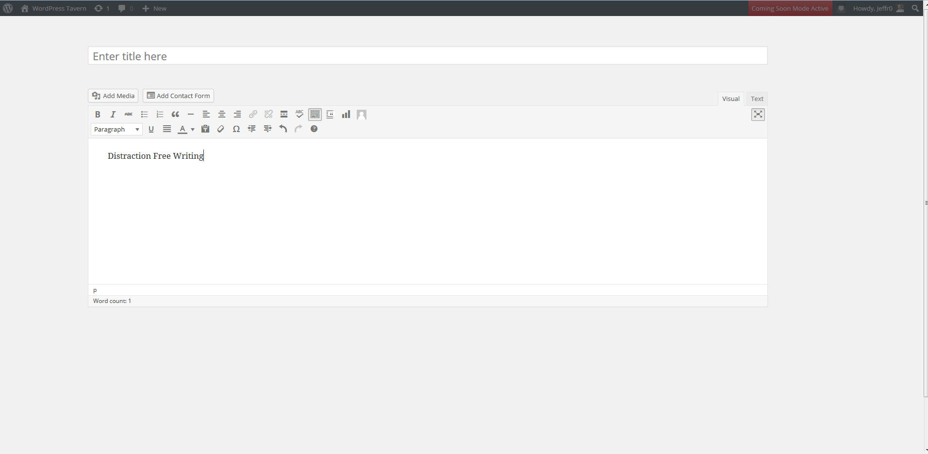
With the release of WordPress 4.1 just a few days ago, millions of people have had the opportunity to use the improved Distraction-free Writing Mode. I rarely use this mode, but I’ve used it to write every post since updating to 4.1 and it’s growing on me.

Distraction Free Writing in WordPress 4.1

The improved mode works great on my Macbook Pro which has a 15″ screen. I’m still not sure whether I like how the admin menu on the left hand side slides in and out of view. Sometimes it’s a distraction and sometimes I don’t notice it.

The rest of the interface fades in and out of view. The animation is fast enough to not hinder my ability to quickly access meta boxes. As an experiment, I’d like to try DFW where the interface shares one animation to see what the experience is like.

Having access to the full toolbar while everything else fades off the screen is a nice change of pace. I didn’t use the original DFW, but the new and improved version is winning me over. How about you?

[poll id=”55″]

66

66 responses to “What’s Your First Impression of Distraction-free Writing in WordPress 4.1?”

  1. It is superior than the older mode, but I feel it needs one more simple addition: the ‘screen options’ tabs allows you to have one column or two columns. For a matter of confort, I believe majority will choose the second option, but when DFW is on, there is this side-column dumb space not being used, so:

    I would like that DFW turn screen options to 1 column when on. When it fades out, it returns to 2 columns. That way, the WYSIWYG editor can use the full width and the quality of the result is improved.

    Does anyone else feel this way? Thanks!

  2. As a follow on from my previous comment, been trying to work with it for 2 hours and, apart from really annoying me, can’t see the point but I am me and I am sure a lot of people like that sort of fiddly functionality and will love it!

    For me I have just turned the function off, sorry
    Phil

  3. I actually find the sidebar sliding in and out to be quite a distraction. The meta boxes fading out are also slightly distracting.

    The real problem is the need for a simpler UX decision – click to enter distraction free mode, click to exit. Accidentally nudging the mouse or moving the cursor outside of the WYSIWYG editor space whilst you’re editing triggers the slides/fades. That’s my main pain point.

  4. I find this version distracting and it doesn’t open to full screen as it did on the previous version. Now I can’t see anymore how the text and embedded photos will actually look like once posted, which is a major drawback.

    Not an improvement at all – please bring back the old distraction-free mode! At least as an added option. Please!!

  5. I like the design a bit more this time around. But, the meta boxes and menu sliding in and out of the page every time I accidentally move my cursor too far is annoying. More annoying than that is when you hover over one of those meta boxes too long and it turns DFW mode off. However, it doesn’t change the state of the DFW button, which means you have to click it twice to get back to DFW mode.

    I think I’ll stick with MarkdownPad for now.

  6. I have been an avid user of DFW for quite some time already. The new design is a liitle bit nervous, just like Justin Tadlock pointed out.

    A big plus of the new DFW design is that you have all editor buttons at your disposal. I have moved the Featured Image box above the Publish box, since I like to hit the [Update] button occasionally – otherwise I need to scroll to the top of the page for every save.

    For a future release, I would welcome when the functions of the Enable full-height editor would be separated from the Distraction-free functionality. Or rather that the DFW button only enables the full-height editor for the DFW mode.

    • Here is an update to my comment above. The new DFW feature had become increasingly annoying to me. The past two weeks, I have been checking out alternatives. Within WordPress as well as outside of WordPress.

      Today, I have settled for TinyMCE Advanced with a minor addition. The default DFW mode of TinyMCE Advanced is screen width. So, I have created an editor-style.css, and uploaded that to the theme folder. The editor-style.css has only one rule: .mce-content-body {max-width: 600px;}. For me, this is a workable, and distraction free solution.

      Please note that you have to enable the editor-style.css within Settings >> TinyMCE Advanced >> Advanced Options.

  7. It seems intended for those who write arguably beautiful text in WordPress. Personally, I’ve been in the “WordPress is a CMS” camp for years. What others might see as a hindrance to creativity, I see as essential tools. Consequently, if I’m going to write the great American novel — or even a pithy blog entry — I’ll likely do it in a tool specifically designed for that, then copy and paste. After that, I’ll need those “distracting” tools that DFW wants to hide.

    It amuses me that you find Distraction Free Writing’s admin panel distracting.

    Also, there should be a hyphen between “Distraction” and “Free” in the name.

  8. I loathe the new version.

    I used DFW all the time, and this new version too easily distracts with a jumpy side bar. I liked the full white screen that made it seem as if I was typing on a sheet of paper, and the ability to save the draft of the post quickly without having reverting to the usual WordPress draft save which refreshes the page. This is a step down from true DFW. It’s enough to make me look towards writing drafts elsewhere again.

    • The save button in the old mode just triggered an autosave. Since then, WordPress also added logged-out handling, local autosaves in the browser, intermittent connection notices, and such. It’s nice for peace of mind but it was basically a placebo, and newer features made the idea of “saving” anything even less important to keep.

      Want something even less distracting? Try Command-S (Control-S on Windows) to trigger the same autosave. WordPress has supported that for years, and it’s probably what you do in most applications. (I can’t remember when the last time I clicked “Save” in a menu.)

  9. Maybe it is useful for people who actually compose posts within the WordPress dashboard. I’ve never found that to be optimal so my method is to compose using the LiveWriter client and upload a draft to my site for final edits and publishing. At that point, I need to see all the post edit options so, for me, this feature is sort of moot.

  10. The way mine was before was a bit better as for “distraction free.” I liked the past mode because I could get a better view of how it was going to look. The plus is that justifications are now in this mode so I don’t have to switch back and forth for that. I would say it was annoying the first time and was annoying later because all the clutter pops in and here and there and like a lot of other things, it may just be more distracting….

  11. It’s ok for those who have screen sizes of 15 inch’s and up but it’s not supported well for those who have 11 inch screen size. All it does is fade out everything around the editor and does not go full screen.

    It looks the opposite of distraction free writing. Also if you move your mouse over to the side a little and everything re-appears, the distraction free button still thinks it’s active.

    If it was able to go full screen properly like before while using the full visual editor of TinyMCE, then I would be happy. Otherwise for me, put it back the way it was please.

    • I use an 11″ MacBook Air almost exclusively and absolutely love it. At the very least, I promise it was tested at that size.

      The distraction-free toggle works like this: If it’s off, then it’ll never fade anything out. If it’s on, then it’ll fade items out once you start typing.

  12. Not at all useful to me because I need to zoom in on a page to write and when I do the writing area gets squashed into a tiny space. So then I have no choice but to magnify the section of the screen I am working in. The previous version was much more useful from an accessibility viewpoint my those of us who are vision impaired.

  13. I’m not really digging it. It’s too jumpy. I’ve accidentally moved in and out of it half a dozen times writing a single post. It feels like it needs refinement or something. It’s just not “right”. I don’t know what would make it feel right. I just know in its current state, I prefer the previous version.

  14. 4.1 REMOVED the most important feature (for me) in full-screen edit mode (now called “distraction-free writing”):
    In the prev. version when you clicked the update button (top menu, NOT the right-margin version), it left you in precisely the position you were in when editing. That’s the VERY reason I used the feature. For a long page edit, the NEW version refreshes the whole page and pops you back up to the top – effectively losing my place on the page. I have to repeatedly scroll down and find where I was at again – quite a nuisance when tweaking little things. The so-called “distraction-free” is exactly the opposite for me. What were they thinking??

  15. Hmm, I have been looking at it for less than a minute and I found at least 1 bug…no thanks.
    1) on a netbook the old version which went full width, this was actually a very usefull feature. Most of the stuff on the side you do not need all the time so the extra space (instead of using 50% of a 9inch screen) is really nice.
    2) In chrome switching on the “improved” DFW fades away the side bars…the end…and when you hover in that region they reappear to stay, though the button stays toggled=bug.

    As such, just go back to the previous version, and improve it by making the textbox framed wrt the screen (i.e. also in the vertical direction, such that you can make use of the features such as font options and such even for longer texts without the need of always scrolling back to the top of the page…an IFRAME type of setup, for those familiar with HTML;) ).

  16. It’s nice but I still prefer to do my writing in Word or OneNote. I use Grammarly which keeps me on track and it only interfaces with MS Office. Since I save stuff to the cloud, accessing files is not a big concern. I use the WP editor to make the post pretty once all of the words are in place.

  17. Doesn’t work for me. Distraction-free writing should be just that: distraction-free. But as soon as I move the mouse out of the supposedly distraction-free writing window, the WordPress toolbars appear and distract me. I much preferred the previous distraction-free writing mode, which I used all the time, and I never got distracted…

  18. Hate it. Actually, I hate the way the scrolling works (or rather -doesn’t- work) starting in 4.0. As one nears the bottom of the editing window, I -often- find that the visible window is actually -below- the boundaries of my monitor screen… literally I cannot see what I’m typing. And since the PgUp and PgDn are affected I have to stop typing and using mouse about in order to get the window back to where I can see my cursor.

    Is there a way to turn OFF the whole 4.0 editing scheme and go back to earlier TinyMCE?

  19. I think it’s a nice idea, but it isn’t implemented well. I just played with it for a few minutes and, several times, it didn’t re-hide the “distractions” when I went back to the edit box. When it does that (i.e. when it continues to show the sidebars while I am in DFW), I have to click the DFW button to turn it off because WP thinks I am still in DFW view, then turn it back on again. It has done this (not re-hiding things) easily 40% of the time.

  20. Meh. Maybe a small plus when in an extended session of concentrated writing, but dubious whether this benefit outweighs the distraction caused by switching out of that view to save/preview. I would definitely never use it again if it forced me to edit in full screen width. The editing window is too wide for comfortable reading as it is.

  21. It’s not distraction-free, like the old version was. Having word-counts, status-messages, and a bunch of buttons visible at the top is (to me) distracting. Having an all-white page with nothing but text (how it used to be) was perfect. If only there would be an option that would re-enable the old behavior. It’s not the best idea to significantly change an interface that’s been in-use for a while without creating a “backward-compatible” mode which allows the user to choose between the new/old interface.

    • I have, however, discovered the “Just Writing” WP plugin, which allows one to edit a post using the “old style” interface. I’m glad to have found it, but would also appreciate it if it were possible to use this interface in the default WP installation.

Leave a Reply

Your email address will not be published. Required fields are marked *

This site uses Akismet to reduce spam. Learn how your comment data is processed.

Newsletter

Subscribe Via Email

Enter your email address to subscribe to this blog and receive notifications of new posts by email.

Discover more from WP Tavern

Subscribe now to keep reading and get access to the full archive.

Continue reading