The day has finally arrived when a block theme does something interesting with the featured image on single post views. One of my biggest pet peeves is when themers simply dump it at the top of the content and call it a day.
I nearly always bolt straight for the site editor to remove the single-post featured image upon installing block themes from some authors. However, after installing Archeo, Automattic’s latest, I simply let it be. At least in this instance, the implementation did not make me wonder if we were ever going to get this whole block-based theme venture right.
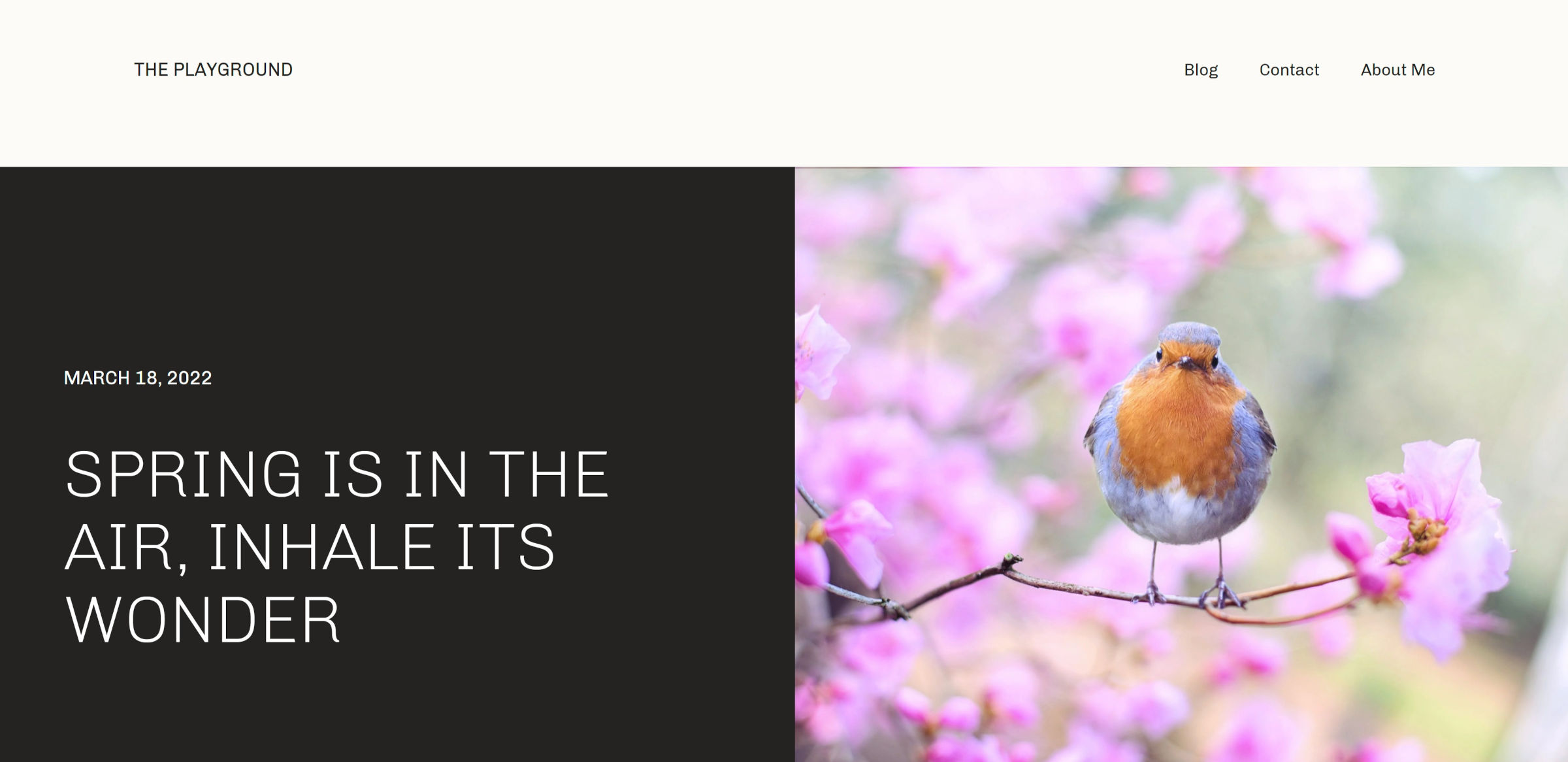
Perhaps the most impressive thing about the single-post header design is that it works with the limited toolset offered by the current Featured Image block.
If there is one knit-pick I have it is that the post and site titles do not align on the left side of the page, at least on wide-desktop views.
So, the single-post header is well-designed. How does the rest of the theme hold up? I am getting to that, but every now and again, something special about a design catches my eye. And, I cannot wait to let others know about it.
Automattic is the most prolific block theme creator to date. Its Theme Team has rolled out a dozen designs to the WordPress directory over the last year. Many of its initial outings had a familiar feel — tiny variations on a simple base. However, things have livened up recently. Livro, the dark theme that made me dislike dark themes a little less, and Skatepark, a unique experiment in its own right, represented a fresh start after the previous months began to feel stale.
Archeo continues that momentum. The theme is bold when it needs to be while making enough use of whitespace to not overwhelm readers.
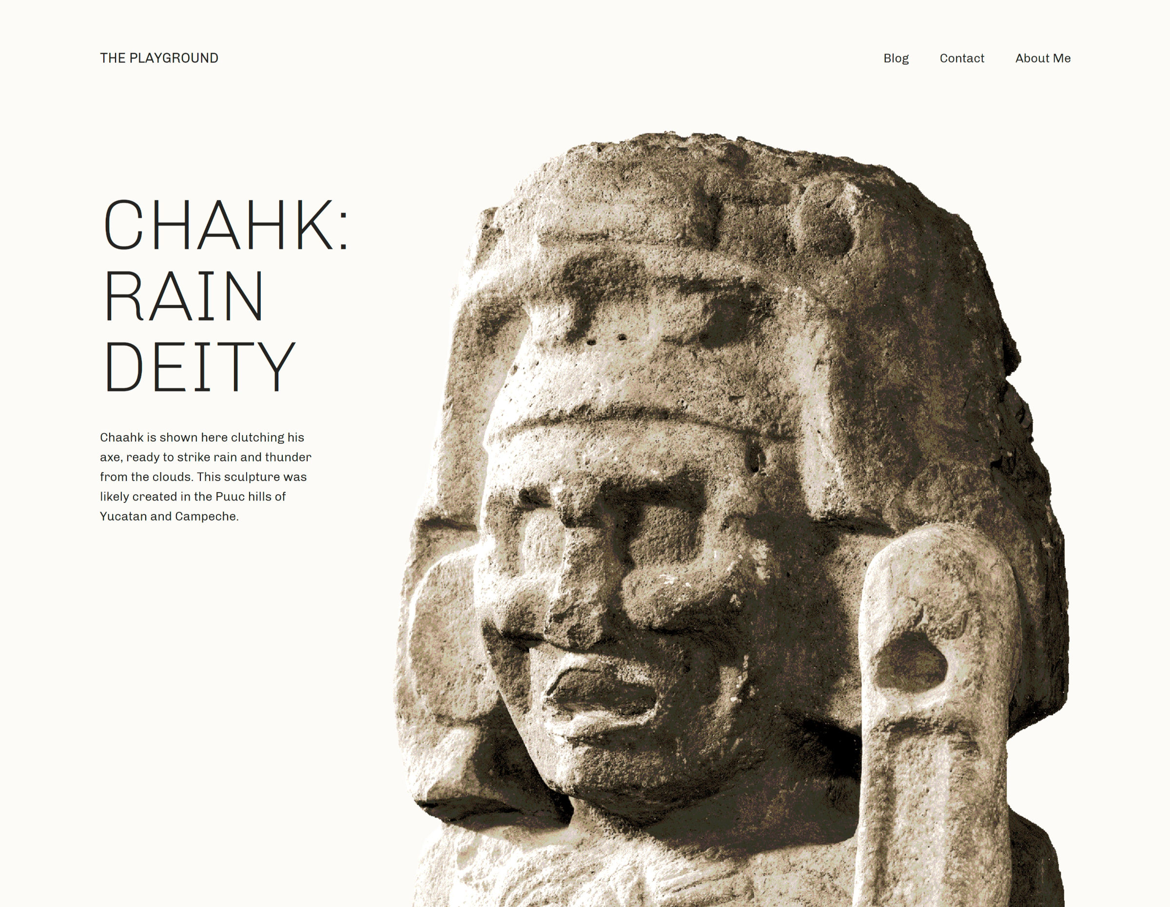
It is one of the few faithful representations of magazine designs that I have seen. No, I am not talking about the muddied term in some circles that confuses it with news design. It reminds me of those stunning feature layouts that would draw a reader into a story as they flipped through the latest gloss-covered print that arrived in the mail. I am a product of my generation and will always have a sense of nostalgia for the dying art form, and I love seeing web-based implementations of it when they work well.
Nearly every one of Archeo’s image-categorized patterns captures that essence of a magazine featured article. The following is one of my favorites.

The theme is described as being inspired by Mayan history and culture. Archeo’s patterns are littered with tidbits of historical text and images that make me want to learn more about the subject. Great design can speak to us in ways that we were not expecting.
As an aside, I would love to see creators who describe their designs as “inspired by” something to provide more insight into the subject via a blog post. For those unfamiliar with whatever that subject may be, it would pull back the curtain a bit, giving us a glimpse into why it was important to the designer.
Archeo is the first theme that I have seen use the upcoming web fonts API expected to land in WordPress 6.0. Users with the Gutenberg plugin installed should see the theme’s only font, Chivo, gracing the front end and editor. Those without the plugin should see their system’s default sans-serif font.
The following screenshot is of the theme’s 404 template and shows the Chivo font:
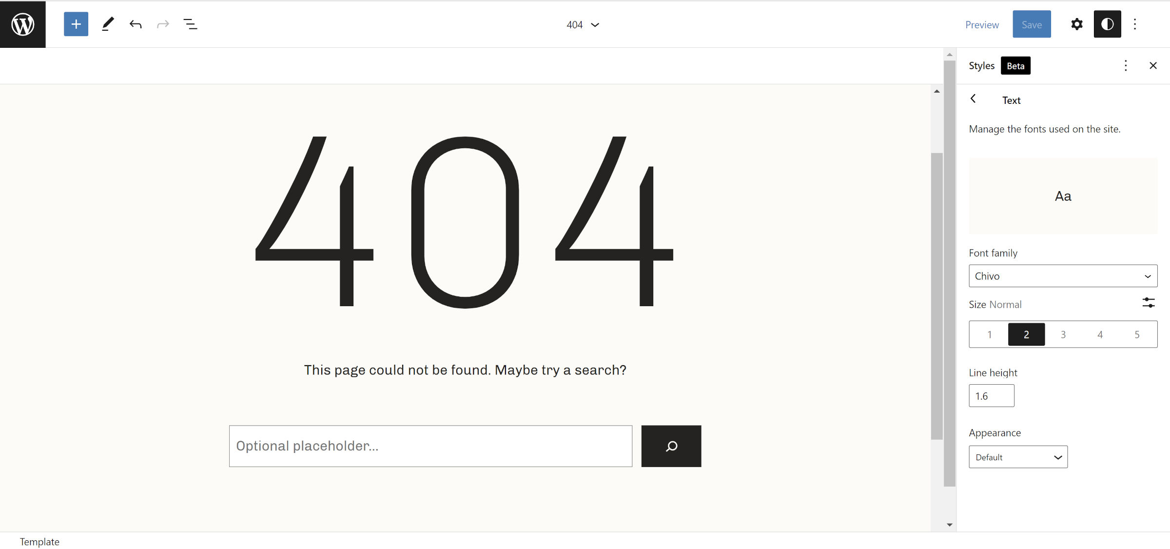
It looks far better than the default, at least on Windows. I recommend running this theme alongside the Gutenberg plugin for the ideal result.
I am surprised the Theme Team did not include a backward-compatible method of handling web fonts for WordPress 5.9 users. It would not have taken much code: a single hook and a check for whether the wp_webfonts() function exists.
Archeo is now the 59th block theme to land in the WordPress.org directory. I am eager to see more from Automattic’s Theme Team, especially if this will be its minimum standard with future designs.
I raised the issue of webfont support in WordPress 5.9 without the plugin with Automattic via Github, as it break Livro, too. (https://github.com/Automattic/themes/issues/5705) This is being handled here: https://github.com/Automattic/themes/pull/5718