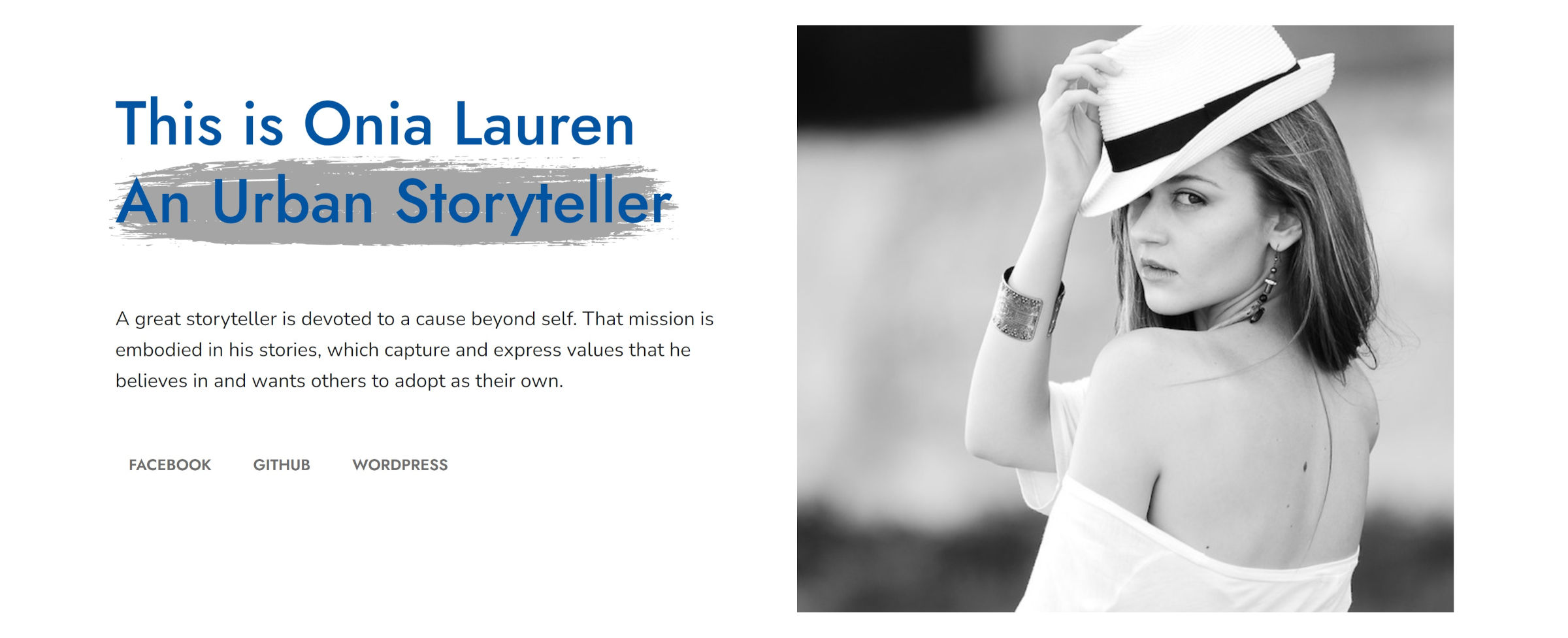
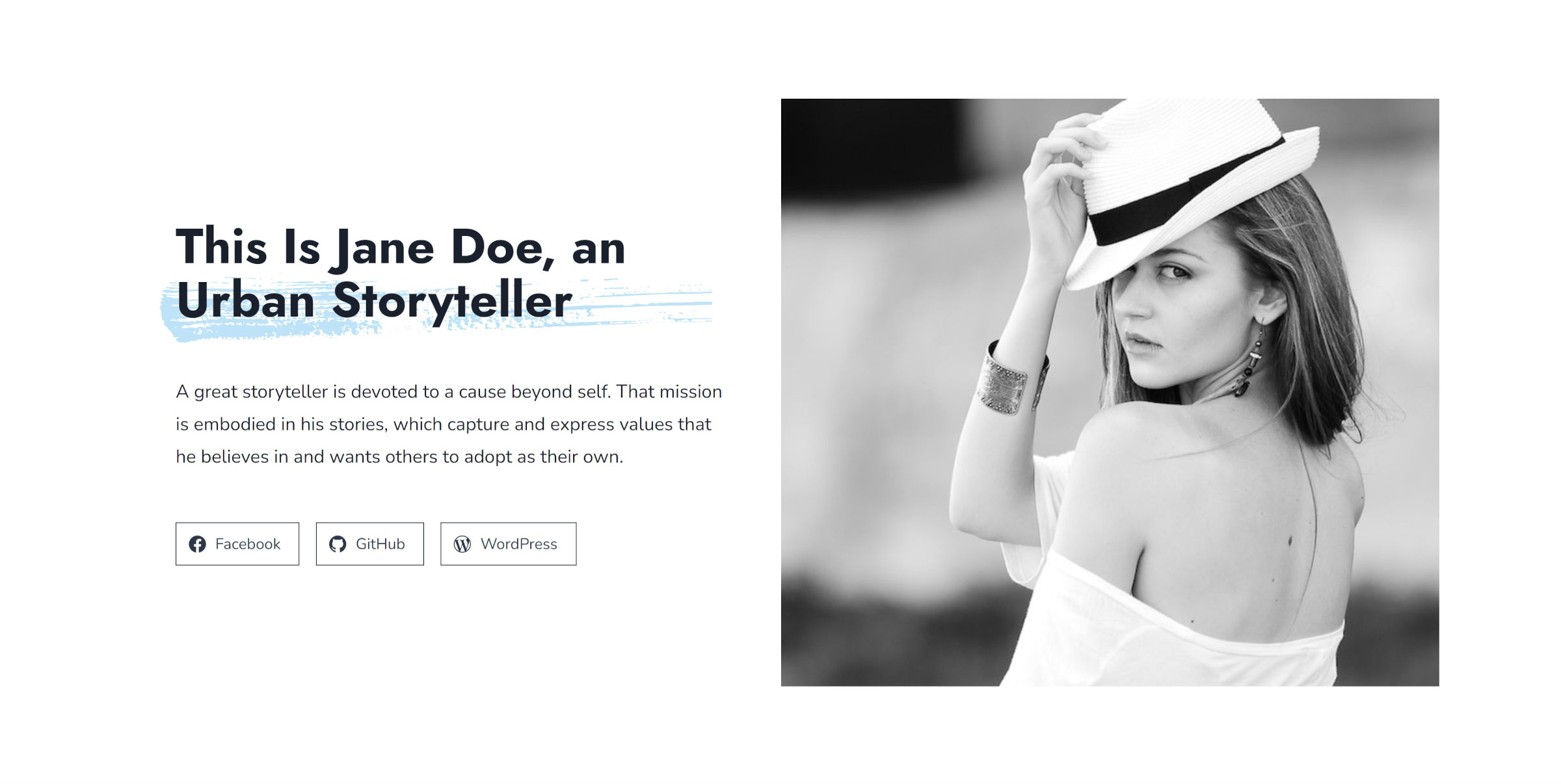
As I was looking over the latest releases from the WordPress theme directory this week, I came across one that caught my eye. Onia was clean and minimal while reserving its flourishes to bring attention to just a few elements across the page.
Could this be one of those diamonds in the rough I am always looking for in the free theme directory?
It had the potential, but it fell short. As I explored the theme, it felt like the author had spent 90% of their time designing an eye-catching front page. Diving into inner pages showed no attention to typography as the character count per line was pushing 150 and beyond, more than twice what it should be for comfortable reading.
That is the sort of thing that is easy to address. I was more disappointed that Onia was not a block theme. All the elements were there. It did not do anything particularly complex, and there was no evident reason for it to be a classic theme.
Yesterday evening, I sat down and recreated Onia as a block theme. Technically, I built its homepage directly from the editor on top of a base theme project I already had on hand. There were a couple of challenges, but I did the bulk of the work in roughly an hour. The other pieces took a little longer as I ran through possible solutions.
The following is a comparison of the two front pages (Onia is first, followed by my recreation):

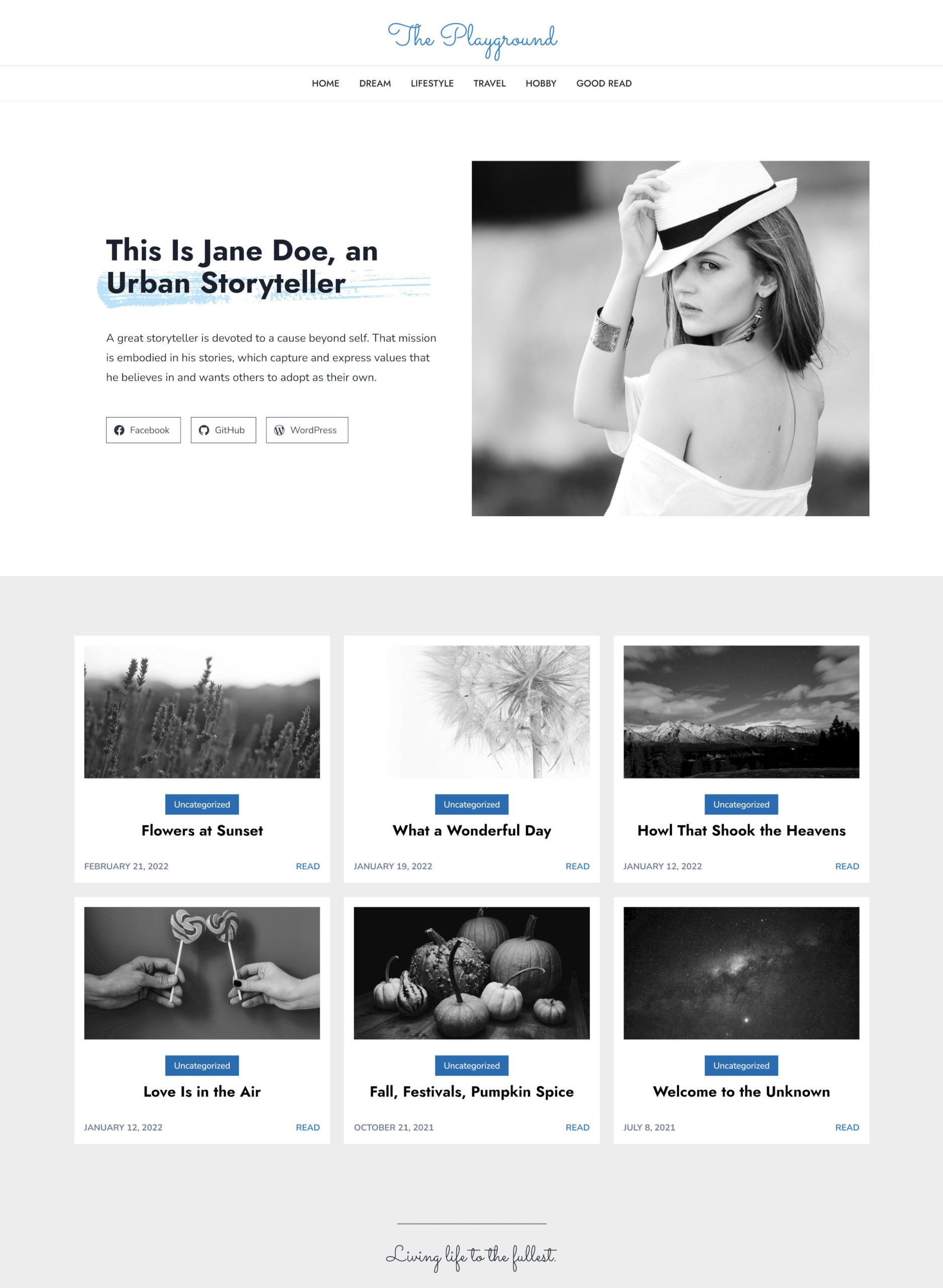
I obviously took a few liberties with spacing, sizing, and coloring. I was not attempting an exact replica. Instead, it was a bit of a reboot with a few spins on the original.
Some Quick Notes
One of the things that often frustrates me with themes is that they show off these beautiful logos in the demo but offer no way for the user to work with the same font. I was unsure of what the original font family was used in the logo, but I added Sacramento as a cursive handwriting option:

These features can make a difference for the average user. Not everyone can load up Photoshop and create their own specialized logo. However, they can type their site’s name and select a font option for the plain text version.
Technically, there are two features currently in Gutenberg but not in WordPress 5.9 that I used. The first is the Read More block. Onia had this in its post grid. As a theme author, I would have simply waited for this feature if it was a holdup. Considering that both the featured image and post title link to the single post page, it was not a make-or-break element.
The second missing feature is the “show labels” option for the Social Icons block. A workaround for the original design would have been to use a Navigation block instead since the links were just plain text. Another option would have been a custom block style for Social Icons. Either way, this was not a blocker for this theme being released as a block theme.
Every other design element of the theme is possible through the block system.
Brushstroke Block Style
I said there were challenges, but I use that term to mean “the fun stuff.” These are the pieces where designers and developers can dive into a problem and attempt to innovate, and they are the solutions that I want to share.
One of my favorite design elements of the theme was its use of an SVG to create a brushstroke behind the intro heading:
The theme used an old-school method of wrapping a <span> element inside an <h1>. This applies the brush background to the last few words of the text. However, that implementation is problematic with smaller devices, not keeping up with the natural flow of text-breaks as the screen changes. There was also no way for users to control the color of the brushstroke or text.
I wanted to know if there was a better way of doing this while offering ultimate flexibility to users.
Fortunately, WordPress News recently relaunched with a brand-new design that leaned heavily on brushstrokes. Plus, the theme is licensed under the GPL, so its assets are freely available.
Honestly, I wish I had looked at its source code before reading over various CSS help and support sites. Our community’s designers had already solved the problems I was hitting. All I had to do was adjust their solutions to fit my needs.
After a bit of wrangling, I managed to create a customizable brushstroke background for Headings:
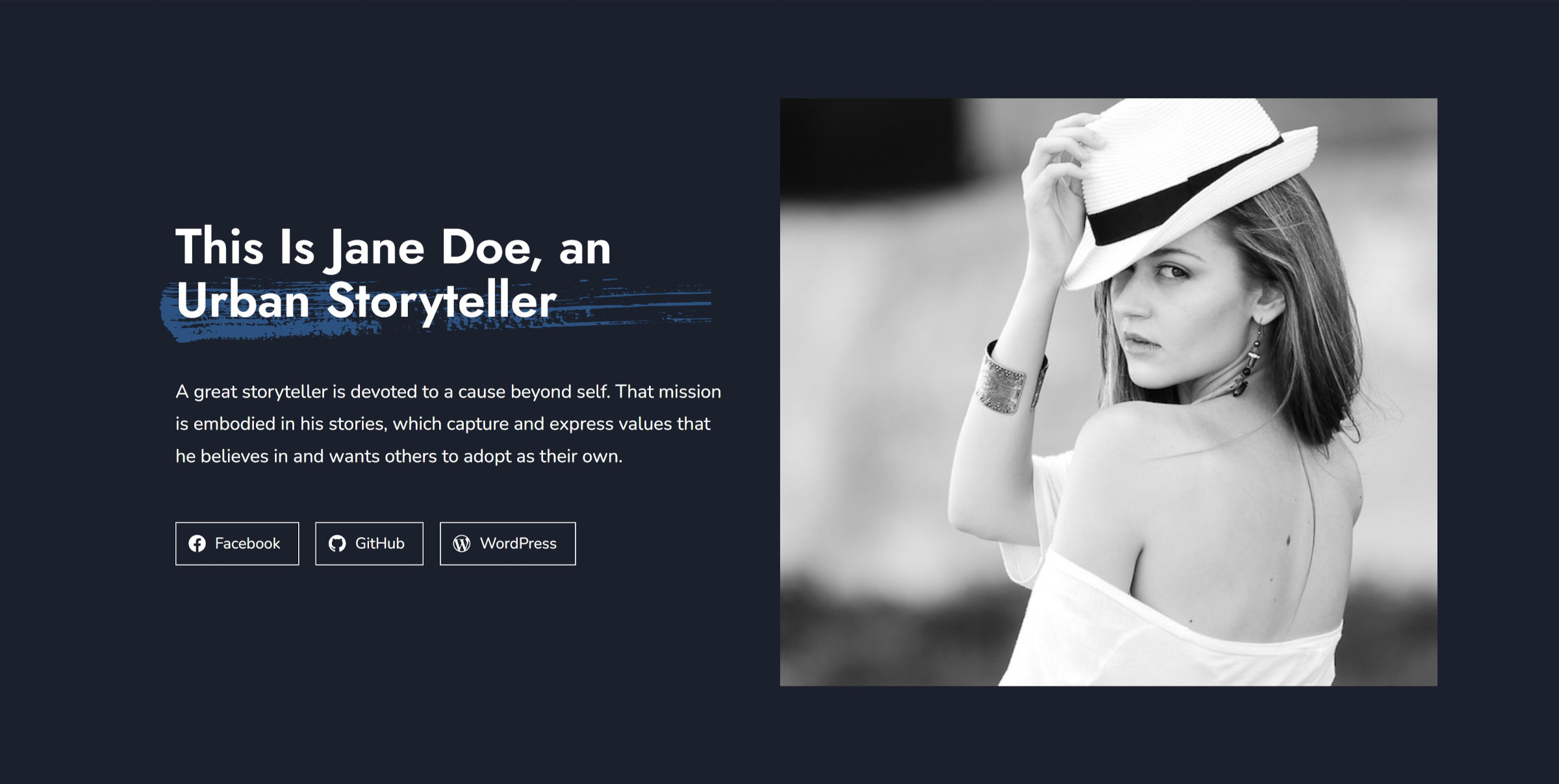
Users can adjust the text color as always. However, modifying the background color changes the brushstroke color. The stroke always aligns with the last line of text, so it will work regardless of the screen size. That may not always be desirable. However, other solutions exist for use cases like highlighting specific text.
The following screenshot is an editor view as I change the color:

To create the brushstroke background for Heading blocks, I added the following code to my theme’s functions.php file:
add_action( 'init', 'tavern_register_block_styles' );

function tavern_register_block_styles() {
        register_block_style( 'core/heading', [
            'name' => 'brush',
            'label' => __( 'Brush', 'tavern' )
        ] );
}
Then, I downloaded the brush-stroke-big.svg file from the WordPress News repo and added it to an /assets/svg folder in my theme.
The final step was adding custom CSS to my theme’s stylesheet. I covered adding styles in more depth in my previous Building with Blocks tutorial for those who need a refresher.
/* Cancel out WP's padding on headings with backgrounds. */
:is( h1, h2, h3, h4, h5, h6 ).is-style-brush.has-background {
    padding: 0;
}

/* Add default background to headings. Clip it to the text. */
:where( h1, h2, h3, h4, h5, h6 ).is-style-brush {
    position: relative;
    z-index: 1;
    background-color: #b5b5b5;
    background-clip: text !important;
    -webkit-background-clip: text !important;
}

/* Adds the brushstroke to ::before. Using ::after can conflict with editor. */
:where( h1, h2, h3, h4, h5, h6 ).is-style-brush::before {
    content: "";
    position: absolute;
    z-index: -1;
    bottom: -1rem;
    left: -1rem;
    height: calc( 1.25em + 1rem );
    width: 100%;
    background-color: inherit;
    -webkit-mask-image: url('assets/svg/brush-stroke-big.svg');
    mask-image: url('assets/svg/brush-stroke-big.svg');
    -webkit-mask-position: left bottom;
    mask-position: left bottom;
    -webkit-mask-repeat: no-repeat;
    mask-repeat: no-repeat;
    -webkit-mask-size: 100% 100%;
    mask-size: 100% 100%;
}
Most of those rules can be adjusted on a case-by-case basis. Some may need a bit of fudging, depending on the theme.
This solution could work for other blocks. I encourage theme authors to experiment and use other SVGs to see what they come up with.
Note: the Onia theme links to a CDN for its SVG background image, which is not supposed to be allowed on WordPress.org. I also could not find any licensing info on it. Being unsure if it was compatible with the GPL, I did not use the asset from the theme.
This brush stroke style gives me an idea for something. I’m gonna go totally overboard with it though!
One thing I noticed is that with the
z-index: 1on the heading block, if it is located close to a navigation block with a submenu, the submenu is obscured. This is despite the submenu specifying a higherz-index.Dropping the
z-indexfrom the heading but keeping the-1on:beforedoesn’t seem to stop it from working correctly, and the nav submenu was no longer obscured. At least that’s what I found in my limited testing.