The “version 1.0” launch of block patterns in WordPress 5.5 was overall successful. However, it was easy to overlook the problems while waiting for this feature to land after months of anticipation. Now that we have had a couple of months of seeing the block pattern system baked into core WordPress, it is time to address issues that are becoming more evident.
As much as I love block patterns as a feature, I cannot say the same for the user interface and overall experience. The pattern category dropdown added in Gutenberg 9.1 was a marked improvement over the endless list of patterns. However, it did not go far enough in presenting them in a user-friendly way.
WordPress has long had a habit of sticking too much into a tiny panel — many theme authors never felt like the customizer panel offered enough space, for example. The same seems to be the case for the block editor’s inserter panel. It is good enough for allowing end-users to pick and choose blocks. However, patterns are much larger than the smaller block icons. When users start scrolling through dozens of patterns at a time in the coming months and years, it will become a usability nightmare.
Paal Joachim Romdahl is proposing an alternative. His idea is to add an “expander” icon/button that would allow users to view more patterns at once via an overlay. At least this would be the case for larger screen sizes, such as desktop users.
“Viewing a lot of patterns in the small inserter panel does not work too well,” he wrote in the GitHub ticket. “It gets tiring needing to scroll one pattern at a time. Having a larger view will help the user to compare multiple patterns at once.”

Romdahl has also created a Figma prototype for people to test what the system would look like in a live demo. The UI is not polished, but it looks like a promising start.
He created the proposal after reading the Tavern’s recent coverage of WordPress.com’s launch of over 100 block patterns. Some of the pattern categories are easy to work through and find the right layout. Others, such as the Text and Call to Action categories, may have 20 or more patterns to scroll through.

If WordPress creates an official block pattern directory, which is currently under consideration, adding new patterns could be as simple as clicking a button. It would be an easy way to rack up dozens of patterns in moments, particularly if a user is trying out various layouts and does not uninstall unused patterns afterward.
Not many users are exposed to the hundreds of patterns WordPress.com’s users have access to. We should move forward with this proposal before they are.
An overlay for inserting patterns and templates is not a new concept. It is common in the WordPress development community. Plugin and theme developers solved this problem ages ago.
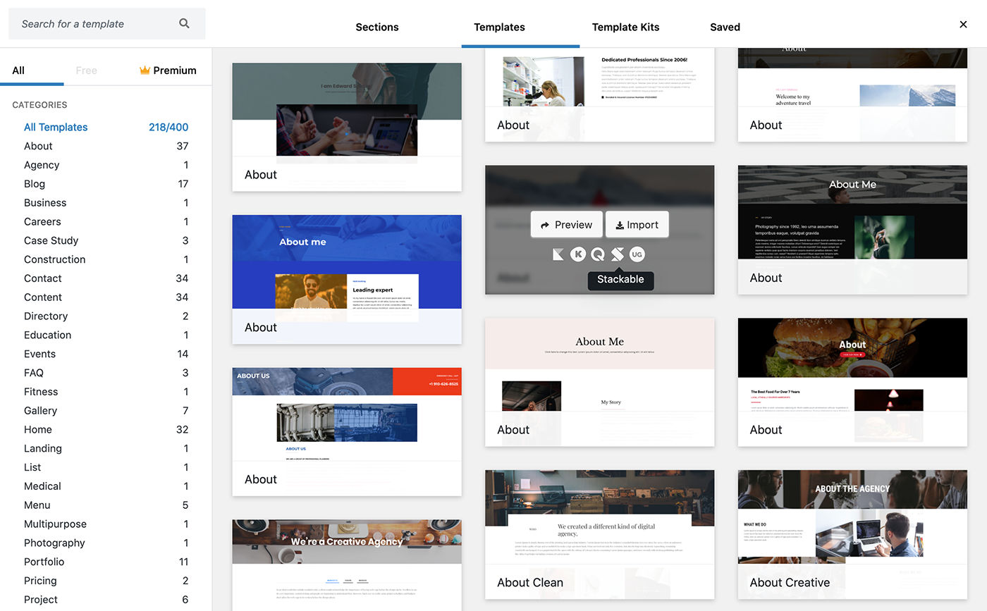
The Redux plugin handles hundreds of templates with an overlay:

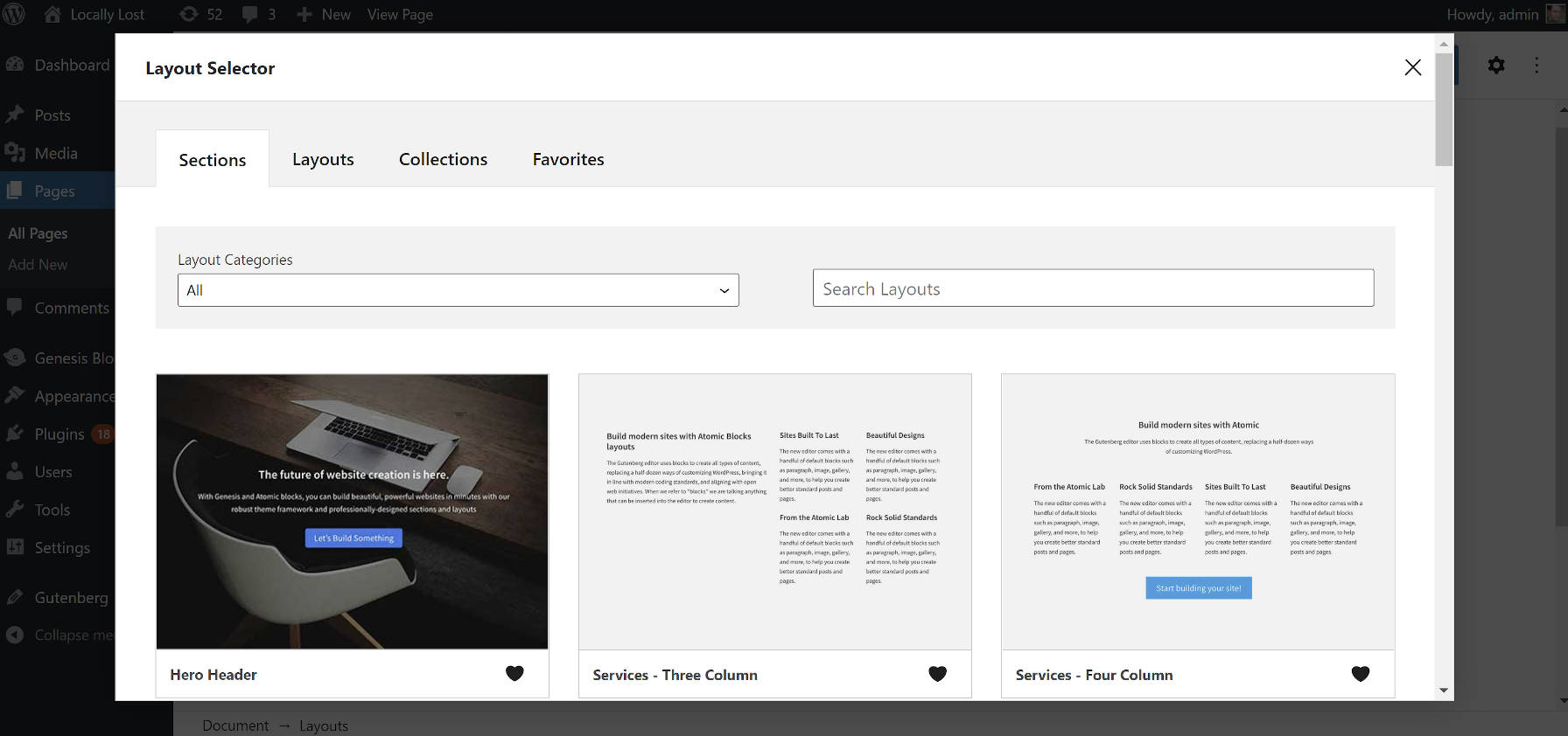
The Layout block from the Genesis Blocks plugin is essentially just a custom pattern inserter with a much nicer UI than WordPress:

Mikael Korpela added similar thoughts to a ticket related to the next steps for the inserter. He proposed a full-screen experience for browsing patterns.
“The patterns sidebar is great if you just want to keep it open while you modify your page, but it’s harder for browsing because of limited space, especially when you’ve registered a lot of patterns,” he wrote in the ticket.
He shared an image of how Sections on Squarespace are handled:

An overlay might also help drive the pattern directory proposal. It would be easy enough at that point to create a new tab in the overlay interface, hook into the WordPress.org API, and allow users to browse through installable patterns — no need to leave the comfort of the block editor.
Another common feature that many of these types of systems share is a way to save patterns as favorites. This makes them easy to locate in the future. Paul Lacey makes the same argument in episode #136 of the WP Builds Weekly WordPress News podcast. He wants his clients to have easy access to their most-used block patterns. This would be a nice bonus to help clean up the block patterns user experience.
Thank you for bringing up and discussing this topic.
I don’t know the Redux plugin, so cannot say anything about its quality per se, but their above shown overlay solution for the block patterns inserter comes very close to what I would like to have for my own work — all categories in a narrow column on the left, with the main part of the overlay showing tabs like, e.g., “Sections” and “Templates” (both of these being part of a hopefully growing WordPress library) and then two tabs for “My Sections” and “My Templates”.
Something along that way, and it will be a pleasure and no problem at all to quickly select the right choice among many hundreds of patterns.