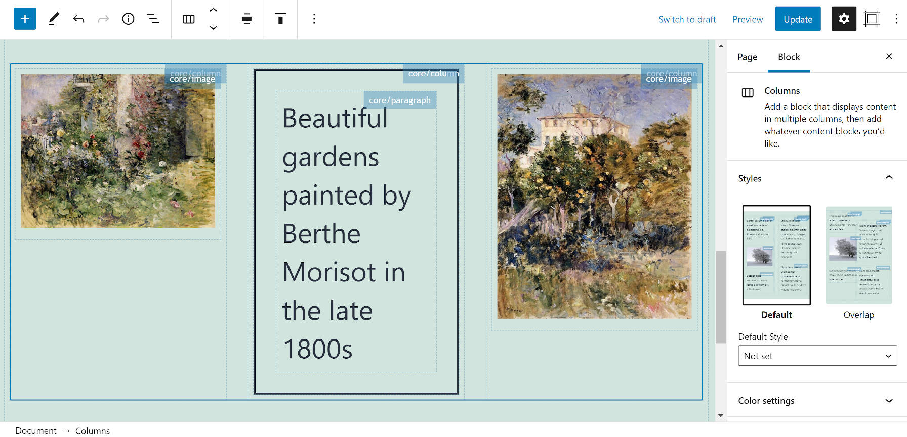
Last week, Kalimah Apps released its Editor Block Outline plugin to the WordPress plugin repository. The idea is simple. The plugin adds a bordered outline to each block in the document along with their associated labels. For some users, this will help them navigate more complex layouts.
There is little information available about Kalimah Apps through the usual WordPress-related channels. However, this is its second plugin in the directory. Its first plugin, which has not been updated in four years, was a massive library of over 40 shortcodes, 1,000s of icons, and dozens of animations. Editor Block Outline is much more scaled back and lean.
The plugin adds a new sidebar panel to the editor. Its icon, located in the upper right of the screen, looks like a picture frame. It has several options to allow users to personalize the experience, such as what contexts to show the outline and whether to show the block name. The latter option is sometimes best disabled when inserting blocks with many inner blocks. Otherwise, the interface may look a bit cluttered.
Users can also select an outline color, border style, and opacity. I recommend knocking opacity down below 50% for more of a guideline look, something that is visible but does not feel like it is a part of the content.
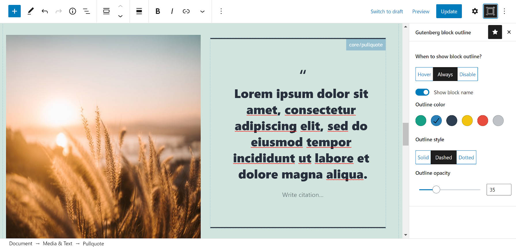
All of the settings are stored as user metadata. Using this data storage method means that each user can decide how they want to use this plugin. Or, they can even disable it altogether. Because it is stored this way, settings will carry over from one post to the next.
“Do you want to know the feeling of driving while drunk, or to move around with blinders on? Then use Gutenberg without this plugin!!!” That is how one user reviewed this plugin. While I may not describe the default editor quite so — ahem — eloquently, this plugin does solve some problems, particularly when you need to more easily click around the interface.
As Brian Gardner joked on Twitter, selecting some blocks like Columns is tedious work or a fun game of whack-a-mole:
Of course, there are ways around that, such as using the navigation tree, breadcrumbs, or keyboard commands. However, the block editor is meant to be a visual interface that allows end-users to simply point and click on the elements they wish to edit. Selecting specific blocks has generally improved over time, but users still run into issues. Editor Block Outline makes it a much simpler affair.
In Full Site Editing (FSE) mode with the Gutenberg plugin enabled, the plugin did not hold up quite as well. Depending on the theme in use, the blocks’ text labels were sometimes huge or did not match across the canvas. The plugin’s icon was also not available on the site editor screen.
FSE is still in beta. The plugin cannot be expected to work with it yet. However, this is where I imagine the plugin will make the most sense for many users. In the post editor, it would get in the way of writing long-form posts. However, the plugin could become an invaluable tool for navigating complex layouts in both the post and site editors.
More than anything, the reason I like Editor Block Outline is its dedication to a singular purpose. It adds a simple feature that enhances the editor without taking on too large of a role.
I have needed this so much glad someone is working on it!