 I’ve taken the MP6 plugin for a test drive and so far, my eyes love what they see. MP6 is an experimental plugin for testing out new ideas for the various UI elements that are within WordPress. My first reaction after activating the plugin was, WOW. The textual elements on the screen instantly became easier to read. The icons along with the colors of the left navigational menu were more pronounced and the post writing screen becomes easier to use. I couldn’t help but notice that I recognized some similarities between what was in MP6 versus the Fluency Administration theme.
Here are a couple of comparison screenshots between MP6 and Fluency.
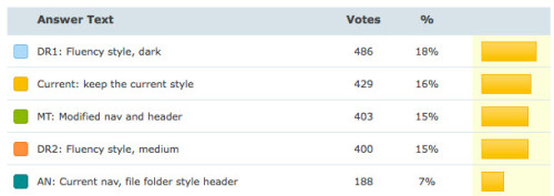
Personally, I like MP6 better than Fluency but I wanted to bring all of this up because back in 2007, WordPress 2.7 “Coltrane” was released and its major feature was the user interface overhaul. In April of 2009, a poll was conducted on WordPress.org where users voted for which design tweak they liked most. While the dark Fluency style contained the most votes, the conclusion of the poll was that overall, a darker color scheme was preferred.

I reached out to Matt Thomas, one of the driving forces behind the MP6 plugin to ask him about these similarities between MP6 and Fluency as well as what the future might hold for MP6 items reaching the core of WordPress.
Q: Regarding the style and design of MP6. Were there any inspirations taken from the Fluency admin theme? Back in 2009, there was a poll conducted on possible design Tweaks and the dark Fluency theme beat every other alternative in the poll http://wordpress.org/news/2009/04/poll-results/ and when I checked out MP6 today, it looked similar in ways, in others not so much.
Also, MP6 is an ongoing experiment but is its links tied back to that poll, knowing full well that there was definitely an audience that would love to see a darker back-end?
There’s almost nothing we haven’t looked at in finding inspiration for MP6. Medium, Readmill, Twitter, Squarespace, Simple.com, we’ve got a vast collection of bits and pieces of UI that have inspired pieces of what you see in MP6. We didn’t directly rely on that survey or the comments from that development cycle, considering how much has changed since that time. But I’ve always been a fan of the Fluency plugin, though I never used it much since I blog on WordPress.com. It inspired my submissions to that 2.8 redesign discussion you mentioned, as well. And we were very glad to see that Dean is following the progress of MP6 and likes where it’s headed. http://make.wordpress.org/ui/2013/03/15/mp6-version-0-3/#comment-22786
Q: While testing Fluency, it’s only compatible with WordPress 3.2. Keeping up with WordPress through the administration theme has to be tough work. Are there plans to keep this plugin updated along side WordPress for the foreseeable future or even perhaps add it to core as an option people could choose within their profile?
Definitely, it’s difficult to keep our development coördinated with trunk just in the course of a single development cycle. Based on my preliminary conversations with Mark J and Nacin, I expect we’ll hand over MP6 to the core team around the beginning of the 3.7 development cycle to begin its implementation into core.
Q: Last but not least did Dean J. Robinson contribute to anything in MP6?
Didn’t contribute directly, but see above for the generous feedback he gave us.
Four years ago, users showed their support of a darker toned WordPress administration area. Is it no surprise then that so many people are loving the way the back-end looks with MP6 installed? After going through major interface design changes in WordPress 2.3, 2.5, 2.7, and witnessing the frustration by fellow users, I commend the WordPress team on their new approach to design changes through a plugin versus outright putting it on our plates with a new release. In this way, we can avoid drastic interface changes from one release to the next and instead, use the plugin as a continual testing ground for enhancements.
To those who are using MP6, what are your thoughts? Would you like to see what’s presented within MP6 to be the next design iteration of the WordPress back-end or are you content with the current grey-blue color scheme?
Hi Jeffro,
Thanks for your detailed information
This new admin is absolutely stunning!
The only thing I see that I would like to have back, is that when I roll my mouse over the left main admin menu links, I can’t see the sub-links modal popup. That forces me to have to click the parent item, wait for it to load, and then go into the sub-menu item. It’s just a waste of time and a click when you are in a hurry and already know where you want to go.