Luke Carbis and Rob Stinson, two of the three-person Block Lab team that WP Engine picked up in 2020, are back together on a new project. This time, they are joined by Byron Keet. The trio is taking on the WordPress charts space via a suite of blocks named Hello Charts.
“Some folks launch deals on Black Friday,” wrote the team last week in only its second tweet since July. “We’re launching an entire product!”
Carbis pointed out that the team strived to create a block-editor native plugin. There are no admin screens or settings pages, and the user just works from the editor.
The marketing material on the website homepage claims that Hello Charts is “the first charts plugin built block editor first.” However, SB Charts has been around for nearly a year, and Chart Block landed in the WordPress plugin directory several weeks ago. Charts Blocks for Gutenberg, which supports CSV imports, got its initial release half a year ago but has not been updated since.
The claim of being first is, perhaps, a slipup in marketing. The only reason I spotted it immediately is that I have been keeping a close eye on similar plugins for a while, hoping to find a decent charts solution for the block editor. While Hello Charts may not technically be the first to land, it offers the best user experience yet.
For most cases, I rely on bar and line charts. However, the plugin offers five block types in total:
- Bar Chart
- Line Chart
- Pie Chart
- Polar Area Chart
- Radar Chart
Each works almost the same when entering data and customizing the output. There are a few options and controls that are specific to each type. Plus, users can transform from one chart block to another and back again at the click of a button without losing data.
After familiarizing myself with the options, I built a three-year product sales data chart by month. I started with the Bar Chart Block, which made the most sense. Each of the blocks has an “Edit Chart Data” button. Clicking it opens an overlay on the screen that works like a typical spreadsheet program.
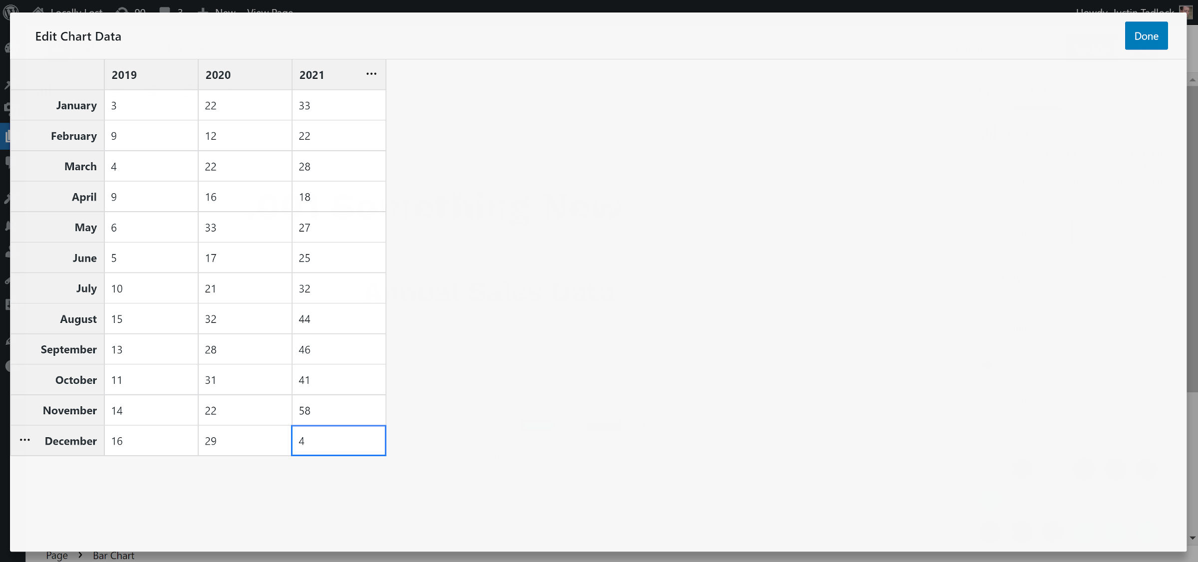
Users can tab through each cell, adding data and creating new datasets or rows. There are options for duplicating datasets or adding new ones before/after by clicking the ellipsis button. It all felt straightforward for someone who has not spent a lot of time working with spreadsheet software since high school computer class.
After a couple of minutes, I had a bar chart. All I needed to do was adjust it to use my theme colors.
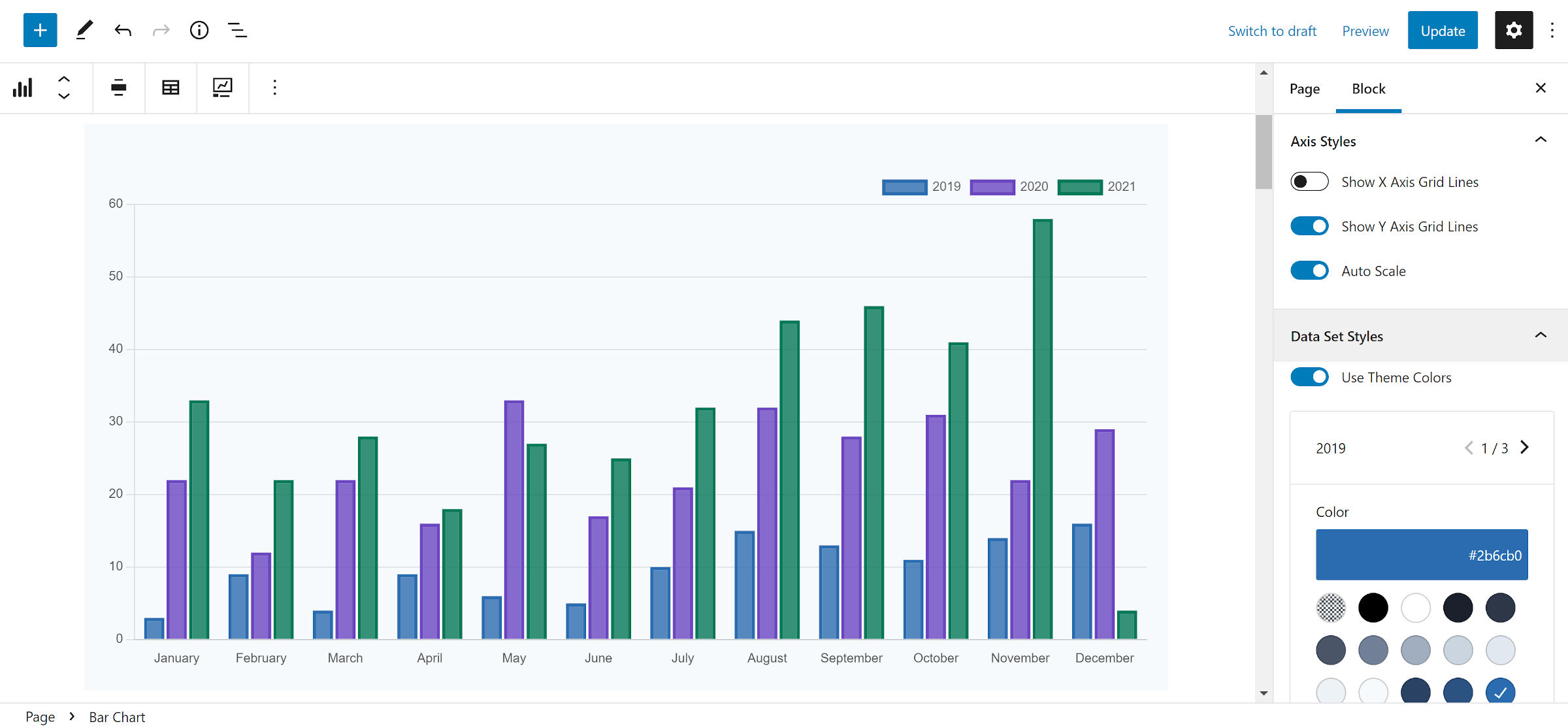
The plugin’s customization options were plentiful but balanced enough to not become overbearing. I just wanted it to match my theme’s design without a lot of fuss, and it did not take long to make that happen.
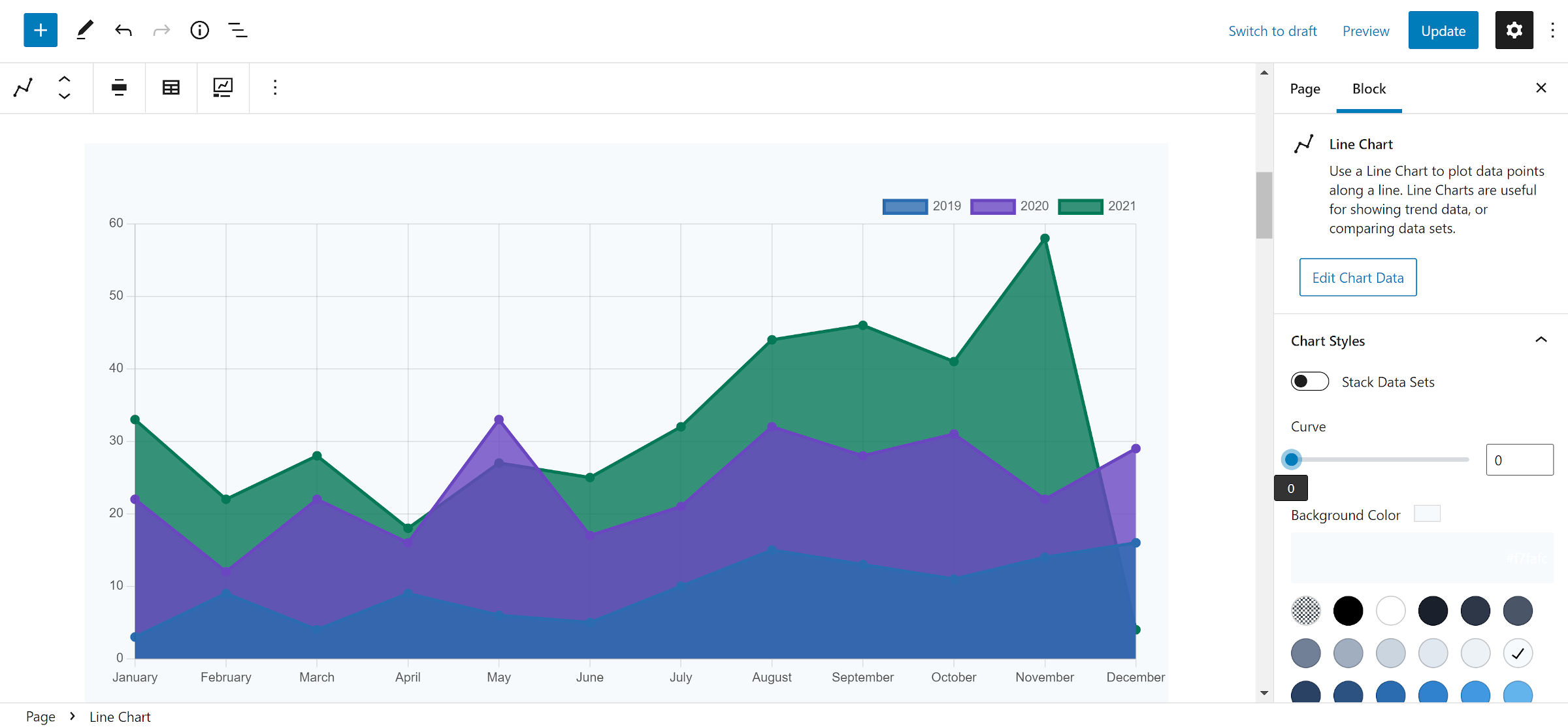
I added a Line Chart block to the editor using my existing data. The only adjustment I needed to make was the “Curve” option. I wanted my lines to look straight instead of flowing in waves. I was already wondering if the team had thought of everything before I knew I even needed it at that point.
For good measure, I tested out the Pie Chart block. It is a chart type that I may get the occasional use out of. Overall, it performed as well as the others.
The feature I missed was printing the data for each of the pie segments on the screen. The data is available via a popup on hover or focus, but visitors cannot see all of the segment data at once.

Admittedly, I did not spend much time with the Polar Area Chart and Radar Chart blocks. My experience with them is non-existent in real-world scenarios, so I do not have a solid grasp on whether there are features that others might want. I simply tested them to make sure they worked. Like the other blocks in the set, I hit no issues.
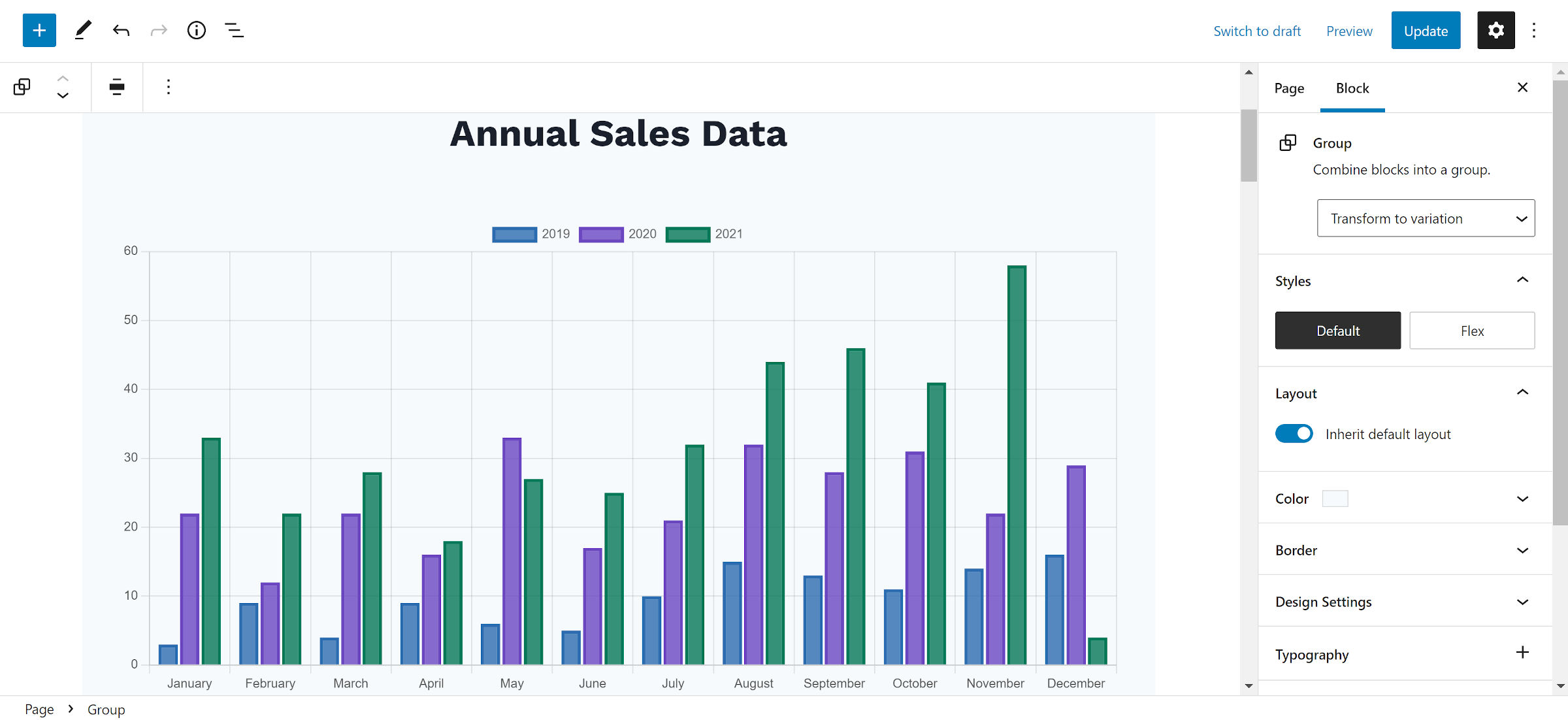
I would like to see a title or caption option integrated into the plugin’s blocks. However, both are easily added with a Heading or Paragraph block. To match the background, wrapping in a Group block helps, as shown in the following screenshot:
A couple of other welcome features would be color options for the X and Y-axis lines and the data text along with block-gap or margin support. The legend spacing left a little to be desired, often butting up too close to the chart output. It has several positioning options, but it needs some extra whitespace, especially when it sits at the top or bottom.
Overall, I could not find much to complain about. Hello Charts is a plugin I would recommend to anyone who needs a chart solution that works like it was built for the WordPress block system.
Purchasing Flow and Setting Up
You can get a bit of mileage out of the current free block plugins, but Hello Charts is well worth the price upgrade. It may even be underpriced for the value. If the team builds in CSV imports, it would be an outright steal.
Users can buy the five individual block types for $4 individually or upgrade to get them all for $16. These offer lifetime updates for a single site with no support. There is a heftier $199 tier for unlimited sites and a year of support.
There is only a single plugin that users must install. Each of the block types is bundled in the plugin. Users are technically buying a license key to activate each one.
Carbis offered me discount codes to test how this purchasing flow worked and provide feedback. The team wanted to take a different route with purchasing blocks. Instead of creating an all-or-nothing deal for users, they could just purchase what they actually need. “So if you need a bar chart, just buy a bar chart block,” said Carbis. “Or you can get all the chart types as a set.”
I had no problems going through the purchasing flow. I began with the Bar Chart, a block that I would need more often than the others. Then, I upgraded to the entire set.
The only hiccup I had at first was figuring out how to activate the licenses since the plugin did not have a settings page. The license field is actually on the Plugins admin screen.
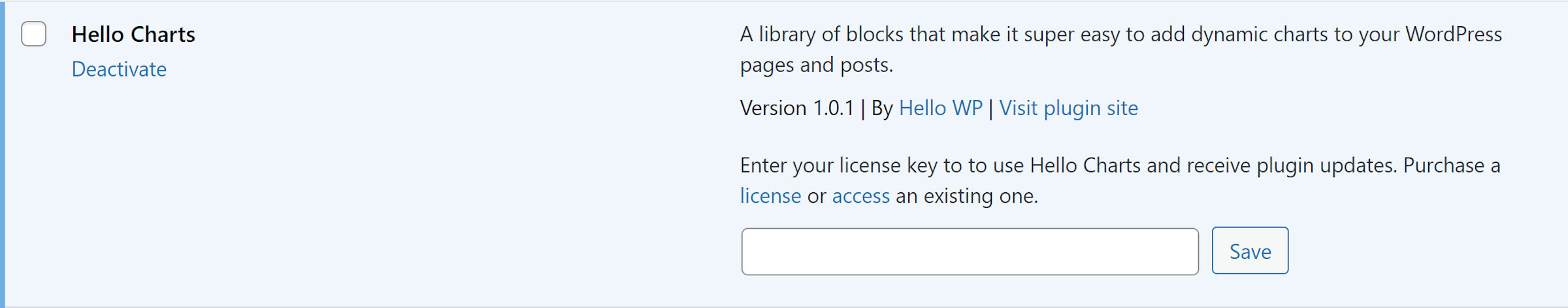
The downside to having separate licenses for each block type is that users must enter the key for one, submit it, wait for the page to reload, scroll down to the plugin, and start all over again with another license. The process was so painful that I wanted to forego testing the chart types I had no interest in. However, I pressed forward, entering license key after license key.
Yes, I am exaggerating a tiny bit, but it would be far easier to enter multiple license keys at once or not wait for the page load. This just happened to be one part of the experience that did not live up to the standard set by the rest of the plugin.
It’s worth noting that Hello Charts and all of the other chart blocks mentioned use the Chart.js Javascript library in the front end, which weighs in at 184kb. This is pretty heavy and could really impact performance on sites that already have a lot of Javascript running.
I’d like to see a chart block that uses an SVG-based charting library to render the chart in the editor and save the markup in the database, which would then require little to no client-side Javascript for visitors.