Gutenberg’s Custom Spacing Should Be Theme Controlled

Using the padding control for the Group block in the WordPress editor.
Adjusting padding on a Group block.

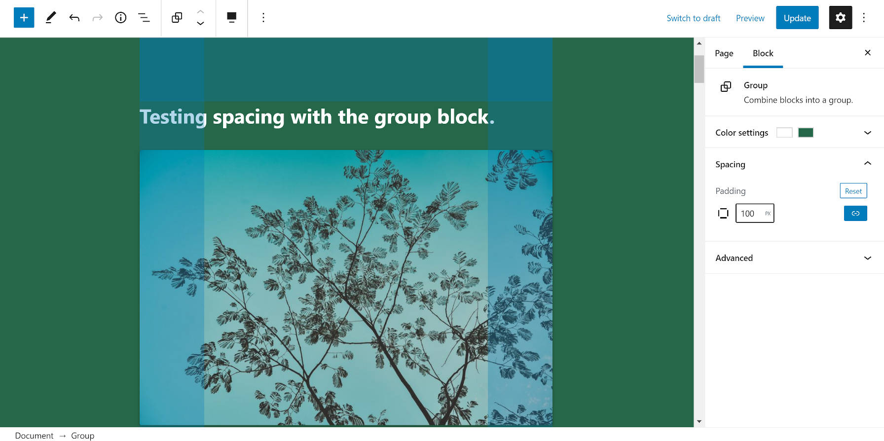
When Gutenberg 9.0 landed earlier this week, it came with an experimental padding control for the Group block. Most users will not see it unless their theme has opted into supporting the feature using the experimental-custom-spacing flag.

This was not the first that we have seen of the padding option on a block. Gutenberg 8.3 introduced it for the Cover block. Since then, nothing has changed with the implementation.

The problem with the custom spacing/padding option is that it creates an inline style that does not adjust based on the design of the theme. Fortunately, the feature is still experimental. This means that we have time to reevaluate how it works.

Unless we’re doing away with any remaining illusion that themes will play an important aspect of WordPress’s future and front-end design becomes fully entrenched within core, theme authors need some level of control. And, even if themes are going the way of the dinosaur, custom padding numbers on the block level will create design consistency issues down the road. Using 100 pixels of padding might make sense within a site’s current design, but 96 pixels might make sense within a future design. When a user adds dozens or hundreds of blocks with custom padding today, it will wreak havoc on tomorrow’s spacing and rhythm.

Besides that, the average user has little concept of design rules. Having a standardized system for spacing would give theme authors control over the output while giving end-users the ability to customize the look.

I have argued that WordPress needs some sort of design framework. For example, Tailwind CSS has specific padding classes. So does Bootstrap and nearly every other CSS framework. The web development community has been down this road. It is a well-trodden path, and WordPress is not innovating by using inline styles.

If the WordPress platform is going to put this sort of power into the hands of its users, it should do so in a way that allows designers to do their thing and not push users toward semi-permanent, inline-style soup in their content.

Pre-Gutenberg, I would have been entirely against the idea of WordPress introducing any sort of CSS or design framework. However, the platform is consistently moving toward becoming a UI-based design tool rather than simply a way to manage content. Users will have design-related options on a global scale all the way down to individual blocks. Users should absolutely have the ability to adjust a block’s padding in such a system. They should not need an understanding of CSS to do so. Instead, for most use cases, users should be able to adjust padding based on whether they want larger or smaller spacing, not specific CSS values.

I propose a full set of standardized padding classes. The same would go for margins or other design-related options down the road. Gutenberg/WordPress should create a set of default values for these classes, which theme authors could override based on their design.

This is not a new concept. Dave Smith, a developer for Automattic, introduced a patch in 2019 that used named selectors for spacing on the Group block. He gave the following reasoning for choosing this approach over absolute values:

Imagine you are a Theme designer. You craft your CSS with spacing that is perfect for the design. You want to ensure that is consistent throughout your Theme, even if the page layout is being created by the end-user in the Block Editor.

With the approach I’ve taken here, when a size is selected only classes are added to the Block in the DOM. This affords the Theme creator the opportunity to provide custom sizes in CSS that are suitable for their Theme. If they opt not to do this then sensible defaults are provided.

With the pixels approach, we’re locking users of the Block into absolute values and asking them to make a lot of decisions that they’d probably prefer not to have to make. It could also lead to an inconsistent visual experience.

This ship has already sailed and sunk with custom colors and font sizes. Gutenberg had an opportunity to standardize class names for these options but left it to theme authors. As a result, there is no standard across the theme market, which means that choosing the “large” font size or the “blue” text color provided by the theme will likely not carry across to the user’s next theme. Now, we are on the cusp of far more design-related options as WordPress moves toward full-site editing. It is time to consider some standards on design-related class names and provide a framework that all themes can use.

Gutenberg could still provide a custom padding option just like it does for colors and font sizes. Users who choose to go this route would be making an explicit choice to work outside of the standard. But, let’s not go down this road of allowing users to set absolute spacing values as the default option.

10

10 responses to “Gutenberg’s Custom Spacing Should Be Theme Controlled”

  1. This certainly gets the block editor more into the page building vs
    content creation side of things, which I don’t think is a good
    development. I don’t know if there should be a style framework but
    spacing patterns should primarily be left up to the theme unless the
    theme author chooses to make manual spacing an option. We already use
    modifying classes for block styles. I don’t see why spacing can’t take
    the same approach. Keep the experience for the editor easy for the user,
    don’t make layout formatting part of the content structure and editing
    experience.

    That’s my thought at least.

  2. Spacing block is very convenient, but leaving the user total freedom to adjust its size bothered me too.

    I like the suggestion of having 3-4 predefined default sizes (e.g. small, medium, large etc) instead of leaving it entirely up to the user. Then, the themes would be able to override those values, remove them, or assign new sizes. In some ways, the functionality is similar to how thumbnail sizes work.

    An approach like that would also give the Theme’s developers the power to use pixels, ems, rems, vh, or whatever they like.

  3. I actually like this way. I prefer working on a post basis. And it is not a creative website, just casual. I do have a theme. But for me, what people want of consistency in the theme makes my post editing more difficult. If I want to edit the block, considering the block context, I should not need an external page to do that (the theme). I can only do that as it currently is.

    I believe my commentary adds to the discussion the person of the admin, important too. The person that choses the theme, should not be locked by it. As the admin of a website, I want myself to be able to adjust the theme and the content.

    Themes should be able to disable features (as it currently is for this experimental spacing) on a block basis. By doing so, admins should still choose to disregard the default position of the theme on a single small feature. On the theme settings, admin should be able to turn off or turn on the way its theme considers the relevancy of this experimental feature.

    It should not be difficult to do create that mechanism. Themes that don’t want to even allow this granularity to admins simply don’t offer it, and the mechanism ia set as “default”.
    Best for everyone. What we have here is a difficult choice: which side of the coin.

  4. Agree. Gutenberg should provide variables, not fixed values. (Sidenote, paddings & margins should never use “px” unit. Rem is better for scaling padding & margins with typography settings from browsers.) If a system of named selectors is used, I hope it’s not the usual scale of sm, md, lg, and xl, which is a short range requiring big jumps between levels.

    Something like the Tailwind system is more flexible and future-proofed. Every four levels represent 1 rem and you’re able to set the original rem value to whatever you like.

    Gutenberg will eventually become a page builder. Momentum of small stuff like this will carry it there. I hope Gutenberg team will look to best practices in the last 5 years of theme development and dnd page builders rather than continuing to blaze their own path. Simply build on top of best practices. It’ll make your life so much easier.

    On the flip side, Gutenberg is a knock off of Square Space and Medium, which is frustrating to witness. It’s definitely not what I mean by building on top of best practices. This reminds me of Tumblr and when WordPress post formats were a thing. SMH. WordPress can do so much better if it would just be itself—cue Mitch Hedberge’s joke about hating turkeys.

    If you’re going to steal from Square Space, steal the entire thing because small differences and butterfly effect will lead to mediocre results. For example, Square Space icon style, sizing, and spacing are a lot more well designed. We can’t just take Square Space interface and slap another set of icons on it.

  5. The block editor has to become a page builder to really get embraced by the larger audience. That’s just the harsh thruth, mostly towards theme builders. I love blocks, but mostly use the Ultimate Gutenberg addon cause the wp blocks lack any form of design: padding, margin, breakpoints per block, etc. Expecially the lack of responsive settings for individual blocks is still unbelievable to me. Gutenberg’s way of design thinking is a desktop, while every designer stated since 2014: mobile first.
    I love Tailwind too. Tried that out, worked fine although the class field is Way to smal, make that a text area please. But still, for non-techs it’s not a user friendly solution, or there has to be a innovative UX system around it. Editorskit has an fine class suggestion feature, if we can connect that way or working with Tailwind and keywords, maybe there’s that innovative design workflow.

  6. Big word. Vertical rhythm of the site belongs to the theme, which will best able to handle the block’s responsivity. “Spacer” controls add unnecessary complexity that lives outside of content management, and there should at least be a very simple way to only allow the selection of pre-determined spacing.

  7. I have always thought that Gmail gives me the perfect level of control when offering “Default”, “Comfortable”, and “Compact”. What if theme’s could opt in to a 2-, 3-, 4-, or 5-step scale of spacing? You’d get the best of both world’s: A quickly-customizable way to make a theme feel really different and portability between themes. Per-block margins and padding are terrifying for anyone thinking beyond a DIY user, more than 5 pages on a site, and/or a website that is built to last 20 years, rather than 1.

Newsletter

Subscribe Via Email

Enter your email address to subscribe to this blog and receive notifications of new posts by email.