Gutenberg 9.4.0 was released this week with many small improvements to existing features, while work on full site editing continues. This release will not be included in the upcoming WordPress 5.6 release but those who are using the Gutenberg plugin will have access to the improvements right away.
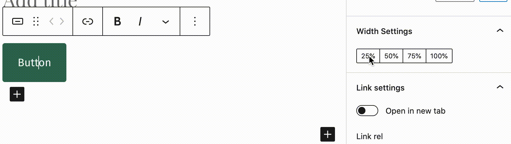
The button block now has a width selector, which allows the user to set the button to 25%, 50%, 75%, or 100% of the parent container. By default, a button’s width is determined by the size of its content. If you like bigger buttons, this update will give you more flexibility. Button margins are also included in the width calculations, so users can create multiple buttons in a row, or a grid of buttons, and have them properly fit together and aligned.
Making a button is easier than it has ever been before. Gone are the days of using shortcodes or hunting for the correct CSS class to apply in order to match the theme. Button creation used to be so needlessly difficult with a fragmented, unfriendly workflow, but the block editor continues to chip away at the complexity with each new release.
Version 9.4 also introduces typography controls for the list block. Gutenberg contributors have been discussing adding color and text size customizations to all text-based blocks since 2018, and the list block is finally getting some font size controls.

Social icons can also be resized now. Users can select from several preset sizes, including small, normal, large, and huge.
The 9.4 update adds support for <kbd> tags with a new button in the overflow rich text menu. These tags are useful for displaying content in the browser’s default monospace font, which helps when writing documentation or articles with inline code.

This release lays the groundwork for handling block variation transformations. Block variations are essentially the same block with registered variations that appear as a separate block in the block inserter. For example, the navigation block has horizontal and vertical variations. The editor now introduces a transform option for the scope field in block variations, so developers can control how to handle these transformations.
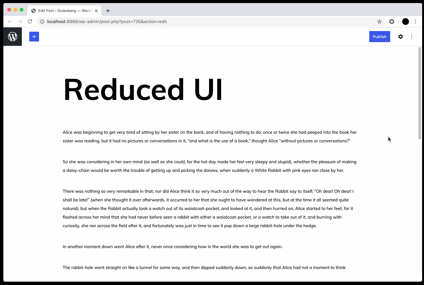
Enhancements in this release add polish to many aspects of the UI, including the inserter search, custom select menu styles, the link interface, Search block styling, shortcode block styling, and reduces the UI on hover (an optional setting in preferences).
One handy new feature for writing is that users can now add a header by typing /h1 to /h6 followed by enter/return. While I like the idea of this, it seems unintuitive to have to use enter/return to change the block to a header. This feature would be easier to remember if it mimicked the existing feature that allows users to add a header by typing ### followed by a space. Changing the trigger action to a space instead of a return would make more sense here.
Version 9.4 also includes a great deal of progress behind the scenes on experiments, including the full site editing framework, FSE blocks, the site editor, and global styles. Check out the changelog for a full list of bug fixes and enhancements.
I would think about how to change the settings from being narrowed inside tiny sidebars and the question what happens with people which invested in 27″ iMacs, 24/32/34/38/43+ monitors which are primarily professionals?
Shouldn’t the UI take into account that customers could vary from people using their iPads and MacBook Airs, to people who use iMacs and Wide screen monitors.
There is absolutely no sense for people with desktop monitors to have every setting in these tiny sidebars and the buttons aligned on left and right when the window is maximized on a 30+ inch monitor for example.
All major softwares like Office softwares, G Docs etc utilize the space based on the device that you use. It would make total sense for Gutenberg and WP in general to do that.
Just because 90%+ of the devs use 13 to 14 inch MacBooks, doesn’t meant this is the primary customer base.
If unsure, I think there could be an optional analytics data feature in WordPress which could give the devs a general understanding of the OS, device and screen size for all WordPress users, so they could get who’s their primary target is.
I didn’t invest so much money in these big monitor just to have all my settings tied in a tiny sidebar.
Yes, I do understand that people don’t like the idea of Genesis to use wide popups and this is not what the Gutenberg team wants, however, there must be a way for all those who work in a professional environment with giant desktop monitors, to have their buttons if they want that.
It is sad to ask this each time and to see even more features being hidden away which results in more clicks, less drag and drop and less intuitivity.
I think in order for Gutenberg to stop being hated so much, they should think about adjusting a flexible UI that is suitable for every screen size and device and choice. Hiding key functionality and requiring clicking all the time with multi-click options that were just one click in the Classic editor is not going forward, it is going backwards.
The UI needs extreme polish and flexibility. As Marx said “From each according to their ability, to each according to their needs”.