Gutenberg 7.9 Adds Gradients to More Blocks, Extra Typography Controls, and New Patterns

For Gutenberg junkies, the three-week wait between major releases has been rough, especially during this time when many are looking for new things to fill the gaps in our social calendars. Not to fret, the team dropped version 7.9 of the plugin earlier today. This release includes several goodies such as new typography-related controls for blocks, extra patterns for testing, and even more work toward a lighter DOM for theme authors.

With the added time, version 7.9 is a larger release than usual. It includes over two dozen bug fixes and almost as many minor enhancements. The team continued work on full-site editing, which has moved along at a steady pace and is currently slated to land in WordPress 5.6 later this year.

The development team has made several tweaks to the user interface. This is a continuation of the work that has landed in the previous couple of major releases. WordPress users who are not running the Gutenberg plugin can expect to see the refreshed UI in August this year when WordPress 5.5 drops.

One nice change is to the link inserter. Instead of outputting the URL from an existing post, it will output the post title instead. This should make it far quicker for users to insert links to their posts or pages in the editor.

Fullscreen mode can now be toggled on and off via the Ctrl + Shift + Alt + F keyboard shortcut. That is assuming you consider remembering which four keys to press a shortcut. At least the option exists for those who need it. I suppose I will acquire the muscle memory to toggle it over time.

On the whole, this a major release in every sense. Everything from documentation to code quality has seen improvements. Developers can enjoy new APIs. Theme authors should also have an easier time styling buttons — the editor HTML should now be consistent with front-end output.

Gradient All the Things

Screenshot of using a gradient background for the media & text block.
Custom gradient background for the Media & Text block.

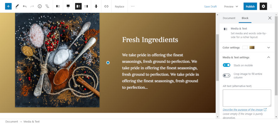
Until now, users could add gradient backgrounds to the cover and button blocks. Gutenberg 7.9 extends this option to the group, columns, and media & text blocks.

I have yet to see many theme authors take advantage of gradients. Granted, gradient backgrounds only landed in WordPress 5.4. I am hoping some of the top designers in the theme space can tackle this, if for no other reason than providing me some new eye candy when writing posts such as this that discuss gradients in Gutenberg.

On the whole, the addition of the gradients option to new blocks is a good thing. The next step is to continue expanding it to other blocks.

Typography for Headings and Paragraphs

Screenshot of using the editor's font-size option for a heading block.
Adjusting the font size of a heading block.

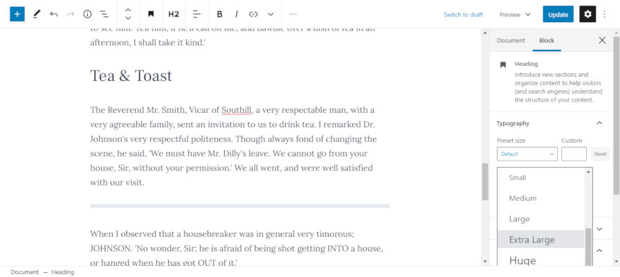
The Gutenberg team has finally checked off one of my longstanding pet peeves. The heading block now has a font-size option. Instead of users using an H1-level heading to make their text larger, they can stick with an appropriate-level heading for the document structure while using the font-size option to adjust how large it appears.

I am concerned about the addition of a new setting to allow users to adjust the line-height for paragraphs and headings. Currently, the setting does not allow theme authors to add choices based on their design system or disable the feature altogether.

We also get some new inline styles instead of classes. At this point, that ship has already sailed and sunk with Gutenberg.

The usefulness of a line-height setting is clear when designing a full-page layout, such as a single-page brochure. However, changing the line-height for most text on a site could have dire consequences in the long term, especially when an end-user switches themes and finds that their chosen line-height is completely out of sync with their new theme. I would not wish the pain of updating dozens or more old blog posts to adjust paragraph design on anyone. Of course, the same could be said of font sizes and similar settings. This is the one setting that I want to see with more theme author feedback as part of the decision.

Three New Block Patterns

Screenshot of using the Numbered Features block pattern.
Inserting the Numbered Features block pattern into the editor.

Gutenberg 7.9 removed the block patterns icon from the top right and tucked it behind the editor options menu. Users can pin the patterns sidebar, which will move the patterns icon back to the top for quick access.

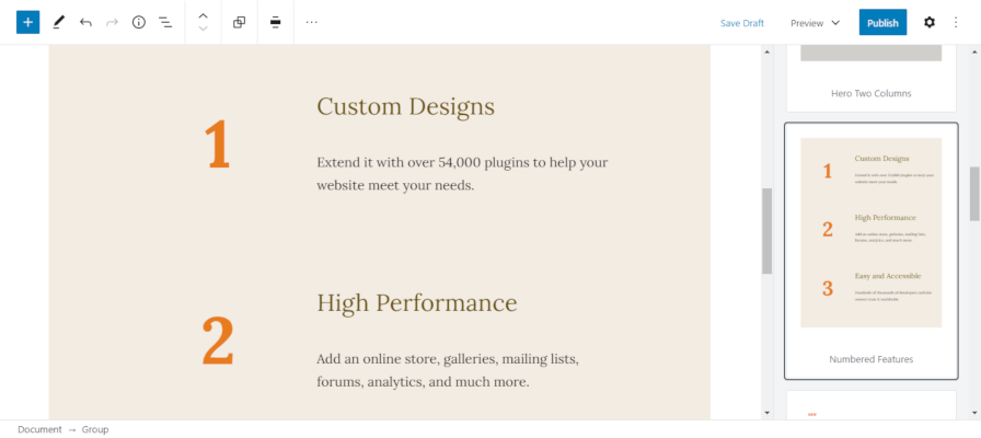
The update also introduces three additional block patterns, bringing the total to six.

  • Hero Two Columns: Displays a group that encloses an italic paragraph, a heading, and two columns of text.
  • Numbered Features: Displays several groups of columns with a number on the left and text on the right.
  • It’s Time: Outputs a paragraph, two columns, and a large paragraph that reads “it’s time.”

The Numbered Features pattern is by far the most intricate pattern the Gutenberg team has put together while building the block patterns system. It is nice to see them exploring some designs that users will find useful.

At this point, most of the patterns are relatively boring and not representative of how feature-rich this system will become in the future. It is important to remember that patterns are still at an early stage of development. By the time the feature lands in core WordPress, we should see more advanced and beautiful patterns for use on websites.

20

20 responses to “Gutenberg 7.9 Adds Gradients to More Blocks, Extra Typography Controls, and New Patterns”

    • Agreed. That should be done in theme’s CSS, in a reset stylesheet, for example, where you can set default line-heights for each heading.

      Consider a user scenario where they set different line-heights for different headings on different pages. The design consistency is severely affected.

      This is definitely theme territory.

      • I’m not sure about of some of these things on a per-block basis at this stage. I would rather have this set via the Global Styles system that is upcoming. Let themes set the default on a global scale. Then, let users overwrite it, also on a global scale, if they want. After we get all of that in place, we can then decide if we want to provide these design controls on individual blocks. To me, it feels like we’re working backwards.

  1. If you had custom patterns (via custom code) or by using Justin’s awesome Block Pattern Builder plugin, there was a delay of 3-4 seconds for the patterns to be presented for selection…, with this update, the patterns show up almost immediately – impressively fast compared to before.

    One thing that is extremely frustrating to me is that only now we are getting some very basic stuff like line height controls and easier button styling for example…, these should have been before Gutenberg was merged in the core, and not 15-16 months after the fact. I would also love to see some of Google fonts insertion to the heading and paragraph blocks for example, with may be with some sort of a warning that having too many web fonts will slow down the site. I can see some abusing the use of web fonts, and making more harm to their sites than good.

    The Click and Drag issue when the toolbar is set on top is still not fixed, which makes my hair turning grey by the hour !

    Overall though, I agree with Justin, it’s a relatively speaking nice update.

  2. I’d love rock solid UX that didn’t change on each update – for instance drag and drop capabilites on blocks, not depending on toolbar location – before more gradients and other fluff.

    Been a big advocate of Gutenberg since 1.0, as I liked is principles, but its really hard to keep people on board when UX is changing fundamentally.

    That said, the nerd in me, enjoys the momentum of the Gutenberg development, and the increasing support from theme and plugin devs. Today its possible to create some really beautiful blogs, easily and for free.

  3. It is amazing the speed of Blocks development.
    I love blocks and it’s potential.
    I just hope they don’t collide with themes and template design.
    It would be a disaster to watch one “brother” smash the other.
    They should evolve seamless.
    And I hope template design isn’t getting like a 2nd choice because it is the essence of any system.
    Right now, the environment around blocks feels like a playground.
    It can led to initial enthusiasm at the beginning but also to frustration and to choosing other solutions after a while.
    A system has to be solid and stable to keep it’s users.
    We cannot forget the true power of WP as a tool: it’s Database control and easy feed. The connection between it’s input (blocks) must be flawless.
    WP forever.

  4. For me the pattern feature is the second useful feature in Gutenberg, after the columns, and I’ll definitely create a library of patterns to go with my company’s design offer.

    Right now I’m using reusable blocks everywhere, for header, for footer, for various “patterns” such as columns, feature boxes and so on. As the patterns are blocks as well, I assume the migration from reusable blocks to patterns will be pretty easy.

  5. If I read the release notes correctly, the title block will become an actual block, with the permalink only available via the right-hand panel. That’s a bit annoying for me (your mileage will vary, of course), as above the title block seemed to the most appropriate place for it to be, and only visible when you wanted it. I’d just tidied up that Document section by disabling the Permalink tab, now I’ll have to reinstate it. Ho hum.

    Apart from that… who are all these people crying out for gradients? Was there a great social movement somewhere, and I missed it? ;-)

    • Yes, eventually the post title should work exactly like other blocks. It may seem a little weird right now given what we’re accustomed to. But, thinking long term, the entire post title/header area should be a block or group of blocks. This would allow users to easily do something like a full-width image behind the title with perhaps the post meta, intro, etc. (whatever they want).

      I currently have a system of doing this with a mix of a page template that removes the title plus me manually adding a cover block in the post content. It’s terribly complicated for the average end-user.

      • Good point re backgrounds for post/page titles, I do that using css at the moment. It would be handy if the Excerpt field was a block underneath the title block, which is where visitors would see it on my site.
        (By the way: I think I accidentally hit the ‘Report’ button when I meant to hit Reply. Fat fingers. Sorry.)

  6. I’m just going to leave this one here. The Gutenberg UI for dealing with post metadata is horrid. I wait on each release to address this awful shortcoming. No satisfaction yet.

    I’m not a developer but I know enough php and jQuery to have created some really useful metadata boxes for our organizations website. Sure the traditional php based metaboxes are still there but without refreshes, it’s very difficult to see if the action hooks are still firing the way they used to. Several of the metaboxes I developed use dynamically developed options for select controls and/or autocomplete from an AJAX data source. Used to take me 5 lines of server side code to render a second editor to save fully HTML formatted metadata. Try that now in Gutenberg.

    Maybe I’m not the target demographic but my metadata is as important, maybe even more important than the post content. WordPress went from slightly awkward but robust for post metadata and took many steps backwards to the current Gutenberg UI for metadata. Gutenberg might be terrific for post content but it’s an epic regression for dealing with post metadata in my opinion.

  7. The number one thing that concerns me about Gutenberg are the things that developers and theme designers can’t control, as you mentioned happening at the moment with line-height. Developers and designers should be able to control any option the user could have in Gutenberg. Line-height is one such thing that should definitely be a global setting which, in many cases, shouldn’t even be available to the user, for the sake of the design. It’s starting to look like half the process of designing a custom site is just going to be hours spent disabling a gazillion blocks and block settings. I’m enjoying the speed of the development and playing with the things that Gutenberg can do, but it’s been, and seems as if it’s going to continue to be, an absolute nightmare making Gutenberg user friendly to many of my clients who constantly tell me that they’re afraid to do anything in it for fear of messing something up. Unless I’m able to hide literally anything they don’t need or shouldn’t be changing, then it’ll be hard for me to get all that excited about new features that override my CSS. I wish I could just export a JSON file or something with all of the registered blocks and their settings that I could just drop into the theme, that would let me turn things on and off easily.

Newsletter

Subscribe Via Email

Enter your email address to subscribe to this blog and receive notifications of new posts by email.