Gutenberg 5.9 Brings Major Improvements to Block Grouping, Introduces Snackbar Notices

Gutenberg 5.9 is now available for those who are running the plugin to get the latest features on their sites. This release brings significant improvements to the grouping capabilities, allowing users to group and ungroup blocks inside a container block. Once placed inside a group, the blocks can be moved up or down within the group using simple up/down controls.

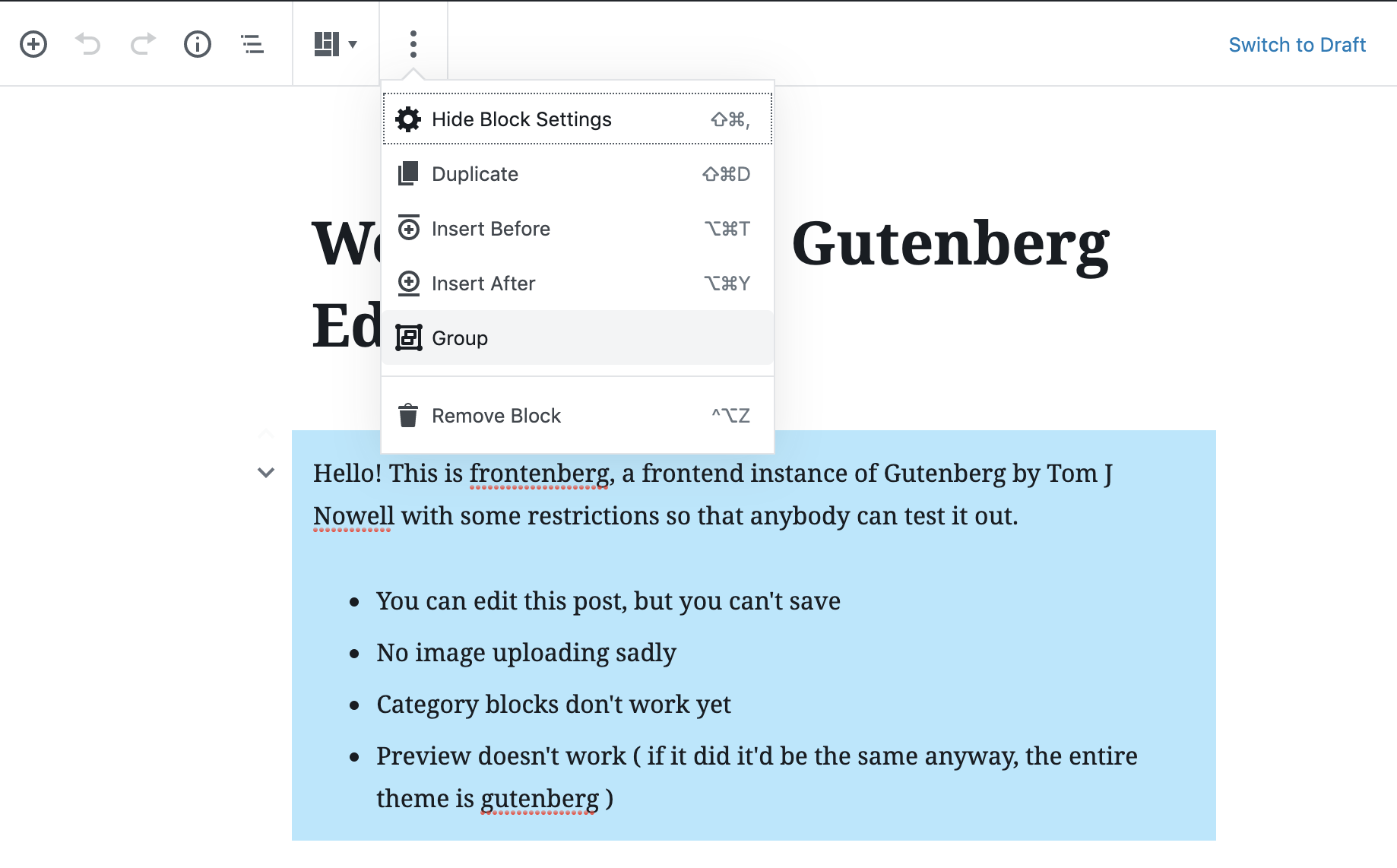
Nested blocks have also been improved so that users can click through to each layer to configure each and navigate to the deepest nested block.

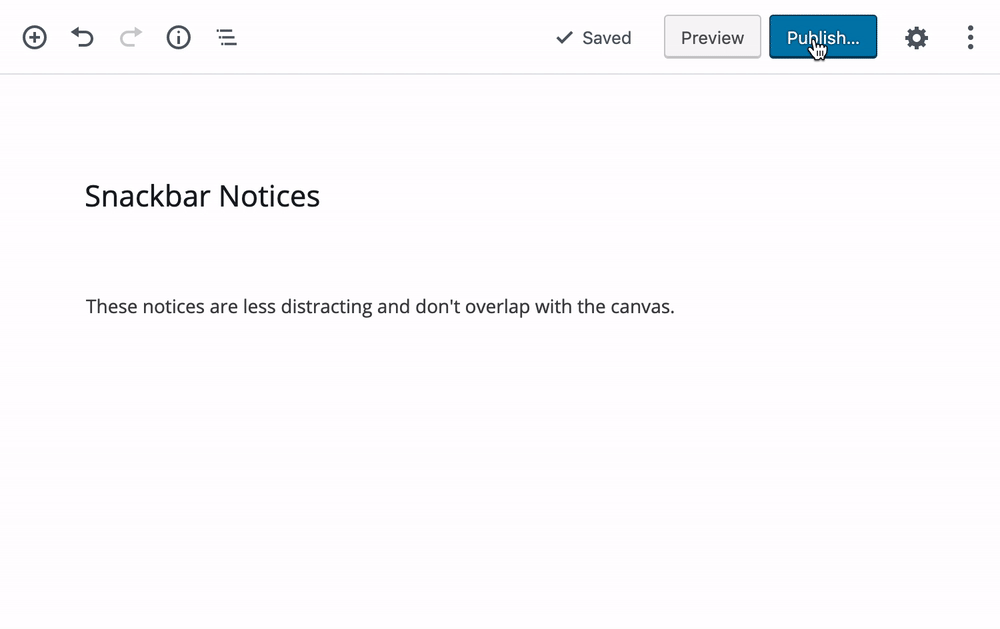
Gutenberg 5.9 introduces “Snackbar” notices to communicate completed actions in the block editor UI that do not require further action.

The term “Snackbar” doesn’t adequately describe the way these notices behave. The concept was inspired by Material design and is traditionally used for providing brief messages about app processes at the bottom of the screen. Gutenberg’s new Snackbars pop up and disappear after a short delay, so the notice doesn’t have to be dismissed.

“For a distraction-free experience, all the notices used in the editor to inform about the post saving/publishing, reusable blocks creation and updates have been updated to use this new type of notice,” Gutenberg Phase 2 lead Riad Benguella said. He posted a gif demonstrating Snackbar notices in action:

This release brings several visual enhancements to blocks and UI components, including a redesign of the Table block placeholder, refactoring and consolidation of dropdown menus, and improvements the output of the Spacer block.

Gutenberg 5.9 contains more than two dozen fixes for bugs found in both desktop and mobile experiences. The editor took a slight dip in performance from the previous version, going from 4.8 to 4.9 seconds in loading time and 62.8ms to 66.3ms for keypress events. More than 40 people contributed to this release and approximately 15% were new contributors.

12

12 responses to “Gutenberg 5.9 Brings Major Improvements to Block Grouping, Introduces Snackbar Notices”

  1. Yes, use snackbar, even though nobody calls them snackbar notices – everybody calls them toaster notices (because they pop up). I don’t get why don’t we use the language the rest of the web is using?

  2. Big improvements in selecting block elements when nested in other blocks, including layout solutions by third parties as well.

    Grouping/ungrouping looks good but we need padding and margins in the group, columns, and, perhaps other blocks, to make them a viable option for layout. And, maybe a drop down to designate the block div as either section or one of their syntactically correct designations.

    Block suites like Kadence blocks make the above redundant. This adds to the standardisation issues. There is this vacuum with the lack of proper layout functionality built in to the editor being filled with various third party solutions which can’t be swapped without breakage.

    Proper built in layout structures/blocks that allow third parties to hook in their own UI and features could solve this.

    • “Grouping/ungrouping looks good but we need padding and margins in the group, ”

      The issue is, Gutenberg has morphed from it’s initial goal of being an improved layout tool to a kitchen sink-y design tool. That is, it is now trying to anticipate and replace the many design decisions that were made globally at the theme level. While the option to set individual groups’ padding and margins appear like it might help, it actually creates significant opportunities for inconsistencies. That’s not a positive.

      Imagine a single user having to remember from group to group, from post to post from week to week what they used for padding/margins. Now imagine that, if more than one person is adding/editing content. Charlie! Foxtrot!!

      It seems that while others are moving towards design systems (e.g., Andy Bell’s and Heydon Pickering’s new https://every-layout.dev) Gutenberg is creating a new mindset. Call it Cowboy Design (as inspired by cowboy coding). This isn’t a positive either.

      Groups? Padding? And margins? That’s just grabbing a balloon.

      • You do make a good point there, regarding the cowboy design and, not something I was considering, in terms of handing a site to a client to work on and then they run amuck.

        I would argue that there are a multitude of other things where this can happen anyway. It’s a perennial problem. This is why it is usually wise to lock a site down for the client so that they can only make a few select moves and access to a select number of templates.

        Yes there are those clients who will get it and will have an eye to keeping things in line, but for the main part many are very good at having a lot of fun with those settings. In a sense the new block editor encourages this for users of all levels when something more rudimentary would suffice. Say, for example the designer templates up post layout and the client just gets a simple classic editor interface when creating and editing the post. That conforms with the concept of keeping content and design separate.

        I like the way that they have kept the block editor as basic as possible. The one criticism, which I highlighted in opening, was standardisation and providing the layout furniture in the form of sections(group block) and columns. As it is these need a bit more work and what we see is many third parties ( Kadence, Co-Blocks, etc.) filling this void. This means that there are many ways that one designer can move away from the standard blocks used and potentially cause problems down the road when another designer steps in and decides they want to use another solution.

        What would be a killer feature of the new block editor would be if hooks where provided for third parties (those who make block suites, themes and page builders) to override the blocks with their own UI and bells and whistles. Change theme, builder or plugin and at least your content would roughly remain in the layout that was intended.

        I do agree that probably the site wide defaults for paddings and margins is a good idea. Then keep them hidden from those pesky clients!

  3. I see 2 issues with the Snackbar notices.

    1. The location is not near the Publish/Update button. Users (especially new ones) will not see them as early was what was before.

    2. These buttons are going to present an accessibility issue since they are time based.

Newsletter

Subscribe Via Email

Enter your email address to subscribe to this blog and receive notifications of new posts by email.