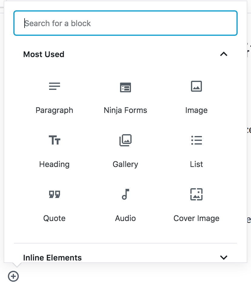
Gutenberg 3.6 was released today, featuring a design overhaul for the core icons in the block inserter. The blocks now use Material icons, which offer more options than the Dashicons. This update also improves the icons for the core embeds, which now display the corresponding icon for each embed service.
Gutenberg testers logged an issue regarding the limitations of Dashicons last year, citing the small number available, the inadequacy of their size, and the generic substitutions for embed service icons. The Gutenberg team closed the ticket, saying there was no sign in testing that showed the icons to be a problem and that potential contributors would need to “revisit with evidence” if they wanted to re-open the issue.
It’s not clear whether the team received the evidence or testing required to make this change but the icons become problematic in other ways. As the community started extending Gutenberg, block icon duplication became a problem, due to the limited number of Dashicons available.
“We really need block icons to move away from using dashicons as soon as possible,” Gutenberg technical lead Matías Ventura said in another discussion on a proposed solution. “We are already seeing plugins adding blocks where the icon overlap is very high just because of the limited icons set, which reduces clarity for users very drastically.”
Switching to Material icons solves this problem, ensuring there are unique icons for each block. The inserter design has also been updated as part of this overhaul. Previously, icons appeared with a grey background, as seen below:

The old design suddenly looks rather dated in comparison to Gutenberg’s 3.6 update, which allows for more whitespace around the icons:
The new embed icons are also greatly improved from previous versions of the plugin:

“The new icons aim to encourage people creating their own blocks to supply their own SVG,” Ventura said. “The hope is to make sure we can avoid multiple cases of duplicated icons diminishing the overall ability to quickly scan blocks.”
Ventura said Gutenberg will retain the ability to specify a Dashicon slug in the Block API but he encourages developers to “supply custom SVGs (or draw from the material icon pool) as much as possible.”
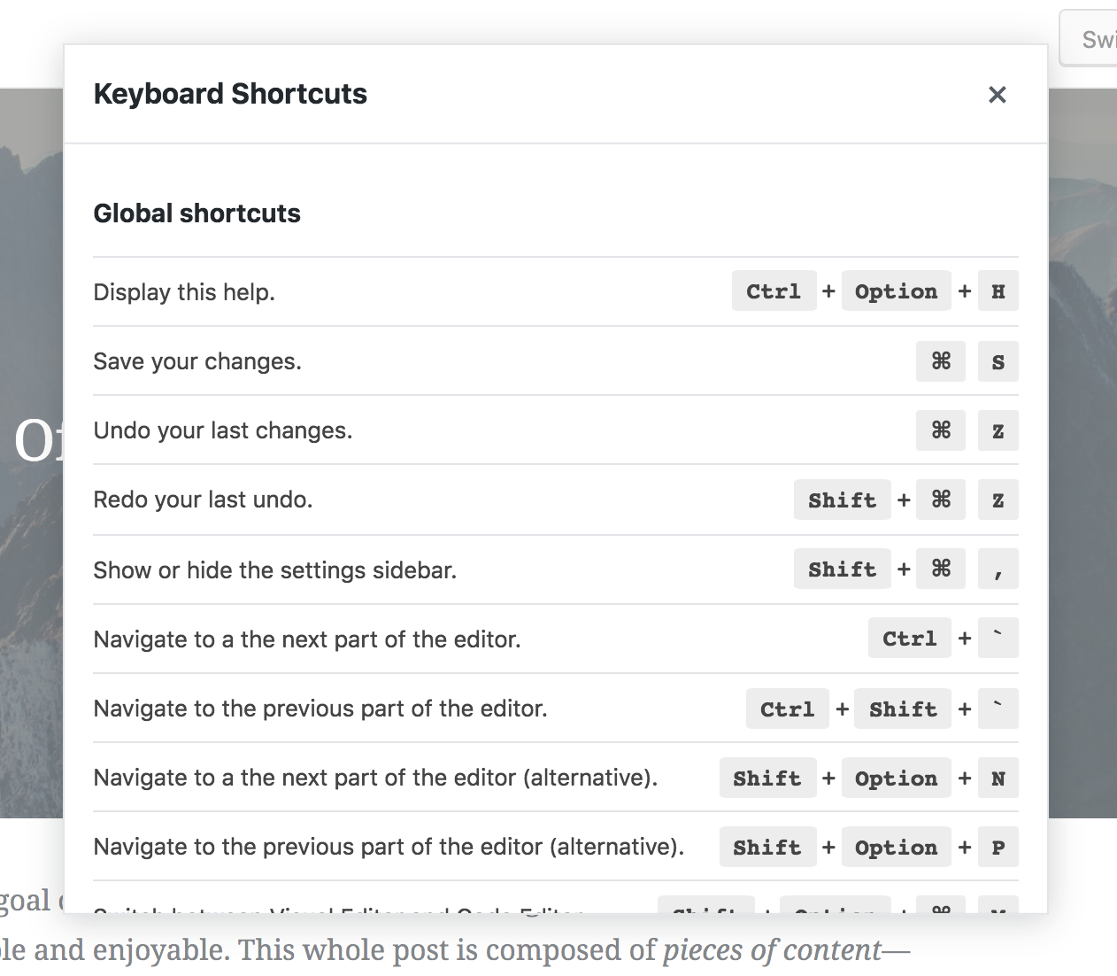
Gutenberg 3.6 also adds several new keyboard shortcuts, including inserting a new block before/after the current block, toggling the inspector settings, removing a block, and displaying a new modal help menu. The modal can be launched from the Settings button at the top of the editor and users can scroll through all available shortcuts.
This release also fixes many bugs that users have reported. Gutenberg will now open a new preview window if the prior window has been closed. It will also bring the preview tab to the front when clicking the preview button. Version 3.6 fixes several usability issues that testers found with the permalink UI. Check out the release post for the full list of all the fixes and changes included in 3.6.
Too much white space, the eyes have to work harder. Nice attempt to try and improve but too much improvements can have a negative effect.
The icon and title/name is too far apart and I know it was mentioned in github about this, but definitely needs tightening up. Also, getting back to the “too much white space” issue, it just makes it harder to distinguish the separation of each element. Having the background colour helps contain each element in it’s own space.