Gutenberg 3.1 added a tips interface that supports and guides new users who are learning to navigate the editor’s blocks and settings. The tips appear when a new user opens Gutenberg, highlighting useful items on the page.
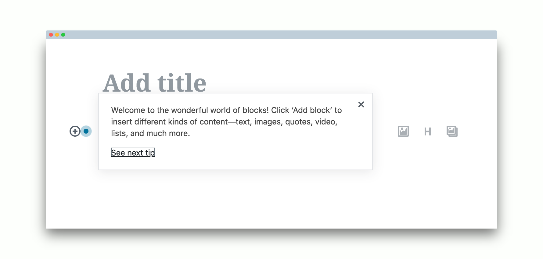
Although the tips may seem cluttered and intrusive to users who already know what they are doing, they are a necessary evil for introducing the UI to new users. Gutenberg is not yet intuitive enough to be able to stand on its own without explanation inside the interface.
10up recently conducted Gutenberg usability tests that unearthed some startling realities about how new users interact with the new editor. The tests were done on previous versions of the plugin (2.9.2) with users who frequently create content using the classic WordPress editor. 10up asked testers, who have had no training on Gutenberg, to write a news-style blog post.
One of the most surprising results was that participants struggled with the simple task of adding an image to a post.
“Although the interface is clean, a lack of focused attention or hierarchy on the page became apparent,” 10up Experience Designer Sarah James said. “Participants struggled to complete tasks like adding an image that did not have a clearly exposed and labeled element like the title and paragraph fields. Heatmap tracking of the backend captured 734 unique clicks in the new post interface and only 40 of these clicks were on actual clickable elements. This suggests a struggle to find basic interactive elements, such as image blocks.”
Participants also had a difficult time finding and inserting additional block types – several testers overlooked the “+” symbol that triggers interface for adding a new block.
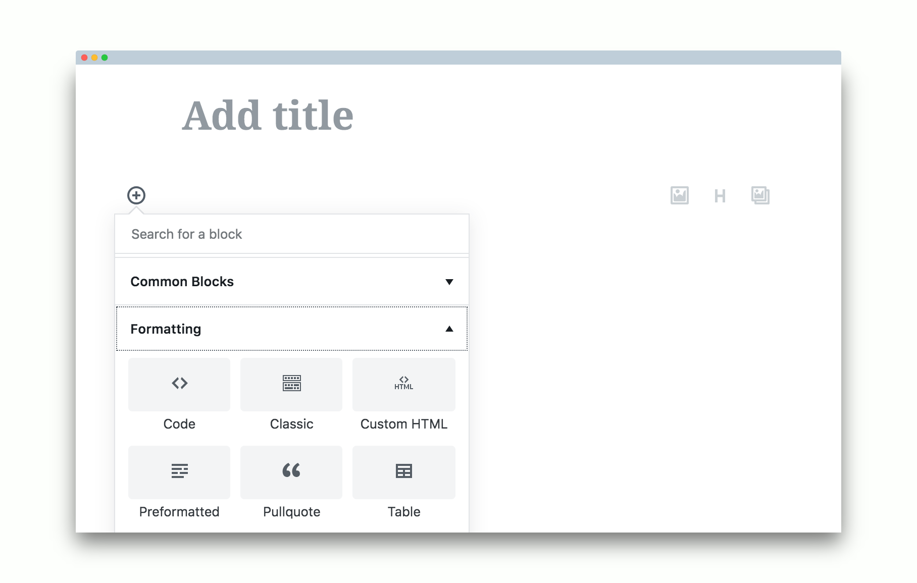
Gutenberg 3.0 and 3.1 have already improved on these pain points with changes that highlight common tasks. The 3.0 release redesigned the inserter, ditching tabs for collapsible panels. This makes it more friendly for hunting among blocks. Version 3.1 includes a new design of the sibling inserter (the “+” symbol that appears to allow user to insert blocks between other blocks).
In addition to improving usability issues with the inserter, Gutenberg 3.1 fixes some of the mechanics of previewing and saving posts. Users can now preview changes to a published post without updating the post. The editor was also updated to trigger autosave as a standard save for a draft by the user currently authoring the post.
HTML blocks that have been converted into shared blocks now show in preview mode, which makes it easier for users to see what they do and insert them visually. The code will only show if the user wants to edit the block.
For a full list of the changes in 3.1, check out the release post on make.wordpress.org.
It’s a pity these new tips look nothing like the existing tips (Feature Pointers) in the rest of the WP UI. So now we have two completely different styled tips in the Dashboard! It makes the Editor interface even more inconsistent with the rest of core.