Released yesterday, Gutenberg 11.7 is one of the more exciting releases we have had in a while. The Global Styles system iterations continue to impress. The lighter nav experience makes adding links easier, and a spacing control for the Columns block delivered one of my oldest wish list items.
The Site Logo block supports duotone filters, bringing it up to par with other image-related blocks. Plus, theme authors can set the default filter via their theme.json files.
There are several other changes to love, such as the refreshed gradient picker design and typography controls for post navigation blocks. The block alignment control in the toolbar now also displays a “None” option. This should make it easier for users to revert from a previous choice.
Lighter Navigation Experience

Building nav menus has consistently been one of the frustrating experiences within the block system. Iterative improvements have made it better, but the actual process of adding links has been a painful one, at least until Gutenberg 11.7 rolled out yesterday.
In previous iterations of the block, users had to go through a two-step process for adding any menu item. This was an issue I called out in Round #9 of the FSE Outreach Program:
This stage of testing calls for adding multiple page links as both top-level and sub-menu items. When clicking the + button to add a link, my first instinct is to search for the page itself. However, the available field is a block search rather than a page search.
In the latest version of the plugin, clicking the + icon allows users to directly search for or type a URL. There is no need to figure out which block (e.g., Page, Post, Custom, etc.) to insert first. This change is part of an ongoing effort to create a lighter navigation experience.
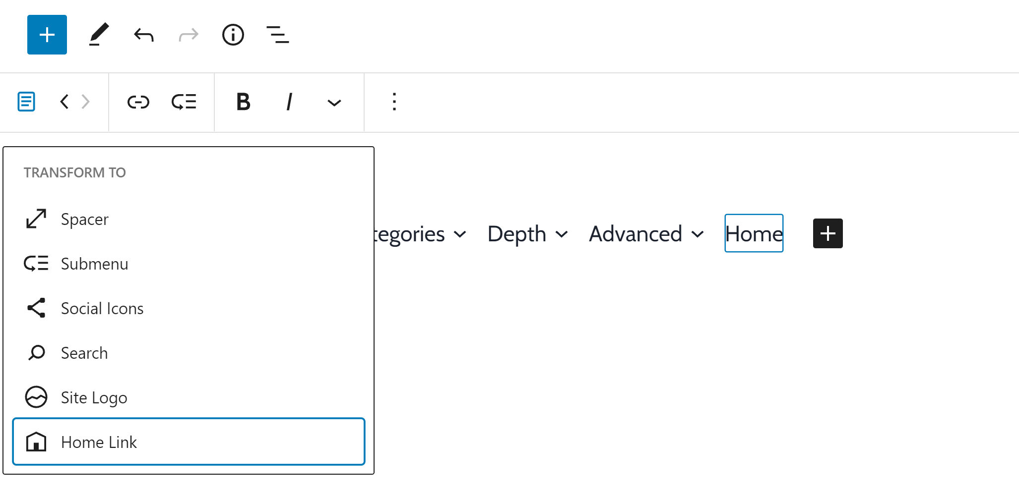
While the link-adding experience was much better, I could not initially figure out how to add a simple homepage link without typing the full URL. Typing “home,” “index,” or a simple “/” character all failed.
After realizing that the previous search did not work, I tried other known site pages. Posts, pages, categories, and tags all worked without issue. However, I could not pull up author/user archive URLs through the search field.
There is one place to add a homepage link, and that is via transforming the menu item to a Home Link block by clicking on its icon in the toolbar. Other blocks are also available for this transformation process, such as Social Icons, Site Logo, and more.
On the whole, this is a much-needed improvement to the Navigation block’s user experience. It likely comes closer to hitting the 80/20 rule when deciding how a feature should be implemented.
Create New Pages From the Link Inserter

The user experience for adding links has been one of the highlights of the block editor this year. In June, Gutenberg 10.9 introduced rich URL previews, which landed in WordPress 5.8. In the latest release of the plugin, developers have kicked it up a notch.
Users can now directly create new pages when adding links. Previously, users could only achieve this feat while adding items inside of the Navigation block. Now, it is available for links added anywhere.
Mind the Gap

Users can now entirely control the gap between columns via the new Block Spacing option. I knew it was coming — eventually. That it took three years since the release of the block editor for it to actually happen has been painful. I was still a full-time theme and plugin developer when I added this to my wish list. Granted, CSS flexbox support for gap was not widespread then, but we could have still managed with old-fashioned margins in the meantime.
I am just happy that the long-awaited feature has finally landed. Now, I can begin phasing out the custom block styles I was using to replicate it.
The feature works on top of the block gap feature that was first shipped with Gutenberg 11.4. Theme authors may need to make adjustments if they have written custom code for controlling the spacing between columns.
Global Styles and Color Palettes
There is a push to improve the upcoming Global Styles feature, which could land in WordPress 5.9 later this year. Gutenberg contributors have made massive strides in improving the experience, building off its overhauled navigation in version 11.6 of the plugin.
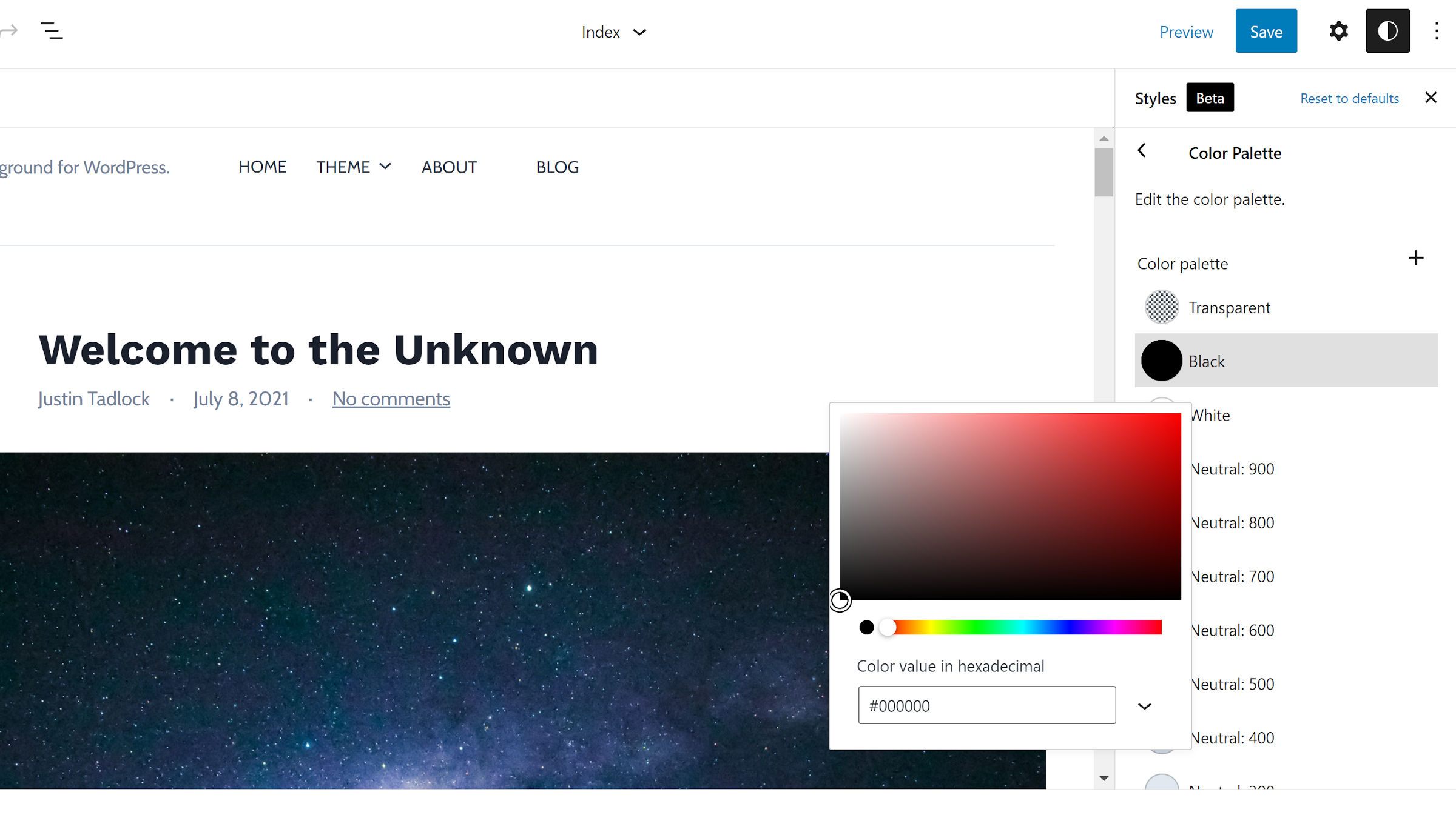
The most notable interface change in this release is the new Color Palette section.

Instead of dropping the palette below the color options, it is now front and center. This is a feature that will ultimately empower users to customize their sites. The decision to focus on this part of the UI is welcome.
After opening the palette section, users can edit the theme-defined colors or click the + icon to create new ones. These colors will all show up as options in the block and site editors.
Users should also see the Layout section at the root level of the Global Styles sidebar. They can now adjust the padding for the overall site.
I am still running into an error when trying to adjust the typography at the root level. This was an issue I first noticed with Gutenberg 11.6.
I would like the Blocks section of the Global Styles panel to show the icons for individual blocks. With dozens of blocks, it is hard to scan through the list.

Another improvement, particularly if we forego icons, would be to alphabetize the list.
Why is the Gutenberg team spending time adding features that many people don’t want?
Gutenberg should follow the normal WordPress approach of having a minimal product and a robust set of apis so developers can add the features they want.
Right now we are already at the point where myself and many others need plugins to disable the features that Gutenberg keeps adding