Another two weeks have flown by, and another Gutenberg plugin update is in the books. I always look forward to the latest release, awaiting what goodies our contributor community has produced. Sometimes I jump the gun and install a development version of the plugin to understand an upcoming feature, such as the new “block gap” style setting. Other times, I like to be surprised with enhancements like the new vertical/horizontal padding controls for the Button block.
Of course, there is always a good chance that a plugin update will throw off our theme’s editor styles in a new and exciting way. It feels like it has been a while since Gutenberg caught me off guard. At least it is only the post title this go-round. The WP Tavern theme is aging a bit anyway. It is due for an update (hint, hint).
Aside from block gap and axial padding, Gutenberg 11.4 turns the Gallery block into a container for nested Image blocks and adds duotone filter support to featured images. Other notable enhancements include an option for adding alt text to the Cover block and font-weight support to the Post Date, Post Terms, and Site Tagline blocks.
Axial Padding for Button Block
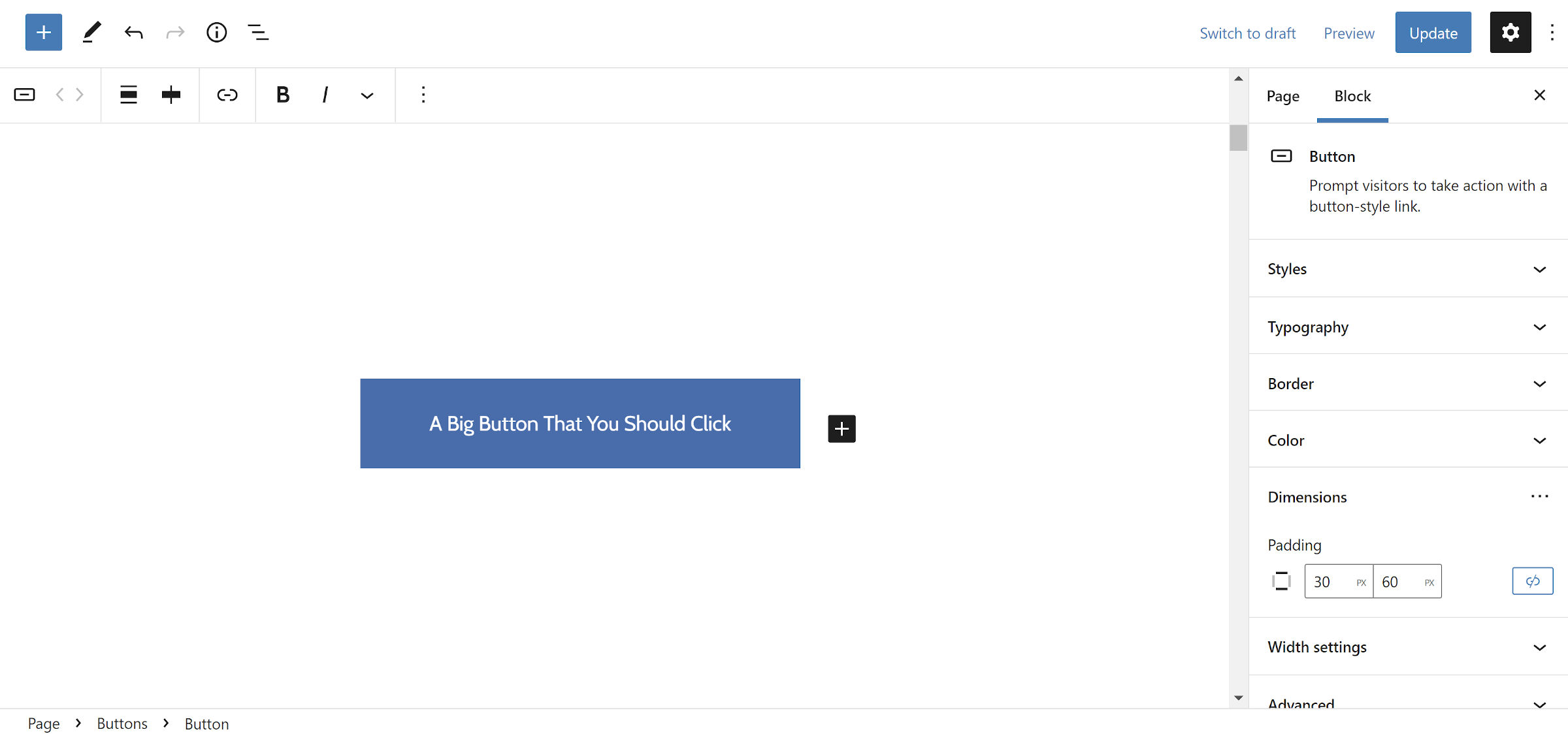
The Button block now supports changing the spacing along the X or Y axis when unlinking the padding. Previously, users could define the padding for all sides, but this could be tedious work. In most designs, top and bottom (vertical) padding should match, and left and right (horizontal) should get the same treatment.
This change should speed up padding customization in nearly all cases. However, it does introduce a regression. The consensus in the ticket was that the tradeoff for a less cumbersome experience was worth less flexibility for edge cases.
Overall, this should be a win for most. I am already a happier user.
Gallery Block Uses Nested Images
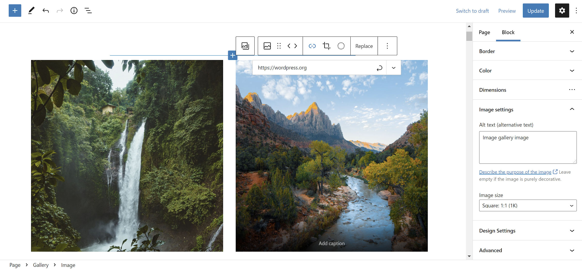
The Gallery block in Gutenberg 11.4 supports nesting individual Image blocks. It is currently hidden behind an experimental support flag and must be enabled via the Gutenberg > Experiments settings screen.
Effectively, the Gallery block is now a container. Inserting media still works the same way. The difference is that end-users have access to customize each Image block within a Gallery separately.
One use case for this feature is to allow users to add custom links around images. However, they now have access to more of the Image block’s options, such as custom theme styles.
Last week, I covered this feature in-depth because it is expected to land in WordPress 5.9, and theme authors should be ready for the transition. This is a breaking change in terms of HTML. Any themer with custom Gallery block styles should test the front-end and editor output before WordPress merges the changes.
Featured Image Duotone Support
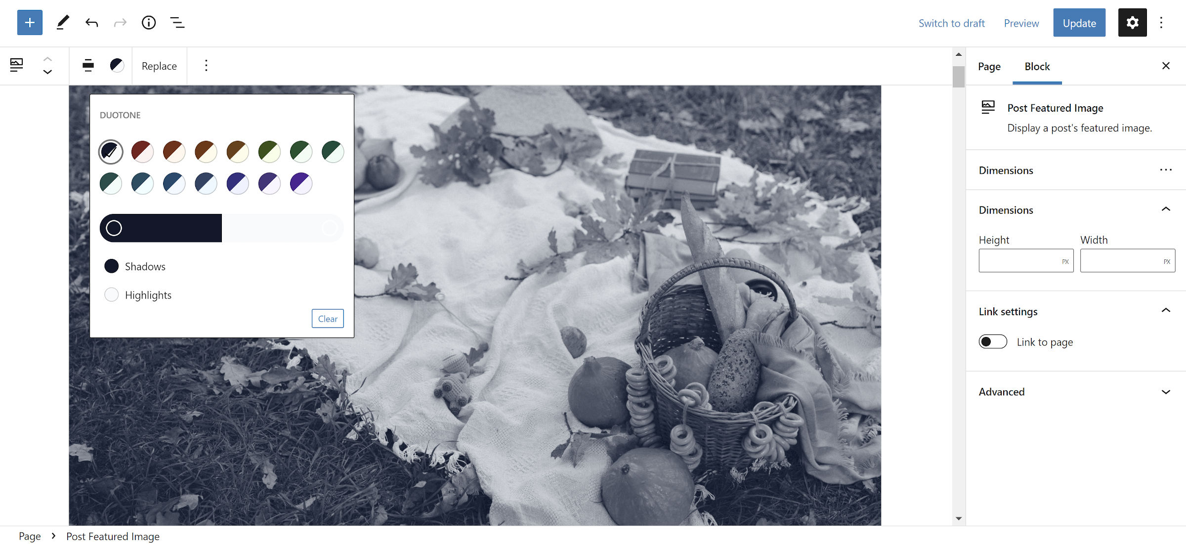
While we are still missing an image size control, I will take any Post Featured Image block improvements I can get at this point. The block felt like a second-class citizen for so long that I am giddy about any enhancements.
Duotone filters, which landed in WordPress 5.8, allow end-users to add a CSS filter over images to control shadow and highlight colors. Themes can register custom ones, or users can modify them. The latest Gutenberg plugin update brings this feature to the Post Featured Image block.
This change allows theme authors to explore adding some visual flair since the Post Featured Image block is meant for templating or site editing. It still has a long way to go before it is ready for more advanced theme design, but the tools are getting us closer.
Global Block “Gap” for Themes
One custom feature that has become commonplace with themes that support the block editor is a “global spacing” style rule, which controls the whitespace between elements. Gutenberg contributors have noticed this trend and are now shipping a standard solution for it. Themes that use a theme.json file will automatically opt into support.
The gap feature adds a top margin to all adjacent sibling elements within block containers. This creates the space between each block using a standard method. Theme authors can control this via the styles.spacing.blockGap key in their theme.json files.
If you are a theme developer, this is one of the most crucial components of block theming from a pure design viewpoint. It is not something to avoid until it lands in WordPress. The time to test and provide feedback is now.
It is also merely a first step. There are pieces left to implement and problems to solve. There is currently an open pull request to bring this to editor block controls. There is also another ticket for zeroing out the margins for the first and last blocks, which would typically not need any. There are still some open questions on how to best deal with exceptions to the default block gap in the original ticket.
Regardless of its unfinished nature, it is an exciting development if you care anything at all about vertical rhythm in design systems.
I just ran into the blockGap issue after updating to Gutenberg 11.4. (I wouldn’t even have it installed, except that I just converted my theme to a FSE theme.)
It’s applied in a really aggressive manner, and removing it from a particular section (<header>, for instance, which needs top and bottom padding and no margin) seems to be a bit of a CSS challenge.