On Wednesday, Gutenberg 10.8 landed in the WordPress plugin directory. The release includes new typography options for controlling the Heading block’s font-weight and the List block’s font family. The Audio and File blocks now show preview content in the inserter.
Gutenberg 10.7 felt like it introduced flashier features than 10.8. But, this was still a solid release. Sometimes the things that you do not see are just as important as those that you do. Full Site Editing (FSE) components continue to move along at a swift pace. Most changes were bug fixes rather than enhancements.
One of the primary theme-related FSE upgrades allows developers to set the padding for nav menu links via theme.json. This may be a small win, but it is unlikely to address the numerous issues with styling navigation items and nested lists. The change also does not affect the Page List block links, which can be set as a nav menu item. The Navigation block will be one of the toughest nuts to crack before site editing is a possibility. Enhancements like this help, but it is a long and winding road to a solution that satisfies both theme authors and users.
Users should see the post title in template-editing mode. The template details modal also includes more detailed information, such as how to best name custom templates.
New Typography Options
Gutenberg 10.8 enables the font-weight control for Heading blocks. This allows theme authors to define the default weight via their theme.json files, and users can override this via the sidebar panel in the editor.
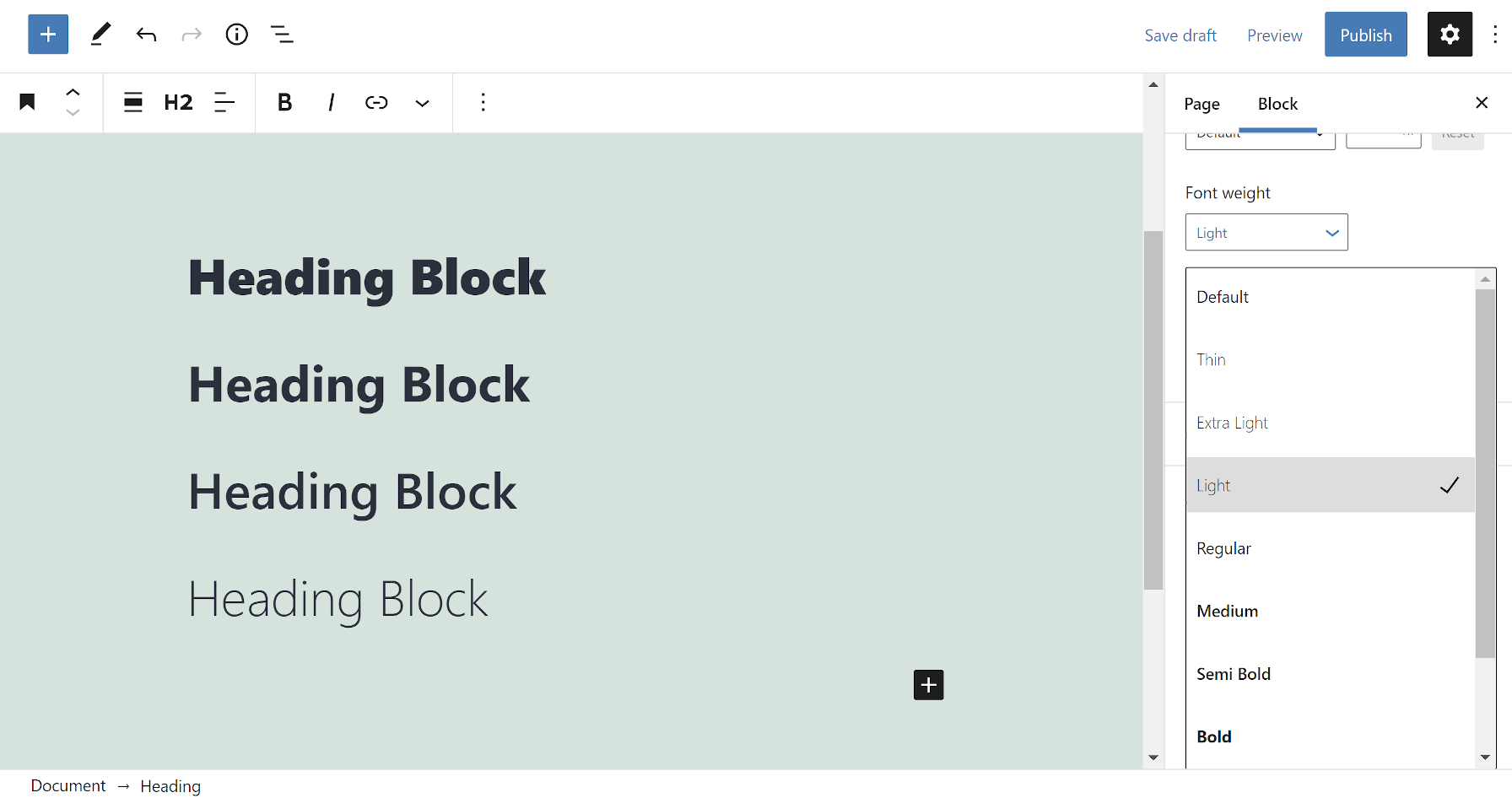
The control displays all nine possible weights:
- Thin
- Extra Light
- Light
- Regular
- Medium
- Semi Bold
- Bold
- Extra Bold
- Black
While each weight is selectable, it does not mean all fonts support a specific weight. For example, users will see no difference between Extra Bold and Black with the Twenty Twenty-One theme.
In the long term, this should be coupled with the font family control. This would allow theme authors to define which weights are supported by a specific family, making those the only options for users.
The List block is jumping ahead of others with its support of the font family option. Generally, we would see the Heading or Paragraph blocks gain such features first.
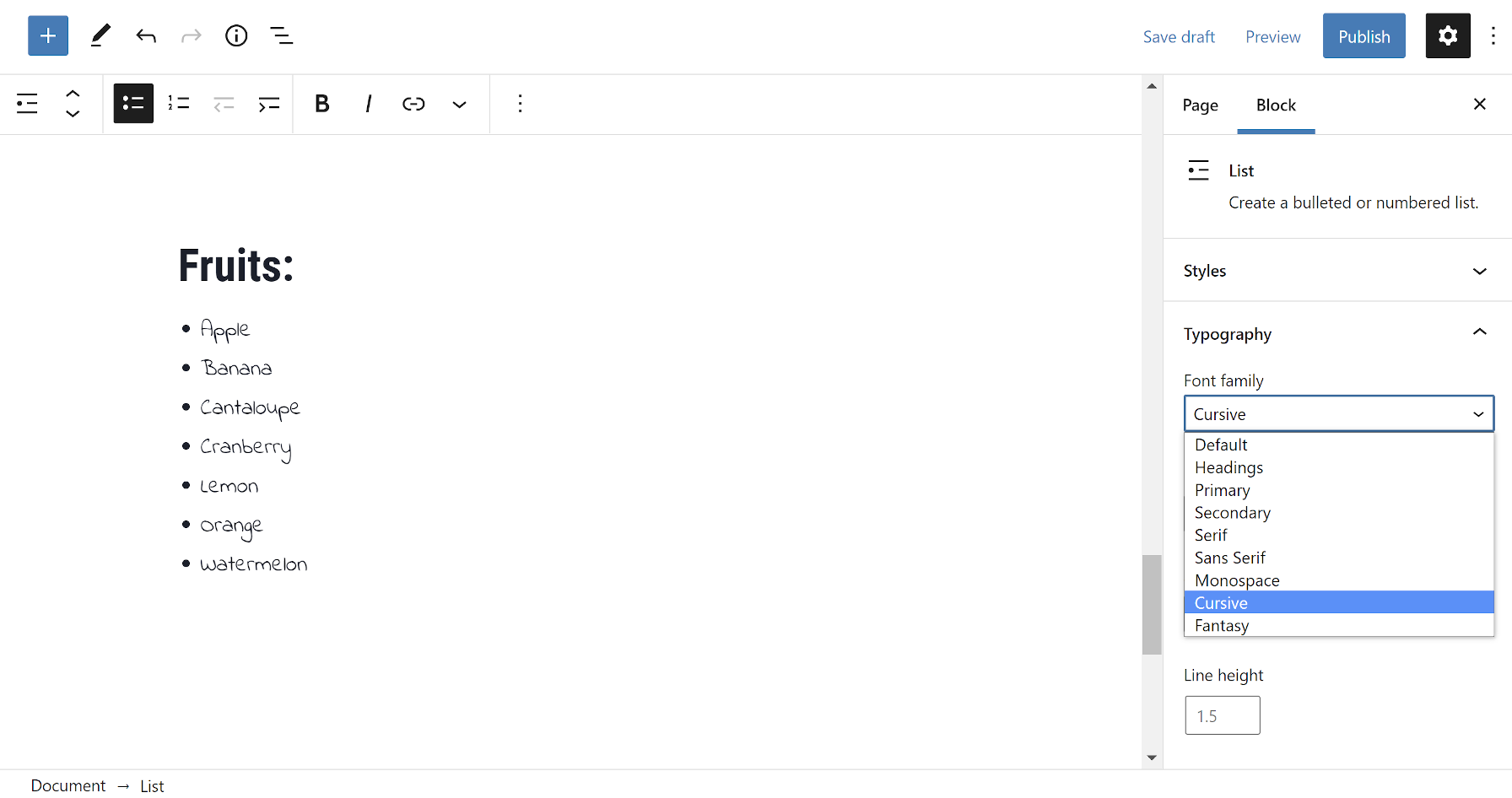
The Site Title, Site Tagline, and Post Title blocks all currently support the font family control. It is a welcome addition to see expanded typography options, but I look forward to the day they are offered across every block.
Theme authors can also define custom letter spacing for the Site Title and Site Tagline blocks. However, the feature does not currently appear in the block options sidebar, which would allow users to customize it. There is an open ticket to address this missing piece of the UI.
Audio and File Block Previews
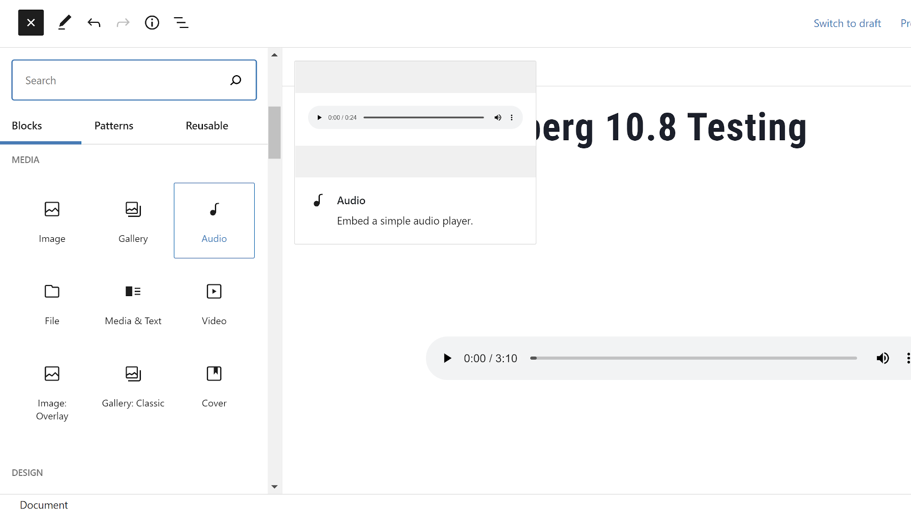
The development team added new previews for the Audio and File blocks in the inserter. This is a nice-to-have enhancement, adding long-missing previews of some of the remaining core blocks, but it is also a bug fix.
In previous versions of the block editor, users who attempted to upload media via the Audio or File blocks would get a duplicate upload. This only happened in situations where their theme or a plugin registered a custom block style. Adding a preview apparently fixed this odd bug.
This change also nearly gives us a complete set of previews for the pre-WordPress 5.8 blocks. Classic, Spacer, Shortcode, and Legacy Widget do not have them, but they are unique cases. The upcoming theme-related blocks also lack previews.
“Archives” Label Now Shown for Archives Dropdown
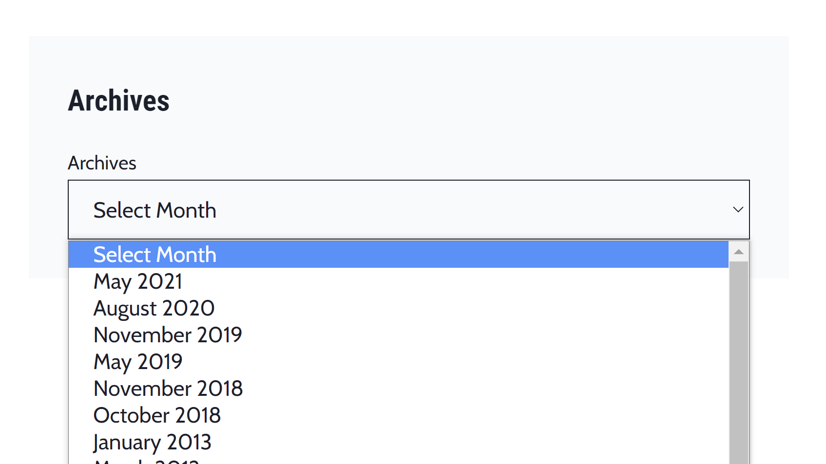
When using the Archives block as a dropdown, it now outputs a label titled “Archives.” While it is a seemingly trivial change, it could impact how themes typically present this block.
This enhancement changes some existing expectations. The primary use case throughout WordPress’s history has been to show the Archives dropdown in a widget. In that case, there is almost always a widget title with the “Archives” text preceding it. I expect most other use cases would follow a similar pattern. This essentially creates duplicate text.
Themes Team representative Carolina Nymark had an alternate suggestion:
What if the label was visible by default, but there was an option for hiding it? Similar to the search block, except there would be an actual label hidden with a screen reader text CSS class when the option is toggled.
That would have been my suggestion too if I had seen the ticket earlier. For now, theme authors who need to hide it should target the .wp-block-archives-dropdown > label class in their CSS.
It’s too bad Gutenberg is trying to do “everything”. The heading styles should be consistent throughout the website and therefore pre-defined weights etc. should be used. That improves accessibility. Enabling this extra features is a step backwards.
Granted users should be able to override theme defaults. That is why we need developers / designers to create websites with typography standards. Users shouldn’t change styles of headings at all.