Gutenberg 10.2 Adds Spacers To Navigation Lists, Lets Users Categorize Template Parts, and Introduces Scoped Patterns

Yesterday, version 10.2 of the Gutenberg WordPress plugin landed. Users can now add a Spacer block between Navigation items, categorize custom template parts, and pick between patterns when inserting the Query block.

The user experience continues to improve in some areas. The Media & Text block, one of the few holdouts, can now be transformed into Columns. The transformation results in two columns with the media and the text separated. This is a one-way transform, however. It is a necessary enhancement for users who write out their text column to realize they can only add uploaded media instead of something like a YouTube embed to the Media & Text block. Making a quick switch over to Columns solves the issue.

The “Start writing or type / to choose a block” prompt only appears for the first empty paragraph when there are subsequent paragraphs. It is a trivial change, but it removed a minor annoyance.

The development team squashed 30 bugs for Gutenberg 10.2. They also continued work toward improving experimental features such as the site editor, global styles, and block-based nav menus. Full Site Editing is shaping up, but it will still be a while before we know whether it will be ready for inclusion in WordPress 5.8.

As I write this post, I am also doing so in a broken editor. Gutenberg 10.2, yet again, changed either its markup or CSS, which means I will have to do some digging to find out why all of our paragraphs are misaligned in the editor. But, that is a job for tomorrow. This should be a theme-specific fix and an isolated issue.

Nesting Spacer Blocks Within Navigation Lists

Navigation block with a nested Spacer block in the WordPress block editor.
Inserting a Spacer into a Navigation list.

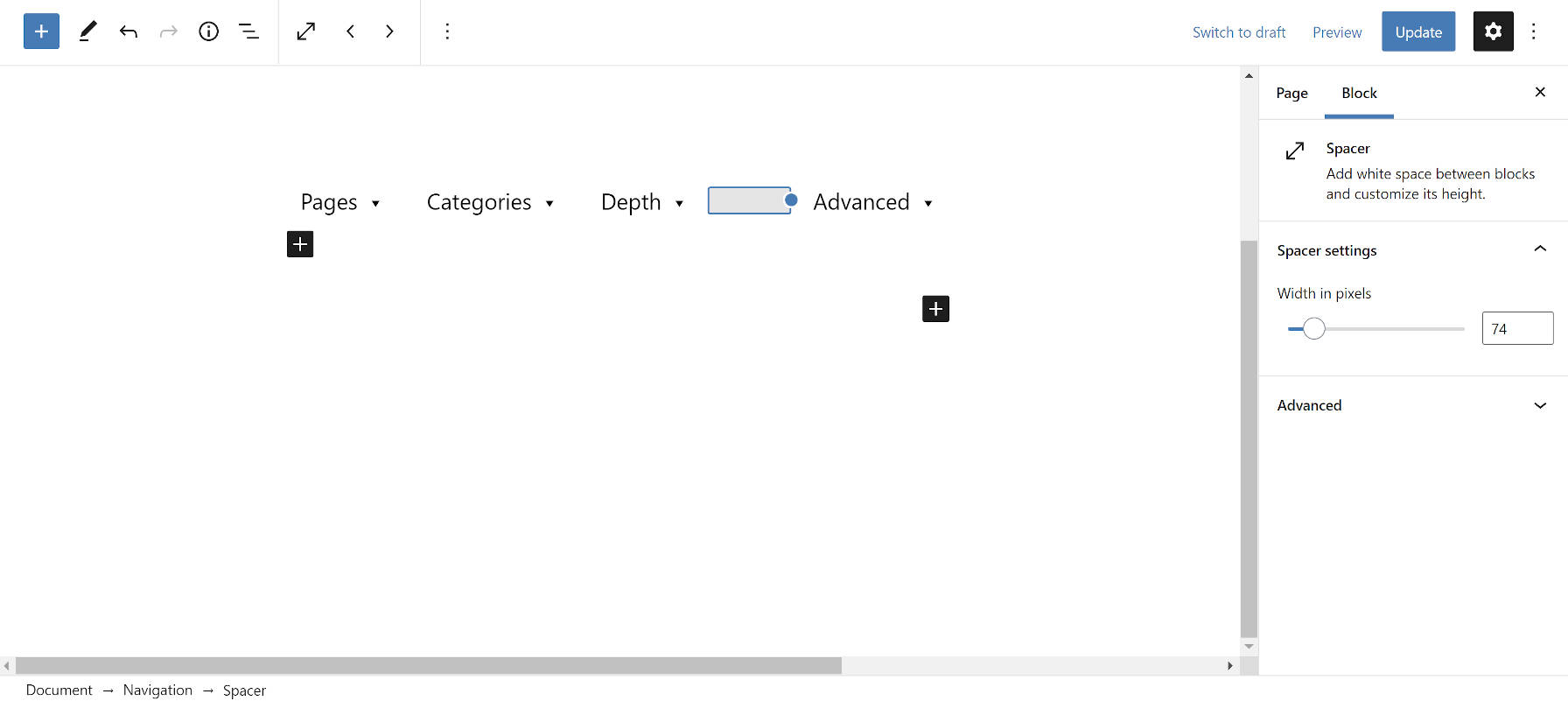
In one of the worst ideas the Gutenberg project has brought us, users can now insert spacer blocks between horizontal Navigation block items. And they can increase or decrease the space in pixels. The idea of spacing is not in and of itself bad, but the solution used is.

As far as I know, the <div> tag is not allowed as a direct child of <ul>. That is where <li> elements go. Maybe it is my old-school HTML upbringing, but it does not feel right to throw other things in the mix. List items are the children of lists.

Fortunately, there are solutions for this sort of horizontal spacing that have been available to web designers for decades: margin and padding.

The Spacer block has never felt right since it was introduced into Gutenberg. I always assumed it was an unfortunate stopgap solution for vertical spacing until we got proper margin and padding block options. I never imagined we would find new and inventive ways to use it for defiling a site’s markup.

Template Part Categories

Site editor with a template part selected.
Selecting an area for a template part.

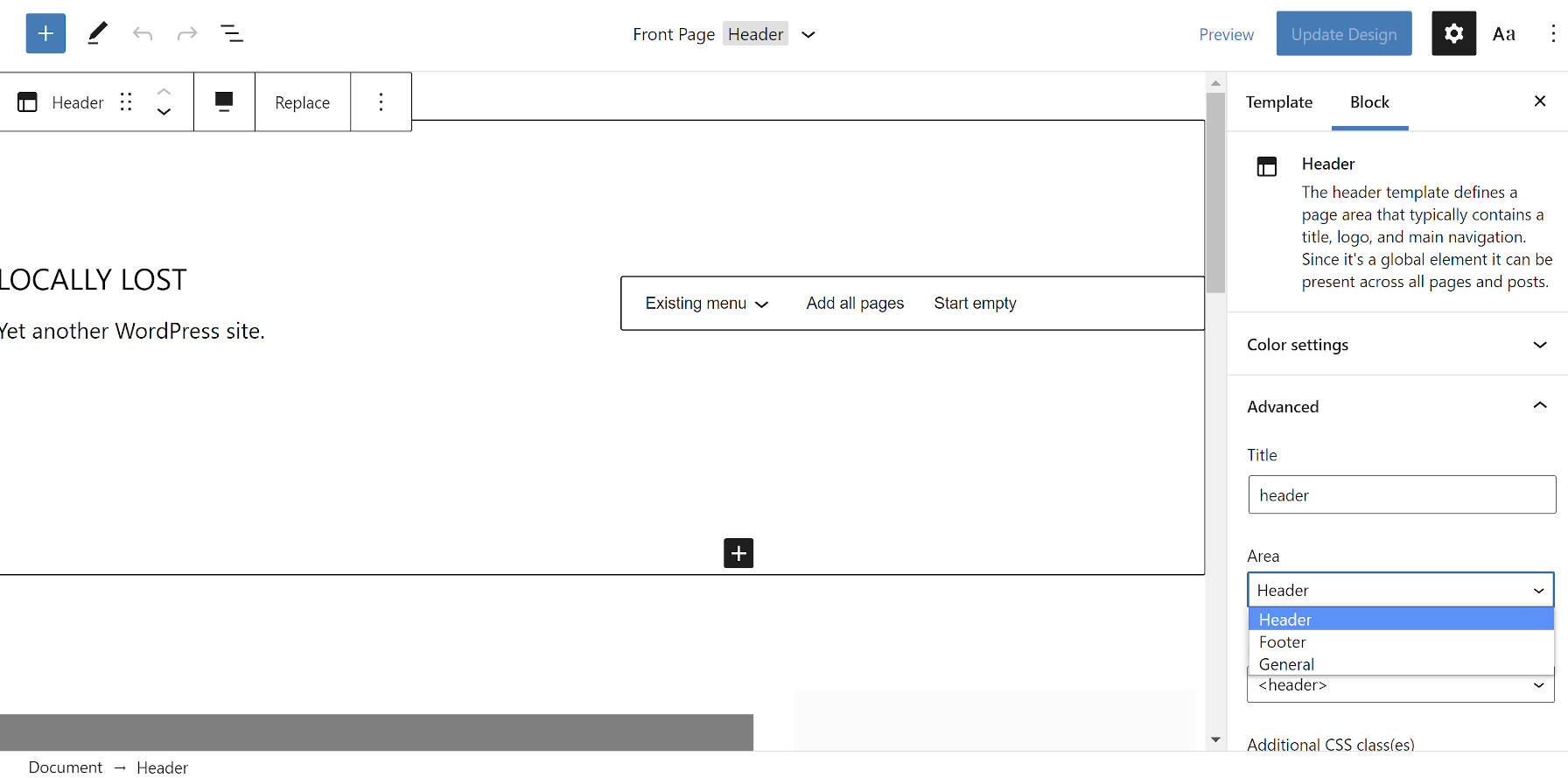
Users can now save template parts to a specific category or “area,” as they are called in the site editor UI. In Gutenberg 10.1, the development team introduced a new categorization system for theme authors that would automatically place template parts into the Header, Footer, Sidebar, or General categories. The same system is now open for user-created template parts.

When saving a template part via the site editor, users must open the “Advanced” block tab. There is a new “Area” option. The Sidebar category is missing in this release. Nevertheless, it is a welcome step toward template-part management.

Query Block Patterns

Initial Query block state when the user first inserts into a post with pattern options.
Pattern selections for the Query block in its initial state.

The Query block is at the heart of Full Site Editing. It will eventually be one of the primary components both developers and users interact with as they build sites.

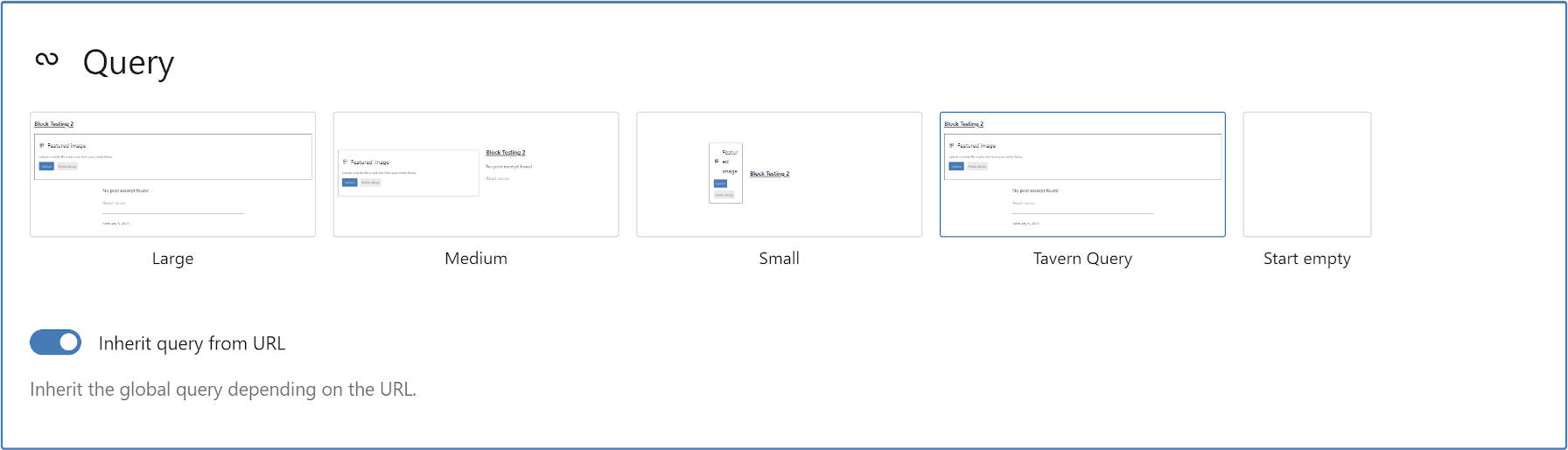
The development team introduced a new concept for end-users when first inserting the Query block. In the past, users saw several block variations. Now, they can choose between patterns that are specific to the block.

Out of the box, there are Large, Medium, and Small patterns. Users can also opt to start from a blank slate.

For developers, this change introduces scoped patterns. It is a new layer to the Block Patterns API that should offer a ton of flexibility in the long run. While the feature only works with the Query block right now, theme and plugin authors could create predefined layouts for blocks that users can choose from in the future.

Imagine having several different styles of post loops that you want to offer to your users. With a few lines of code, you could register each of these as selectable Query patterns.

The new part of the API adds a scope argument that looks like:

'scope' => [
        'inserter' => false, // Whether to show in the main block inserter.
        'block'    => [ 'core/query' ] // The container block for the pattern.
]

This is still in the experimental stage, so things could change as the feature is further developed.

Following the core example, I created a quick Query pattern with the following code:

add_action( 'init', function() {

	register_block_pattern(
		'tavern-query',
		[
			'title'  => 'Tavern Query',
			'scope'  => [
				'inserter' => false,
				'block'    => [ 'core/query' ],
			],
			'content' =>
                '<!-- wp:post-title {"isLink":true} /-->
				<!-- wp:post-featured-image {"isLink":true,"align":"wide"} /-->
				<!-- wp:post-excerpt /-->
				<!-- wp:separator -->
				<hr class="wp-block-separator"/>
				<!-- /wp:separator -->
				<!-- wp:post-date /-->'
		]
	);
} );
15

15 responses to “Gutenberg 10.2 Adds Spacers To Navigation Lists, Lets Users Categorize Template Parts, and Introduces Scoped Patterns”

  1. I’m enjoying using Gutenberg for content, and as it improves with the help of plugins, I’m coming around to using it for full site design. But the spacer block has to be among the worst ideas the Gutenberg team has had. Adding it to the menu makes a bad idea worse.

  2. I find it curious that one of the criticisms highlighted in the article, with the latest releases of Gutenberg, you mention broken CSS. Added to this the oddball spacer, leaves me cold regarding the new block editor. There is too much a touch of, we’re having fun experimenting here, and not enough of building something stable.

    Don’t get me wrong, fundamentally using the block editor is quite good, but I only use it sparingly. Once you start straying into something more ambitious it becomes very unwieldy.

    For example I have been running a test site with the excellent Kadence theme, very flexible and feature full. What let’s me down is not the theme itself but the way the block editor can suddenly go skew ways. For example I installed the much reviewed Editor Plus and imported one of its layout packs to a page. First impressions look good until you looked more closely and realise many element that were meant to be aligned centrally are not. It’s like margin auto was broken on one side. For the life of me, was it possible to fix easily… NO, defeating the purpose of the block éditer being the all dancing panacea for WordPress into the future.

    Part of me feels excited with the prospect that many page builders, that already donlayout far better than the block editor, would convert to become block based under the hood. Then again another part of me fears the regret that may come with this move.

    And, you would wonder what will happen to WooCommerce, still stuck in Classic land. It is like the third secret of Fatima. Is the Classic editor still set to disappear by the end of this year?

  3. Thanks, Justin, for the nice summary.

    I’ve really been trying to like Gutenberg. Believe me, friends and neighbors, I really have. But when an editor starts messing with the HTML5 content model for no reason I really can’t come up with a smart defense anymore.

    A spacer block div? In a nav menu list? Are you kidding me? This is just plain wrong on so many levels!

    First of all, why would I ever want to include empty div containers for the purpose of styling at all? This is definitely not the way HTML content structures and web layouts are supposed to be created.

    What’s the next step following this approach? Table layouts? Transparent pixels? 🤔

    And of course you’re totally right: the children of a list element should be list items (https://html.spec.whatwg.org/multipage/grouping-content.html#the-ul-element).

    How can something so flawed ever make it into a release? I am by no means a design Guru or programming genius. Far from it. And I certainly don’t want to sound snooty. But even I understand that this sort of rubbish is completely unacceptable.

    The least I expect from a content editor is that it allows me to make my own mistakes – not have it make them for me without my knowing.

    A bad tool is a bad tool, even for a skilled craftsman. I can always try to improve my own set of skills, but I can’t and certainly don’t want to spend my time fixing my tools. Not to mention the way those tools can and will be used by less skilled content producers (e.g. editorial departments).

    In the end it all boils down to the issue of reliability. Tools need to be reliable. A content editor has to function and output valid content reliably. It seems that Gutenberg is trying very, very hard to erode that reliability.

    Maybe I am overreacting, but it feels like it is about time to look for something else.

  4. Thank you for the detailed overview, and I absolutely agree that this spacer block thing is »one of the worst ideas the Gutenberg project has brought us«.

    I really like the block editor (aka gutenberg phase 1), but if a horizontal pixel width spacer block is the solution to whatever the problem may have been it will be quite a while before full site editing (aka gutenberg phase 2) becomes usable in any form …

  5. “Maybe it is my old-school HTML upbringing, but it does not feel right to throw other things in the mix. List items are the children of lists.”

    You sound surprised, Justin, that WordPress would ever produce duff HTML code, even though you’re the author of a handy plugin that corrected Gallery output!

    By the way; does anyone else write and/or do template work on a 13.3″ screen, or is everyone using 21″-plus? I often feel a bit hemmed in (I have the right-hand toolbar open all of the time) and usually have to scroll down modals and pop-ups to find the option I’m looking for. Columns tend to be difficult with less space to work in. Just wondering.

  6. The navigation spacer block shows why there is a pressing need for more people to get involved in shaping the way Gutenberg evolves.

    Sometimes a PR needs someone to say “I don’t think this is a good idea, and here’s why…”, and open up the conversation to critical feedback, rather than two or three contributors all saying “yes”. Before you know it, that bad idea has made its way to release.

    • Agreed. However, I also think part of the problem is that it’s easy to miss these things. There are 2.8K tickets right now for Gutenberg. Keeping track of even a portion of those is mind-boggling. Even for someone like me who is following updates almost daily, I often don’t see something until it lands in a release.

      • Justin, the fact that one has to go through the labyrinthine route to post on GitHub says it all about putting people off criticising or suggest feedback regarding the Gutenberg project.

        The pattern for most > find the plugin page for Gutenberg and add a review or, open a support ticket, only then to be told to go onto GitHub and open a PR. For most people following this suggestion it is just overkill. It should be enough for ideas and feedback to land in the plugin page and somebody with good UX and project skills should be triaging all this material and digesting it to realise where the core team are going wrong.

        That’s why I have given up on posting in feedback directly to WordPress when it is probably more effective to put some hard hitting comments on WP Tavern posts!

        It’s a pity because the core idea of the block editor is quite good till it strays off in some odd directions or doesn’t address some key important use cases such as data entry/WooCommerce updates.

  7. I want to create sites for clients using Gutenberg. But when I start a specification process for a big site, for an organisation with 30+ employees where the editors will undoubtedly be the most junior an inexperienced … I am in total fear of letting them loose with this rather unstable and weird system.

    I know this will be deeply unpopular but I notice that most of the Gutenberg cheerleaders are only running really simple blog type sites. It’s very rare that I follow a project contributor and see they’ve struggled with the same massive monster projects as I encounter at work.

    It’s fine to use Gutenberg on a blog with a couple of additional pages. As soon as we start to look at sites with 5 CPTs, custom layouts, bespoke blocks, additions to allow layout switching, capabilities for templates. It all starts to fall apart really very quickly.

    Gutenberg still seems like a tool to edit blogs about making Gutenberg.

    • Have to agree with you there. The larger a site, its complexities and the more users of mixed abilities, the more the odds go up that something will go awry.

      There seems to be an misconception in the tech industry that any body and every body can be a genius user/programmer. The reality is a lot different. The cognitive load is often too much for those either new to, or unwilling to learn and engage properly. I am not saying that we are dealing with rocket science. It definitely is not that complicated.

      I would say that with any of the editors, classic, block or whatever comes with a page builder, they do have their demands. To mitigate against this the best UX possible needs to be applied. The team behind the block editor aren’t doing us any favours by ignoring certain use cases.

      You mention a site with 5 CPTs. I would often have a post type that is set up primarily for data entry, designed for the controlled capture of information in a concrete format and then fronted with a template to display all this in a uniform manner across all post instances. This mitigates against complete disorder on the site. The way that the block editor is implemented in WordPress it appears above any custom field groups designated in a CPT, inviting users to go wild with free form content. To this end I created my own rudimentary plugin to style out the block part of the editor. I would rather see the Gutenberg team address these practical matters rather than FSE which does nothing for me. I can achieve full site editing in much more enjoyable way with a good page builder.

      To a degree you are correct in saying that Gutenberg still seems like a tool to edit blogs about making Gutenberg.

  8. These updates are killing me. I have a website with hundreds of posts and courses, all built with the Gutenberg. The latest updated changed the behaviour to how the ‘space’ between paragraph (ie: empty space) works. Previously it was not taking hardly any space, now it takes up some 40 pixels in height.

    All my blog posts and courses are massively spread out now and looks like a big on my whole site.

    Any idea if there is a fix for this or will I have to go through every single post and update to avoid these massive gaps between paraphs?

    • It will depend on your theme. Most likely, you’ll need to adjust the top or bottom margin for paragraphs. Not knowing what your design is like, I can only give you some general advice. Try one of the following two CSS adjustments. It should work but may need some adjustment.

      p {
          margin-top: 2rem;
      }

      Or:

      p {
          margin-bottom: 2rem;
      }

      If it doesn’t change anything at all, you’ll need to ask your theme author or hop over to the WordPress.org support forums.

  9. Spacer block within the navigation? Very interesting…

    I know, why I still don’t use Gutenberg on any productive site. How can I “trust” people which implement such solutions?!

    My only idea to explain that to myself is, that they think, people that have no clue of code, will don’t care.

    Now, I want to play around with the Mozilla Composer this evening…

Newsletter

Subscribe Via Email

Enter your email address to subscribe to this blog and receive notifications of new posts by email.