FSE Outreach Round #11: Going on a Site Editing Safari

Anne McCarthy announced Round #11 of the FSE Outreach Program on November 11. The latest test, dubbed Site Editing Safari, calls on volunteers to run through a step-by-step list to find strengths and weaknesses around the upcoming WordPress 5.9 site editor. Volunteers are still welcome to provide feedback until Tuesday, December 7.

This is actually my second attempt at Round #11. The first was right when the testing began nearly a month ago. As always, I was excited to jump in and contribute in some small way to the project. So, I made sure I updated everything and loaded up my test environment. Then, the entire experience rocketed downhill.

I became frustrated after the template navigation was removed from the site editor. So, I simply threw in the towel. The one feature I had been waiting on for months felt useless. I pointed out these frustrations in my review of Gutenberg 11.9let’s just say there were a few drafts of that post that were far less kind.

Shortly after, template navigation was re-added to Gutenberg and should land in WordPress 5.9.

Calls for using the TT1 Blocks theme are also demotivating. I have become burned out testing it and hope to never see it again. On the other hand, Twenty Twenty-Two is far more exciting. Plus, it will be the theme that showcases what FSE can do. So, I installed it instead. Yes, I began breaking the rules before I even hopped over to the first step of testing.

The following is a screenshot of the final homepage customization after running through the tests:

Homepage of a website with a short header, followed by a three-column grid of blog posts.
Custom homepage design with Twenty Twenty-Two theme.

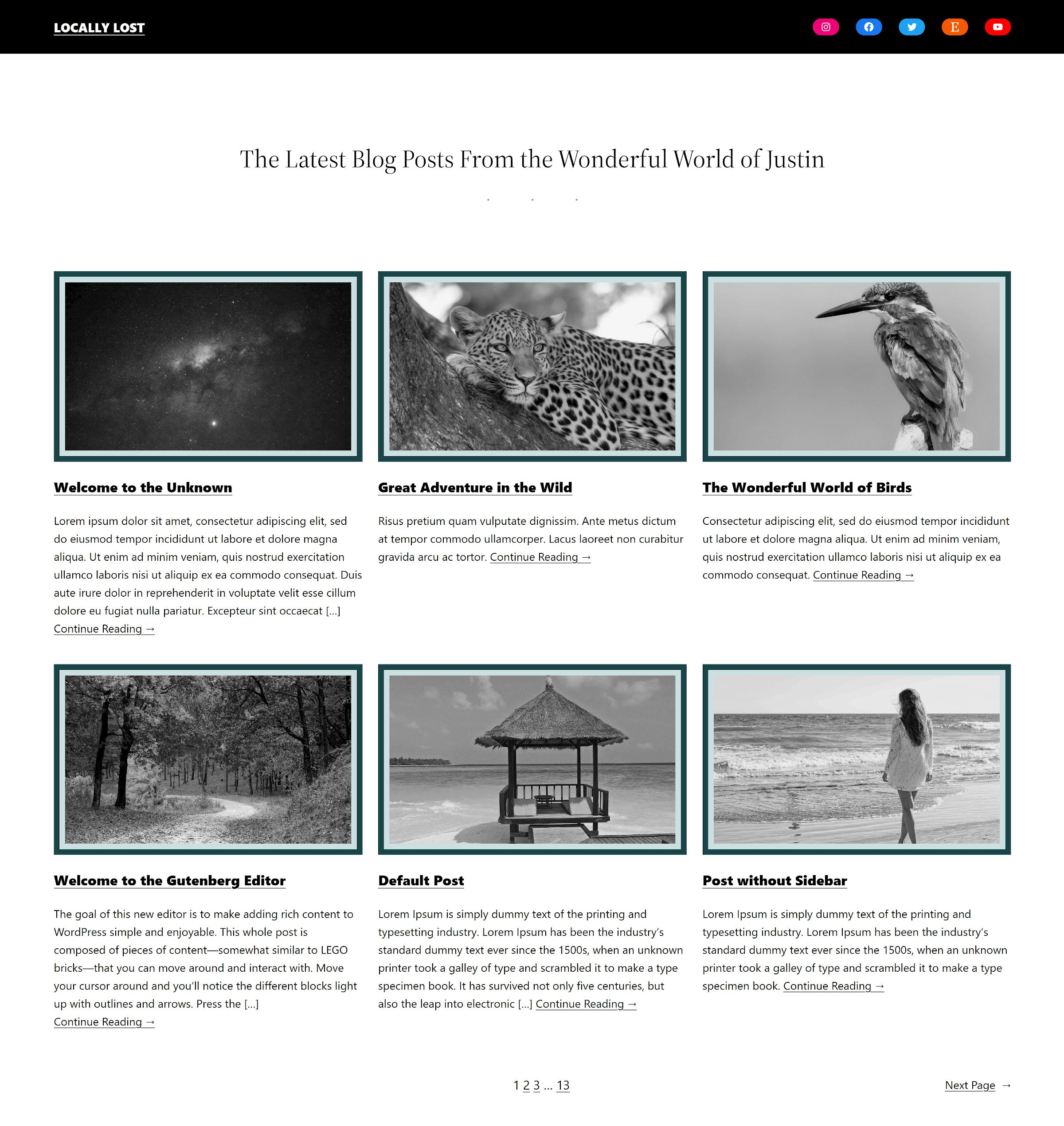
I jumped ahead and started from the header-editing section at the end of the test. The header area is the first thing you see in the editor, so it felt natural to begin there.

I started by removing the Page List block from the Navigation menu in the header. I have 90+ pages on my install, and it is always irritating when themes list them all by default. There also does not seem to be a way to limit that to top-level pages or a max number. I opted for a few custom links instead.

Then, I added a Search block, but its options were far too limiting to fit it into the design. There was no way to edit the colors or typography of the input field. It would also be nice to have a search text input that expanded or popped up when clicking the search icon.

Using the WordPress site editor to add a search block to the navigation area in the header.
Trying to customize the Search block.

Eventually, I just dropped it all and added a Social Icons block. They were a bit less boring than run-of-the-mill links.

The biggest issue I hit was with the Group block. By default, the Twenty Twenty-Two theme adds an 8rem (that’s pretty big) bottom margin to one of the Groups within the header area. That pushes everything on the page after it down. The trouble is that there is no way to customize that space because the block still does not support margins.

I ended up adding an intro section to balance out all of the whitespace between the header and content areas:

Homepage design in the WordPress site editor with an intro section between header and content.
Intro section between header and content.

Based on the current direction of an open ticket, Group margin support is unlikely to land in WordPress 5.9. The suggestion is to rely on the Spacer block to do the work.

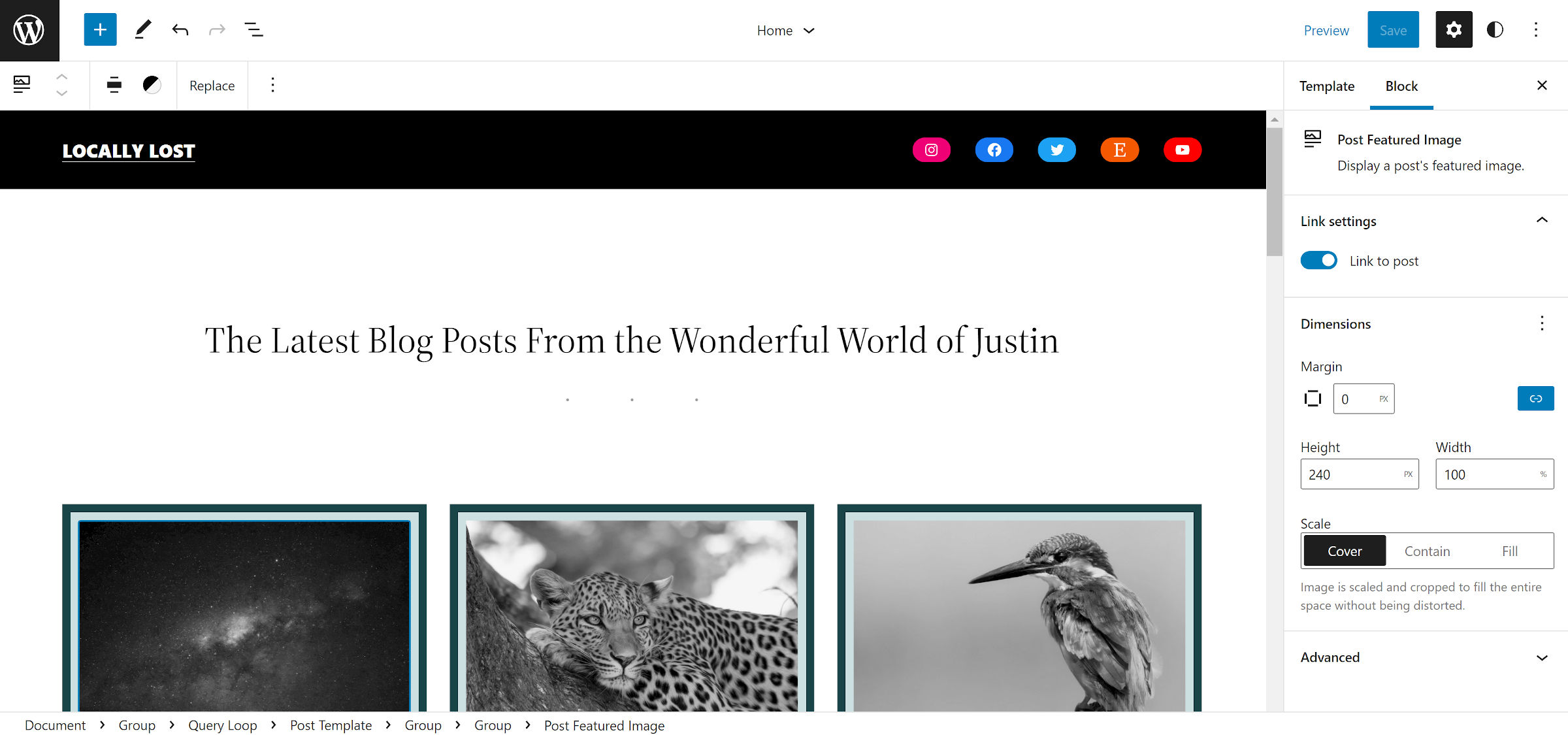
When I jumped back to the first section of the testing steps, I wanted to put the Post Featured Image block through its paces. It has improved, but it is still missing the vital Image Size option, which would allow users to select a theme-registered size.

I also wanted to add a border, but the option does not exist for the block. Instead, I had to wrap it in a Group block to create the effect. I took it a step further by adding padding and background color, essentially creating a two-color border.

Customizing a Group block's colors and borders in the WordPress site editor that is wrapped around the featured image.
Grouping the Post Featured Image block for borders.

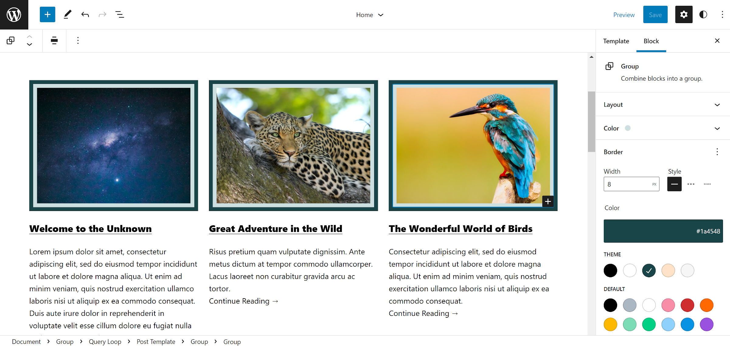
The purist in me cringes at wrapping an image in a <div> element just to add a border. Users should be able to add it directly to the Image block.

This very much feels like where the state of the block and site editing is overall. Many pieces are exceptional, but after digging beneath the surface, you find that you need workarounds for some essential design needs.

During testing, I ran into a few features I would like to have, such as a word-count limit for the Post Excerpt block and a button-style design for the “more link.” I am sure there are already tickets to address these, so I did not dwell on them.

The biggest, ahem, hiccup that I ran into wiped all of my progress when editing my header. I tried to transform one of the outer Group blocks into a Cover to give it a background. It wiped everything in the header area clean, and the “undo” button did not seem to work. I just started over.

I ran through all of the tests without any other issues. The site editor and global styles interfaces feel close to ready for their version 1.0 release in WordPress. The system works well enough for those willing to accept some frustration to play around with a suite of new toys.

8

8 responses to “FSE Outreach Round #11: Going on a Site Editing Safari”

  1. What I love about your articles, Justin, is that they show you are humble in your approach to the subject of the article, while at the same time demanding with your own professionality and respectful towards others.
    Thank you for all these qualities – they make reading your articles so pleasant AND useful.

  2. “I started by removing the Page List block from the Navigation menu in the header. I have 90+ pages on my install, and it is always irritating when themes list them all by default.”

    When creating a theme it is difficult to know which way the wind is blowing with the Navigation. There was briefly the navigation areas (primary, secondary, and tertiary) that solved a lot of issues and worked quite well, but no sooner had I started working with it, it was decided to deprecate it.

    I don’t like leaving the default menu empty, nor do I like using hardcoded “demo” links. The Page List works well on a fresh install, but like you say with a lot of pages it really doesn’t!

    I seem to remember some classic themes submitted to the directory would not have a fallback menu so the initial state was empty, and the theme reviewer(s) would often hold back on approving the theme until the author had addressed this. Usually they were encouraged to output all pages as the fallback.

    At the moment the Page List, although not ideal, seems the best compromise. A small snippet of CSS could limit the displayed page list menu items, but when we want to get away from themes adding stuff like this and let core/gutenberg handle it, a maximum number option would be a great thing to have.

  3. I started by removing the Page List block from the Navigation menu in the header. I have 90+ pages on my install, and it is always irritating when themes list them all by default.

    There’s a Gutenberg issue which covered this Page List fallback.

    The Gutenberg team couldn’t be convinced to change this. Another missed opportunity for improving themes.

  4. Justin! Always a pleasure to see your thoughts. As someone mentioned above, I very much echo that your articles are always pleasant and useful.

    I became frustrated after the template navigation was removed from the site editor. So, I simply threw in the towel.

    Always appreciate the candor and, for what it’s worth, would have welcomed a post about it then. As you likely saw play out in GitHub, this was a very tough and tricky call to make but feedback often helps give great context to make decisions.

    Calls for using the TT1 Blocks theme are also demotivating. I have become burned out testing it and hope to never see it again.

    You and me both at this point :D Expect TT2 going forward for future calls for testing. My hope is actually to have folks go straight to the Theme Directory and pick any block theme to test from in the long run. For now though, both TT1 and TT2 have needed the feedback.

    I started by removing the Page List block from the Navigation menu in the header. I have 90+ pages on my install, and it is always irritating when themes list them all by default. There also does not seem to be a way to limit that to top-level pages or a max number.

    Great call out. Opened an issue here to cover this piece of feedback: https://github.com/WordPress/gutenberg/issues/37340

    There was no way to edit the colors or typography of the input field. It would also be nice to have a search text input that expanded or popped up when clicking the search icon.

    Agreed! Thankfully, there’s an issue open for this already. I’ve commented there to make sure your ideas (and interest) are captured though: https://github.com/WordPress/gutenberg/issues/22071

    The biggest issue I hit was with the Group block. By default, the Twenty Twenty-Two theme adds an 8rem (that’s pretty big) bottom margin to one of the Groups within the header area.

    Excellent call out once more. There’s an issue open for this as well but I’ve added your feedback to it in case it helps create more momentum to address this: https://github.com/WordPress/gutenberg/issues/36797 I too have run into issues with this in my testing from time to time. Of note for any themers, themes can opt out of Block Gap styles: https://github.com/WordPress/gutenberg/pull/34491

    I took it a step further by adding padding and background color, essentially creating a two-color border.

    I dig this effect :) As for your note about being able to add borders to Images directly, I’ve noted it on this previous issue on the same topic: https://github.com/WordPress/gutenberg/issues/21540#issuecomment-993032825

    This very much feels like where the state of the block and site editing is overall. Many pieces are exceptional, but after digging beneath the surface, you find that you need workarounds for some essential design needs.

    Expect to see this quoted in the summary post. I super appreciate these high level thoughts and takes as someone who is often very deep in the experience itself. Feels very apt and part of what we have to look forward to in future releases. I have to keep reminding myself that this is just a V1 despite my impatience and excitement.

    During testing, I ran into a few features I would like to have, such as a word-count limit for the Post Excerpt block and a button-style design for the “more link.”

    Heh as expected both are noted already: https://github.com/WordPress/gutenberg/issues/34757 & https://github.com/WordPress/gutenberg/issues/33288

    I tried to transform one of the outer Group blocks into a Cover to give it a background. It wiped everything in the header area clean, and the “undo” button did not seem to work. I just started over.

    Whoa! I could replicate this and have opened an issue: https://github.com/WordPress/gutenberg/issues/37342 There are two recent PRs that might be related to resolving this but, to be safe, I’ve reported.

    Thanks once more for going through this test, reporting back, and encouraging others to do the same through your actions (and not just your words!).

    • Thanks for the detailed response. You are the best person for digging up tickets. I often miss them in searches, even when I know I had seen an issue previously.

      I’m happy you were able to replicate the Group/Cover transform issue. Sometimes, it’s hard to tell if it’s a for-sure bug or just one of those random occurrences. It’s good to have someone confirm. And, thanks for opening a ticket on this.

      • Always happy to connect the dots! It helps me learn as I go too.

        Sometimes, it’s hard to tell if it’s a for-sure bug or just one of those random occurrences. It’s good to have someone confirm.

        100000%. So appreciative when folks mention these kinds of “what the heck just happened?” moments. You never know when it might connect to something larger.

    • Concerning the dimension control issues that Justin mentioned, I am very focused on that right now and have begun adding individual PRs for the most relevant blocks. I currently have Paragraph and Group blocks done. While from a code perspective, these PRs are minuscule, they do warrant debate and have been the subject of debate in the past. Therefore, I have broken them out individually. If anyone has any thoughts, please do add them to the GitHub via the links below 😉

      Paragraph: https://github.com/WordPress/gutenberg/pull/37300
      Group: https://github.com/WordPress/gutenberg/pull/37344

Newsletter

Subscribe Via Email

Enter your email address to subscribe to this blog and receive notifications of new posts by email.