There’s a curious design trend among WordPress themes that shows no signs of stopping. The prominent use of mint green has become designers’ favorite highlight color.
The trend started in the greater design community, as recently illustrated by Automattic design engineer Mel Choyce in her tweet commentary:
Some interesting color trends appearing on dribbble: https://t.co/JUOl11VFnS
— Mel Choyce-Dwan (@melchoyce) February 10, 2014
The color is often seen accompanying a flat design. “It’s in kind of the weird space between green and blue,” Choyce commented before suggesting the name “Frosted Cyan.”
It’s as if someone merged turquoise and seafoam green to create the next design obsession. You’ll find it everywhere from fashion to product design to interior decorating, as seen on Etsy to Pinterest.

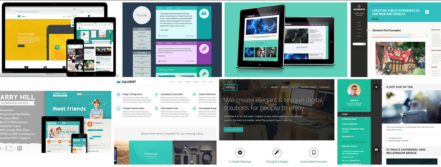
Both “Vintage Aqua” and “Arctic Marine Blue” come pretty close to the mark. Whatever you want to call it, the color has now fully infiltrated WordPress theme design. Commercial and free themes alike are making liberal use of mint green and its many derivatives. I’ve compiled a small sampling:
The Psychology Behind Mint Green
How does a color become trendy? Do colors have inherent meanings or do they simply remind us of things we’ve seen in the world? Color psychology is a fascinating science to explore, given that colors are proven to have patterns in how they effect large portions of the populace when empirically tested. Throw history and culture in the mix, along with the physiological effects of colors and you have a whole spectrum of insight when experimenting with specific hues.
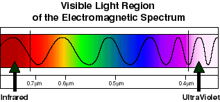
Colors exist in different wavelengths and stimulate the eyes and mind in various, measurable ways. Red is on one end of the electromagnetic spectrum of light visible to humans and has the longest wavelength. Violet is on the other end with the shortest wavelength. Green is right in the middle and is the easiest to perceive.
Colour Effects, a London-based color consultancy, has this to say about the psychological properties of green:
Green strikes the eye in such a way as to require no adjustment whatever and is, therefore, restful. Being in the centre of the spectrum, it is the colour of balance – a more important concept than many people realise. When the world about us contains plenty of green, this indicates the presence of water, and little danger of famine, so we are reassured by green, on a primitive level. Negatively, it can indicate stagnation and, incorrectly used, will be perceived as being too bland.
So what is it about mint green? For many, a light green hue evokes feelings of freshness or lightness. Designers seem to be quite fond of using it in contrast to a flat grey in their latest creations. The color was, of course, first inspired by nature, with which so many of us have lost touch. Mint green, or a muted/pastel shade, is said to represent tranquility to many people and has a calming effect. Perhaps this is why it’s often used in hospitals.
Why is Mint Green Trending?
The fact that mint green is trending probably says more about us and our digital culture than it does about the products themselves. In an era where many of us are chained to our electronic devices, the trending mint green color may be a subconscious attempt to reconnect with nature. These electronic devices and the near constant flow of information they provide are often a cause of stress. Instant access to traumatic events happening around the globe and the pressure to stay connected may have a deeper psychological impact on us than we know. It’s no wonder that we are gravitating towards colors that convey tranquility and balance.
This particular mint green design trend started in 2012 and held strong throughout 2013. Has it reached its zenith? Why do you think it’s been so popular?
Never mind Mint Green I love the sound of “Frosted Cyan.”
Sounds much more sophisticated.
Not sure why it’s popular but before I read this post I published a new “Contact” page on a new site, and what colour is the header?
http://divitheme.co.uk/contact/