Features such as the upcoming block-based widgets system, the template editor, theme-related blocks, and others have taken up much of the spotlight as of late. However, one of the best user-focused tools shipping with WordPress 5.8 is a duotone filter for Image and Cover blocks.
The term “duotone” in this sense means combining two colors as a filter. Then, layering it over an image or video. More specifically, one color is used for the shadows (dark elements), and the second color is used for the highlights (light colors).
When the feature first landed in Gutenberg 10.6 back in May, I spent a couple of hours just tinkering around with it on that first day. Since then, I have racked up a few more. It is a powerful media-editing tool that does not require users to dive into image-editing programs, allowing them to change the mood of a story at the click of a button.
Duotones can be anything from a simple grayscale to a mixture of any two colors. Shadows and highlights can even be inverted, depending on the shades chosen.
The following shows the difference between an original image of kittens (because who doesn’t love kittens?) and one with a grayscale filter:


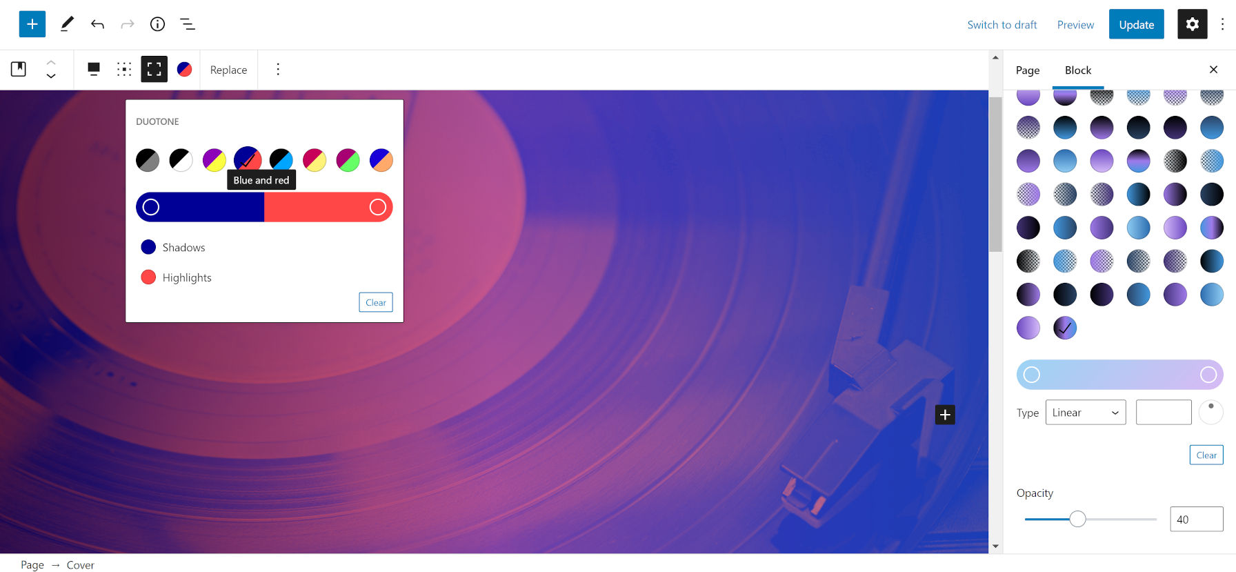
WordPress offers a set of eight duotone color sets by default. This includes a grayscale, dark grayscale, and various combinations, making for some fun filters. Some will work better than others, often depending on the media file uploaded.

Like many other features awaiting users with WordPress 5.8, theme authors are those who need to dig in to offer a range of ready-baked options for users. The new theme JSON file configuration allows developers to define a set of duotone colors that match their theme.
Defining custom duotone filters is as easy as plugging a name, a slug, and two colors into a theme.json file. The theme developer handbook includes examples of creating such presets.

Users are not limited to the filters that WordPress or their themes offer. The duotone popover allows them to choose from any range of colors for custom shadows and highlights.
Duotone typically works best when an image has a high contrast, which means a wide-ranging spread between the light and dark colors. Darker shadows and lighter highlights make for more visually stunning filters.
When used with the Cover block, users can add filters to both image and video backgrounds. However, they also have access to the typical overlay color or gradient option. This provides a ton of flexibility for customizing media.
Because the duotone feature works with an inline SVG file under the hood, it also means that using it does not permanently change image or video files. Users can still use their original media elsewhere on the site without uploading a second copy.
Duotone is just the tip of the iceberg. There are so many other possibilities outside of just laying a couple of colors on top of an image. Bence Szabó wrote an extensive tutorial on using SVG filters for patterns on CSS-Tricks. This could be a route for background options in the future — wood grain, anyone? Maybe not every possibility is suitable for core WordPress, but I would love to see plugin authors taking a stab at some alternatives.
I agree with this post. My fav. combination is the one with the black shadow, and blue highlight, and because we can customize the colors individually, replacing the blue with another color, while keeping the black shadow in place, also produces some incredible results.
There is a limitation though. If your Cover’s background image is “fixed” the duotone does not work. My workaround for that is to layout a temporary Cover block, set the duotone, render it on the front end, and with the Windows Snipping Tool I capture the duotone image as a jpg. Now I can create my actual Cover block, use the captured duotone jpg image as my background, and simply set it to be “fixed”. I have not tested it, but by doing so, we might even get better page load times, especially if the page contains too many duotone images.
Many (including me) often criticize Gutenberg for it’s deficiencies, but when it comes to the Cover Block, the duotones, along with the Matrix control are top notch, It’s time for me to give the devs. all the props they rightfully deserve in this case, what’s fair is fair !