 Created by Tung Do of DevPress, DP Dashboard is a plugin that transforms the back-end of WordPress into something that is supposed to be simpler, modern, clutter-free, productive and an enjoyable experience. For me however, I preferred the experience of MP6. Instead of writing a lengthy review, I’m going to tell you what I liked and disliked about DP Dashboard.
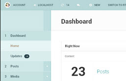
What I Like
Typography – The typography is easy to read, even from a distance.
Numbered Menus – I like the idea of using numbers for top-level menu items just as long as the order doesn’t change.
Things I Don’t Like
Everything Is Too Big – DP Dashboard was created to provide a large screen experience by only supporting 1024 resolutions and above. He also added support for landscape view in tablet devices. I’m using a 20 inch widescreen LCD monitor and DP Dashboard has me thinking I don’t have a big enough screen. Buttons, text fields, menu items, everything is just too big.

This leads to a lot of unnecessary scrolling.
Not A Fan Of The Color Scheme – I don’t like the seaweed color scheme. There is also not enough contrast between the white and grey. On my monitor, they appear to be the same color.
Too Many Clicks Added To My Workflow – Using MP6 or the default post writing screen, the right side of the page has an area to drag around widgets. In DP Dashboard, the widgets have been replaced by links to the widgets. I prefer to have the widgets I use most such as Tags, Publish, and Categories on the right side of the post writing screen. By having the widgets I use most to the right of the post writing panel already open, it saves me a mouse click. Using DP Dashboard, I have the choice of scrolling down to find the widget I’m looking for, or clicking the link to take me straight to the widget. After using DP Dashboard for a day, I’ve concluded that I don’t like this workflow.
Conclusion
I’ve respected Tung Do’s work over the years. His WordPress themes always have a touch of class and sparkle that, in my opinion, is unmatched in the WordPress theme community. However, I can’t see myself ever using DP Dashboard. It doesn’t improve any part of my WordPress back-end experience versus MP6. I’ve left the plugin enabled for a day to perform typical administrative functions but the longer I use it, the more I want to disable it!
Instead of creating an alternative to MP6, I’d like to see Tung Do create his own version of MP6 using it as a foundation. I can tell that Tung put a lot of work into DP Dashboard, it’s just not my cup of tea.
is this available yet? i was using the old one, but it wasnt working with 3.6+