It is easy to become jaded after reading the same old keyword-stuffed theme descriptions. After viewing the same hero-plus-three-boxes theme designs. After seeing another theme with “block editor styles” that utterly fails to deliver on its promise.
As I peruse the demo of Anders Norén’s latest WordPress theme, Eksell, I am reminded that artists still exist in the WordPress theming realm. For those familiar with his past theming work, this is not revelatory. Most of his 20+ free themes have 1,000s of active installations — Chaplin even became the base of the Twenty Twenty default theme.
Awaiting a theme from Norén is almost like counting down the days until your favorite director’s film hits the theater. You know you are going to like it before you see it. Even the worse outing is better than everything else spilling through the pipeline. Every now and then, you are greeted with something special.
I could not wait this time. Norén’s latest project is at a pitstop in the review system, so it is not officially available in the WordPress theme directory yet. In the meantime, anyone can still grab a ZIP file from its Trac ticket and upload it the old-fashioned way.
Eksell is a love letter to the block editor.
It is more than just making a few style adjustments to work around any quirks of the default block styles. It is an extension of those styles to create something unique. It is more than running a theme through a few tests and calling it compatible. It is looking at common problems and making sure they are styled correctly on the front end. And it is more than slapping a few blocks together and calling them a pattern. It is about providing users with a one-click solution for custom-designed or tough-to-build elements.
Building WordPress themes means being able to wrangle tons of elements that users can rearrange on a whim. The block editor has increased those pieces at least tenfold. It is rare to see a theme that manages to handle every edge case, and I am sure there are some that Eksell misses. However, the whole of the work is one of — if not the best — block-ready themes available today.
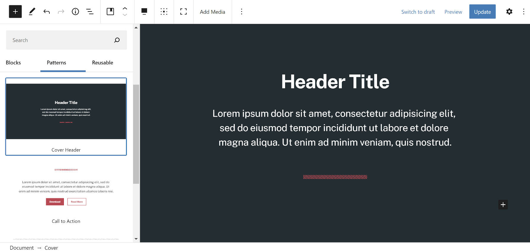
If there is one area in which Eksell did not go far enough, it is with block patterns. The theme registers five of them:
- Cover Header
- Featured Items
- Call to Action
- Contact Details
- Stacked Full Groups
Each of these is in the demo. However, there are some missed opportunities, such as the following three-column “pattern”:
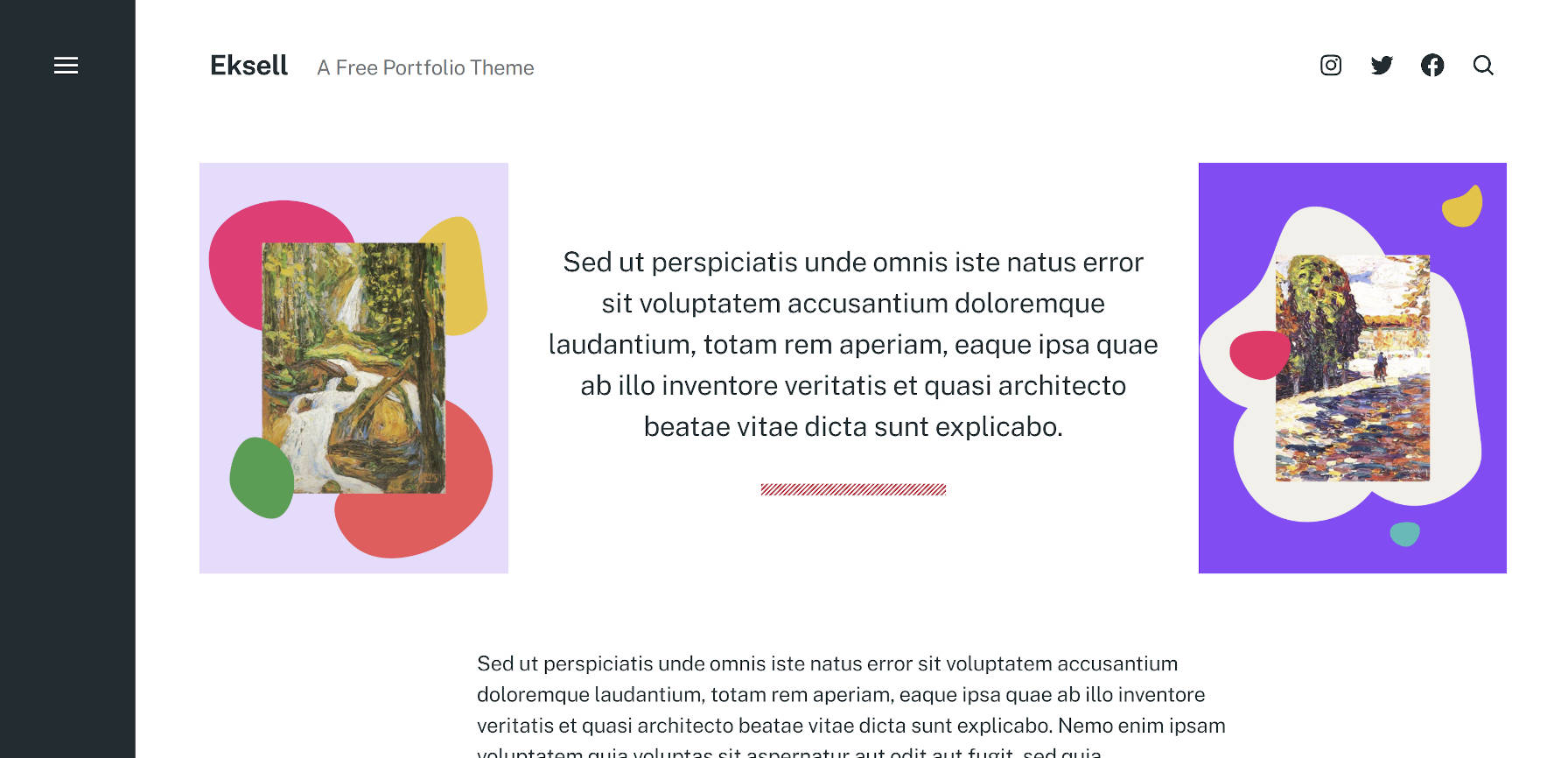
Pros at building layouts with blocks could recreate that in minutes. A one-click option for inserting it into a post might save a headache or two for average users.
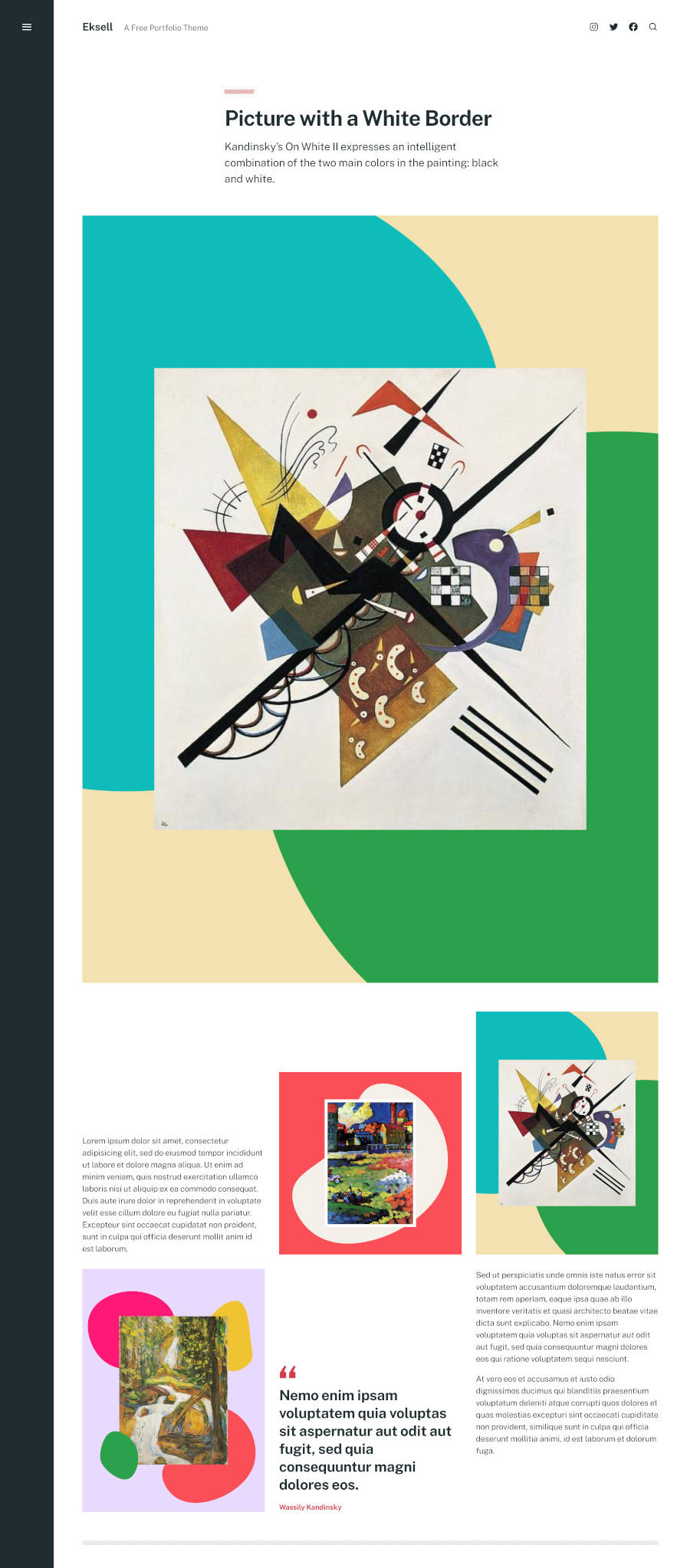
This is not the only example. Eksell’s demo is full of experimental groupings that showcase the flexibility of the block system. As bold as it is, the theme is a bit timid with its patterns. There is no need to be. They are already there. They simply need to be registered in the system.
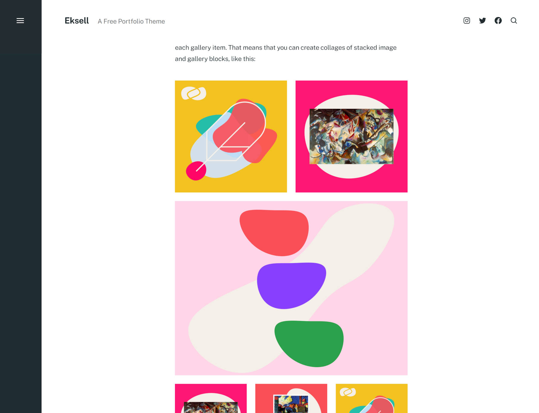
Users can stack individual Image and Gallery blocks, making them appear as part of the same gallery. The theme automatically adjusts the margins between the blocks, bringing them together.
Another candidate for a block pattern.
And, here’s the thing. I firmly believe the traditional theming paradigm held back this theme. Its uniqueness is in its handling of blocks, which are still limited to the content area in WordPress. When the site editor and global styles land in WordPress later this year, a theme like this would already be miles ahead of others in integrating with Full Site Editing.
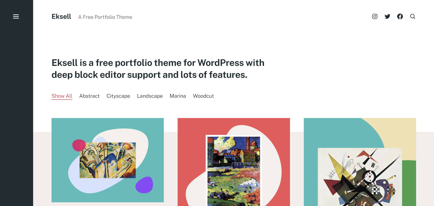
Eksell is more than just a theme that does cool stuff with the block editor. It is a genuinely useful portfolio theme. Instead of marketing it as yet another multipurpose general-purpose project, it has a target audience. Despite that, it is well-rounded enough to handle a variety of situations. Norén made sure the theme would work for blogging with on-point typography.
By default, the theme displays blog posts in a grid-style portfolio. However, Jetpack users can opt to use the plugin’s portfolio project post type to keep their portfolio separate from their blog.
One feature that might go overlooked is that Eksell provides an option to upload a fallback featured image. Far too often, portfolio-style themes with post-image grids fail to load a default image. The expectation is that the user will have featured images for every post, which is not always the case. When a theme is built around this idea, it needs to cover all of its bases, covering edge cases where things might fall apart. Eksell handles this, but Norén is an old pro at this point. He doubtless knows these common pitfalls.
The theme does not overwhelm users with options. It provides enough flexibility to personalize the theme’s color scheme and make a few layout-related decisions.
Old-school theme options will be a thing from a past era in the coming years. It is best to focus on the elements users will be working with for the long term. The customization power is with what users decide to do with blocks, and Eksell is ready for whatever users might throw at it.
Every WordPress theme author should dive into the Eksell theme. Consider it a free masterclass in building on top of the block editor. It is the standard by which we should be judging all other offerings.
Big thanks for the kind write-up, Justin! More block patterns are definitely coming, and hopefully before Eksell goes live in the directory proper.