Community Created Mockups Suggest Improvements to the WordPress Plugin Directory Redesign

When we announced that the new WordPress plugin directory redesign was in open beta, a number of readers provided us with their feedback. Some of the most common items mentioned include:

  • Missing tabs
  • Too many read more links
  • Everything displayed on one page leading to a lot of scrolling
  • A lack of search filters

Based on feedback and his own preferences, Paal Joachim Romdahl of EasyWebDesigntutorials, created a new set of wireframes for the WordPress plugin directory redesign.
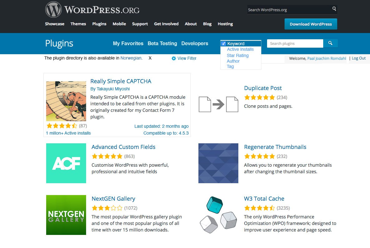
CommunityCreatedPluginDirectoryWireframe
Mockup Design of the WordPress Plugin Directory Main Page

Romdahl’s wireframe of the WordPress plugin directory main page adds the ability to filter search results based on keyword, active installs, star ratings, author, and tag. It also adds last updated, compatibility, and active install information to the plugin cards. The page is responsive so those with larger monitors will see additional columns of plugins.

Romdahl also published a design mockup for the single plugin view. The plugin author and title is moved above the plugin banner. Permalinks are displayed beneath the plugin’s banner and the full description is shown by default.

CommunityCreatedPluginDirectorySinglePluginWireframe
Single Plugin View Mockup

In addition to these two pages, Romdahl created a mockup of the Add New plugins page in the WordPress backend that I encourage you to view.

After browsing the new plugin directory redesign, I discovered a couple of things I don’t like. I prefer clicking on tabs to see specific information rather than using my scrollwheel and having to scan the page to find what I’m looking for.

I also don’t like the number of read more links I have to click, especially the plugin’s description. I agree with many of our readers that it should be prominently displayed in full by default.

It’s hard to know from a screenshot whether something is useable or not. Hopefully, the WordPress Meta Team can implement a few of Romdahl’s ideas into the next iteration of the design to allow the public to test their practicality.

What do you think of the changes proposed in Romdahl’s mockups?

9

9 responses to “Community Created Mockups Suggest Improvements to the WordPress Plugin Directory Redesign”

  1. I like the initial proposals by the meta team – fresh, concise, and accessible.

    It is true that there are quite a few Read More links. To better handle these, I would appreciate seeing an easily accessible X to collapse a section after having expanded it (without having to scroll). Or even the ability to expand a section by clicking on its header – that seemed an intuitive action for me.

  2. I love the design, but the heavy amount of “Read more” links is annoying. I would prefer the approach of Android Material Design, in which, you simply can click (or touch) anywhere within a collapsed box of content to expand it and again to collapse it.

    Either way, the current tabbed navigation is very useful for those plugins with really long texts. Also, the possibility to point a direct remote link to the FAQ or Changelog or Support page for any given plugin, is a feature that should be preserved.

    Beyond these points, the overall new design looks pretty nice :-)

  3. The new design is certainly more visually appealing, but I also prefer the tabs. They are significantly more efficient than all the scrolling. Hopefully a design both visually appealing and efficient can be found!

    I don’t see one of my pet peeves addressed, which is the ability to search within the support forum of a single plugin. This makes it difficult to determine if my question or issue has already been asked and answered. I usually resort to a Google search to try to achieve this. (If there is currently a way to do this that I’m just too thick to figure out, please let me know!)

    • Thank you Jeff for shining a bright light on alternative ideas about the plugin directory here. Hopefully someone is listening. The plugin directory is a functional tool and visual appeal is only a part of its mandate. Improving form should improve functionality and not detract from it.

      Paal’s ideas about functionality are great. More powerful and more personalisable would be ideal. Not all users are identical, hence the tool (plugin directory) should be powerful enough to serve us all.

      Great idea Christee about improving support search. That would be the just kind of improvement which would make WordPress publishers’ lives better.

  4. The new designs are great. I will say that more filters would be amazing! Replacing ‘popular’ with a dropdown I feel is a good call. By being able to select a star rating, I think this places more value on what is popular because honestly, there are some great plugins with 4 star ratings. As well, newer plugins might have gotten some lower ratings at first where active development on the plugin could have changed the outlook across the board.

    In terms of the design, I like the blue bar instead of the white bar that is currently present. It feels more like the WordPress backend :)

    All in all, the direction is great. The meta is already there so I would assume that the implementation would be rather unobtrusive.

  5. Mocking things up like this is premature and generally we end up arguing visual issues which, while fun, are the least important of the issues here.

    What we need to really figure out are the UX issues – what are the purposes of the directory? Who are the ‘customers’ and what do they want and need?

    For example, popular. Who CARES about whether a plugin is popular (even assuming we can adequately define that word in the context of plugins)? A site owner shouldn’t install a plugin because a lot of other people are doing it, they should install a plugin because it fills a need.

    So, the first thing is that the interface should be far more conversational. It should assume the visitor is looking for a plugin to do X and encourage them to express that – “I’m looking for a plugin that does _____” where the underline is a select menu of common things that people use plugins for with an Other choice for cases that aren’t common.

    Next, USE FACETED SEARCH. It’s better that the mockup lets people order by various criteria, but I often want to show only plugins rated 3.5 stars and above *and* which have been updated in the last 3 months. Forcing one search mode on me is 1990s thinking.

  6. Choosing a plugin would be easier if WordPress permitted a little more repository information. Author-generated advice is untrustworthy because it’s biased. Popularity (number of installs) is, also, a lame indicator. Newer plugins sometimes are better. We can’t search on freshness.

    We seek indicators of credibility (which is composed of expertise, trustworthiness, and leadership). These cues are sometimes referred to as information scent. These things are inferred in the plugin repository – or are discovered by downloading. They include:

    1. Download file size. This is a potential indicator of plugin efficiency. Not always but frequently. If we have alternatives, we recommend the smallest plugin package to avoid bloat. Why doesn’t WordPress just tell us file size before downloading or having to click? Editorializing download links is considered polite and good web etiquette.

    2. Date of first approval or submission. Longevity in the market is an indicator of credibility. At present, we either must open the download package and examine the readme.txt for a change history – or figure it out in the repository by compatibility to the oldest version of WordPress. Like a reverse-lookup. Do we have to use Wikipedia? That still doesn’t really tell first-release date of the plugin.

    https://en.wikipedia.org/wiki/WordPress#Release_history

    3. Similar or newer plugins should be listed as linked options.
    Popularity doesn’t always mean “best.” It may just mean old or antiquated. Inference from similar plugins (if listed) helps cue us for plugin usage and adaptation (workarounds).

    4. Does the plugin require a signup or registration? In other words, is it bait?

    5. Does the plugin interrogate an offsite database or cloud information? This is an indicator of slower load times (page speed) and HTTP requests.

    This information and more would make for better productivity using the repository. There isn’t enough information when making choices.

    There are a few other things we’d love to see. But we’re being idealistic in our wish list. These include answering plugin questions such as:

    Does the plugin have hidden non-features? For example, some image optimization plugins have limitations of how many image conversion quantity. The repository says nothing about it. Nor does the readme file. You must install first to find this bugaboo out.

    Are there known incompatibilities or conflicts with other plugins or themes? Sometimes authors only reveal this in the readme.txt file. That wastes our time.

Newsletter

Subscribe Via Email

Enter your email address to subscribe to this blog and receive notifications of new posts by email.