What began as a project in August 2020 has now become a reality. All past Twenty* default WordPress themes now have their own unique block patterns. In recent weeks, Twenty Ten through Twenty Fifteen received updates.
Designer Mel Choyce-Dwan kick-started tickets for all previous 10 default themes before the WordPress 5.5 release, the first version to support patterns. Twenty Twenty, Twenty Nineteen, Twenty Seventeen, and Twenty Sixteen each made the cut for that update. However, the remaining default themes were left to languish, at least for a few months and WordPress updates.
Jumping back over a decade to update past themes might seem extreme, but all of the default themes are still some of the most popular from the directory. Granted, they had the benefit of being installed directly in WordPress. Still, the current number of active installations means they are worth a small refresh:
- Twenty Fifteen: 100,000+
- Twenty Fourteen: 100,000+
- Twenty Thirteen: 70,000+
- Twenty Twelve: 100,000+
- Twenty Eleven: 100,000+
- Twenty Ten: 100,000+
Despite having the lowest installation total, Twenty Thirteen has some of the best pattern designs. The Informational Section and Decorative Gallery patterns stand out the most, but all fit well with the overall theme design.
Informational Section 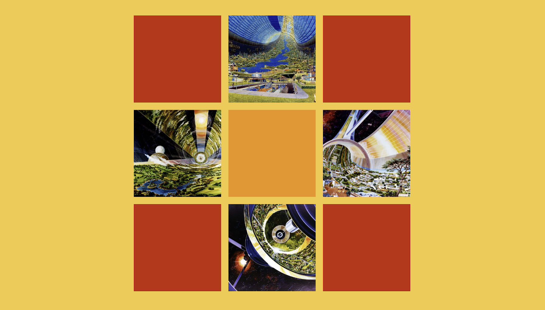
Decorative Gallery
Twenty Thirteen is also the only remaining default theme that supports wide and full alignments. Its one-column layout affords it more flexibility, and the old design feels fresh again with its new pattern choices. Perhaps they can revive the theme’s lagging numbers relative to the other defaults.
The initial pattern designs for the theme included a suite of layouts for post formats, one of the features Twenty Thirteen leaned on. Something similar to the first gallery design landed, but the others were left out.


Post formats never garnered widespread support past their launch, and the core development team all but abandoned them, never building atop the feature. However, all of the format-specific patterns might be welcome for those users still running the theme. They would have been a nostalgic nod to the old WordPress, a throwback to yesteryear. If nothing else, maybe they can serve as inspiration for those of us still clinging to that tiny sliver of hope that post formats will make a roaring comeback.
These theme-bundled designs highlight how the upcoming pattern directory is not meant to be the only destination for snagging the best layout sections to drop into the block editor. Often, the best choices will be specific to the theme. Much of the flavor of custom design is lost when building for a general audience. What looks good with Twenty Twenty-One may look terrible in another and vice versa. Maybe that will change as block design tools become more robust and how they are used becomes standardized, but for now, at least, the most artistic patterns are those that designers include with their themes.
Aside from Twenty Thirteen, Twenty Ten’s new patterns stood out the most. The theme was the first of the new era of yearly themes, and its classic blog design has weathered the years well — just ignore the 12-pixel sidebar font size.
The three patterns are at home in the theme. The Introduction pattern, which showcases the Image, Heading, and Paragraph blocks, is simple, but it relies on Twenty Ten’s typography for an elegant article intro. The Quote and Alternating image layouts do not try to do too much, simply highlighting the theme’s design.
Landing squarely in my favorite-but-most-disappointing category was Twenty Fourteen. The About pattern’s image and text looked elegant and roomy in the editor, but the front-end view painted a different picture. Because the theme lacks wide-alignment support, the photo was scrunched up. The gallery-supported Summary pattern has a lot of potential as a full-width pattern, but it falls short in the theme’s 474-pixel wide content area.
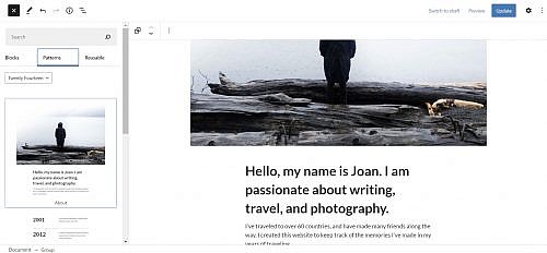
About Pattern 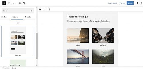
Summary Pattern
There is really no reason why Twenty Fourteen could not support wide and full alignments. It has free space.
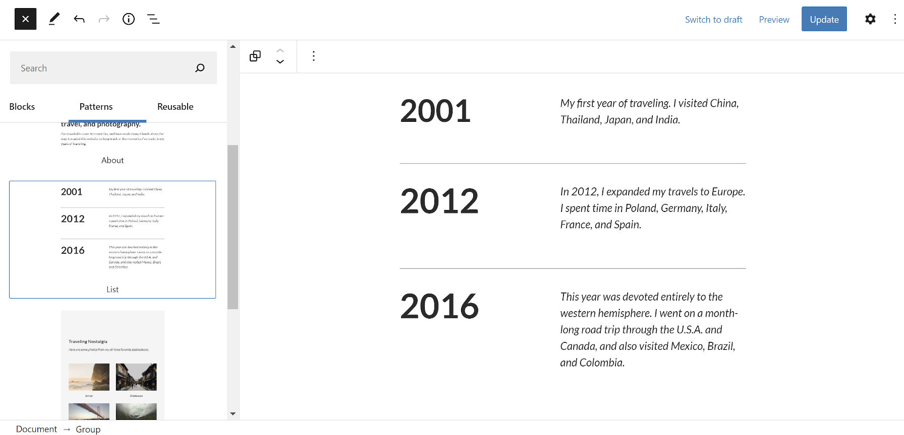
At least the timeline-esque List pattern is pretty sweet in both the editor and front-end views. I may borrow that for my own projects.
I was not particularly excited over the other patterns, but I am happy to see a little love thrown toward the 600,000 or so users with these themes still active. I am sure many will find something they can use on their own sites.
The themes are aging; the wrinkles and weaknesses of their designs are showing. With the site editor looming ahead, it might be time to consider retiring them. That is assuming no one wants to take the reigns and update them for a modern era. Otherwise, they will continue falling behind, remaining a relic of classic WordPress.
I’m pretty excited about the Twenty Thirteen changes. I have a microblog that I enjoy writing on quite a bit using Twenty Thirteen. I don’t hold out hope for any real post formats work, but they’re still close to my heart.