WordPress Twenty Fourteen Theme Is Out in the Wild

Twenty Fourteen is making its debut on WordPress.com today, a full 22 days ahead of the WordPress 3.8 target release date. The theme is now available for free to millions of WordPress.com users.

twentyfourteen-home

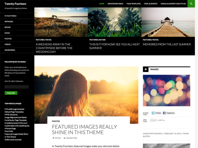
Twenty Fourteen, designed by Takashi Irie, started out as the Further theme. Through contribution from many in the WordPress community, it is now a very solid theme and ready for the spotlight. While we’re all admiring Twenty Fourteen’s sleek design, Amy Hendrix reminds users that it is also the most accessible default theme to date:

https://twitter.com/sabreuse/status/403213971836006400

The Accessibility Team has been following the project and contributing to make this theme accessible to as many people as possible in terms of technology and ability.

Now that Twenty Fourteen is out in the wild, clear and easy instructions on how to use the theme are available. One of the most helpful items to reference on the Theme Showcase page is the list of of ideal images sizes (in pixels) for the header image, featured images and single image pages. If you follow these sizing guidelines, you’ll keep Twenty Fourteen looking its best:

  • The main column width is 474.
  • Featured images work best with images that are least 1038 wide.
  • The primary sidebar (left) width is 162.
  • The secondary “content” sidebar (right) width is 306.
  • Widgets in the footer widget area are 255 wide.
  • The header image size is 1260 wide and 240 high.
  • Single image pages are full-width and 810 wide.

Self-hosted WordPress.org sites will not have access to the theme until it is released with WordPress 3.8 in December. However, if you want to get it early, you can switch to trunk using the WordPress Beta Tester plugin. Another option is to download the WordPress zip from its github repository, a mirror of the subversion repository, and extract the Twenty Fourteen theme folder from there.

17

17 responses to “WordPress Twenty Fourteen Theme Is Out in the Wild”

  1. I’ve been working with the Twenty Fourteen theme most of the day. 474px for the main column is absurd. I’ve spent hours tweaking this theme and with each element that needs to be fixed am more annoyed than impressed by this “new” default theme.

    There is a point where clever goes too far. This theme is a good example.

  2. Bravo for wordpress redesigning their full admin responsive, and mirroring that effort on the front end with the 2014 theme. They’re pushing everyone in the right direction, although I’m sure the transition will be naturally frustrating for tons of ppl…

    Make no mistake, the best thing about this theme is the clean responsive design on mobile / “accessibility”

    The web default sizes leave a lot to be desired, but that’s a skeleton design for you, it’s not meant to be 100% polished – that’s where the child themes come in. But, if you start with this theme, you’re doing yourself a huge favor on mobile having that all in place. How much of a favor? A growing amount, starting at about 25% – 35% of your current traffic, if your site is like most.

    The small column width is strange looking at first when the rest of the page is empty. I think that small column width is intended for the featured post with large image, it’s supposed to cut up into it underneath the main tiles and next to the right sidebar – in that context it does look pretty nice. If you don’t like that 3 column format, just make a custom full width template variation to your liking but work with the responsive settings and you’ll really be ahead of the game for 2014.

    This year mobile and tablet traffic is going to be between 30-50% for most sites! It’s an annoying transition if you have a site that has a complex HTML structure with fixed width…. starting with this theme really gets you a head start there and it does look clean on mobile.. maybe it’s time to just cut over to a new theme from scratch and make a clean start this year?

    All you really need to do for any blog is create a child theme, change some colors, and just don’t messy it up and it will look great for the mass amount of phablet traffic coming this year :)

    I’m just now trying out customizing the base theme on a new site mystyleplatform.com … Check back in a couple days or a week or so and see how it changes from today’s default install :)

    I’m excited to see what custom themes come out based on this responsive layout, I bet this year’s theme marketplace is going to be awesome, lots of pinterest style sites to come with this new default featured tiles layout I’m sure.

  3. Hi there I am starting a school holiday blog with my daughters, who are totally crazy about horses and ponies, we wanted to share our lifestyle on a blog. We have chosen the twenty fourteen theme I would really love a link to a video tutorial about the twenty fourteen them so we can get it looking mint like the demo :) Can you recommend one, thank you, Mayo family.

  4. Anyone have an idea of how to create a tag which does so that the post doesn’t come up on the content page? Like the “feature” tag makes the post go on the slider or grid, and it doesn’t “duplicate” onto the content page…? So in essence I’d like to add a tag called “hidden” and then that post won’t show up on the content page!

Newsletter

Subscribe Via Email

Enter your email address to subscribe to this blog and receive notifications of new posts by email.